How Verdant Graphics became a brand of its own
Wit & Craft positioned Verdant Graphics, a commercial printer in West Michigan that had spent twelve years printing for one company, and built the brand it launched to the outside world. The printer had a new building, new presses and a team with 188 years in the trade between them, and almost nobody outside its own family of companies knew it was there. So we did the work in order. First we found out what was true about the company and wrote it down as a position. Then we drew a symbol, chose three colors with no green in them, and built the identity around them. Then we planned the launch, designed the brochure that carries the story, and presented the brand to the whole Verdant team. The brand went out in 2023, and it is still on the company’s website today.
The challenge
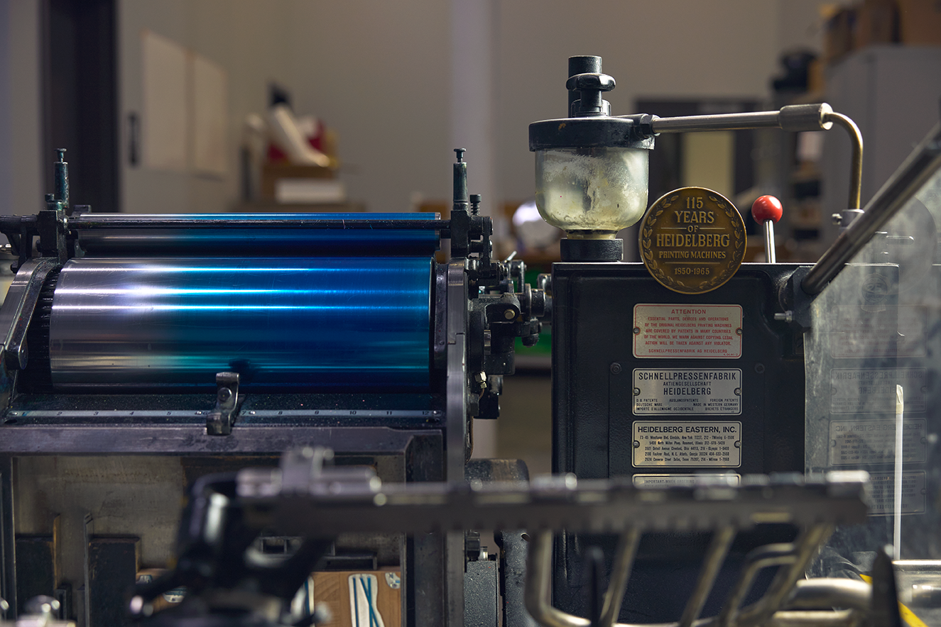
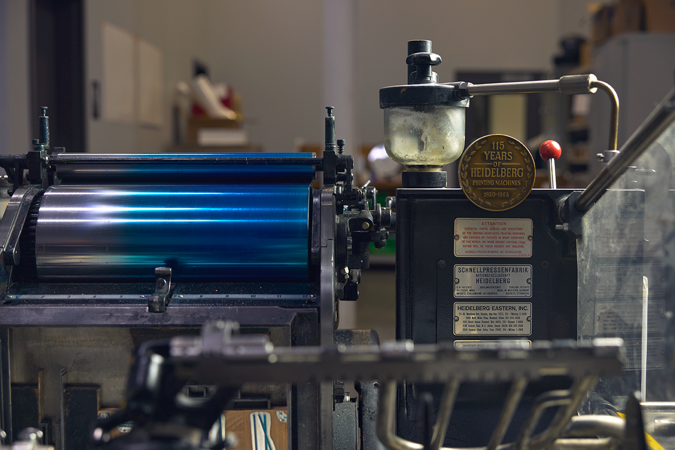
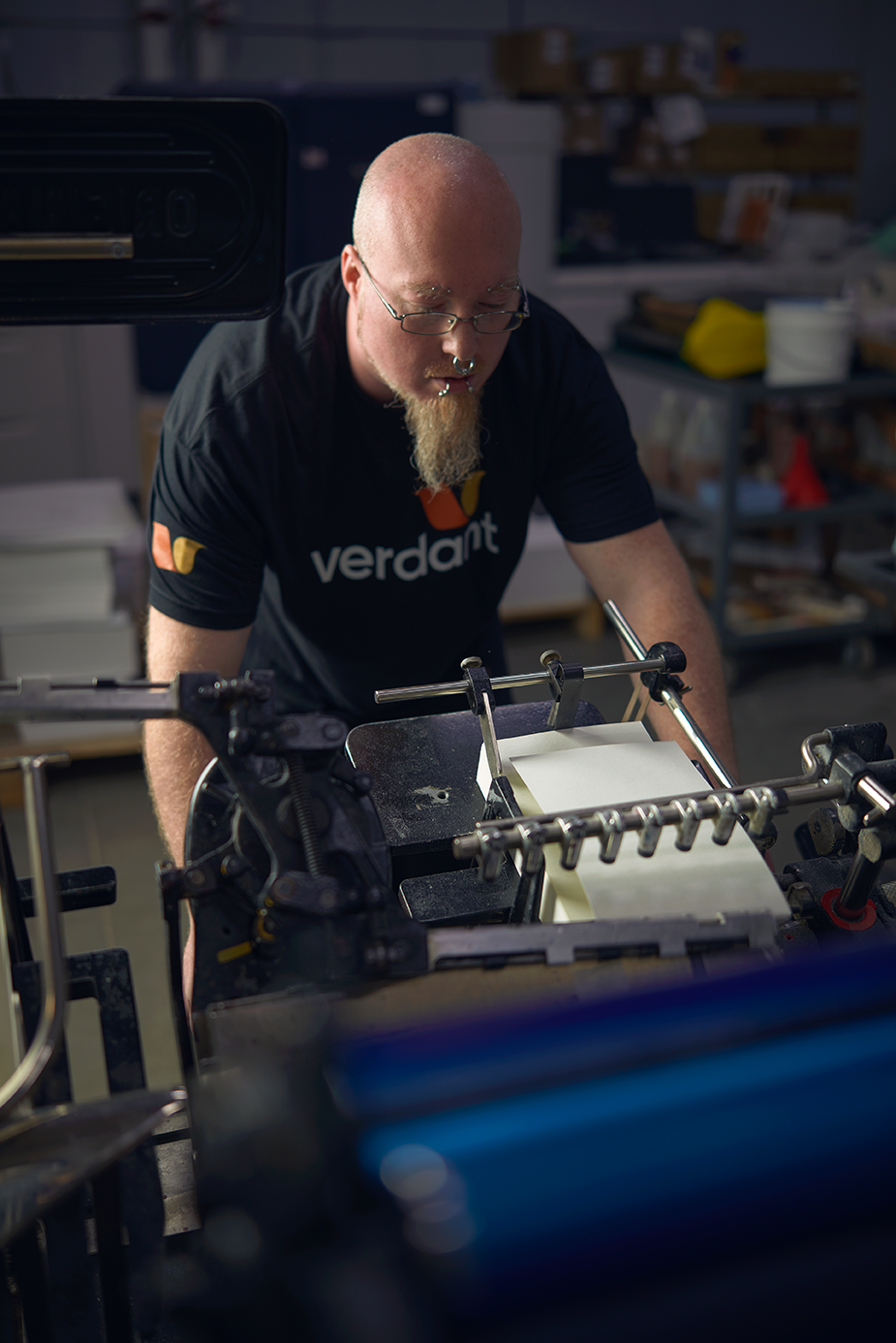
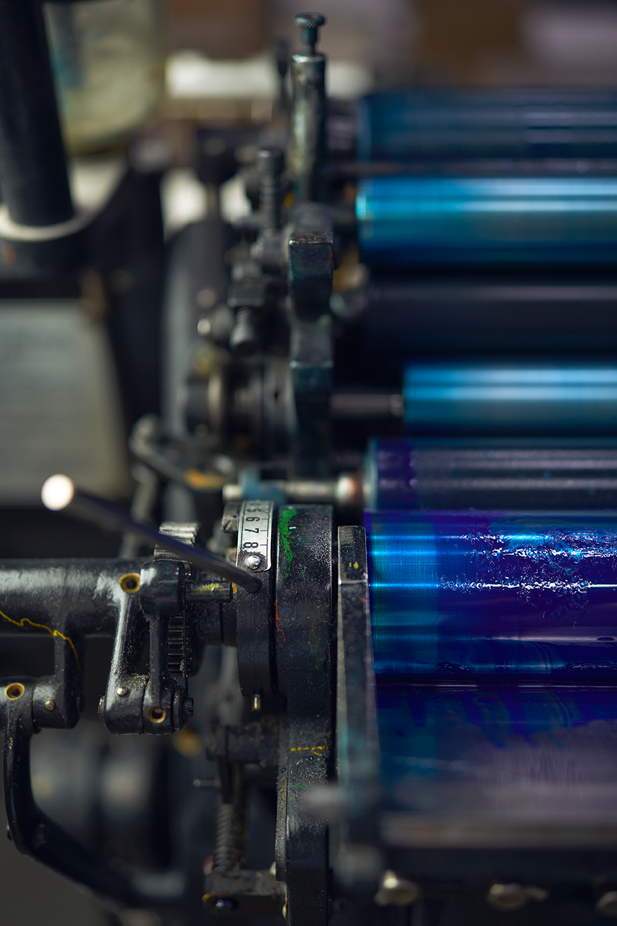
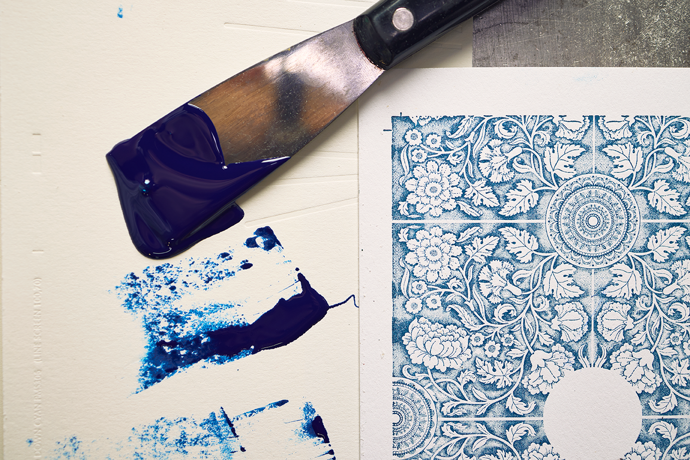
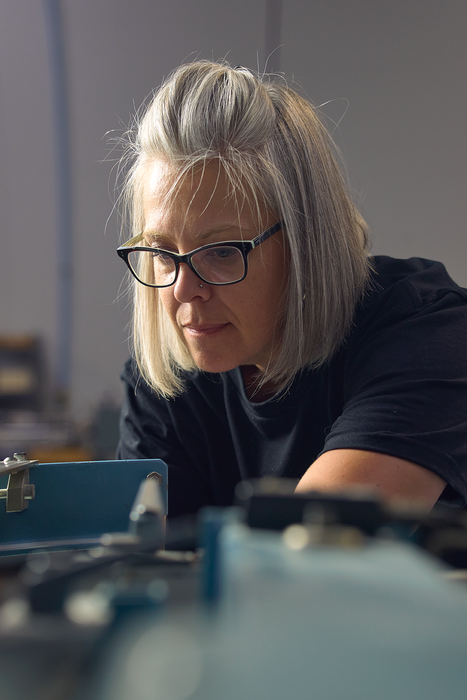
Verdant Graphics was founded in 2010 to print for its sister company, a national greeting card publisher in the Convivial Brands family. For twelve years that was nearly all it did. It learned the trade from the inside, as its own client, and built a shop that does the whole job under one roof. It prints offset, digital and letterpress, binds and finishes in house, and does its own foil, embossing, die cutting, thermography and glitter. In 2022 the company moved into a 15,000 square foot building with new presses and room to grow, and set out to sell to the outside world.
Our discovery work in the fall of 2022 found a company with a lot to say and no one to say it to. The capabilities were unusual for the region. One of the team described the service as treating every job like the biggest one in the shop, because that is how a small job grows into a big one. The green practices were real, from soy inks to a press that cures with LED light instead of heat. And outside a small circle of customers and peers, the brand did not exist. There was no sales team and no agreed picture of which customers came first. The logo was the word verdant in sand brown with a green leaf, and it said little about any of that.
The name pulled the design one way. Verdant means green, and the company chose it for its environmental practices, so every obvious design answer was green and a leaf. The team wanted a brand that stood apart from the other West Michigan printers. It also had a date. It wanted a full public launch in 2023, with a sales team being built at the same time, and it wanted its own people to meet the brand first, because they would carry it every day.
Why we started with the words
A new logo was the obvious ask, and it would have been a fresh coat on a company nobody outside could describe. So the work ran in order. Discovery first, in a long session with the leadership team and a hard look at six competitors, from the big local shops to the online printers. Then the position, the few sentences that say why Verdant exists, how it works and what it is. Then the identity, with every design decision answering to those sentences.
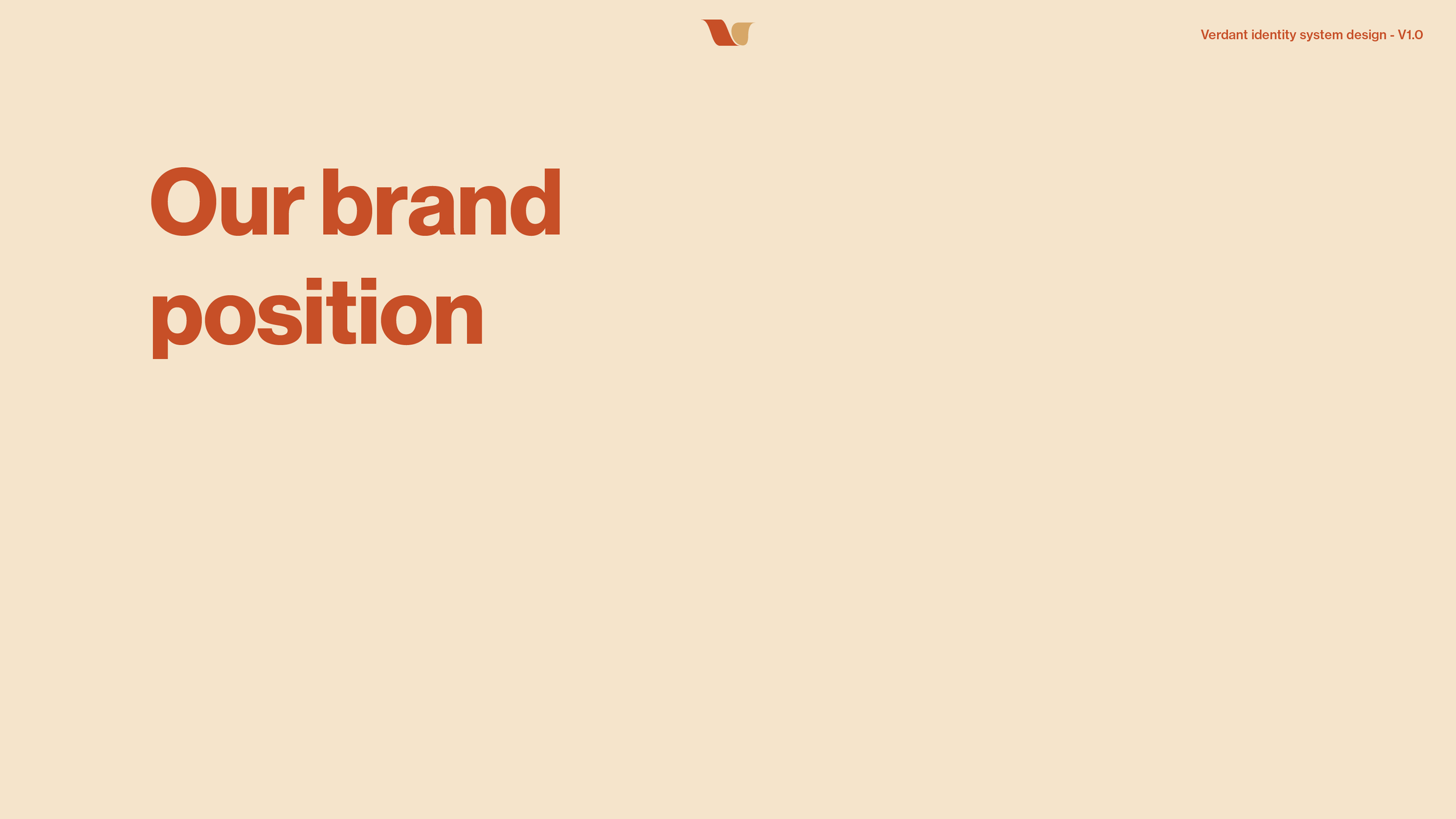
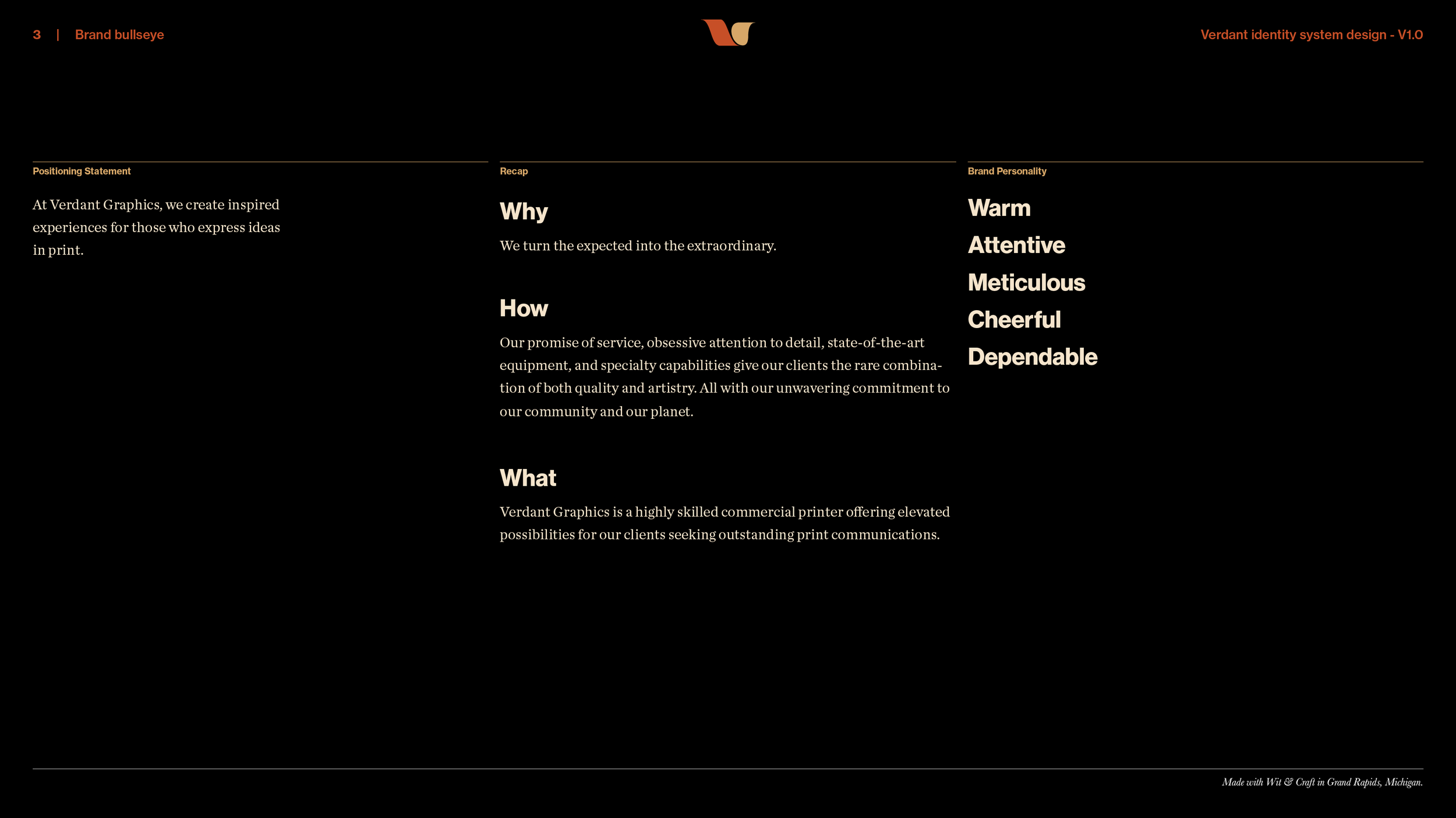
The position came out of one line in the discovery findings. Vast capabilities, unmatched customer service and green practices added up to the best kept secret in printing. The job of the brand was to stop being a secret. The position gave the company five traits, warm, attentive, meticulous, cheerful and dependable. It named the promise, that Verdant turns the expected into the extraordinary. And it ended on the sentence everything else answers to. At Verdant Graphics, we create inspired experiences for those who express ideas in print.
The Brand Position
Why.
“We turn the expected into the extraordinary.” Seven words, and the team already lived them on the shop floor, where a job is not done until it amazes the customer.
How.
“Our promise of service, obsessive attention to detail, state-of-the-art equipment, and specialty capabilities give our clients the rare combination of both quality and artistry. All with our unwavering commitment to our community and our planet.” The service and the equipment sit in the same sentence as the artistry, on purpose, and the planet gets a sentence of its own.
What.
“Verdant Graphics is a highly skilled commercial printer offering elevated possibilities for clients seeking outstanding print communications.” A printer first, and a printer that can do more than print second.
The Brand Identity System
The symbol.
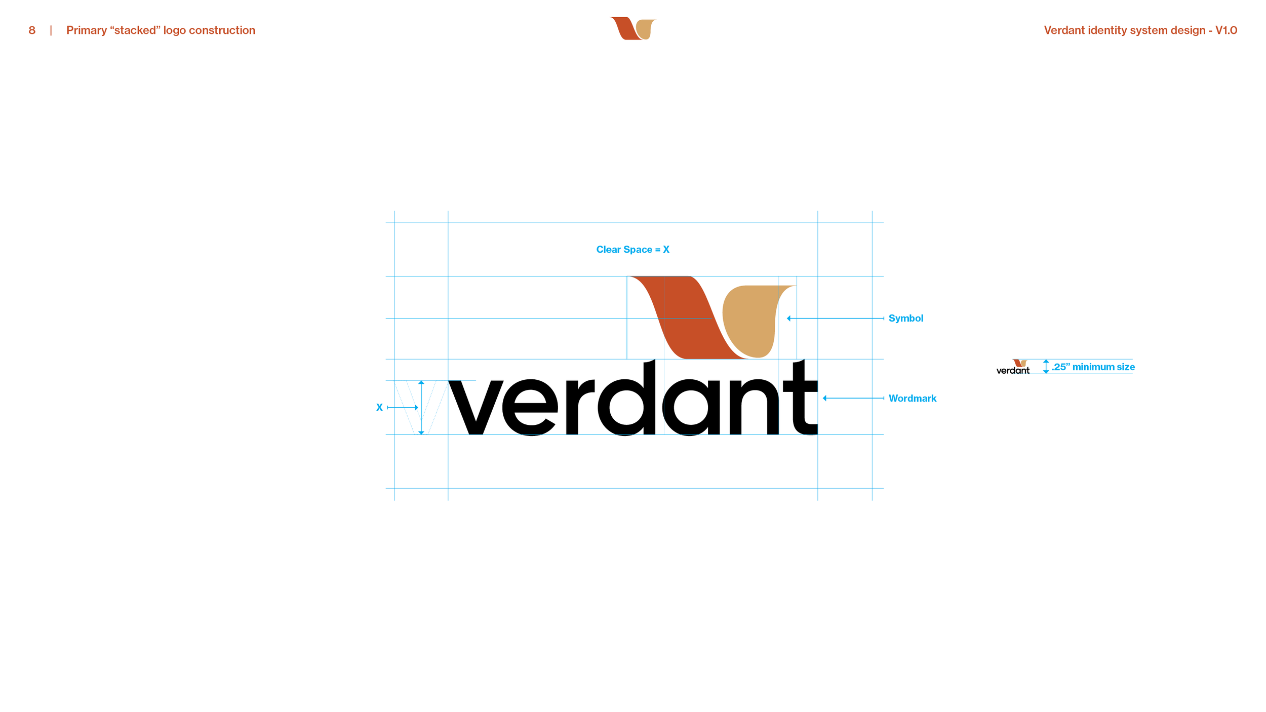
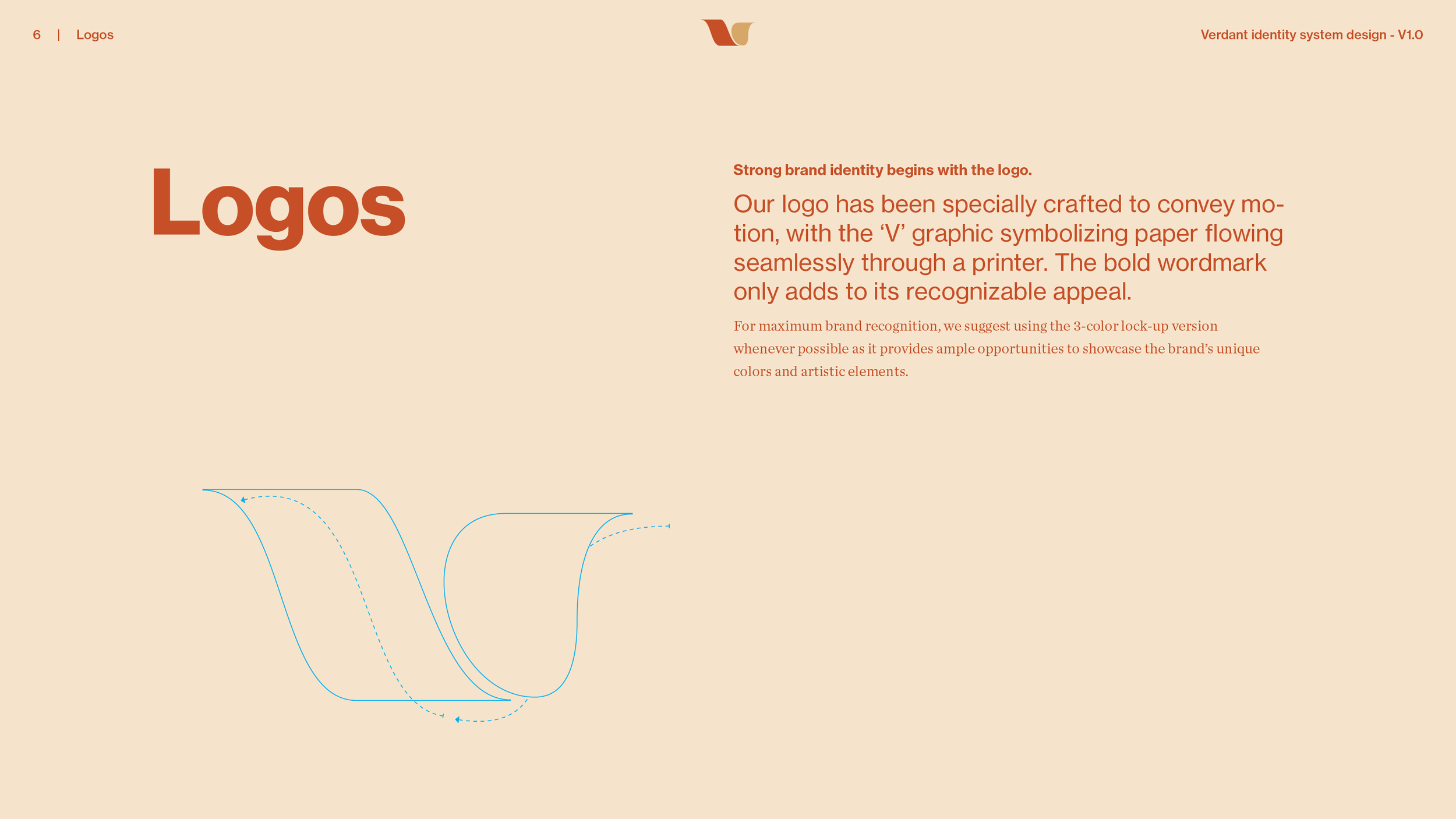
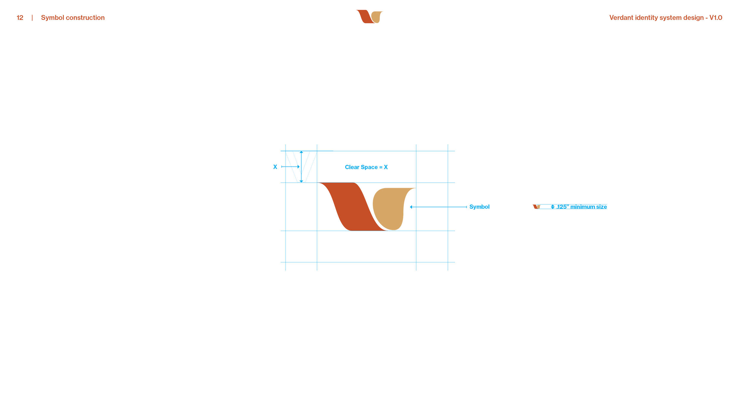
A V drawn in motion, a sheet of paper flowing through a press. It is the one part of the logo that says what the company does, and it reads at an eighth of an inch. The team saw the logo concepts in January 2023 and chose this one.
The logo system.
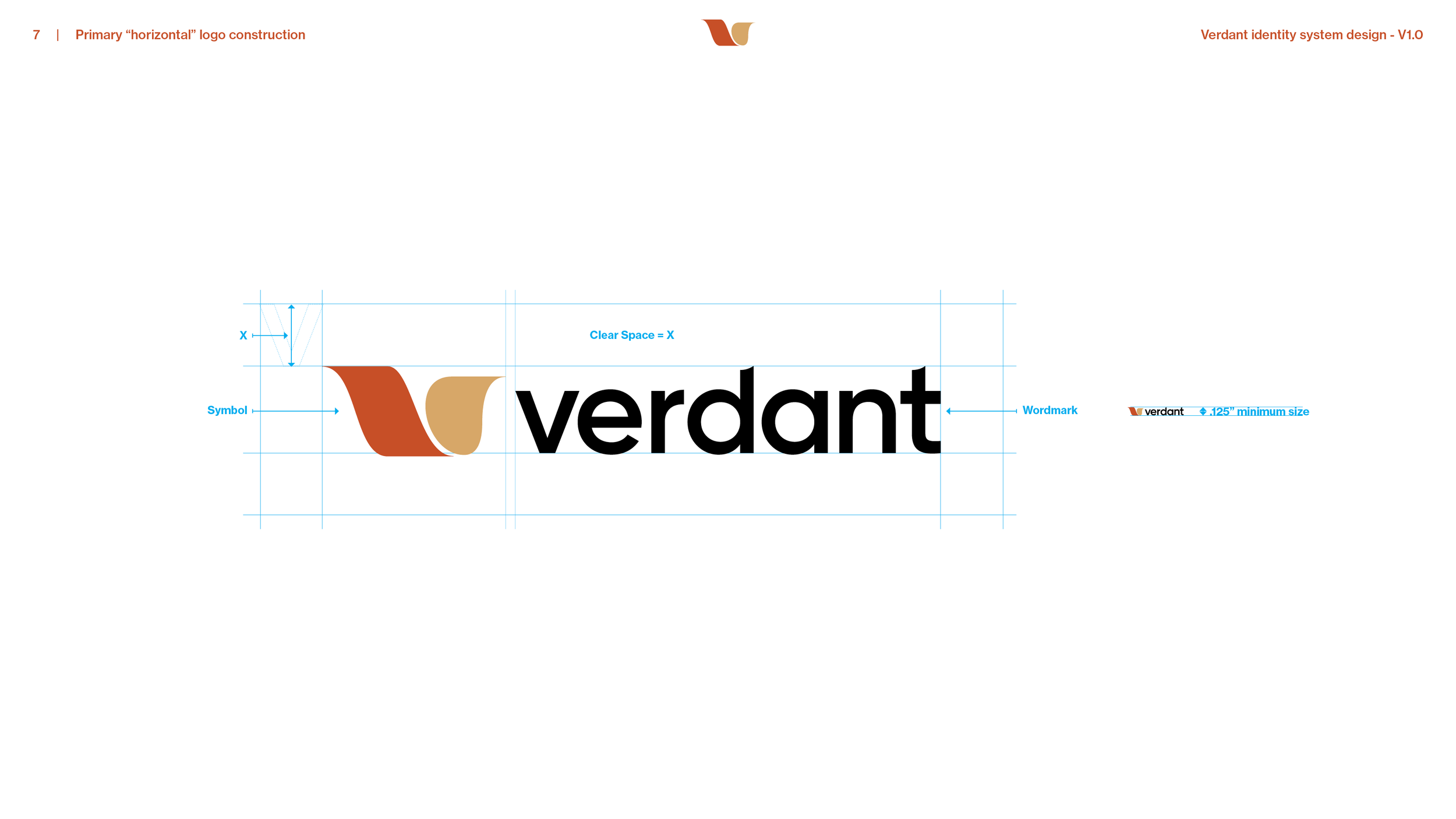
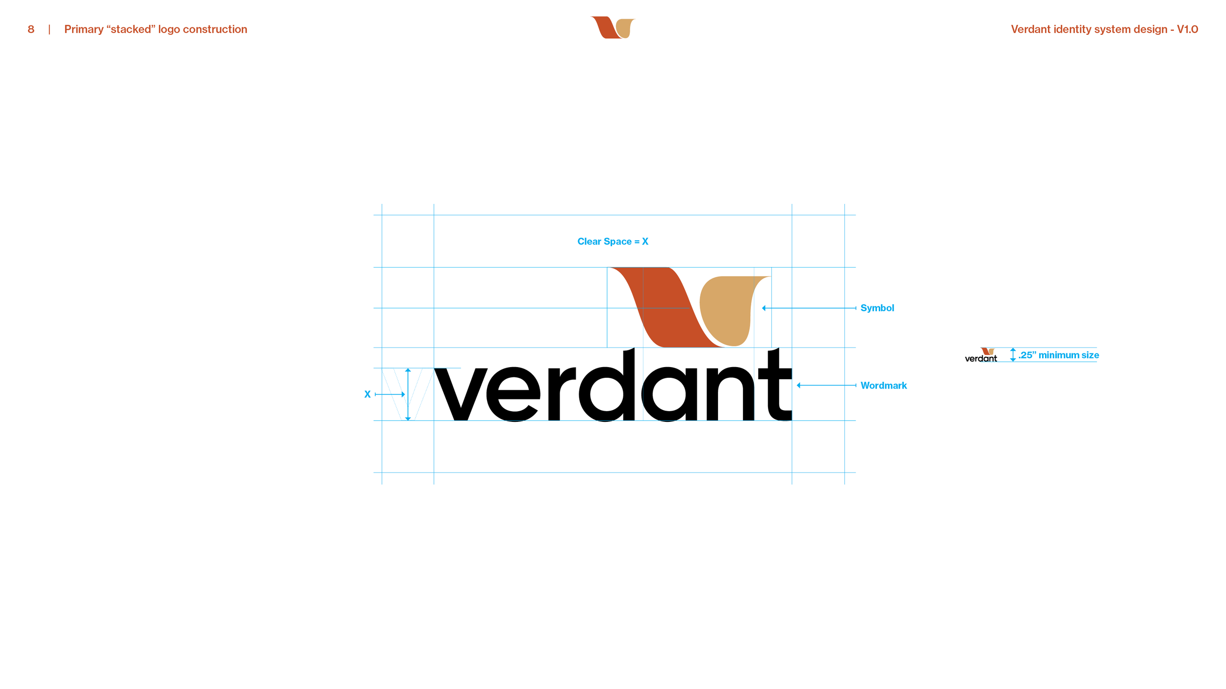
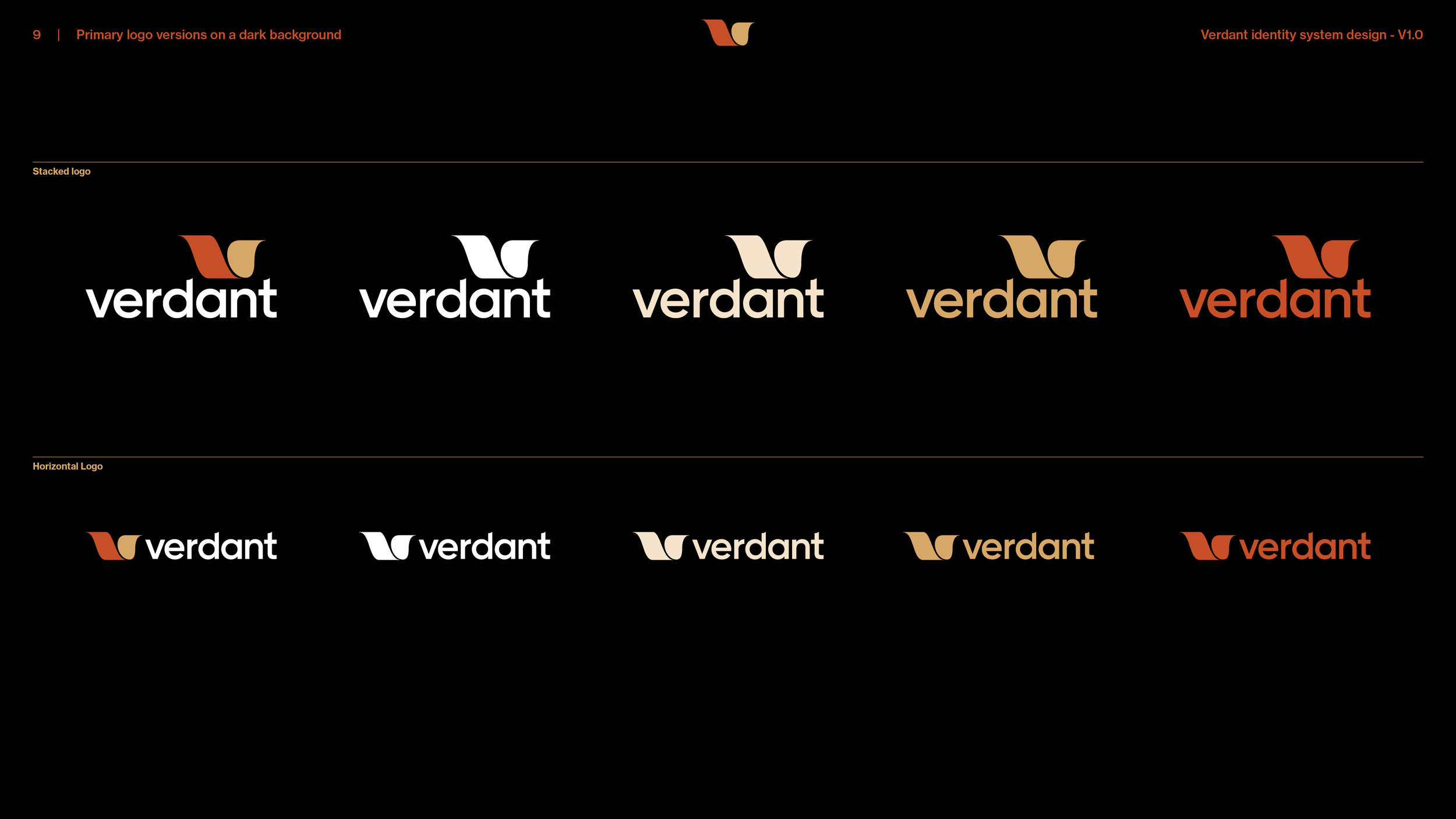
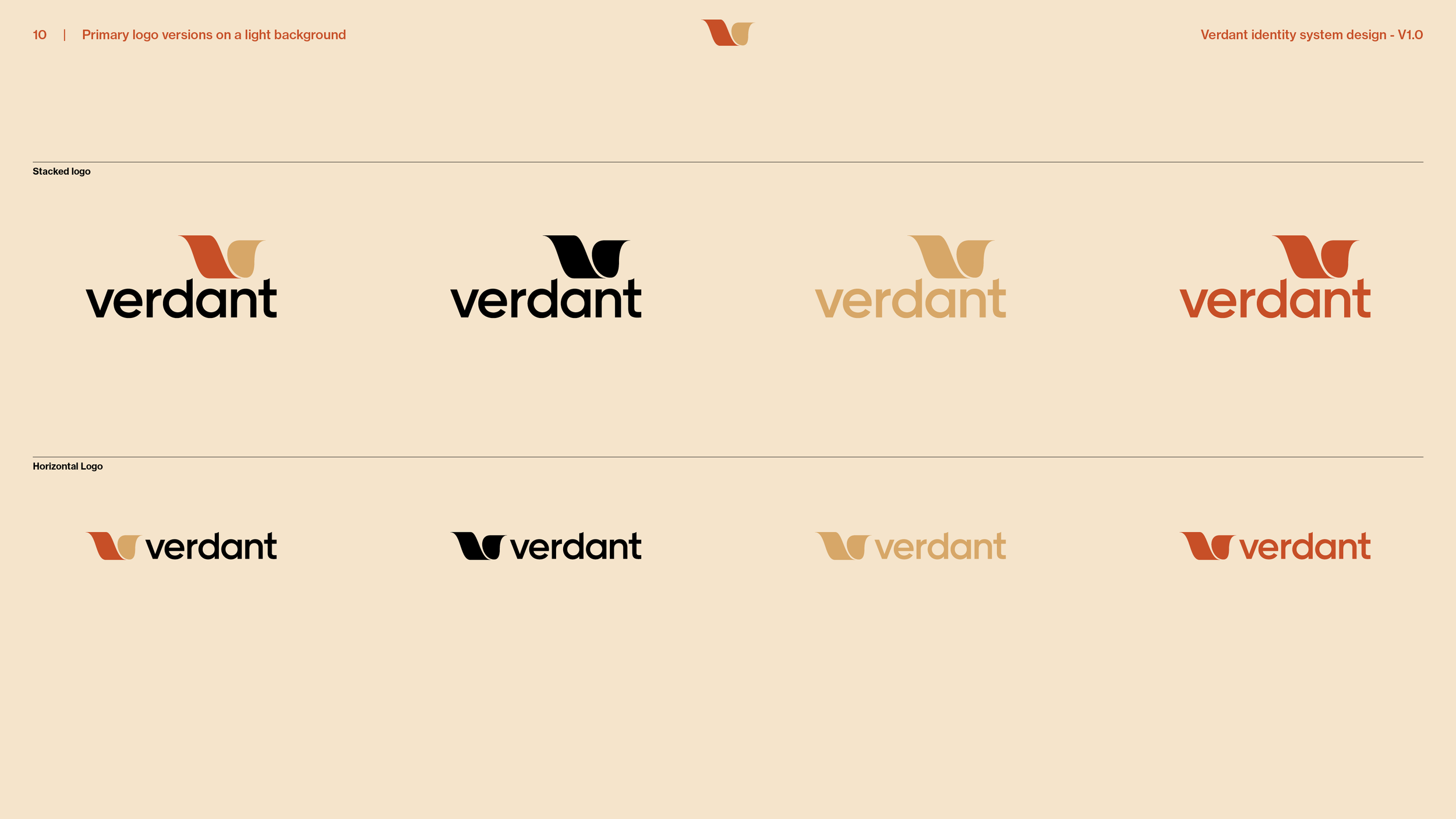
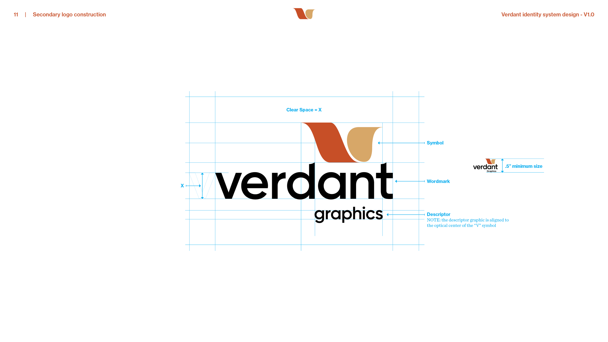
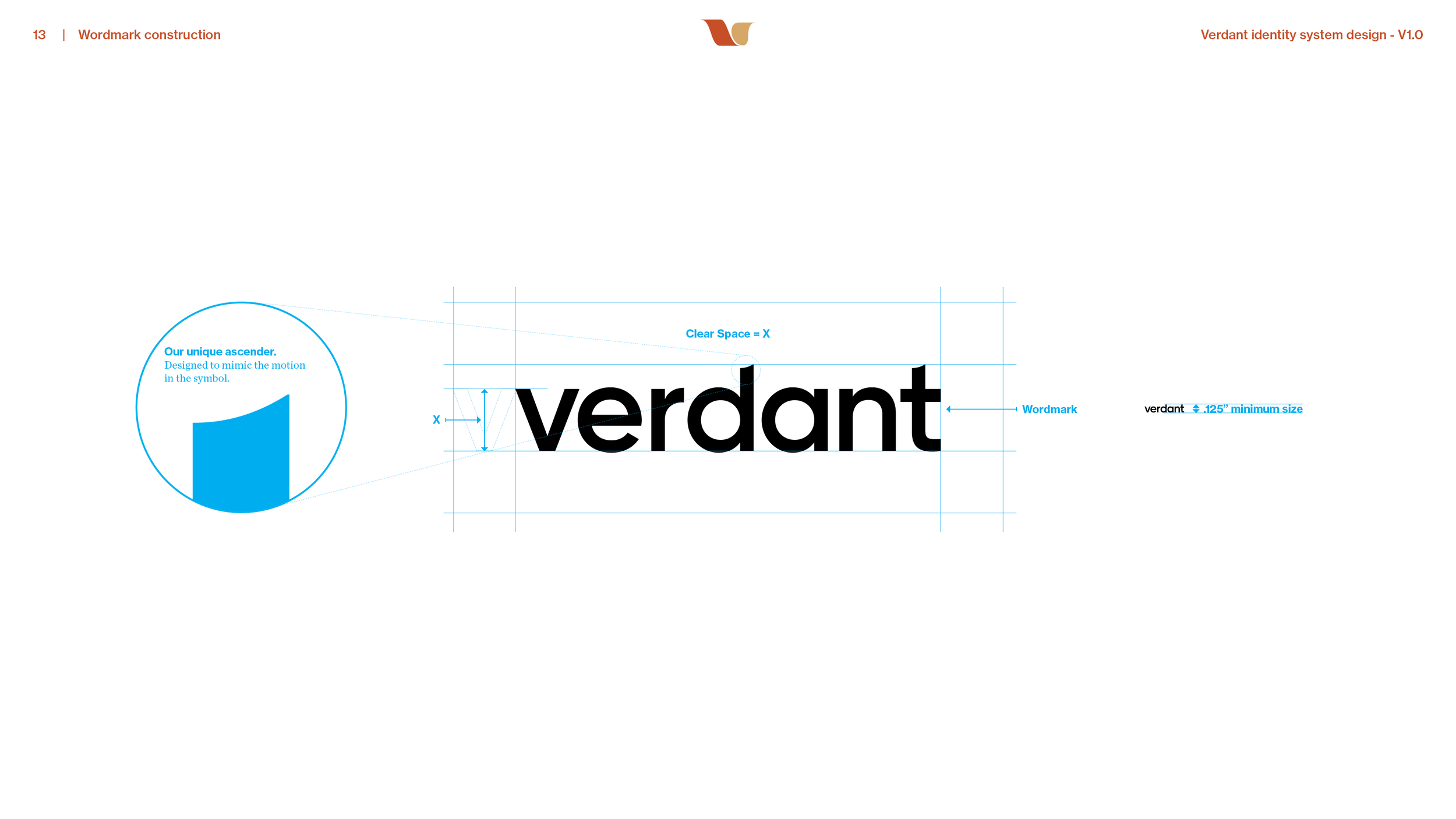
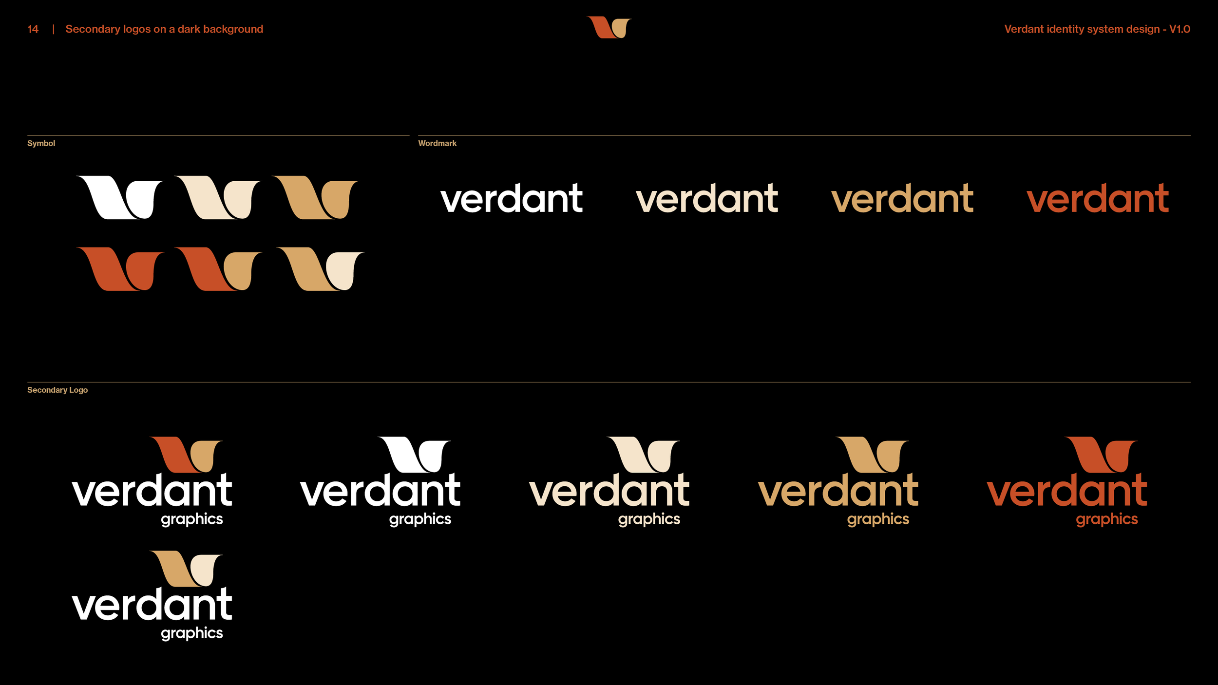
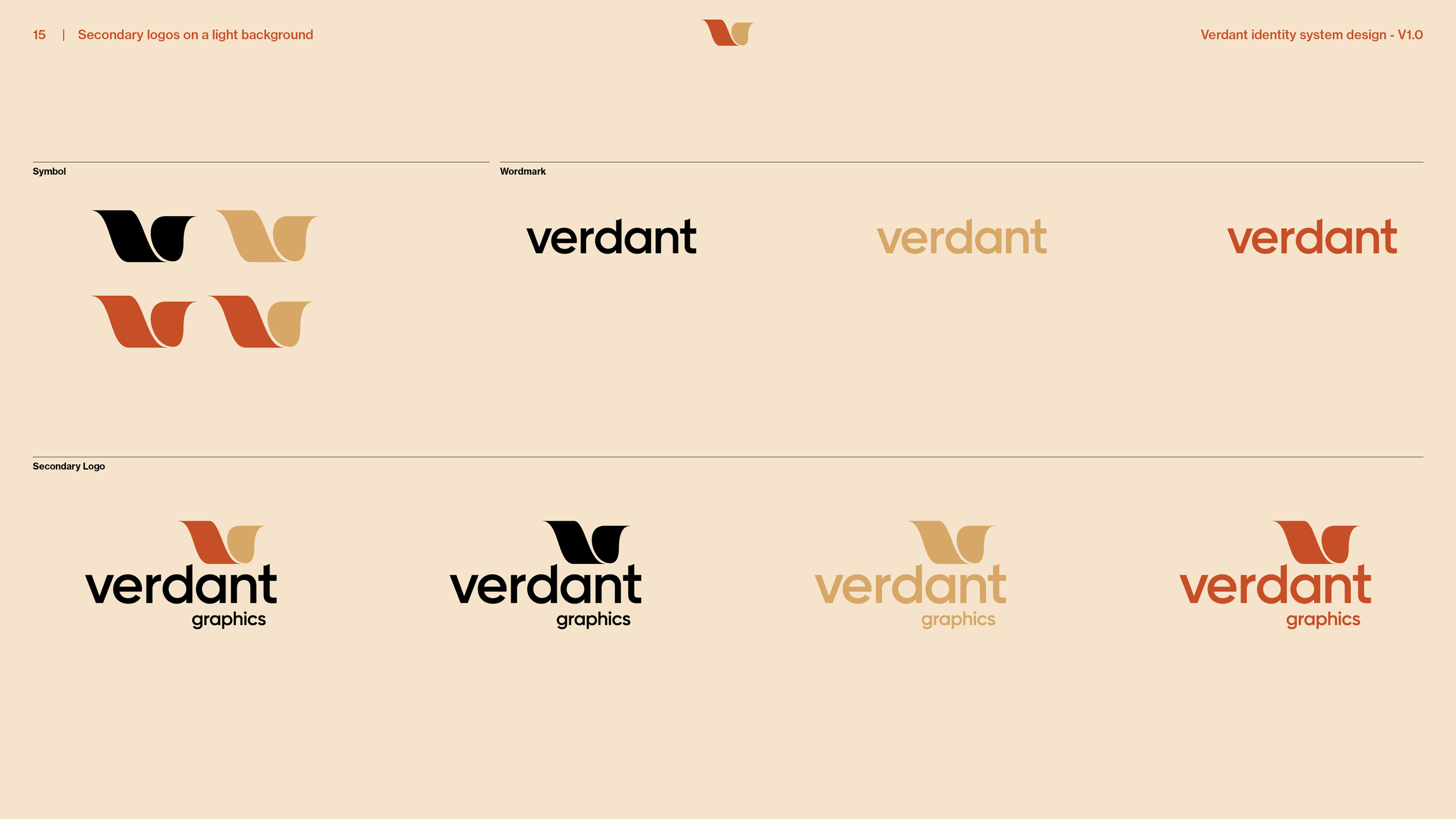
Five approved versions. The horizontal logo, the stacked logo, a secondary logo that adds the word graphics under the symbol, the symbol on its own and the wordmark on its own. Each has its clear space and minimum size, an eighth of an inch for the horizontal logo and the wordmark, a quarter inch for the stacked logo and half an inch for the secondary logo. The three-color lockup is the one to use whenever possible, because it shows the most of the brand’s colors.
The wordmark.
The company name in bold lowercase letters, with one ascender drawn to match the motion in the symbol. It is the one detail that makes the wordmark Verdant’s own.
Color.
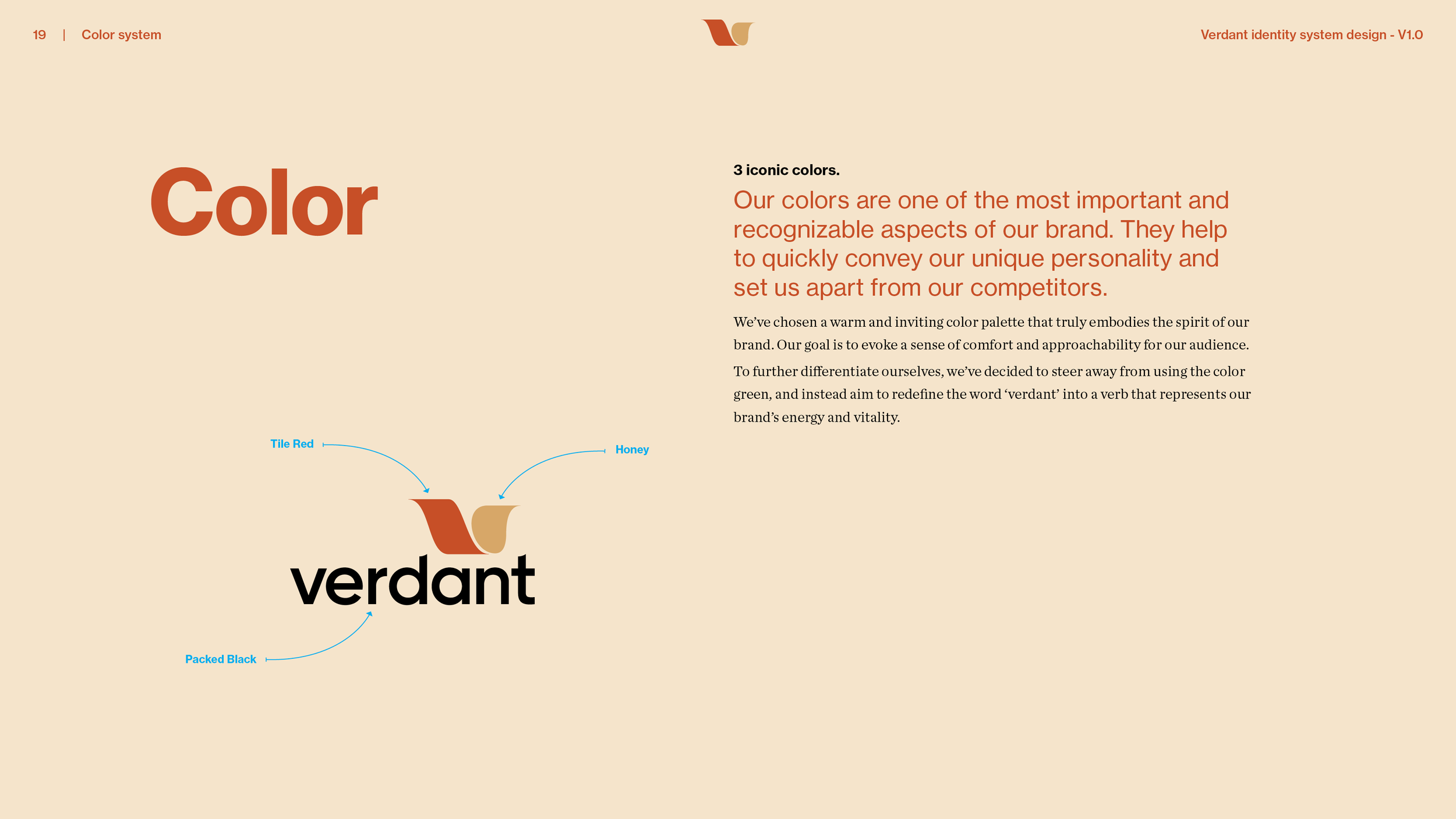
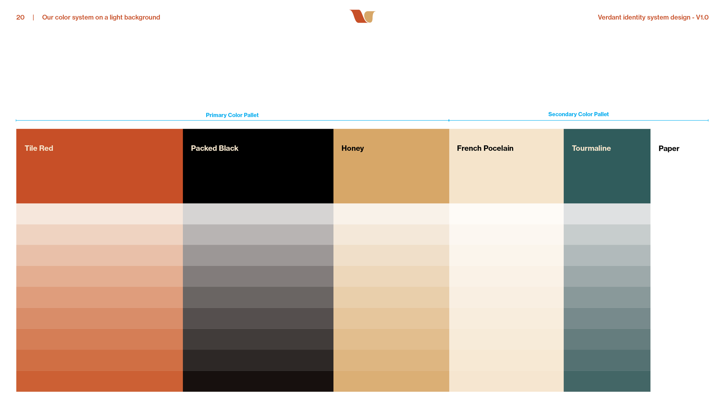
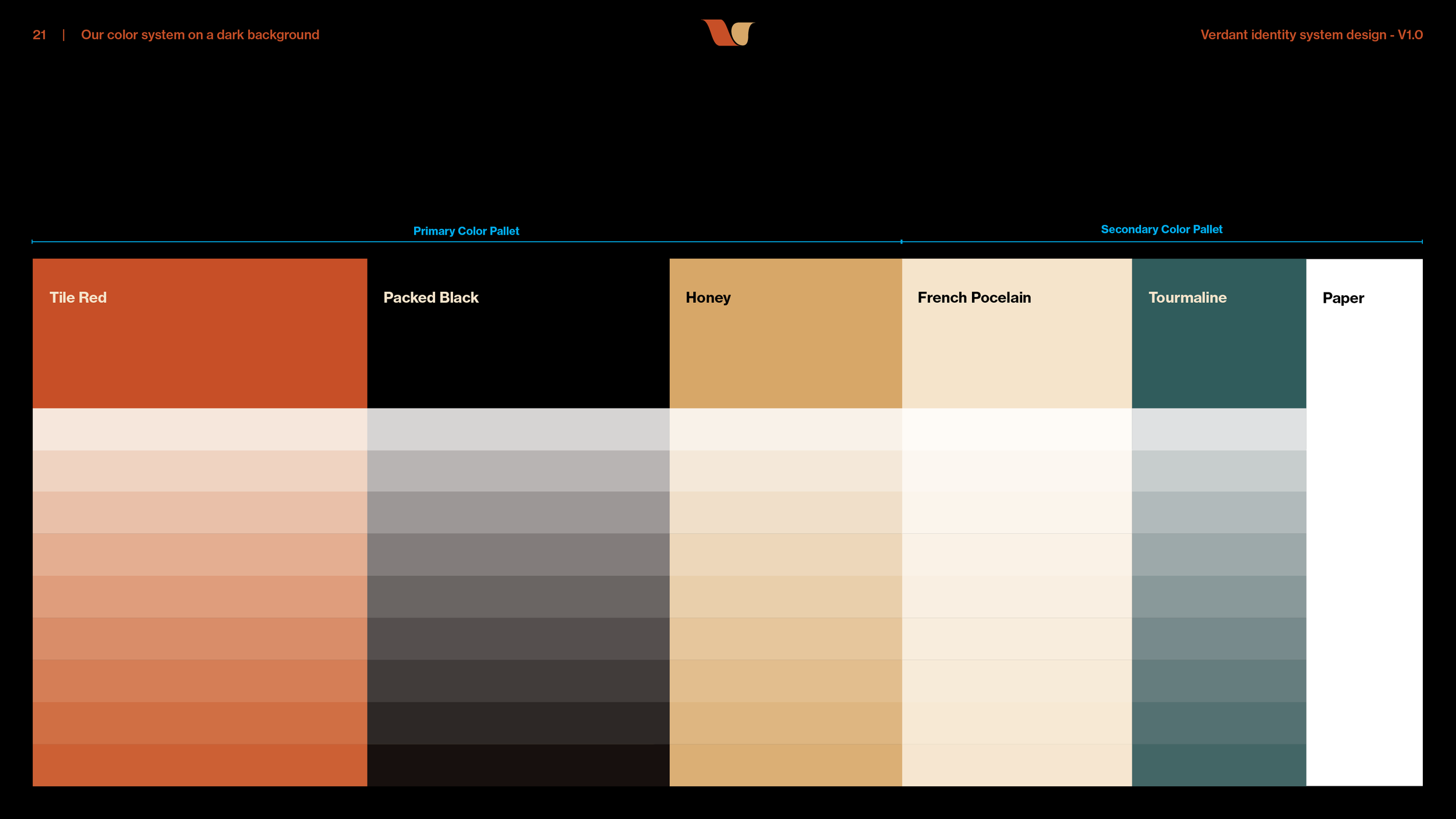
Three iconic colors, and the brand book calls them that. Tile Red, Honey and Packed Black, with French Porcelain, Tourmaline and plain paper behind them. The palette is warm on purpose, chosen to evoke comfort and approachability.
No green.
The name means green, and the palette has none, by decision. The brand book says why in one line. The company steered away from green to set itself apart, and set out to make verdant a verb for the brand’s energy and vitality instead of a color.
Typography.
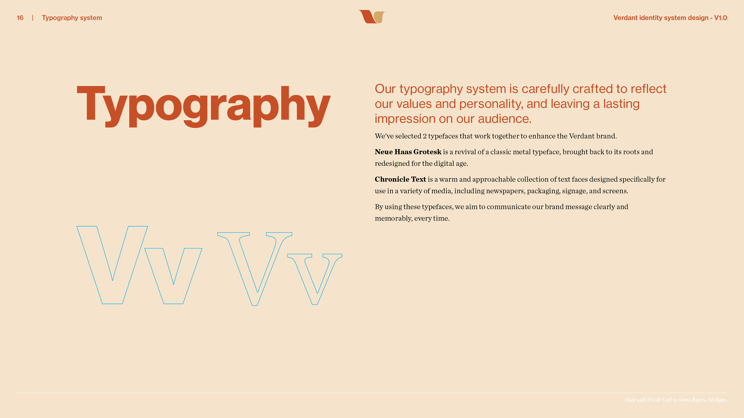
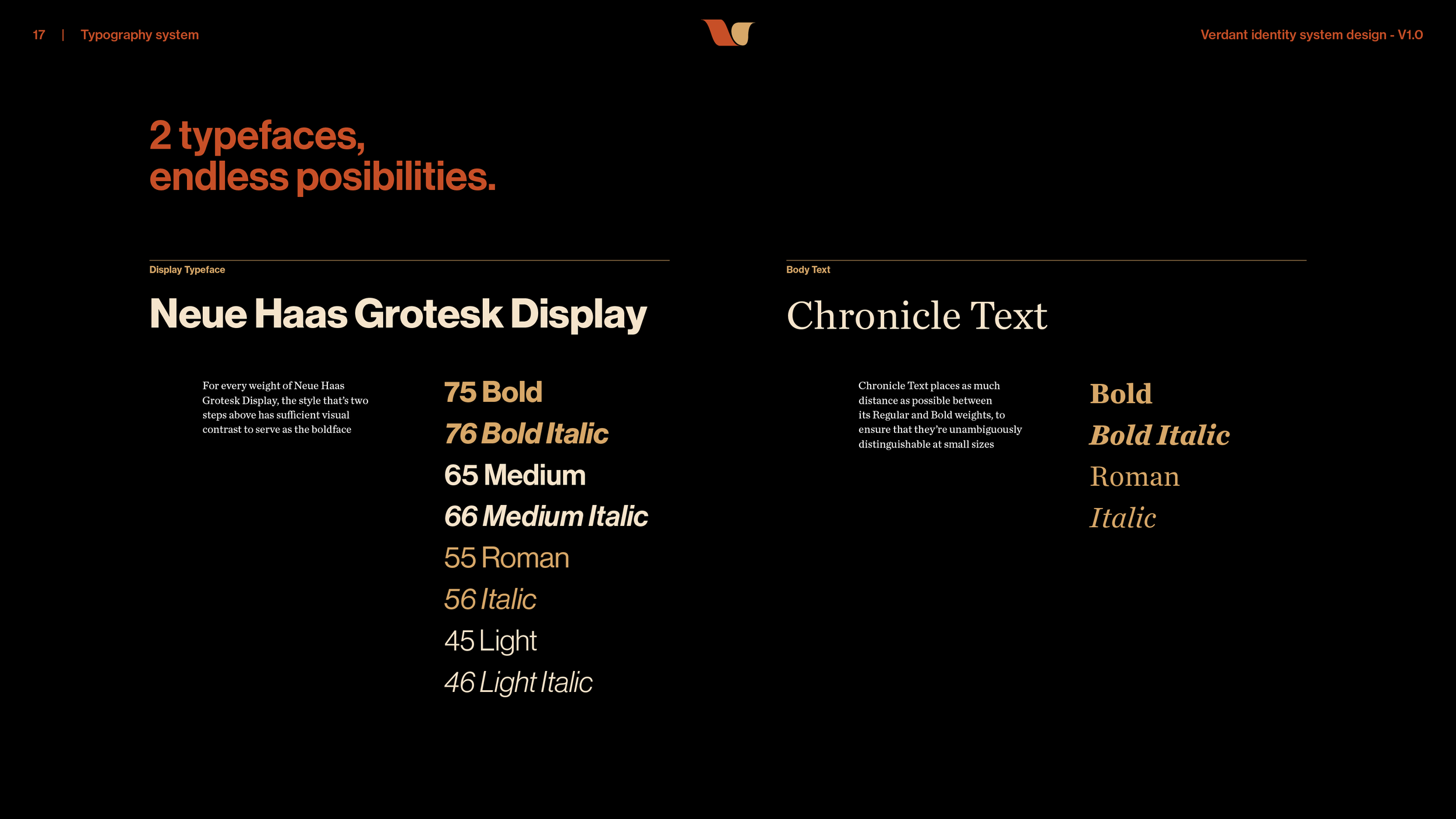
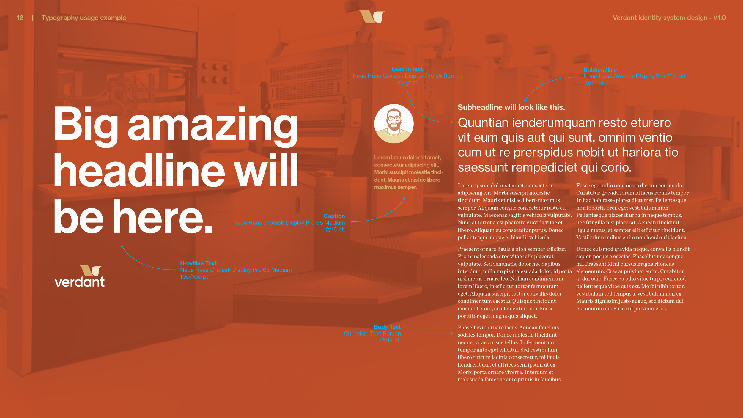
Two typefaces. Neue Haas Grotesk Display for headlines, a revival of a classic metal type redrawn for screens, and Chronicle Text for reading, a warm face made for newspapers, packaging, signage and screens. The brand book shows the weights, the pairings and a sample page with every size set, so a headline, a lead-in, a subhead, a caption and the body text keep the same rhythm.
The moodboard.
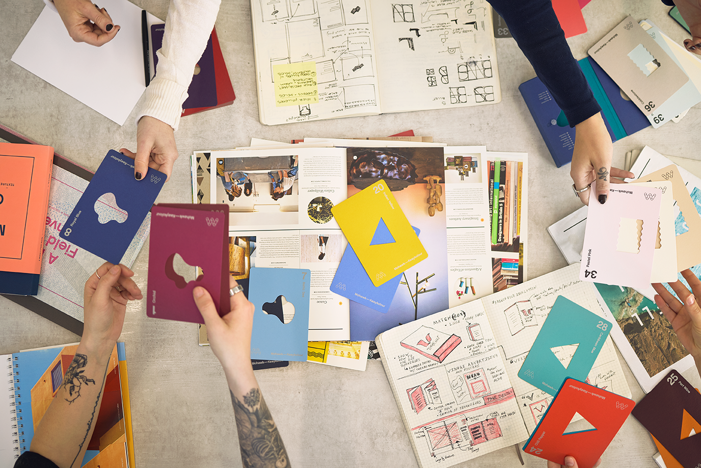
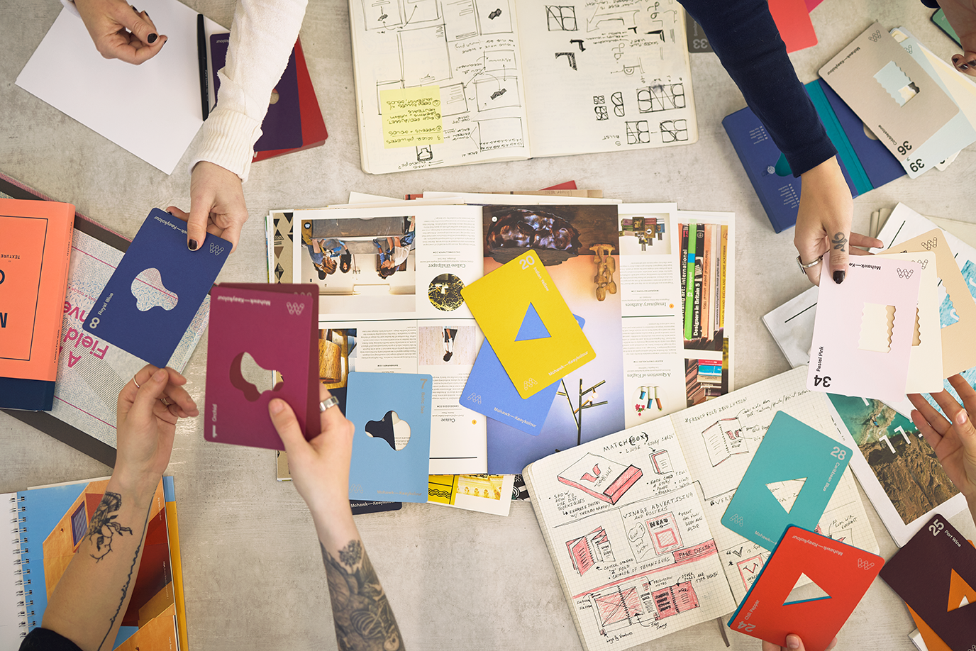
Before anyone drew a logo, the team agreed on a direction called warm and grounded, a board of found print, type and color that set the tone. It set expectations before the mark was drawn, and the brand book keeps it as a point of reference.
The overview brochure.
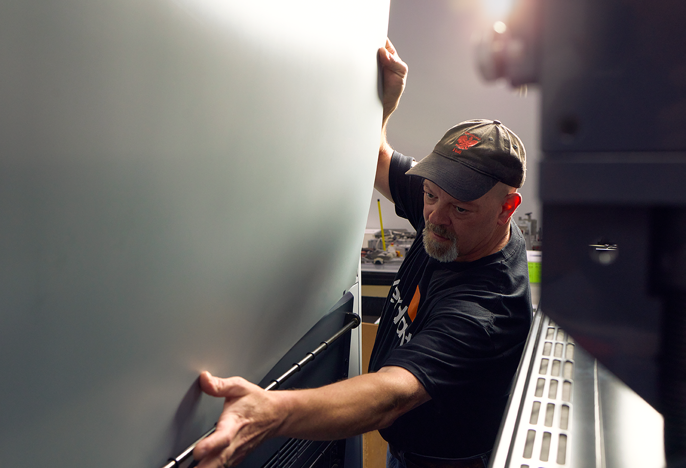
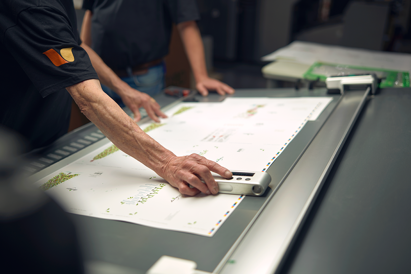
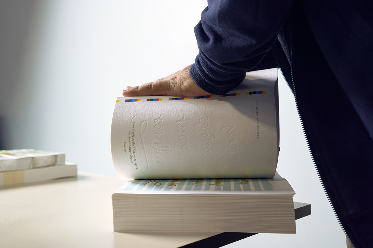
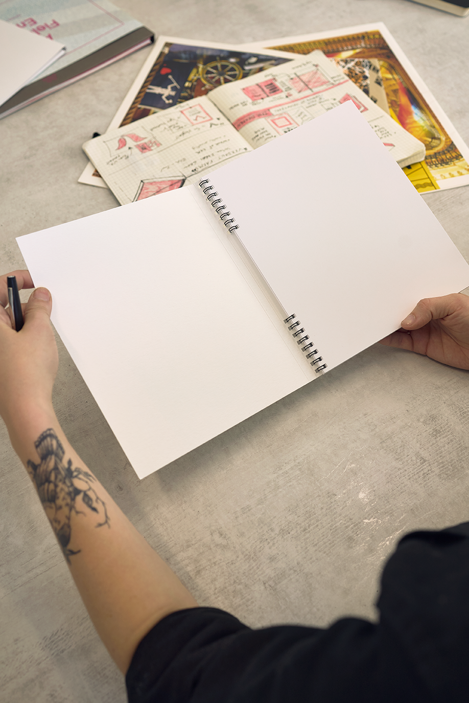
The first piece in the new brand was the piece the sales team would hand a prospect. We wrote and designed a brochure that tells the brand story and shows what the shop can do, and Verdant printed it in house with its own foil and finishes, so the brochure is also the sample. One spread tells the handled with care story in the team’s own words.
The team presentation.
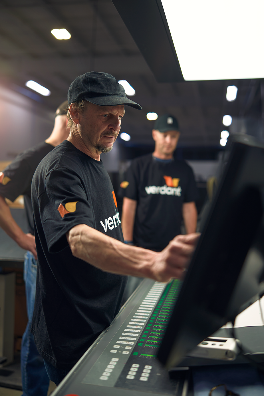
In September 2023 we presented the finished brand to the whole Verdant team at the shop. They saw the position, the five traits, the logo, the colors and the type, the things they carry every day.
What came with the guidelines
Logo production files
Every version of the logo in print and screen formats, in every approved color, delivered as one asset package in May 2023 so nobody rebuilds the mark from a screenshot.
The brand book
One document with the discovery findings, the position and the identity system, presented to the team in April 2023 with a recorded walkthrough, so a new hire can read how the brand was decided and why.
The launch plan
A field guide and a workbook. The guide explains the three phases of a launch and the five channels. The plan sets the target date, July 2023, names the audiences and lists the pieces in order, the customer letter, the employee lunch, the press release, the brochure and sample kit, the landing page and the social profiles. The workbook gives every task a lead and a deadline, so the team ran its own launch.
The results
The first discovery session was September 19, 2022. The position was presented in late October and final by December. The team chose the logo in January 2023 and approved the identity system on February 16. The launch plan followed in March and the brand book in April. The brochure was on press in July, printed and foiled by Verdant itself. The website went live in August with the new brand, and in September we presented the brand to the whole team at the shop. More than three years on, it is still the brand on verdantgraphics.com, Tile Red and Chronicle Text included, and the studio has sent its own print work to Verdant since. In 2025 the parent company came back to build a brand the same way for another company in its family. Jeff Kallil, who led the project as VP of Marketing at Convivial Brands, put it this way. “Wit & Craft excels in their genuine care for clients. Their consistent interest in our family and organization convinced me their passion would translate into project excellence. I wasn’t disappointed.”
FAQ’s
-
If it wants customers who are not already in the family, yes. Verdant had printed for one company for twelve years, and it had a shop, a team and a set of capabilities most printers in the region could not match. What it did not have was a way to tell a stranger what it was. The position gave it one, in a positioning statement, a why, a how and a what, and the logo, the colors, the brochure and the website all follow from those sentences. Here is how we do brand strategy consulting.
-
Because the team decided the name should mean more than a color. Verdant was chosen for the company’s environmental practices, and a green leaf was the obvious logo. The brand book turns that around. The palette is Tile Red, Honey and Packed Black, chosen to feel warm and approachable, and the word verdant is treated as a verb for the brand’s energy. The green practices are still in the how statement, where they belong, as a commitment and not a color.
-
Because they are the ones who deliver it. A brand is a promise, and the people on the press and on the phone keep it or break it every day. Verdant’s launch plan put employee communications in the pre-launch phase, with a customer letter next, so nobody inside was surprised by a business card and no customer was surprised by a new logo. In September 2023 we presented the whole brand to the Verdant team at the shop. It is the same order we plan for a manufacturer’s changeover, and a full rebrand for a manufacturer is its own page.
-
About a year, for a company launching to the public for the first time. Verdant’s first discovery session was in September 2022. The position was final by December, the identity by February, the brand book by April, the brochure by July and the website by August, with the team presentation in September 2023. A company changing a brand it already has moves on a different clock, and the Code Blue case study shows that one. A smaller company with one logo to replace moved faster, and that story is in the Upfit Supply case study.
Services
Brand discovery · Brand positioning · Brand personality · Moodboard · Logo design · Logo system · Color system · Typography system · Brand book · Brand guidelines · Launch plan · Overview brochure · Team presentation · Logo production files
Ready to sell to people who have never heard of you? Start with what is true.
Start a conversation
Wit & Craft is the brand agency for owner-led manufacturers and trades, in Grand Rapids, Michigan, since 2015.