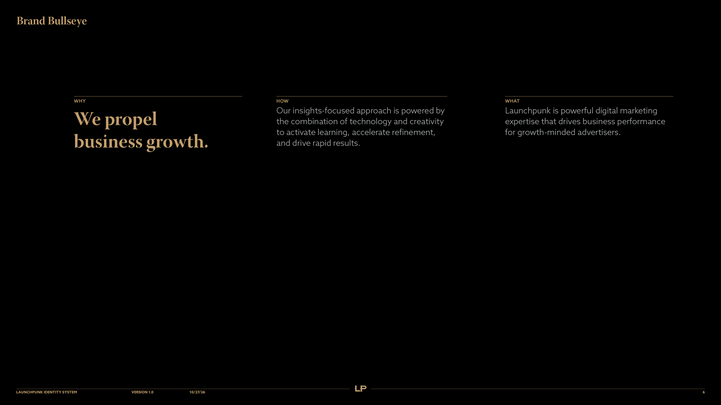
Launchpunk is a powerful digital marketing expertise that drives business performance for growth-minded advertisers.

A Responsive Logo System

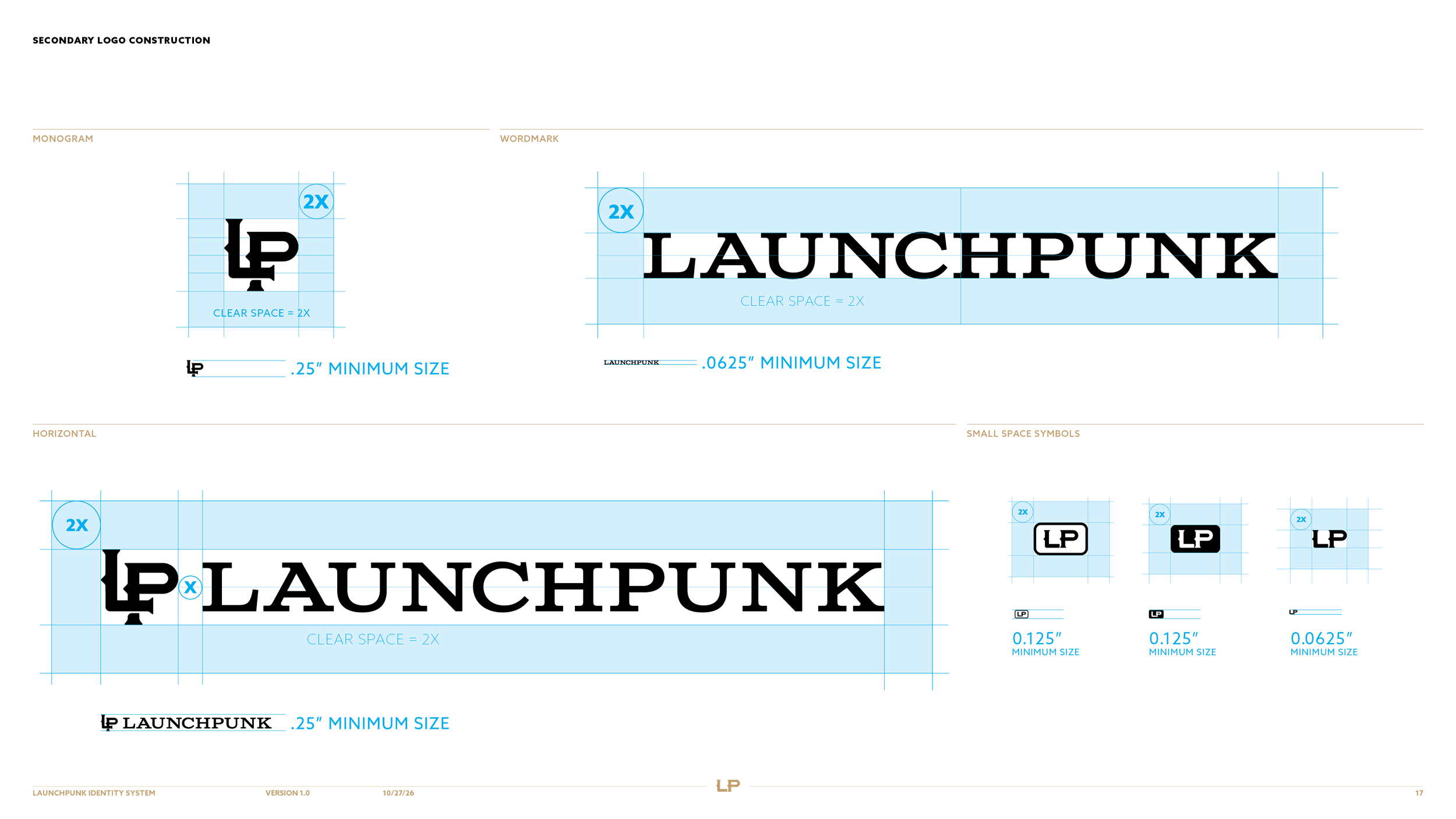
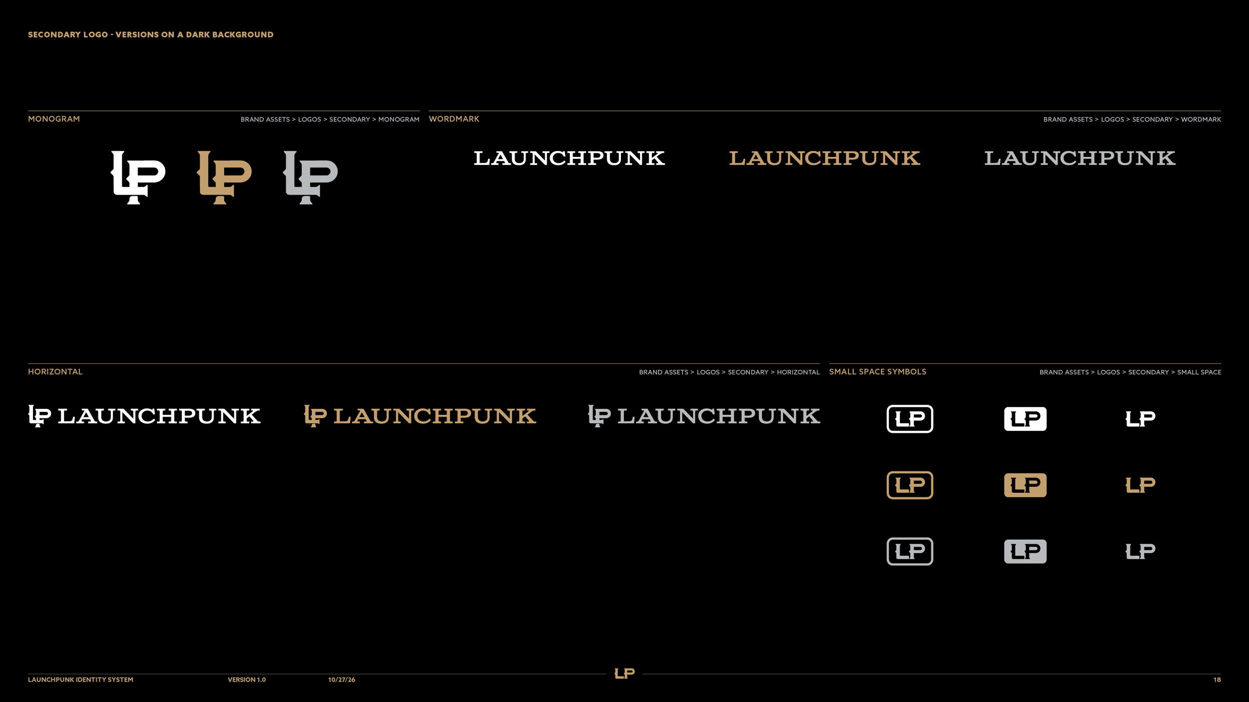
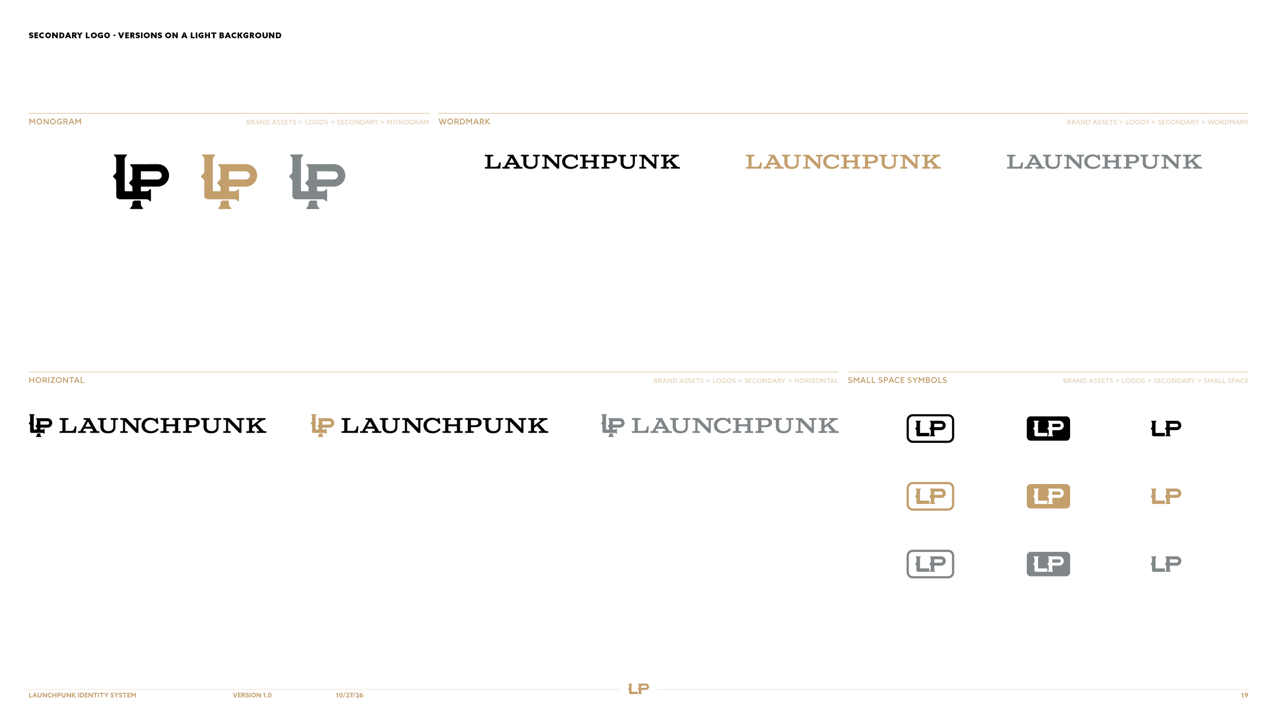
Launchpunk's responsive logo system, stepping down from primary logo to wordmark, LP monogram and small-space symbol.

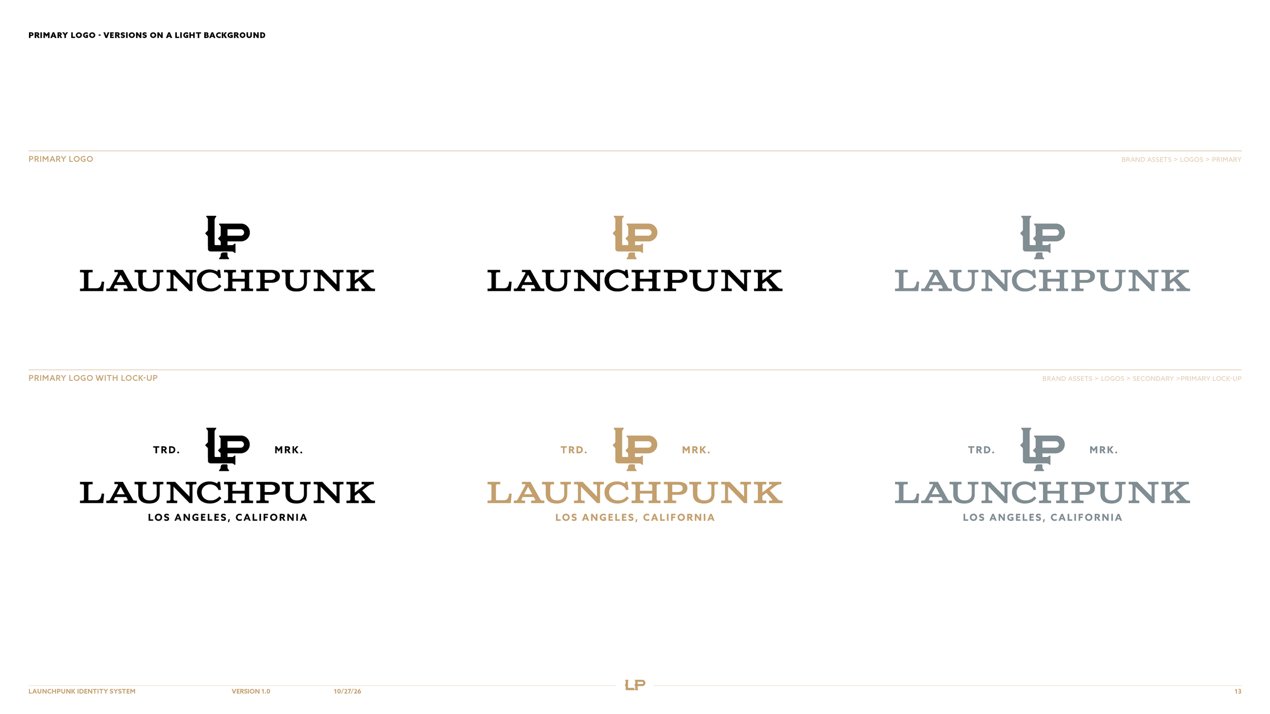
While the primary logo gets the most use across branded touchpoints, a suite of responsive logos was also developed for special use-case scenarios.


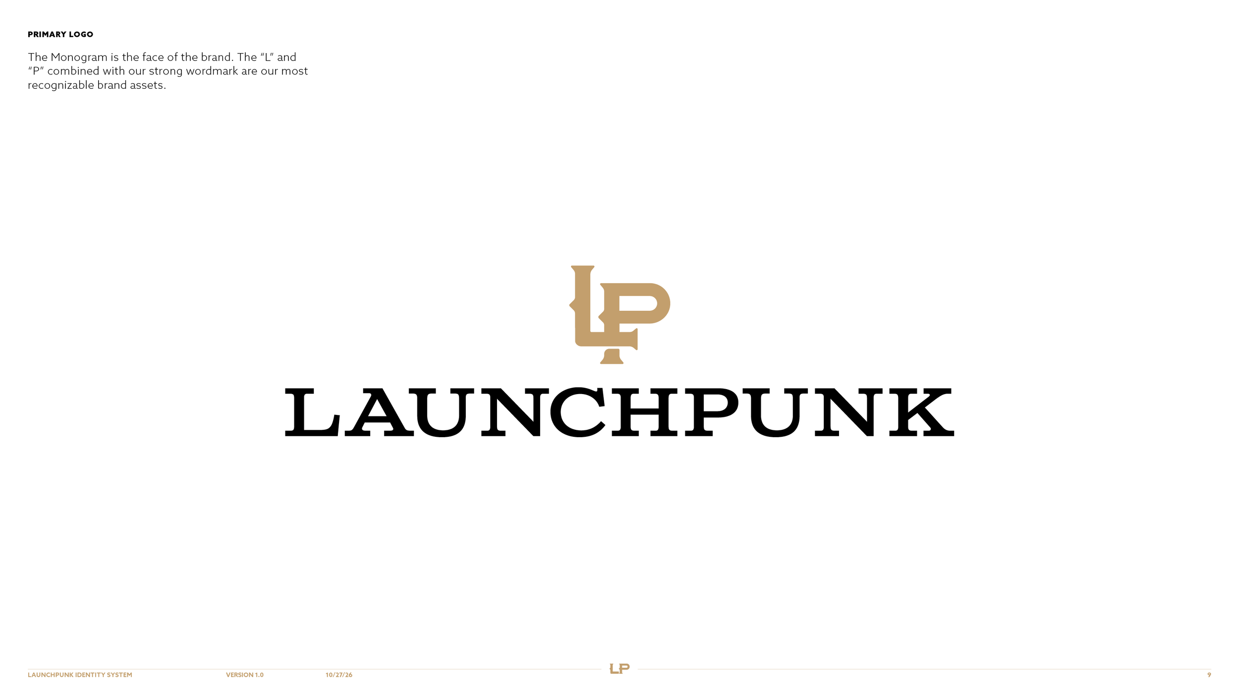
Primary Logo

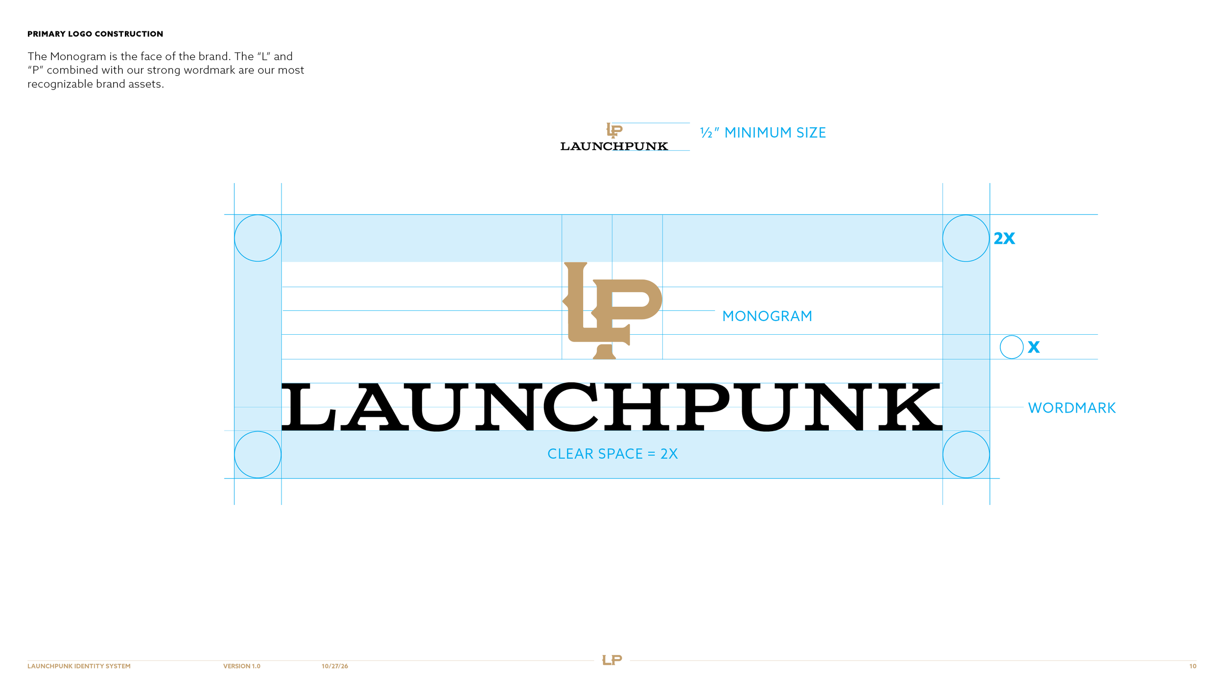
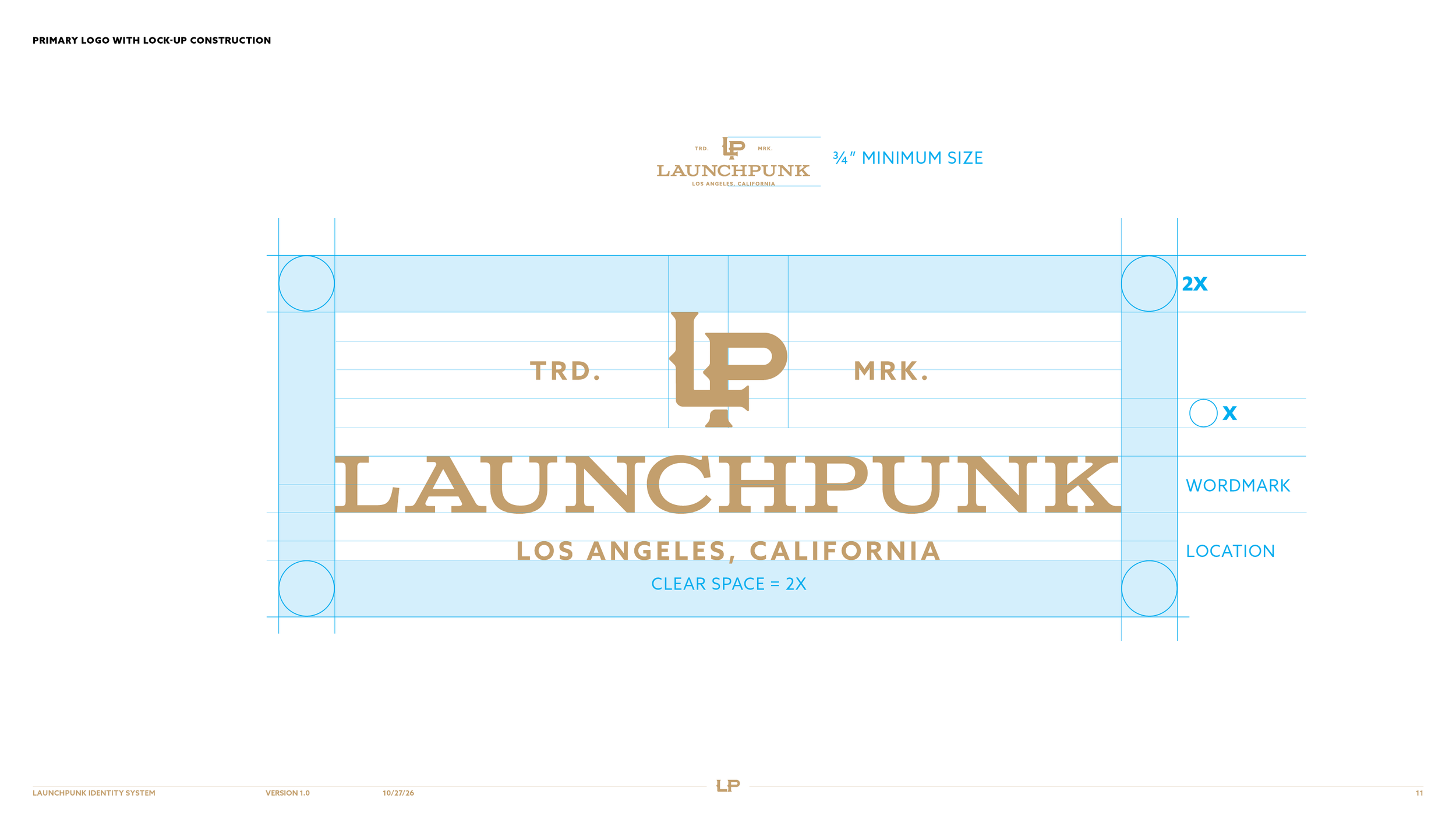
Clear space diagram for the Launchpunk primary logo, a gold LP monogram above the wordmark, with clear space of 2X.

Primary Logo With Lock-up

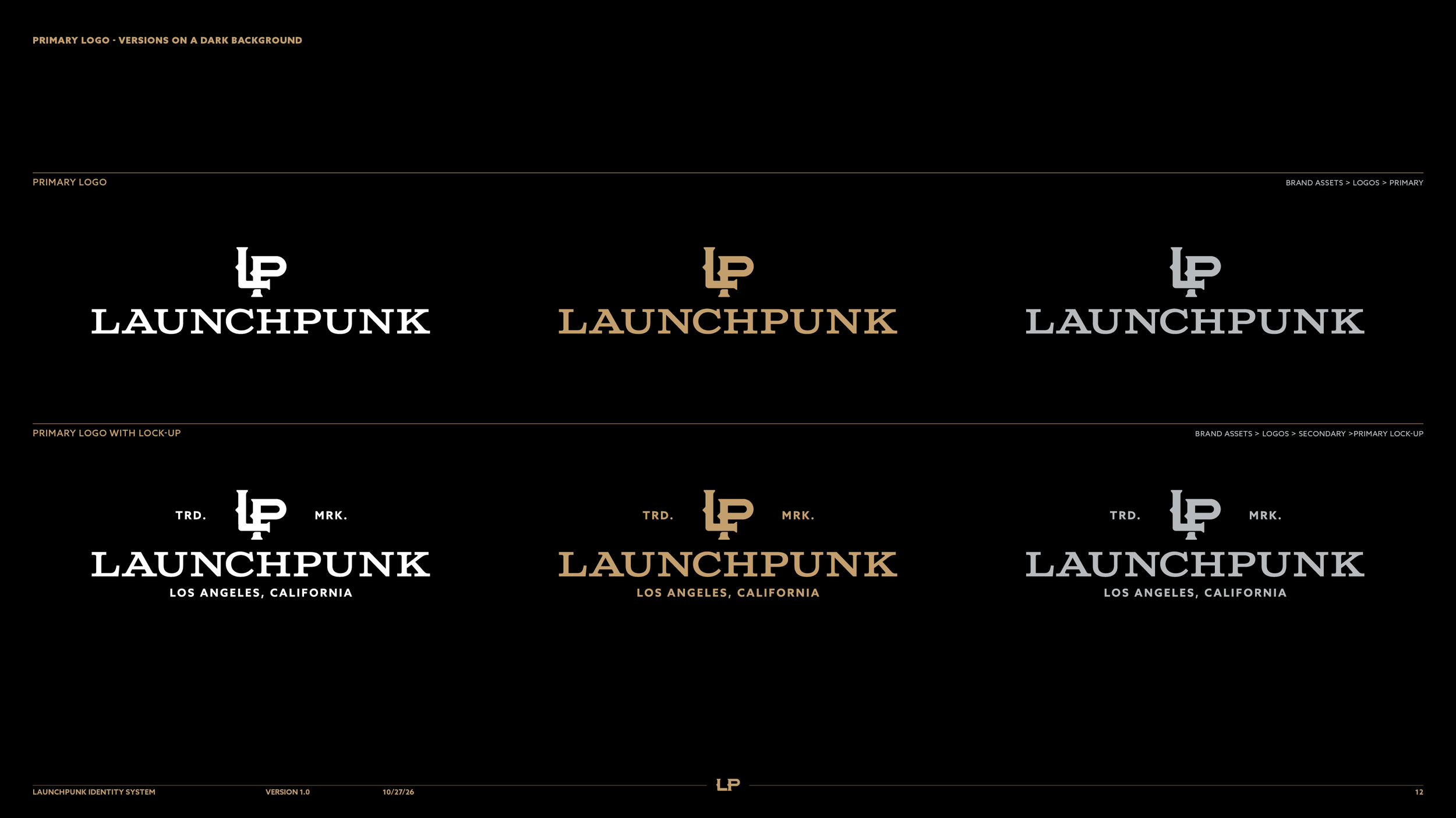
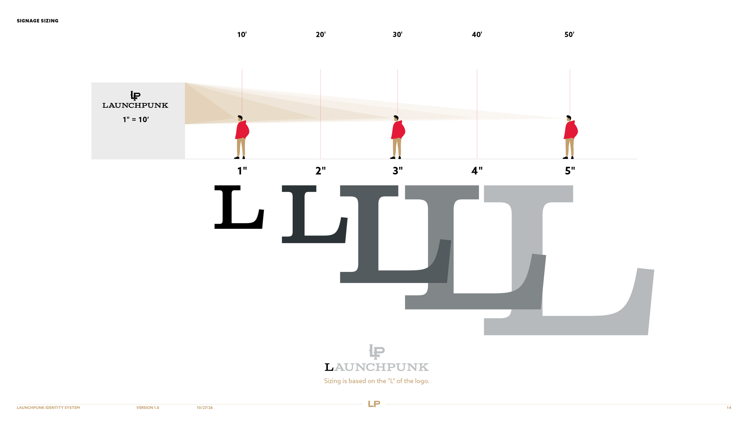
This striking artwork will be used on clothing, window designs, and wherever the brand can share its strong message.

Launchpunk lock-up with the LP monogram between TRD. and MRK., above the wordmark and Los Angeles, California.
Embroidered black patch with a red border, the gold Launchpunk LP monogram and small LA and CA tags.

Color Palette

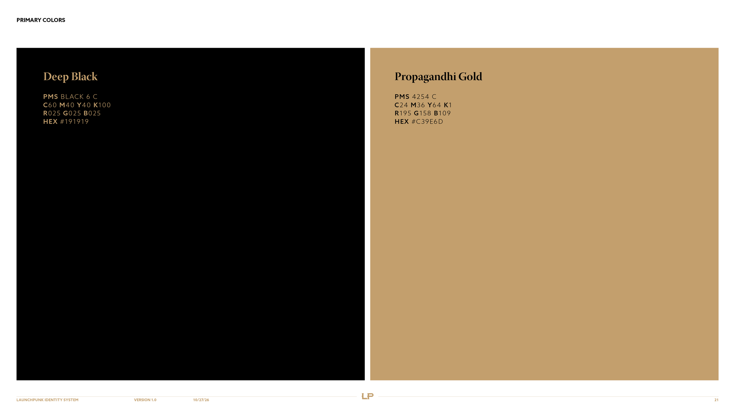
Launchpunk's primary colors, Deep Black #191919 and Propagandhi Gold #C39E6D, with CMYK and Pantone values.
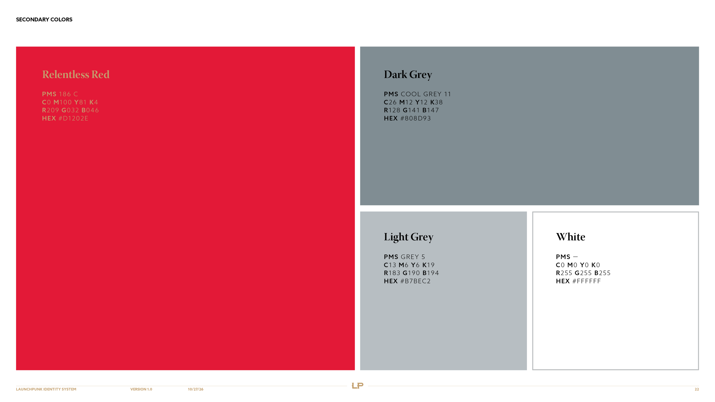
Launchpunk's three secondary colors, Relentless Red, Dark Grey and Light Grey, shown as tall swatches.

Typography

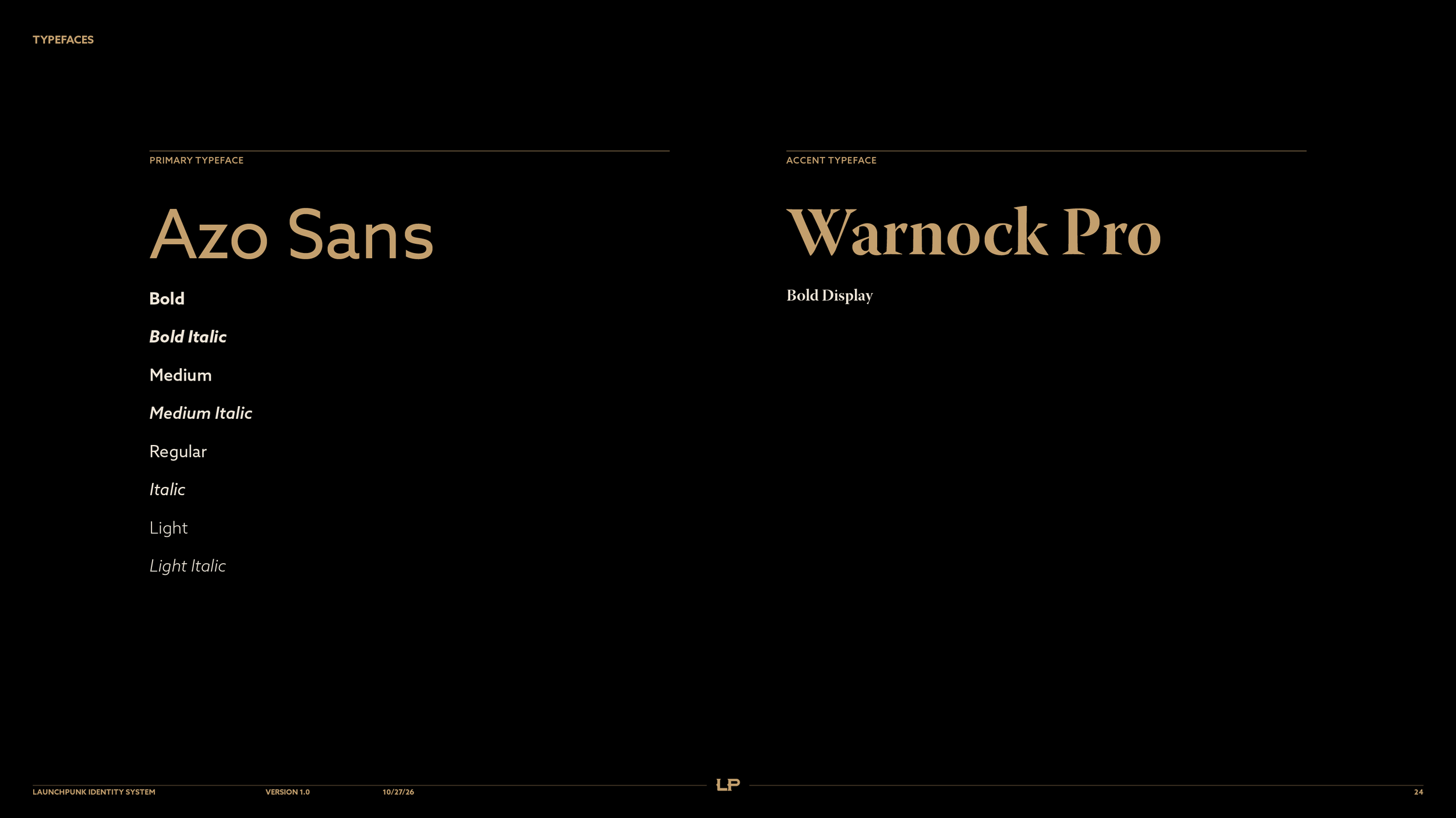
Azo Sans is our primary typeface, a bold and confident font family that ensures ultra-clear readability across all communications. Warnock Pro Bold Display serves as our expressive accent typeface, chosen for its distinctive personality. Warnock brings the punk to Launchpunk.

Gold sans serif A beside a gold serif A, pairing Launchpunk's Azo Sans with its Warnock Pro Bold Display accent.
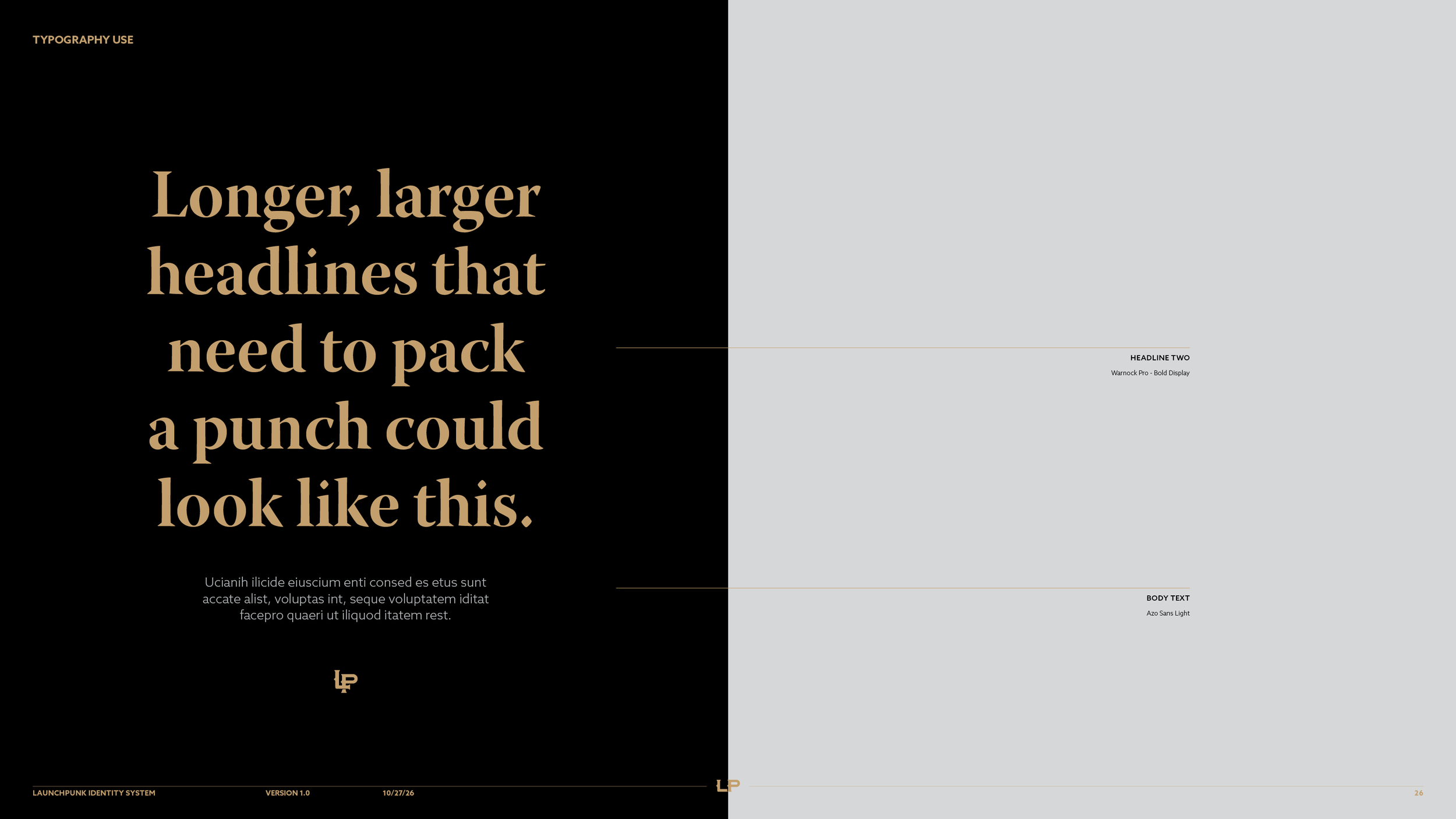
Launchpunk guideline page with a large gold Warnock Pro Bold Display headline above Azo Sans Light body text on black.
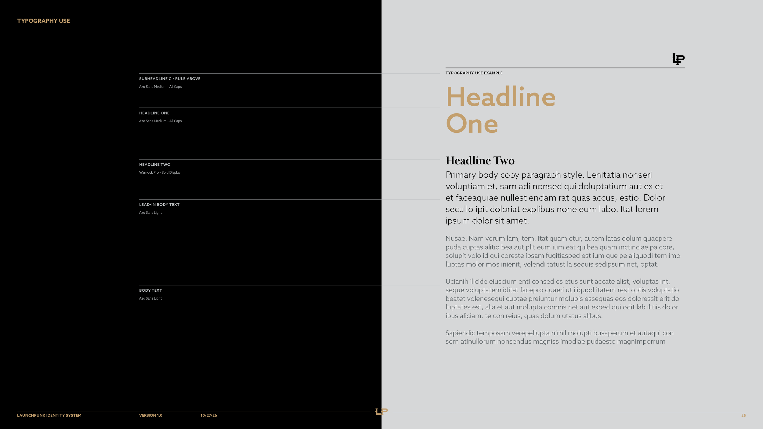
Launchpunk type hierarchy page showing sample headlines and body text set in Azo Sans and Warnock Pro Bold Display.
Previous
Previous

Asymmetria

Next
Next

The Farmstead