How Code Blue took its brand beyond the blue light
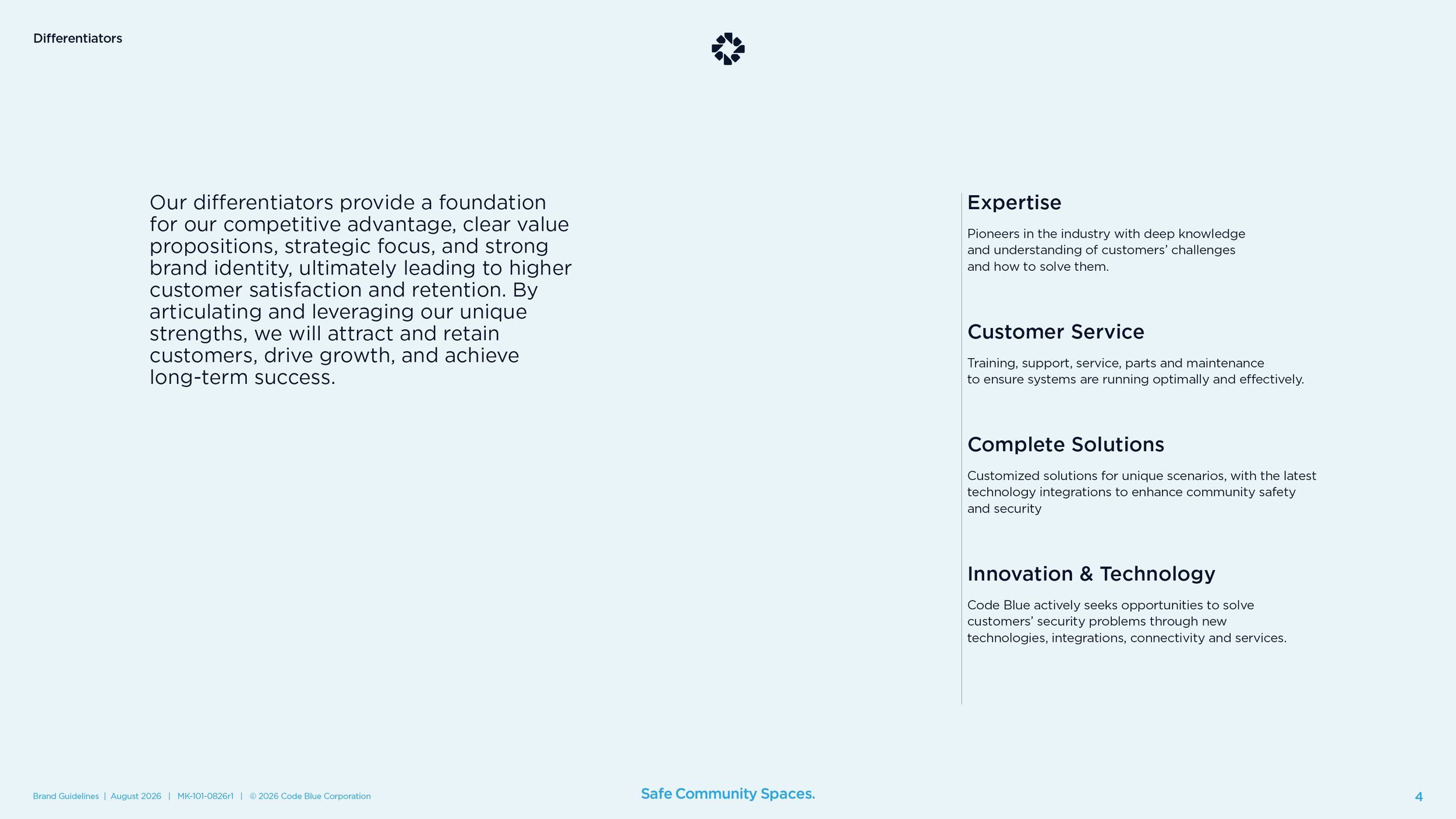
Wit & Craft repositioned Code Blue, the company that made the original blue light emergency phone, and gave it a new identity to match. Buyers saw a phone on a pole, bought it from a catalog, and shopped it on price. The company had grown into much more than that, and nobody outside could tell. So we did the work in order. First we found out what was true about the company and wrote it down as a position. Then we set the rules for how its products relate to the company name. Then we drew a new symbol, chose a tagline, and wrote a 50-page book of brand guidelines that Code Blue now runs itself. The brand is on the website, the catalog, the trade show booth, and the towers.
The challenge
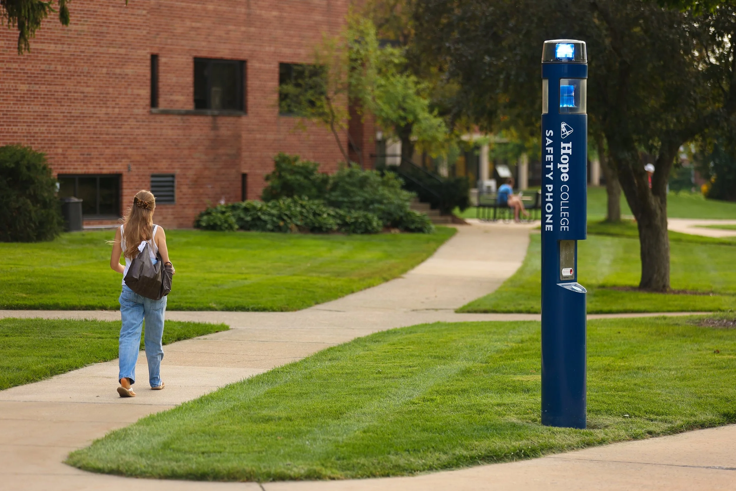
Code Blue has made emergency phones in Holland, Michigan, since 1989. It made the original blue light phone for public spaces, the kind you see on a college campus or in a parking garage. Over three decades the company grew well past the phone. It makes towers, Help Point® units, software, cloud services, and the systems that tie them together. It designs, builds, and wires its own product. It trains the people who install it and answers the phone when something breaks.
The market had not kept up. Our discovery work in the spring of 2024 found the same thing from every direction. Buyers called it just a phone. Some said they had cell phones now. Code Blue never sells to the property owner directly, so its story passed through integrators and distributors who sell from a catalog and quote on price. The owner never heard about the training, the service, or the technology. The product was a commodity, with no brand awareness behind it and no brand preference.
Leadership knew it. The company’s own messaging had grown complicated, written by and for people inside the building. A technology platform had taken on a name and a look of its own, which blurred what Code Blue itself stood for. The company wanted to be known as a leader in community safety, and its brand still said phone.
Why we started with the words
A new logo would have been the easy sale. It would also have put a fresh face on a story nobody understood. So the work ran in order. Discovery first, to learn what was true. Then the position, the few sentences that say why Code Blue exists, how it works, and what it is. Then the brand architecture, which decides how product names relate to the company name. Only then the identity. Every design decision after that had something to answer to.
The order mattered for a second reason. Code Blue sells through a channel it does not control. The brand had to be simple enough to survive a distributor’s catalog page and strong enough that a property owner might ask for it by name. Both are positioning decisions, so they had to come first.
The Brand Position
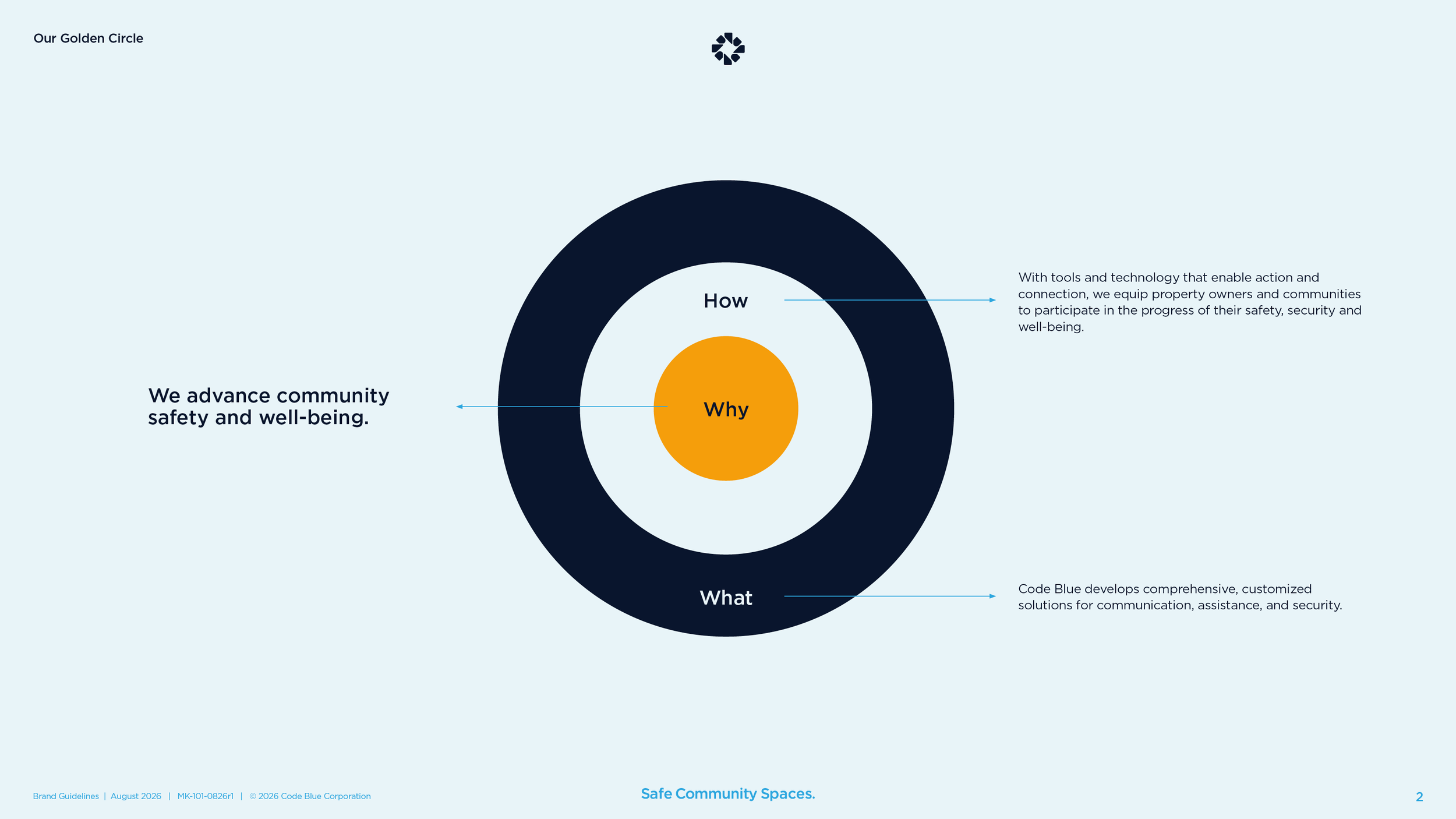
Why.
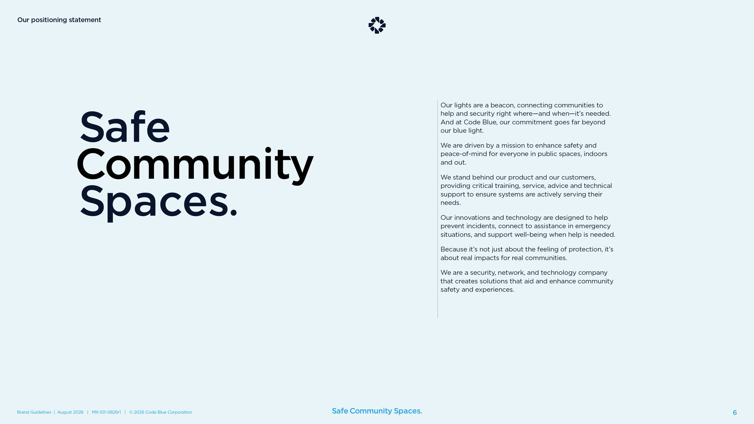
“We advance community safety and well-being.” Six words, and the brand guidelines now open with them.
How.
“With tools and technology that enable action and connection, we equip property owners and communities to participate in the progress of their safety, security and well-being.” The how names the buyer, the property owner, and gives the public a part to play.
What.
“Code Blue develops comprehensive, customized solutions for communication, assistance, and security.” Three nouns, in that order, and the phone is not one of them.
The Brand Identity System
The symbol.
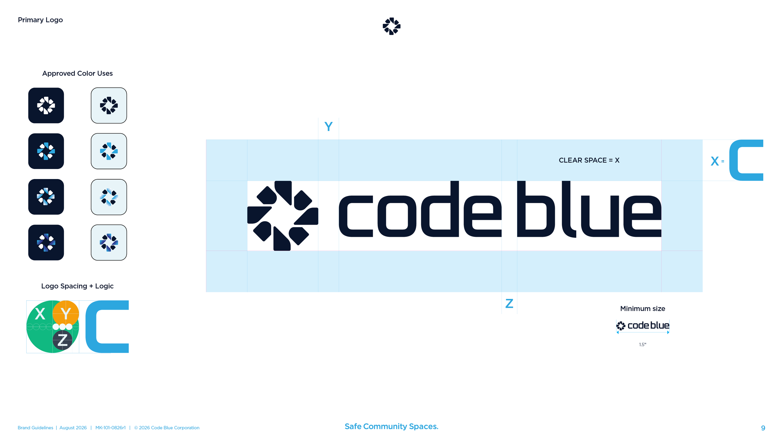
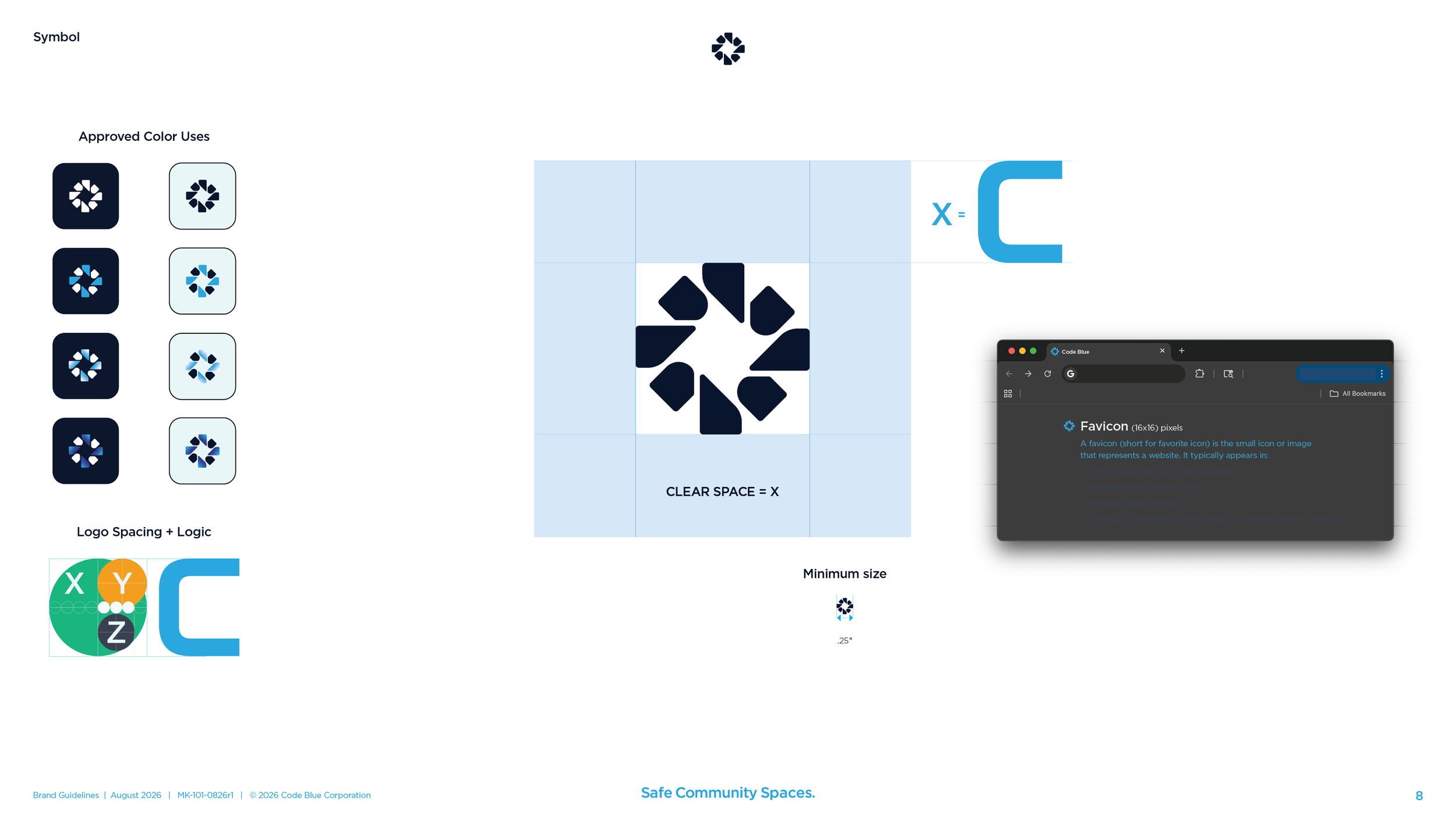
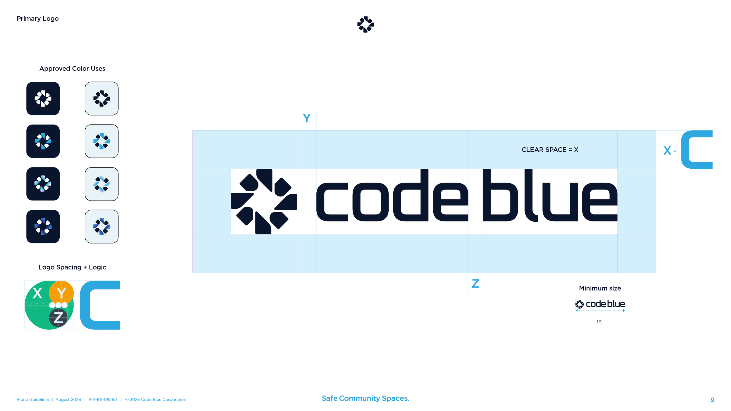
The old logo was a diamond, and people in the industry knew it. The new symbol keeps the diamond in the space between eight shapes that circle it, and that same space reads as a plus sign. It works at a quarter inch on a business card and high on the back of a tower.
The logo system.
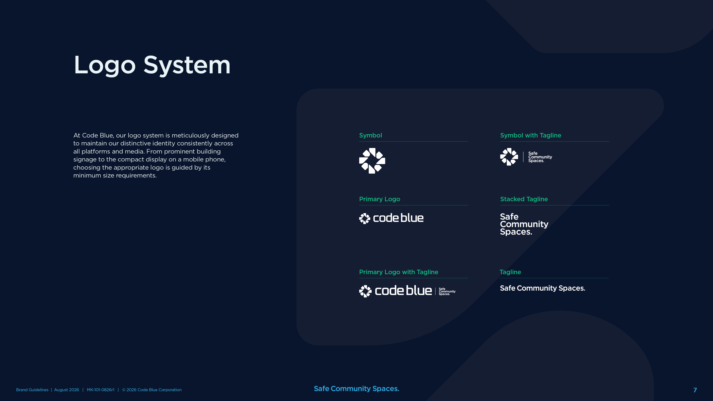
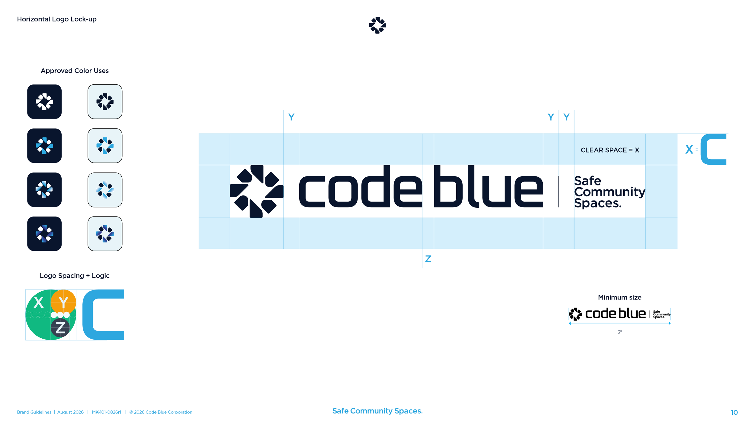
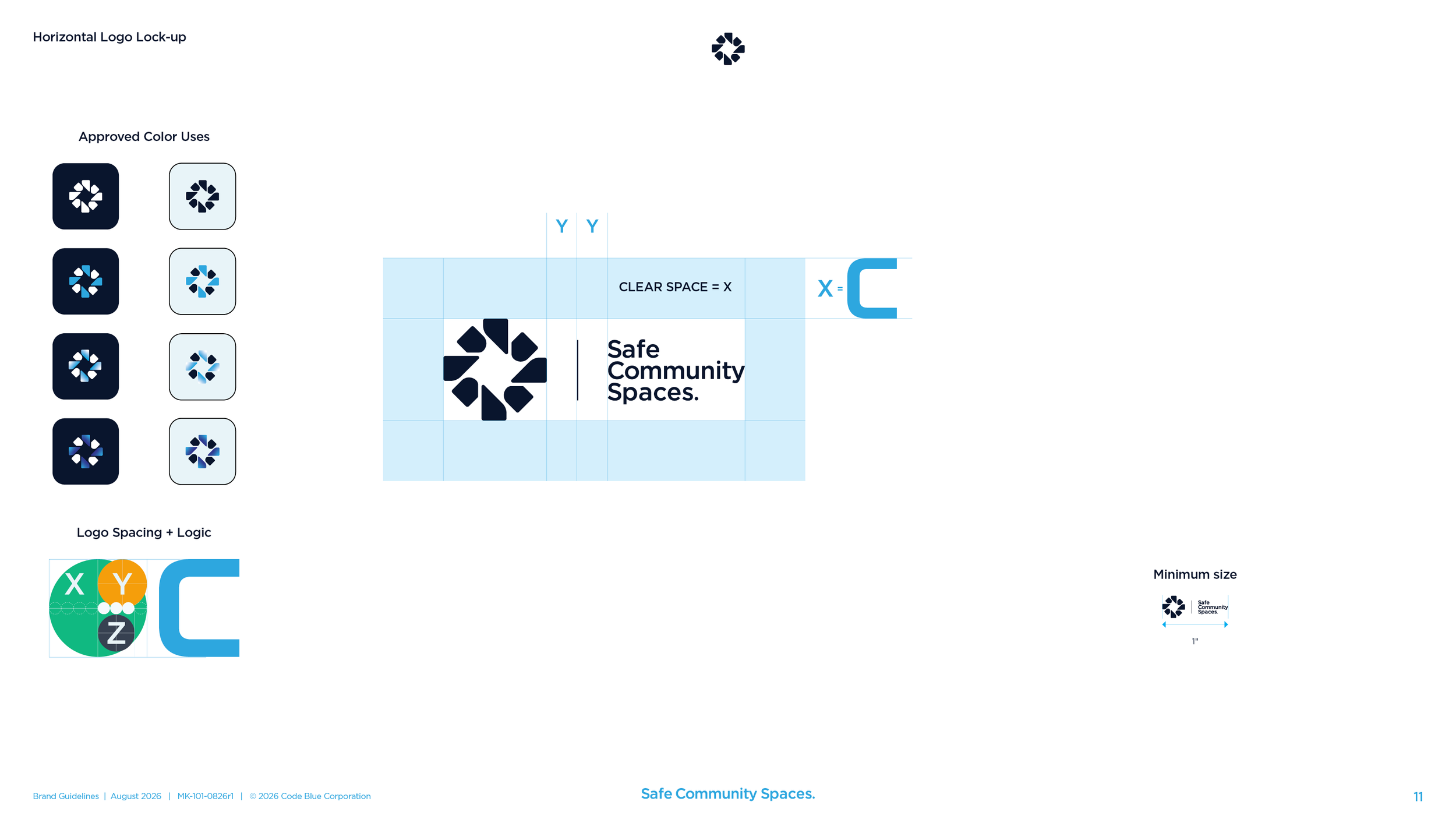
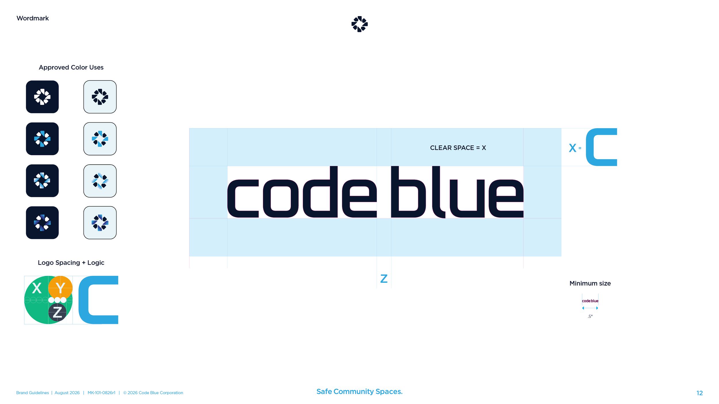
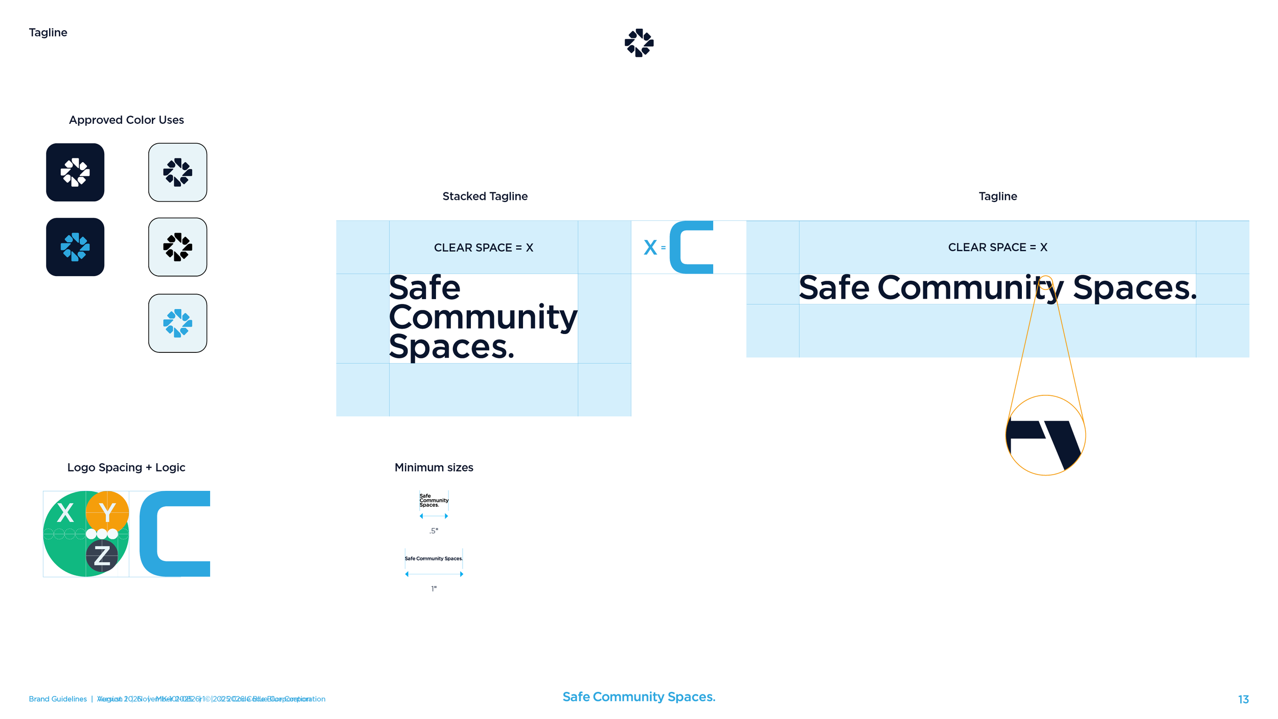
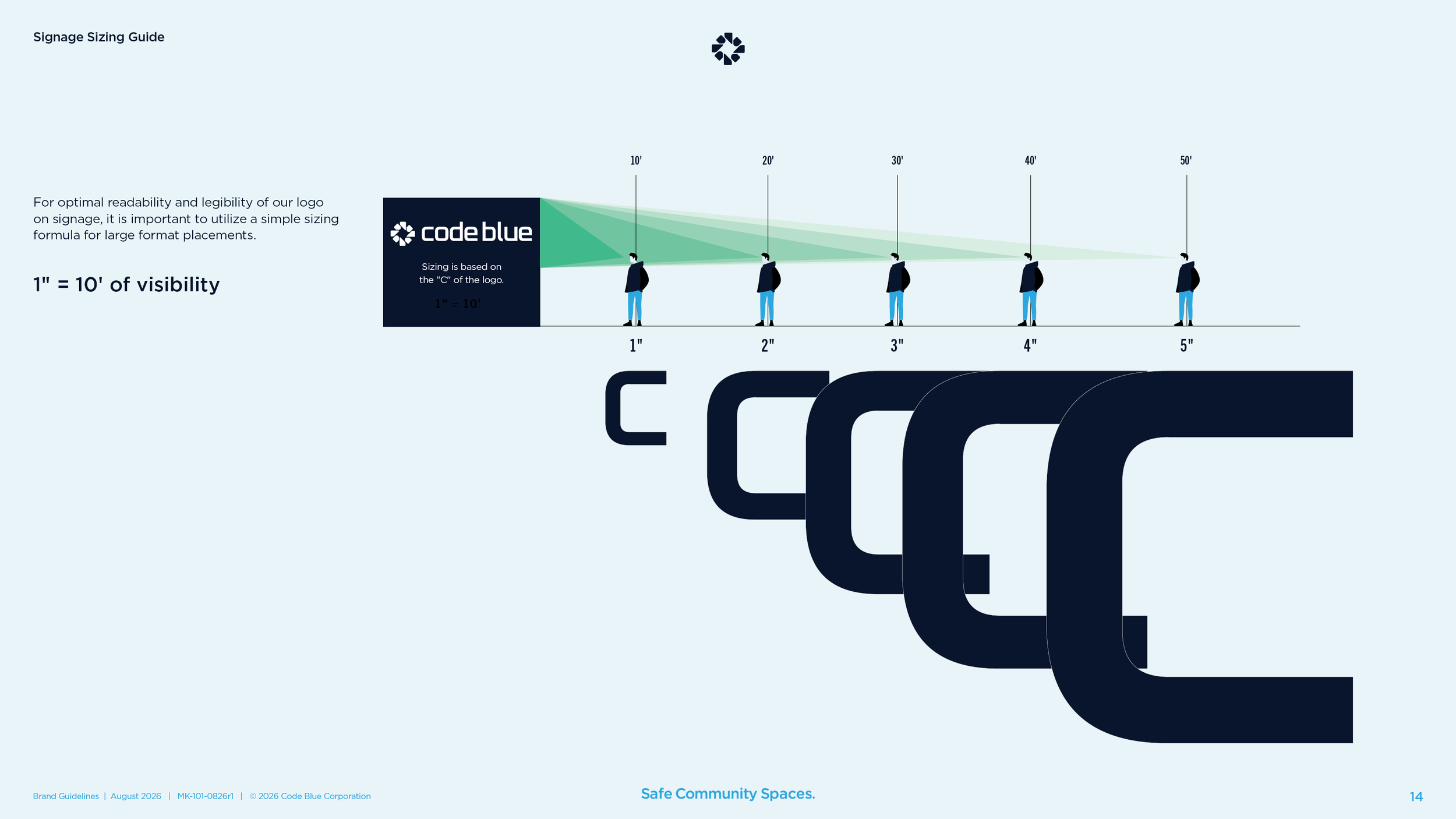
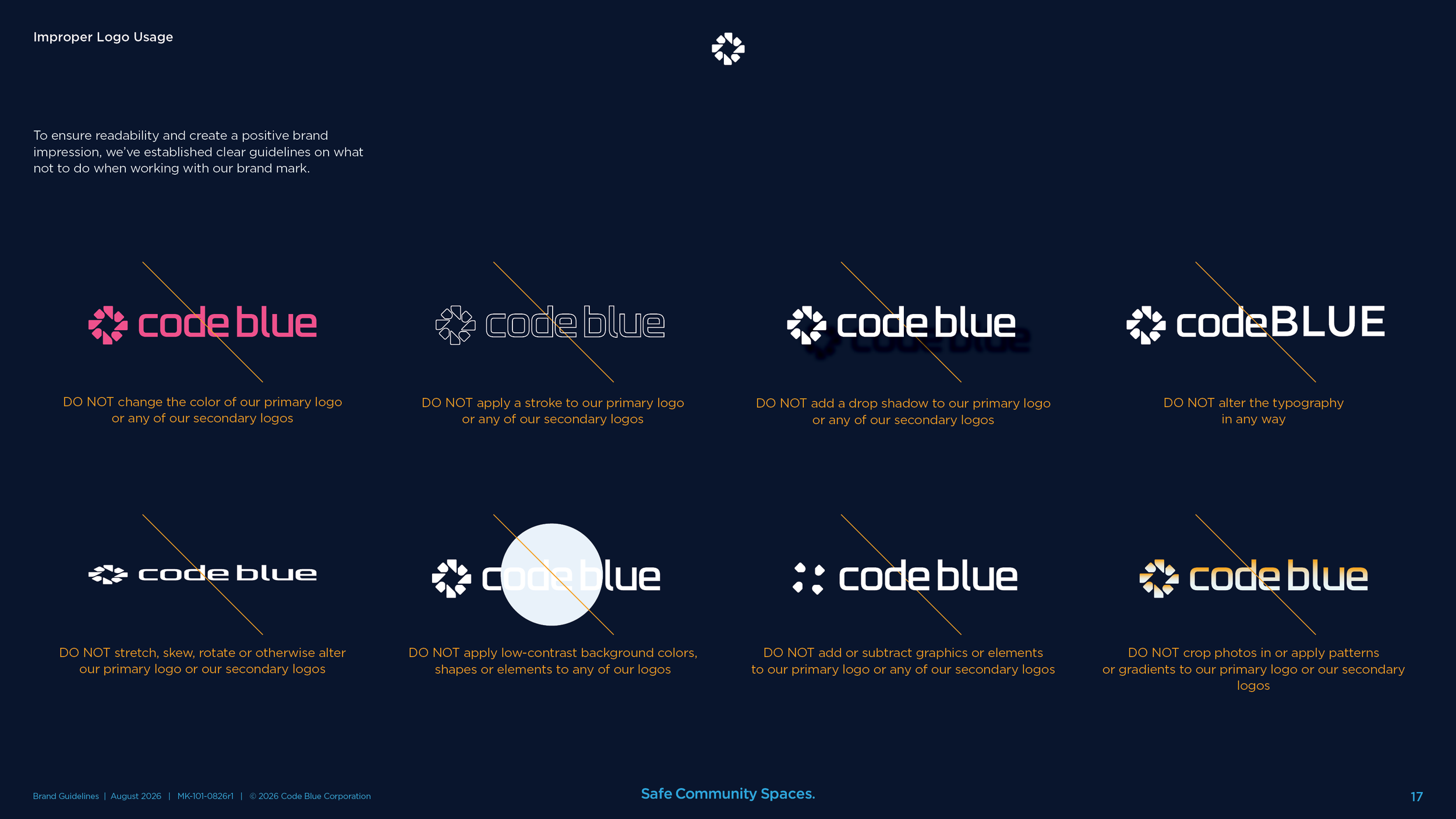
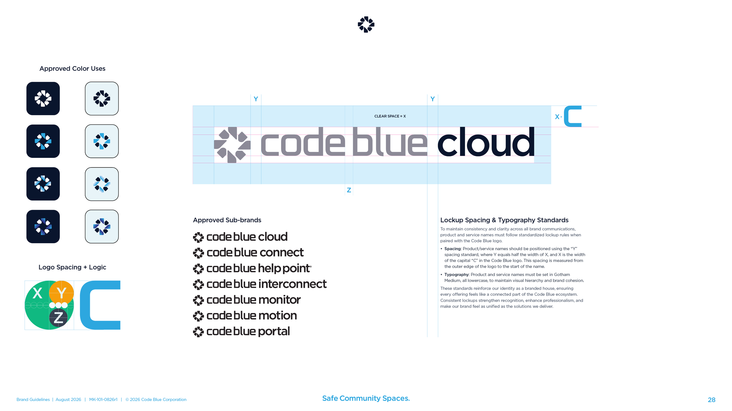
Six approved versions. The symbol alone, the primary logo, each of those with the tagline, the stacked tagline, and the tagline on its own. Clear space on every one is the width of the C in the wordmark. Minimum sizes run from a 16-pixel favicon to a sign you can read from fifty feet away.
The tagline.
Safe Community Spaces. Three words chosen from a field of options the team scored and argued over. It sits in a lockup with the logo, on the business card, in the email signature, and in the footer of every page of the guidelines. It later became the name of Code Blue’s content campaign and newsletter.
Color.
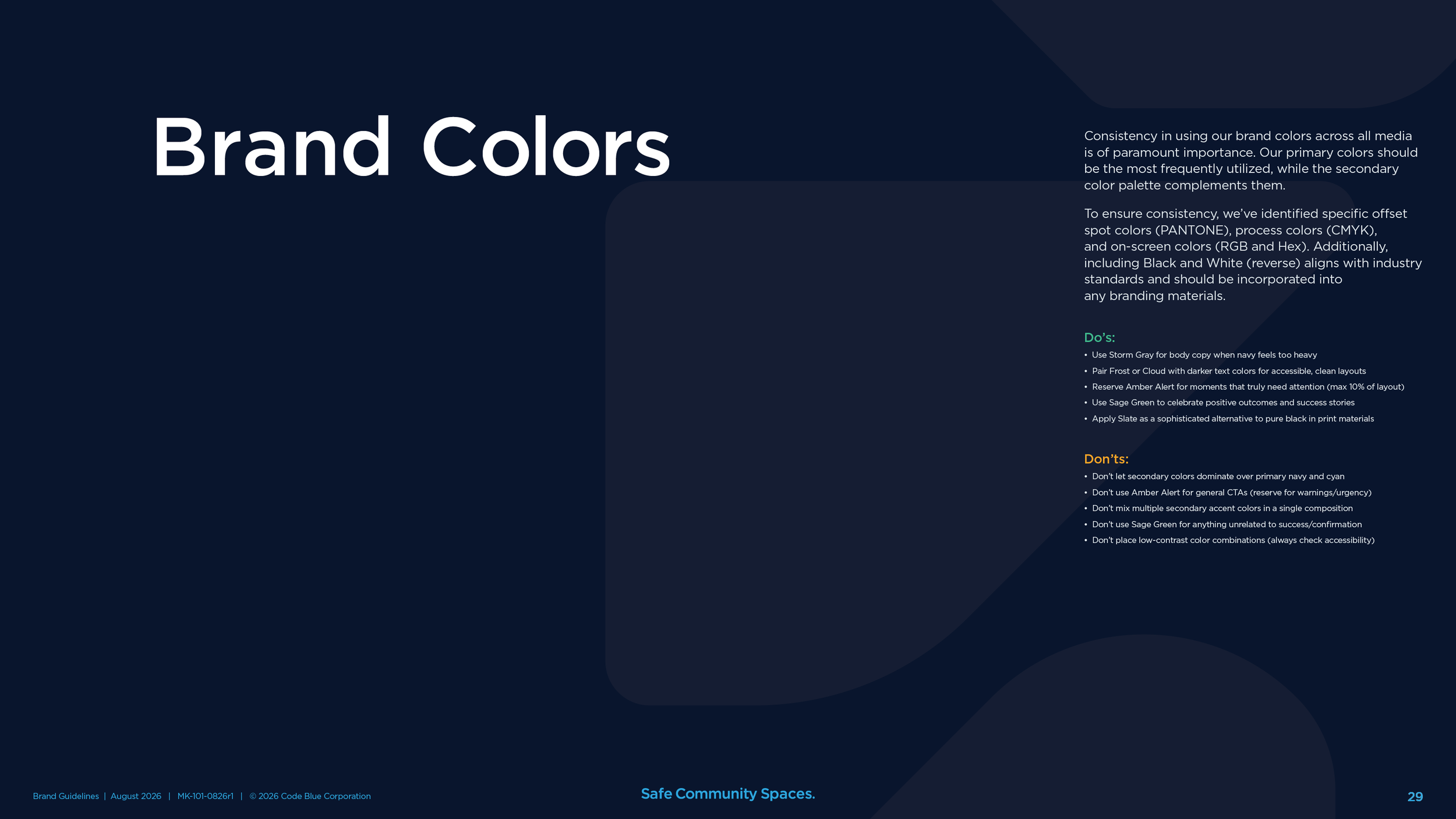
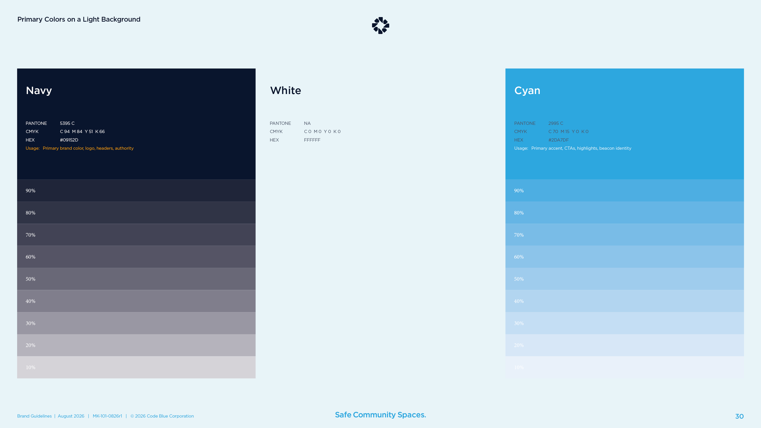
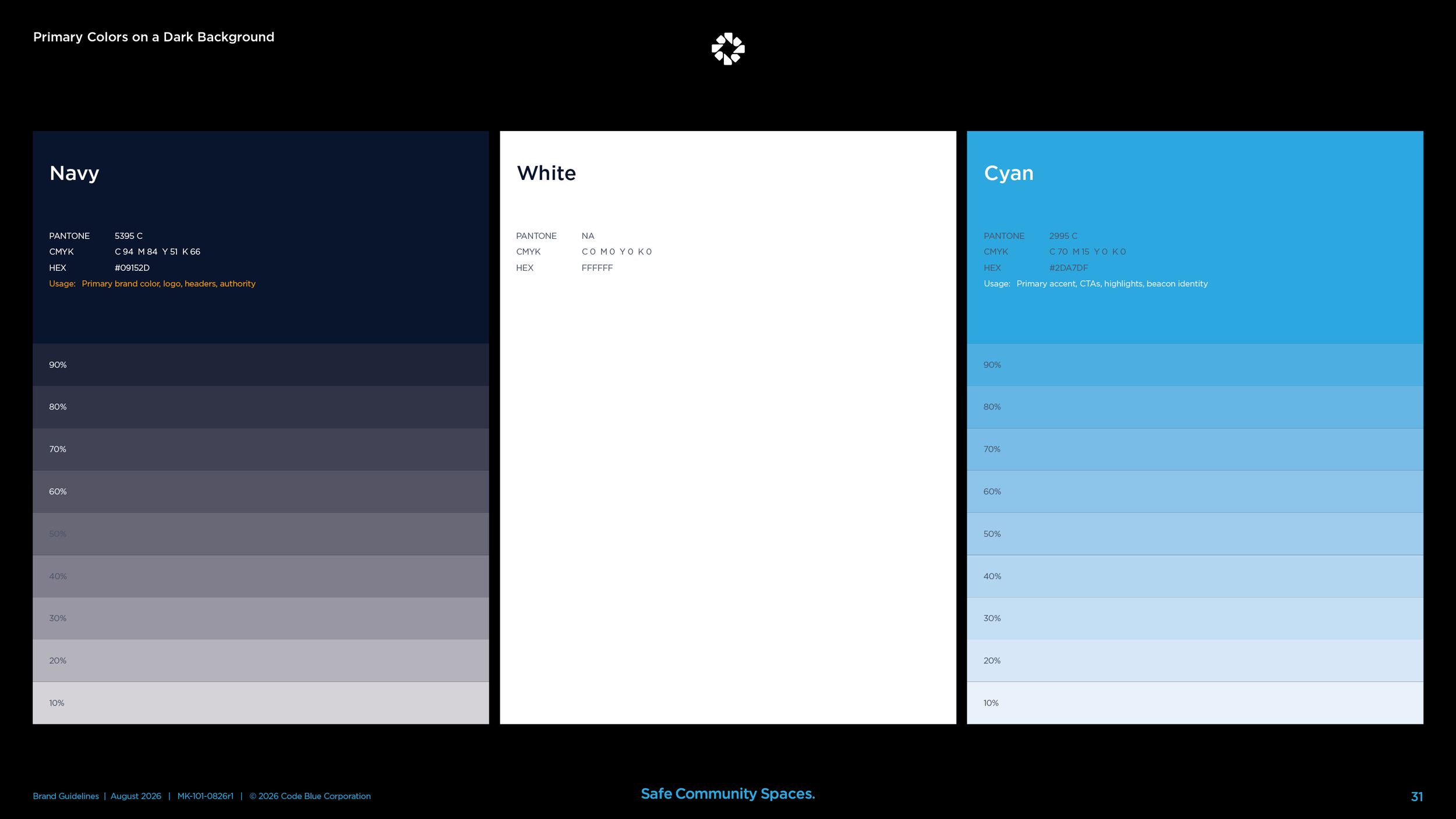
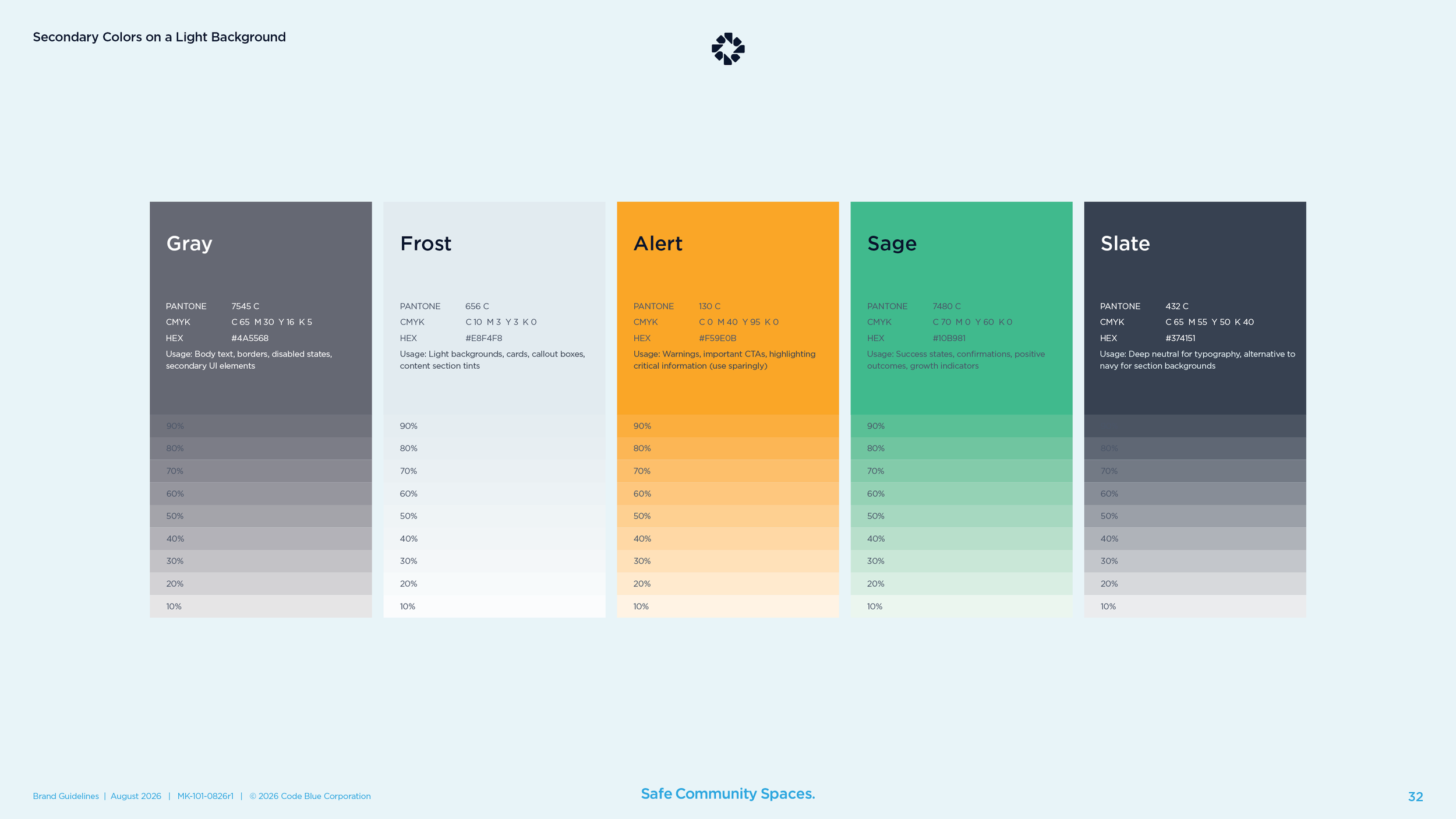
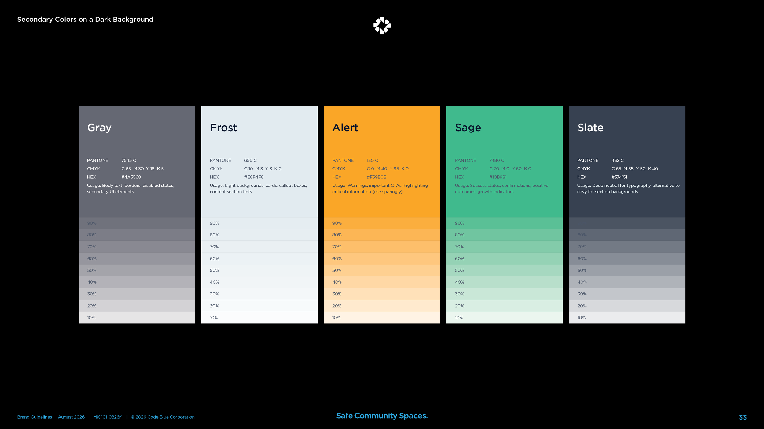
Navy for authority and cyan for the beacon, each with a full run of tints on light and dark backgrounds. A second palette of gray, frost, alert, sage, and slate, with a rule for each. Alert is for warnings and never for an ordinary button.
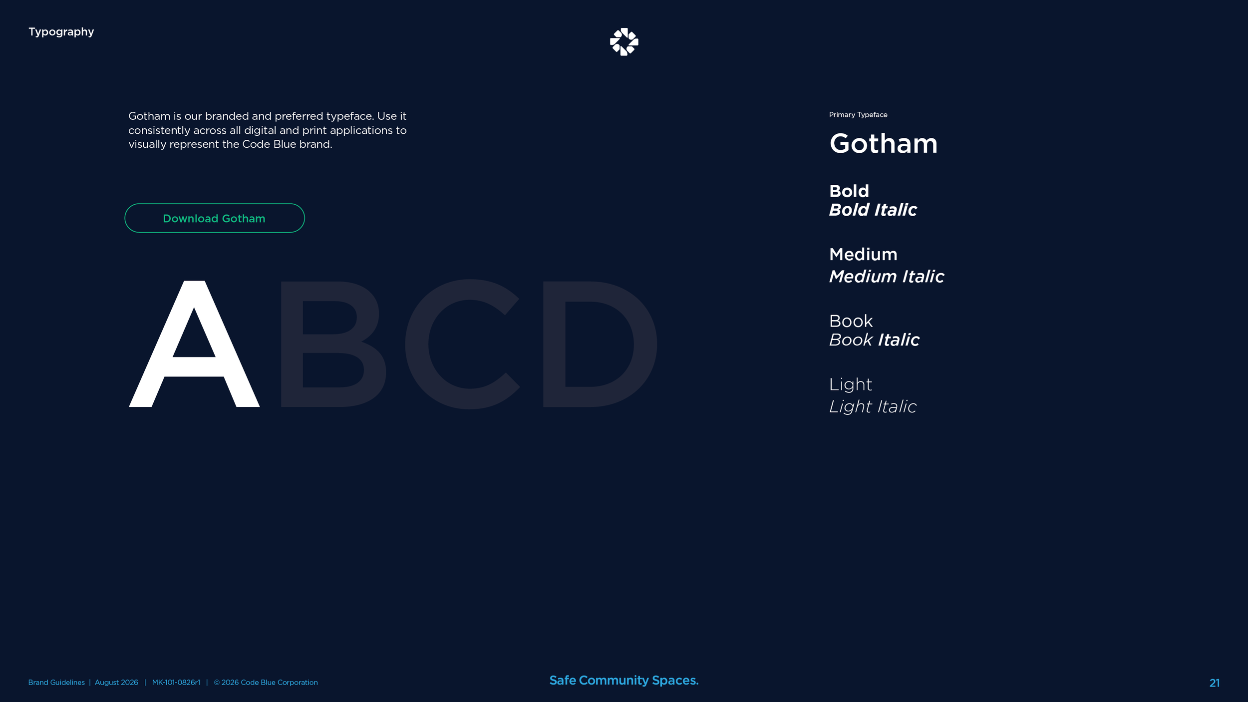
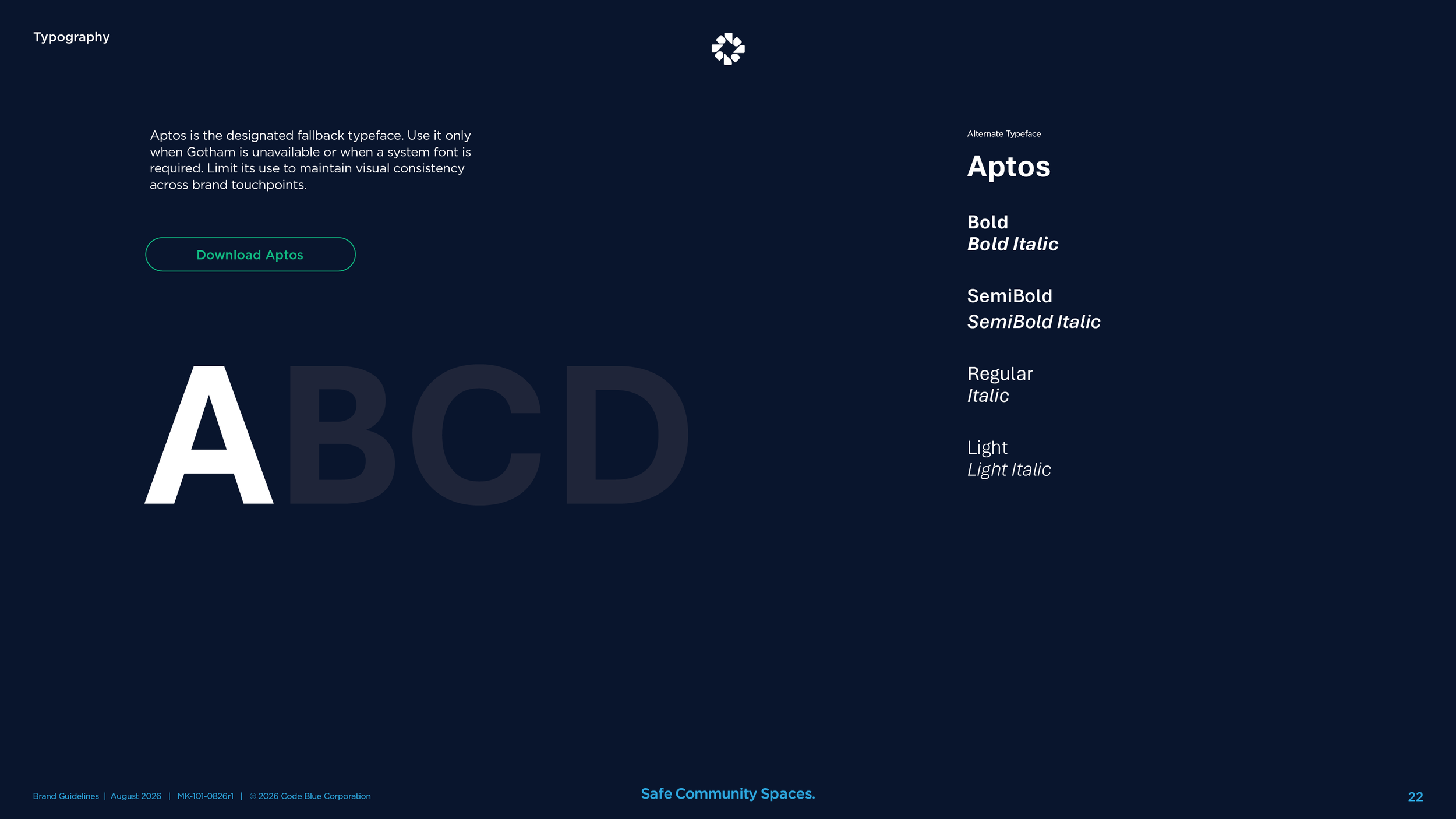
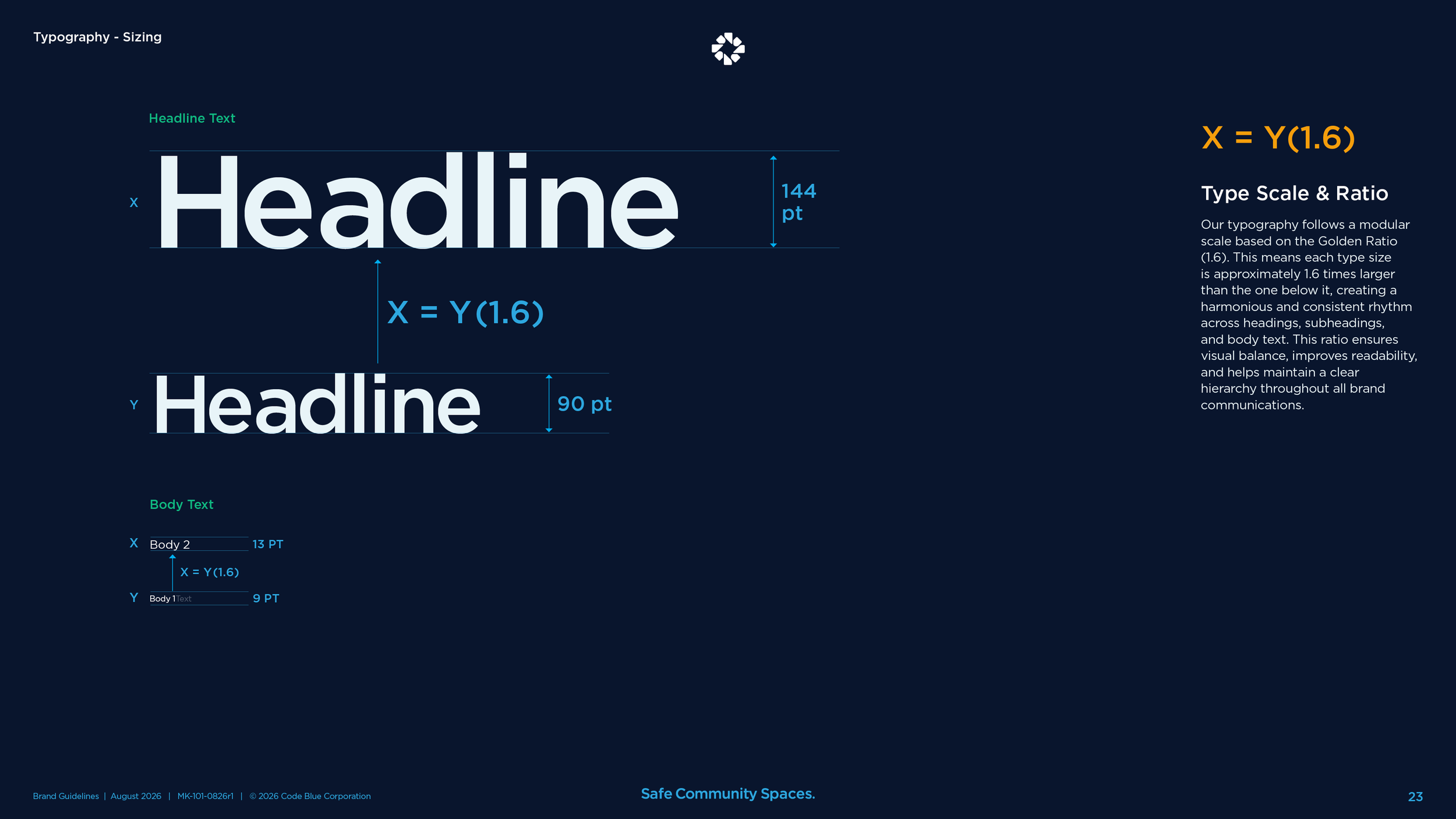
Typography.
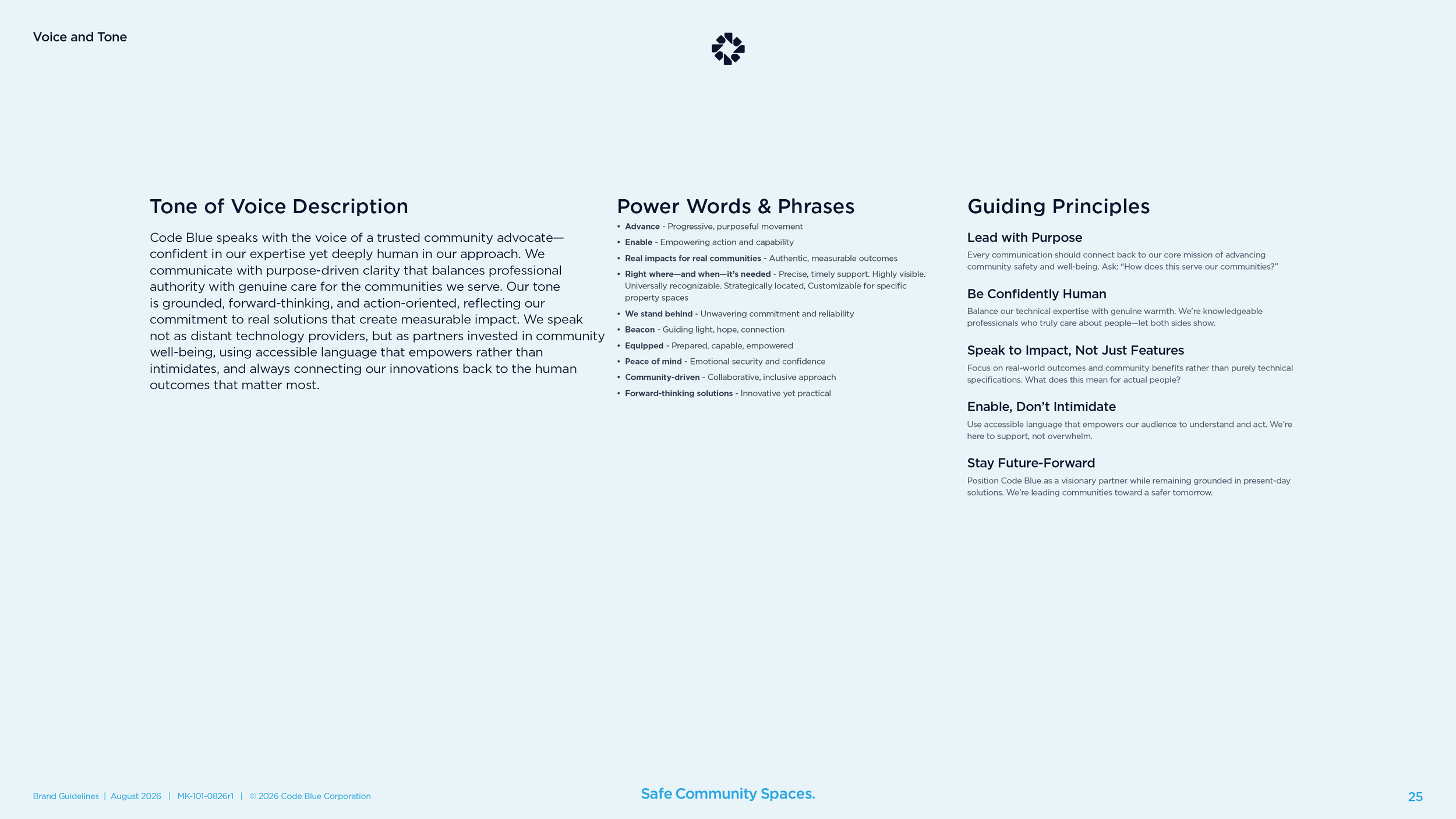
Gotham, in four weights, for everything the company prints or posts. Aptos as the fallback for email and shared documents. A type scale of 1.6, so headings and body text keep the same rhythm on a sign, a web page, and a spec sheet.
Symbol on the product.
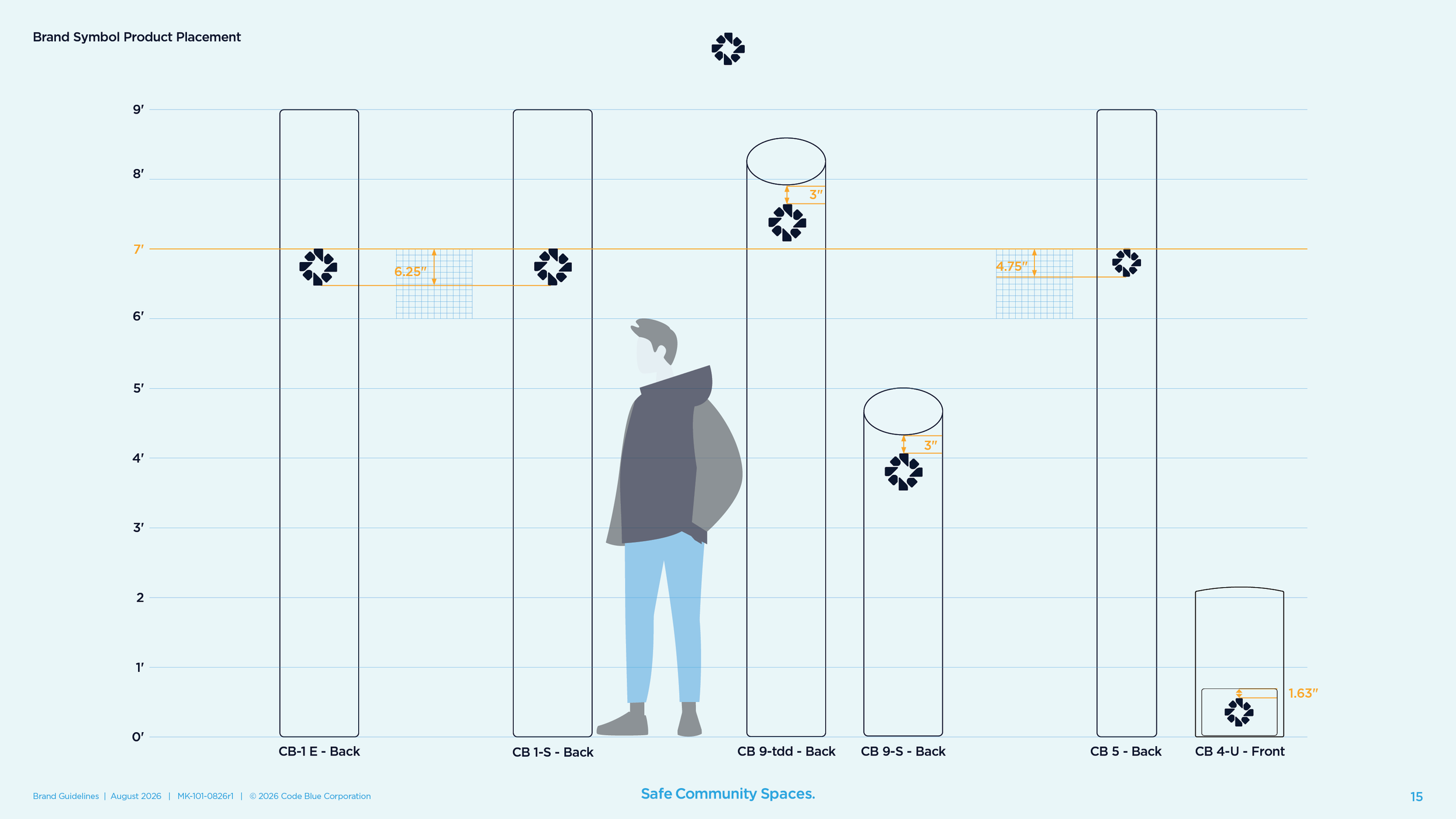
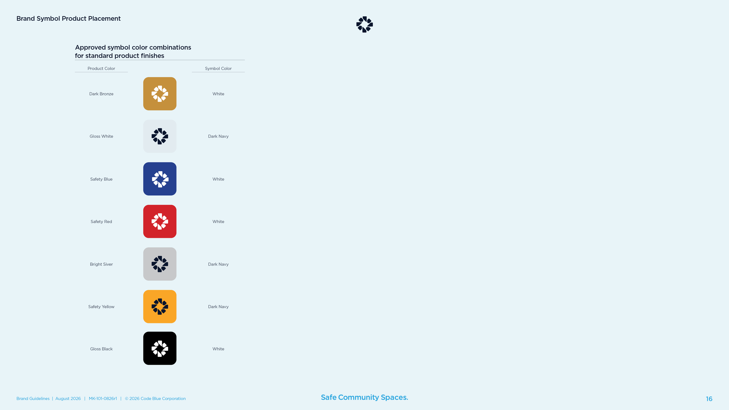
Where the symbol sits on each tower and wall unit, measured from the seven-foot line or the top of the housing, and which color it takes on each of seven standard finishes. The brand leaves the building on the product, so the rules had to cover the product.
Lockups for products.
Code Blue is a branded house, so every product and service name locks up with the logo the same way. Gotham Medium, all lowercase, set half a C-width from the symbol. Seven lockups were built, and a template makes the next one.
Icons and video.
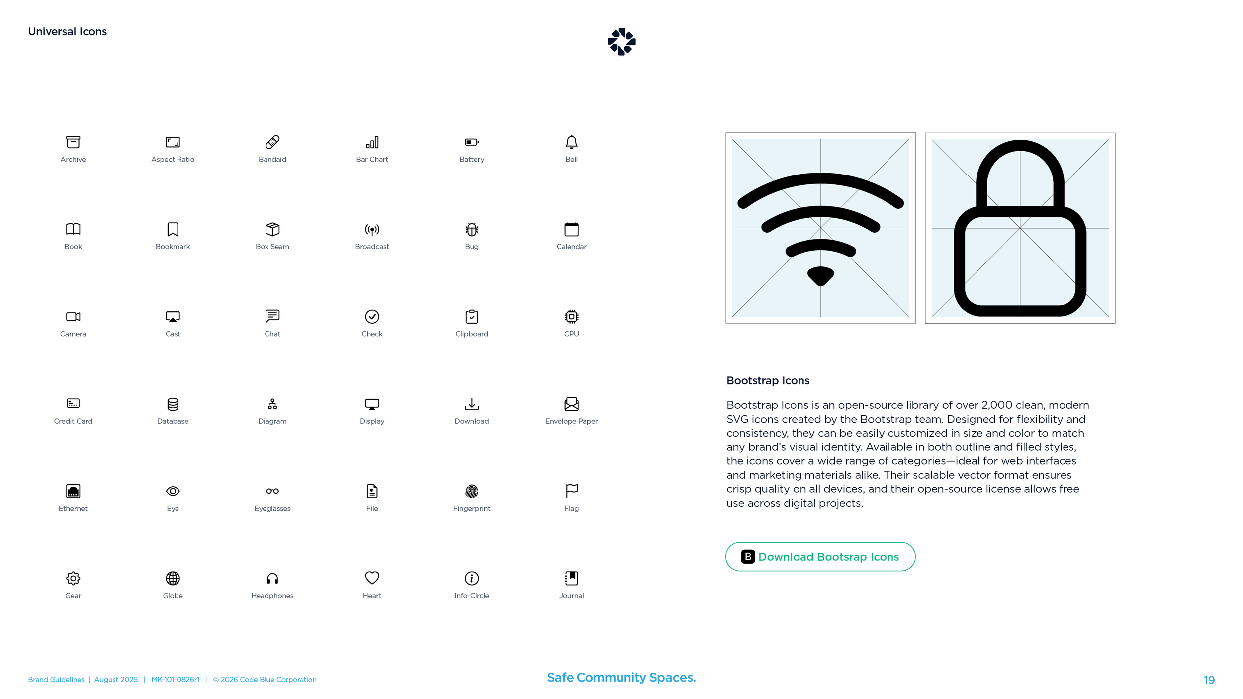
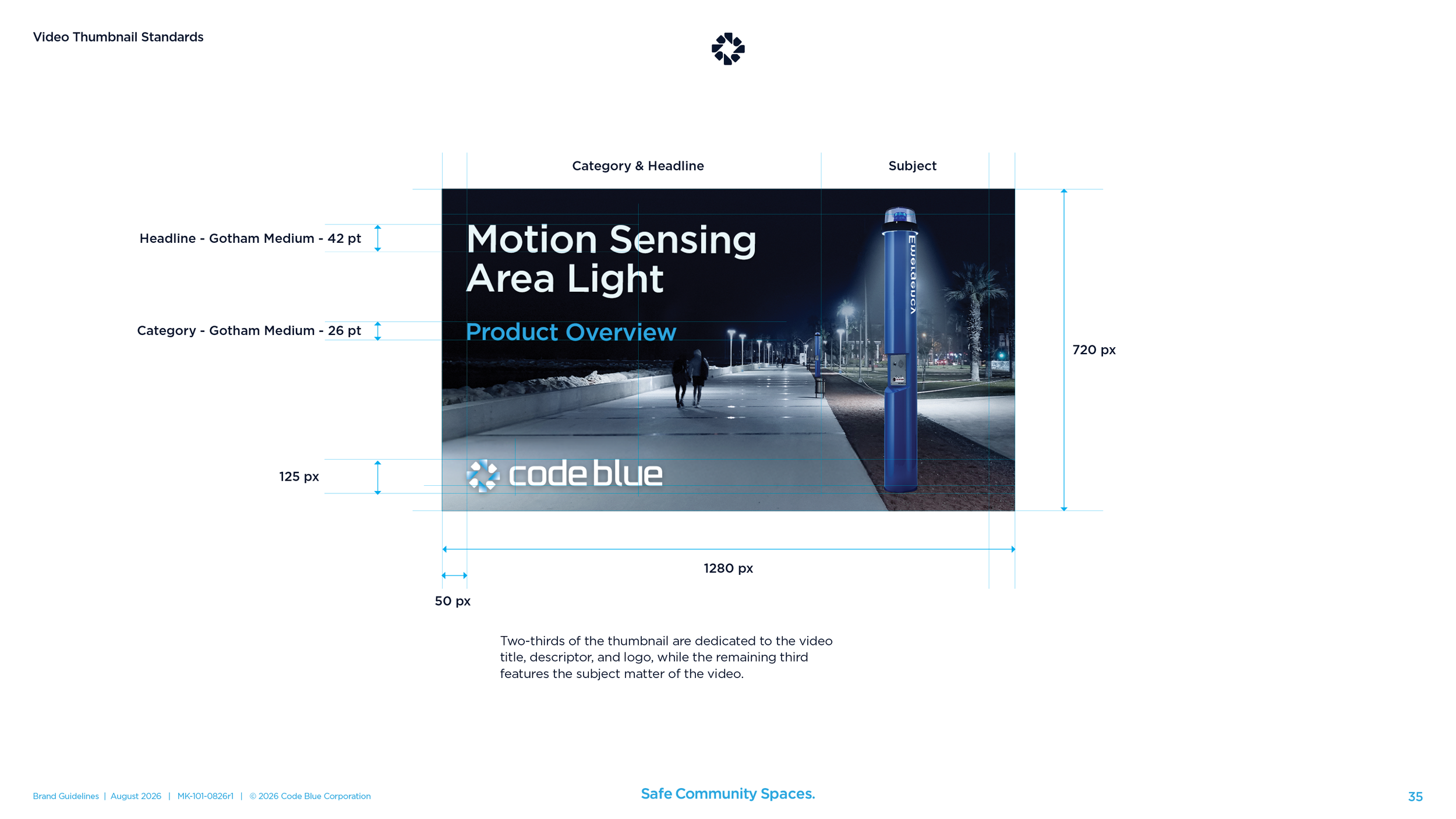
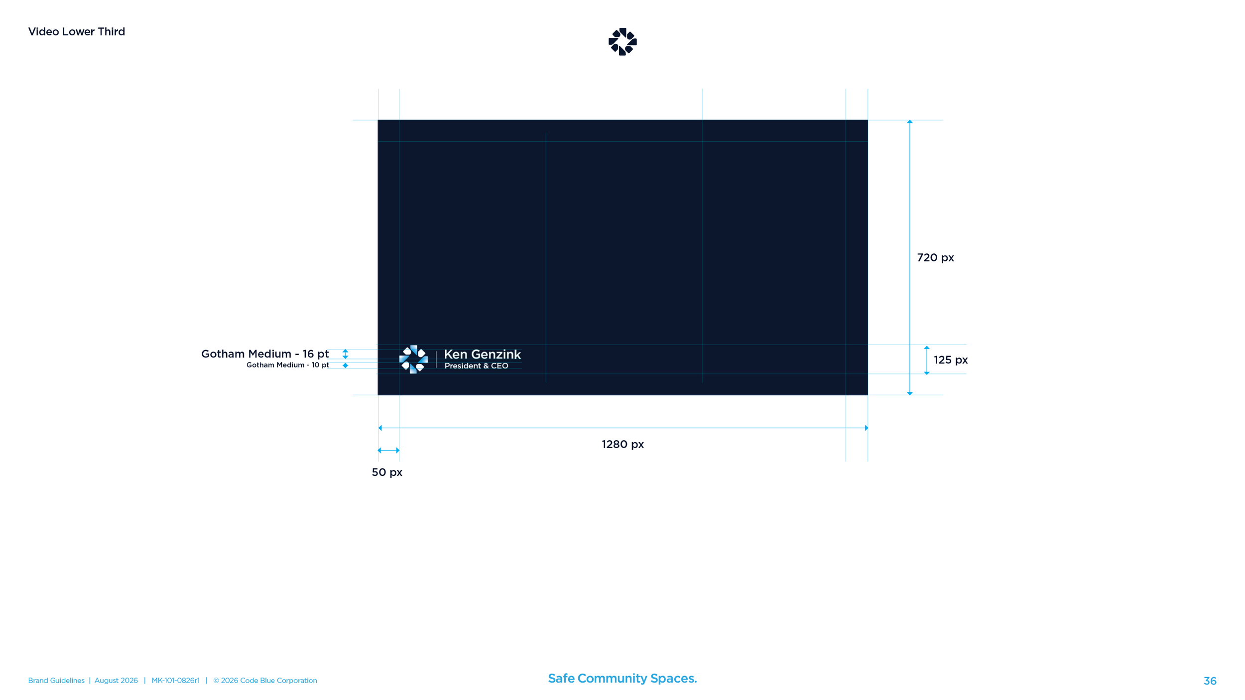
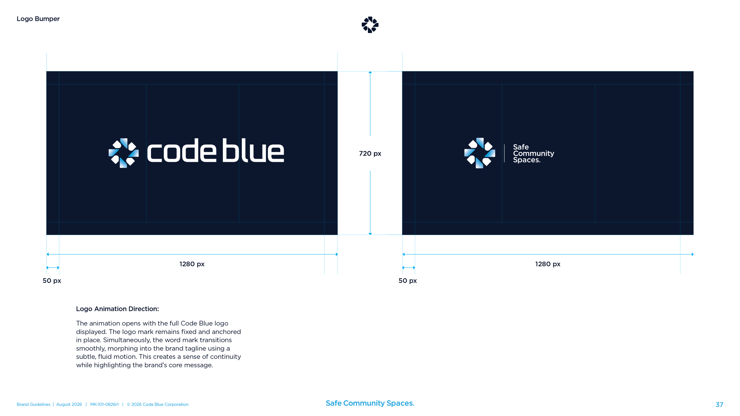
An open icon library with a starter set of about 35, so the website and the spec sheets draw from one drawer. Video standards for the thumbnail, the lower third, and a logo bumper in which the wordmark turns into the tagline.
Stationery, templates, and voice
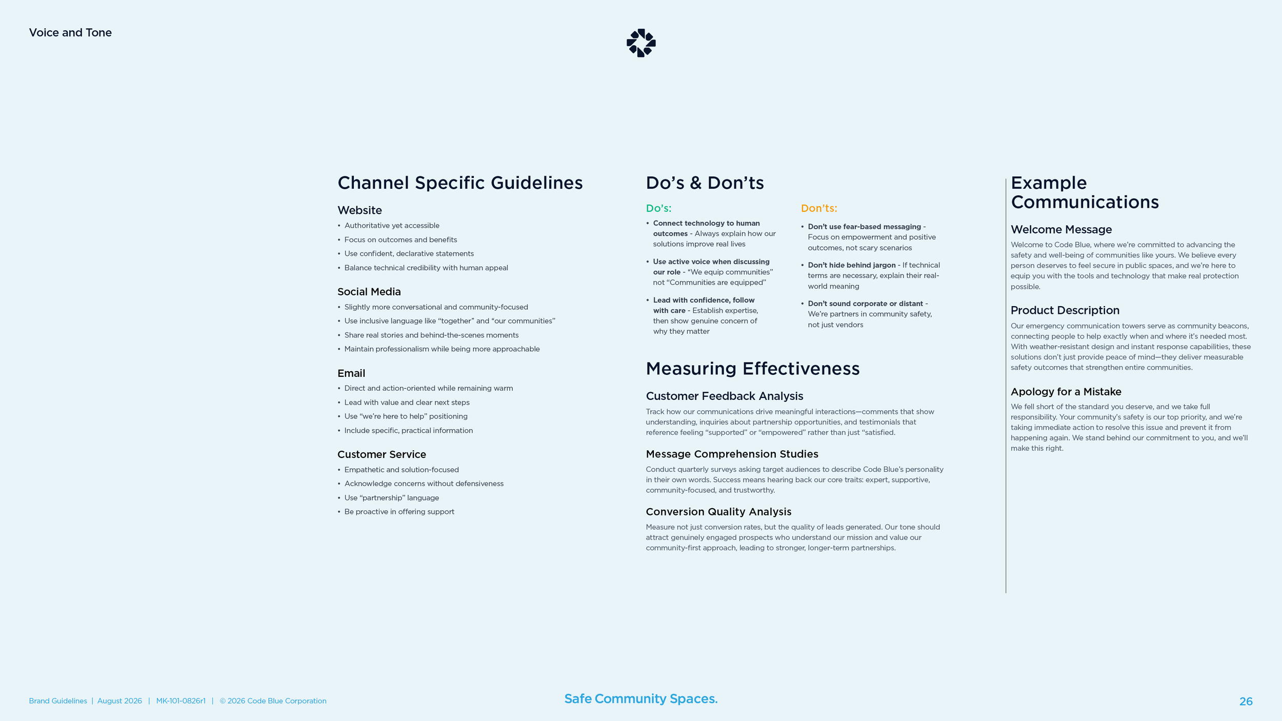
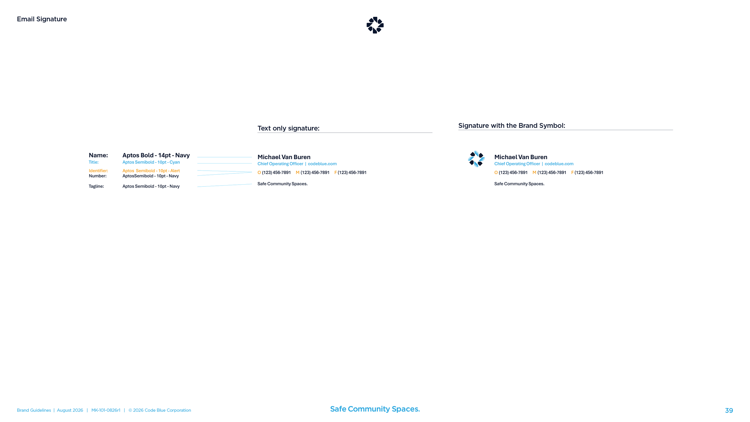
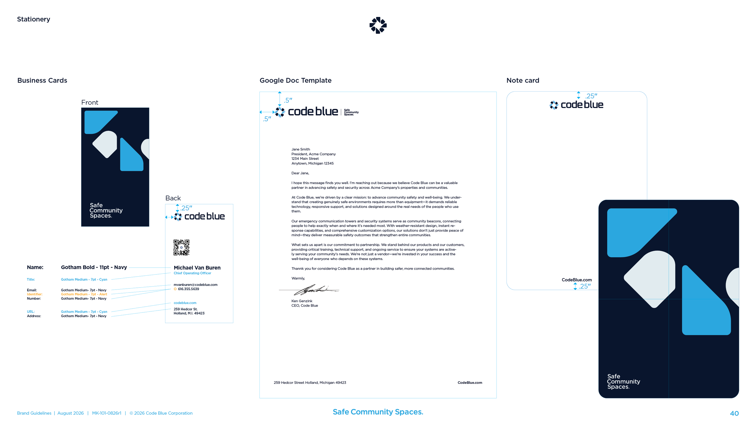
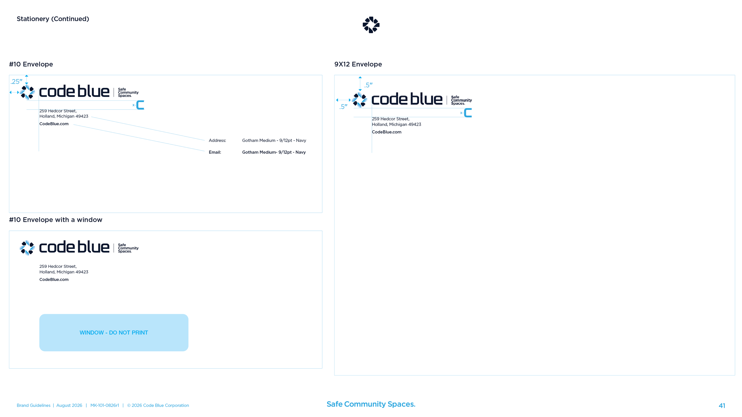
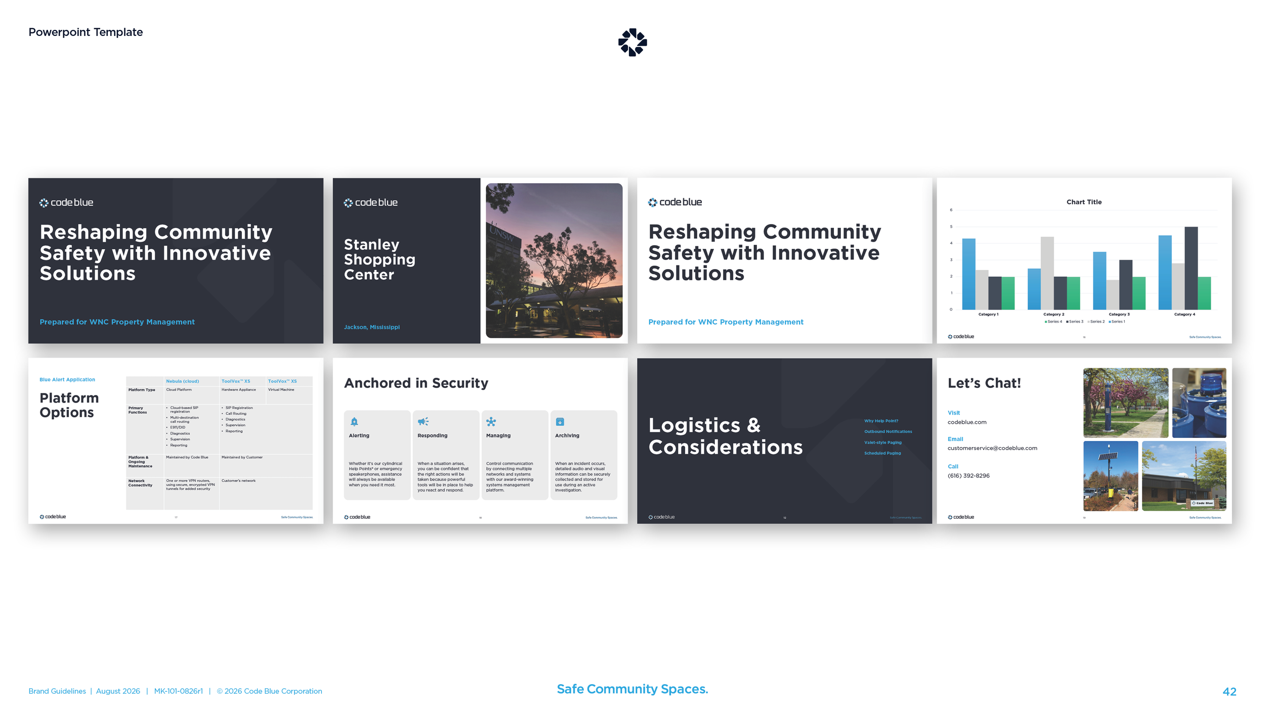
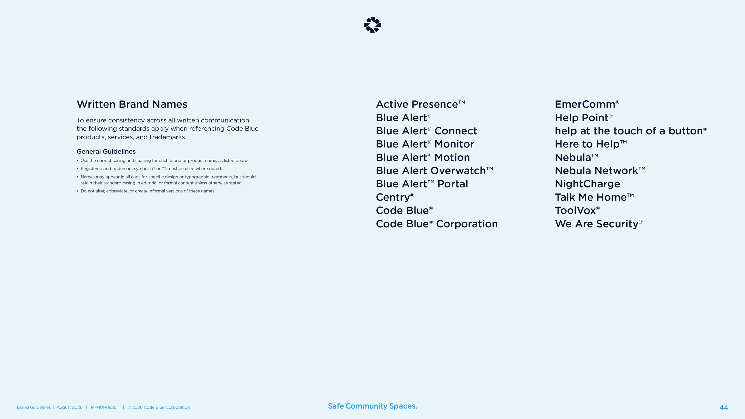
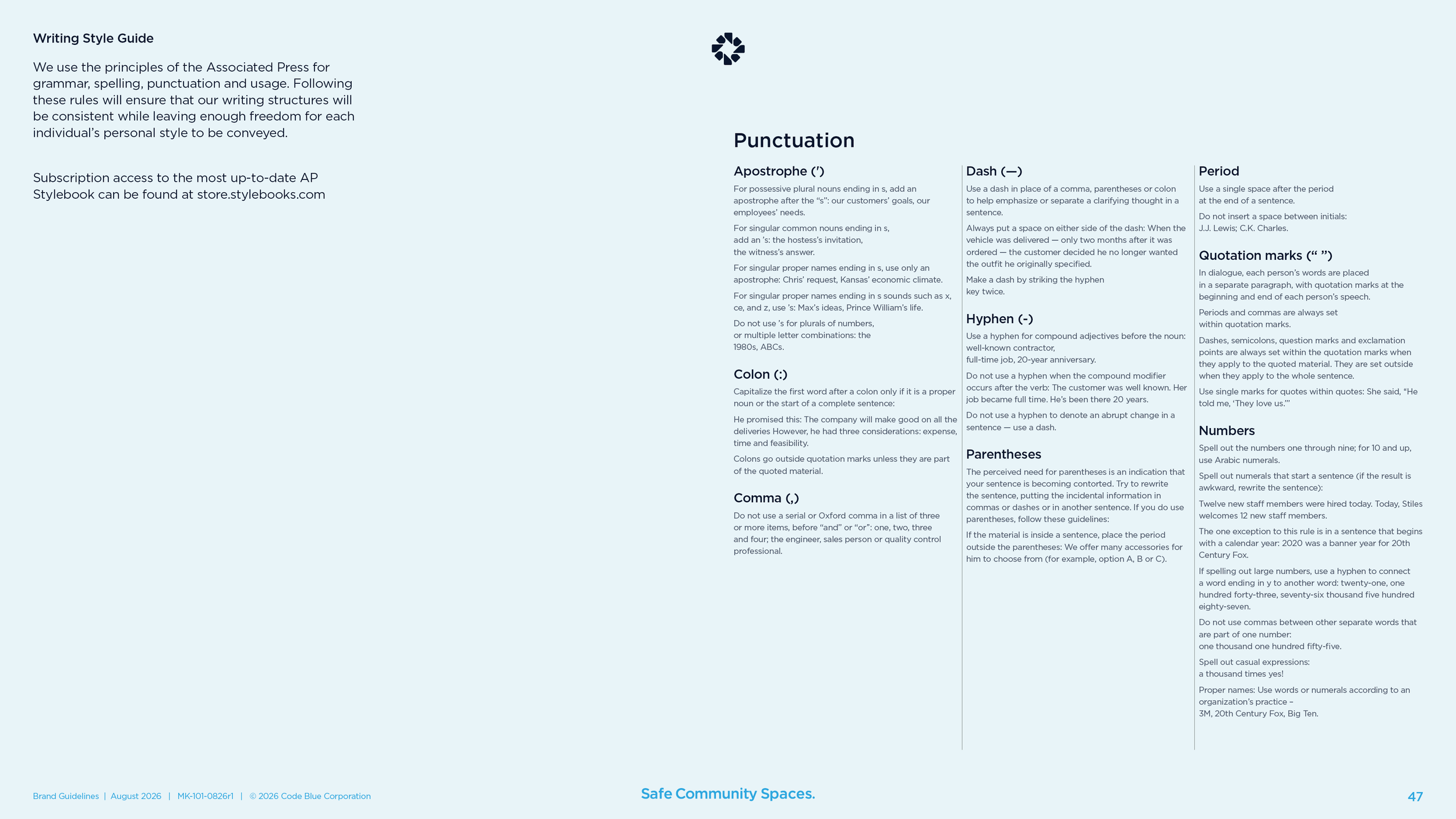
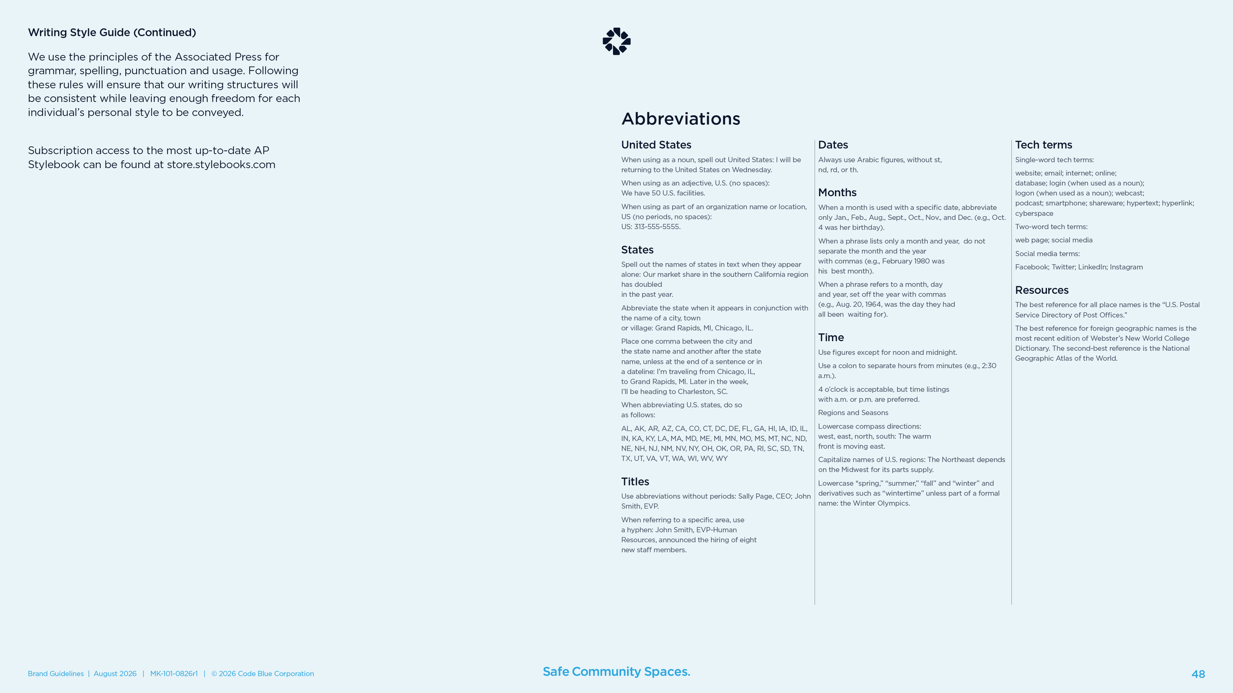
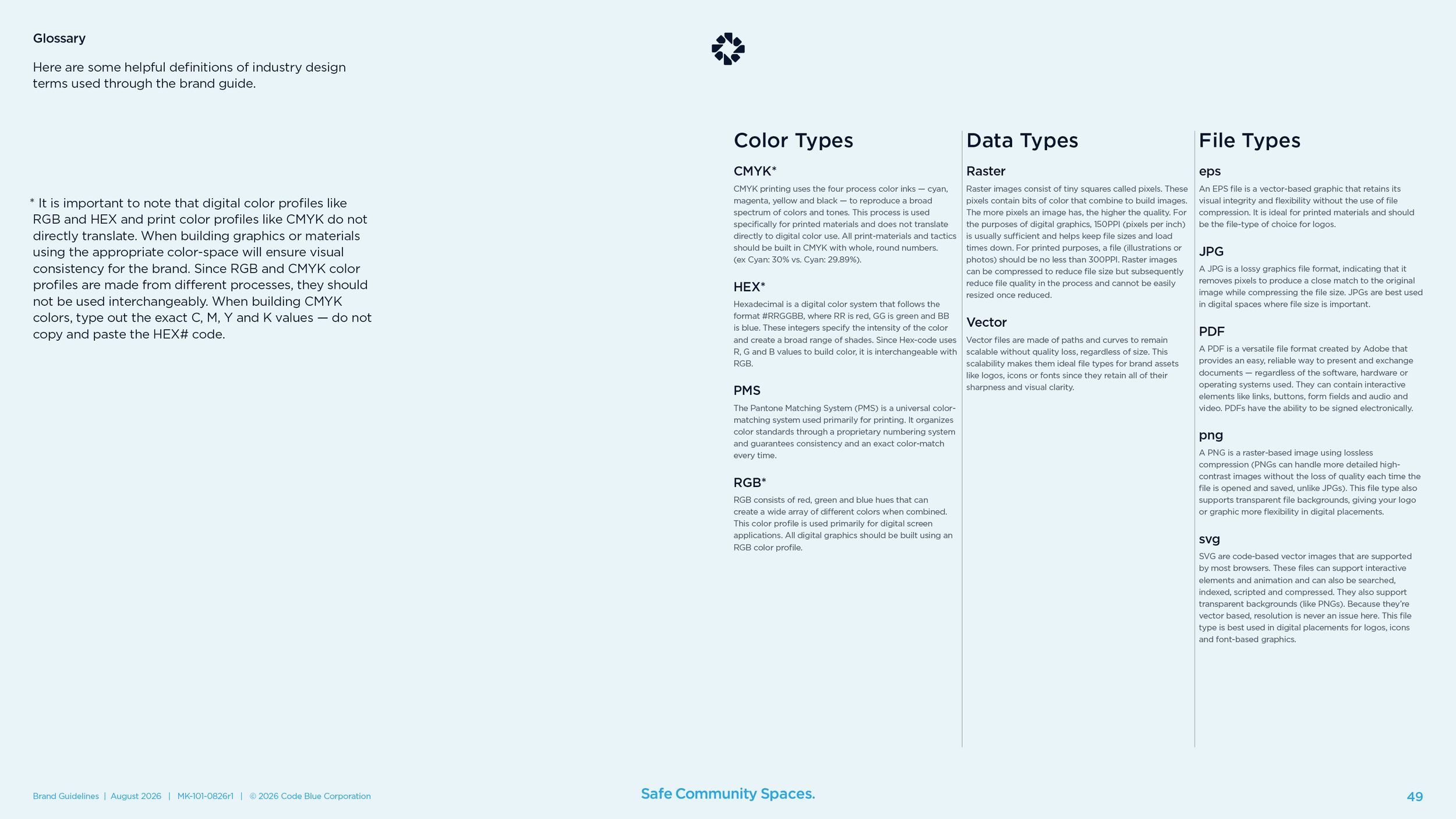
Business card, note card, three envelopes, a letter template, a slide template, and the email signature down to the point size of each line. A trademark list with every ® and ™ where it belongs. The book also carries Code Blue’s voice and tone and a writing style guide, so the people who write for the company have rules too.
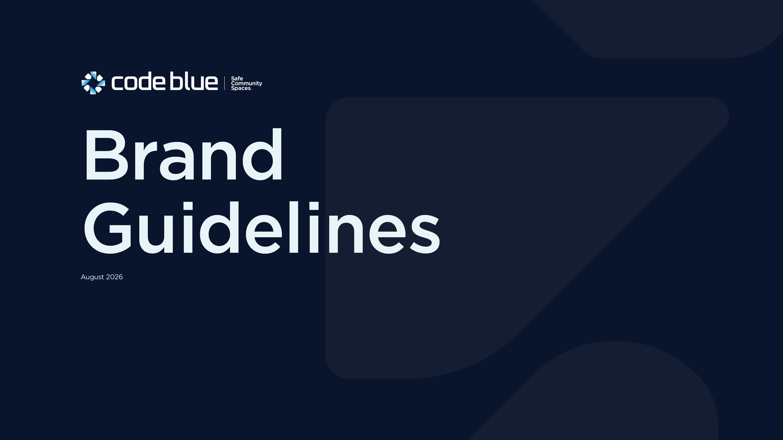
What came with the guidelines
The sub-brand lockup set
Seven product lockups, each in four versions for light and dark backgrounds and in print and screen formats, with a blank template for the next product.
Logo production files
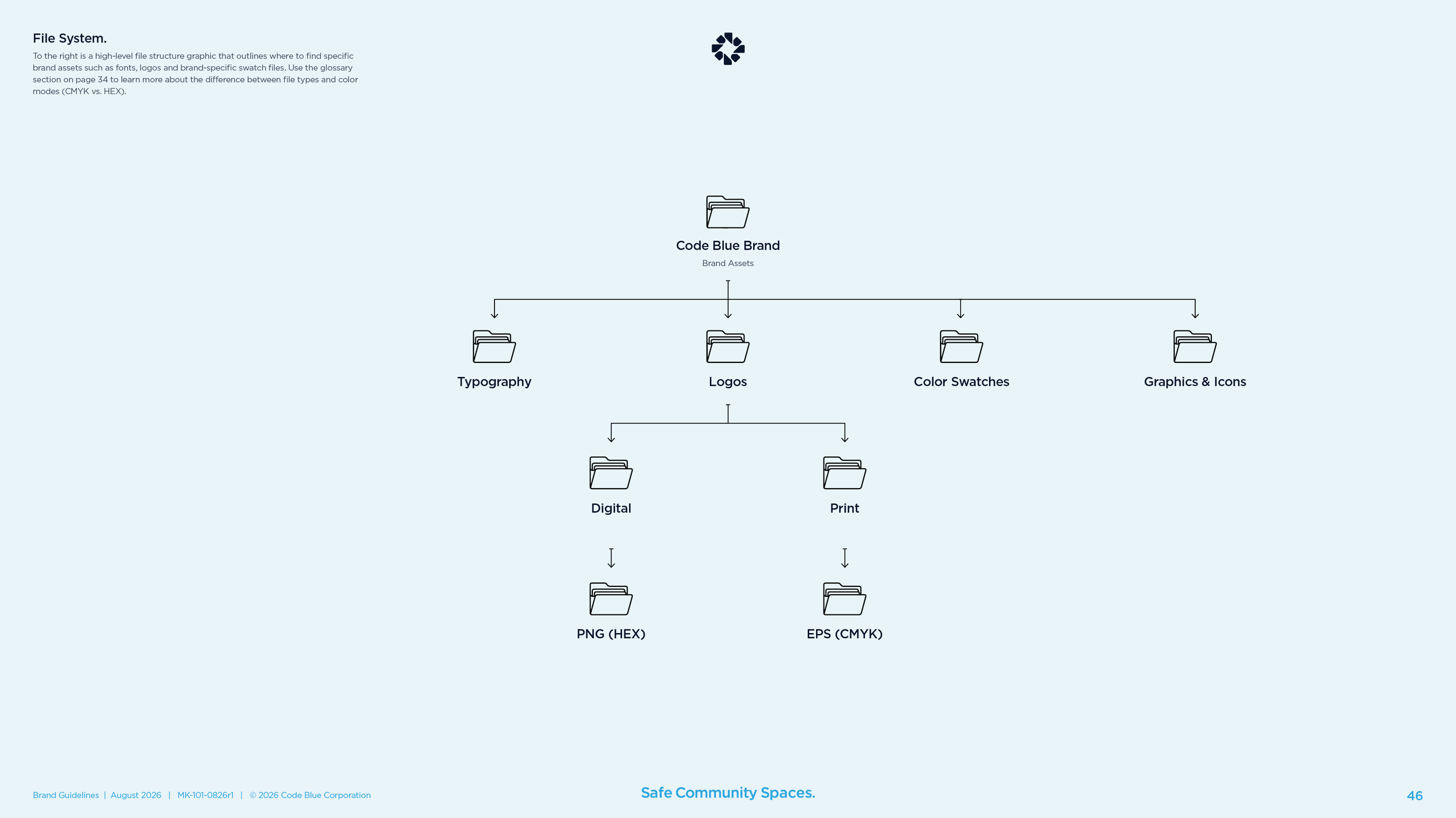
Every version of the logo in print and screen formats, in one color, two colors, white, black, and the gradient, with bundles cut for partners and for the website team, so nobody rebuilds the mark from a screenshot.
The master file
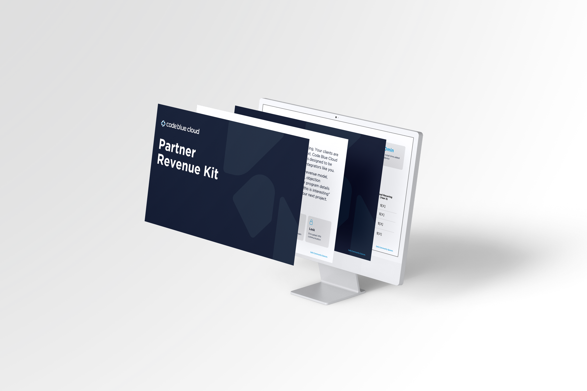
The InDesign master went to Code Blue with the files. The company now keeps the book under its own document number and has already revised it as the product line grew, adding three more products to the symbol placement page.
The results
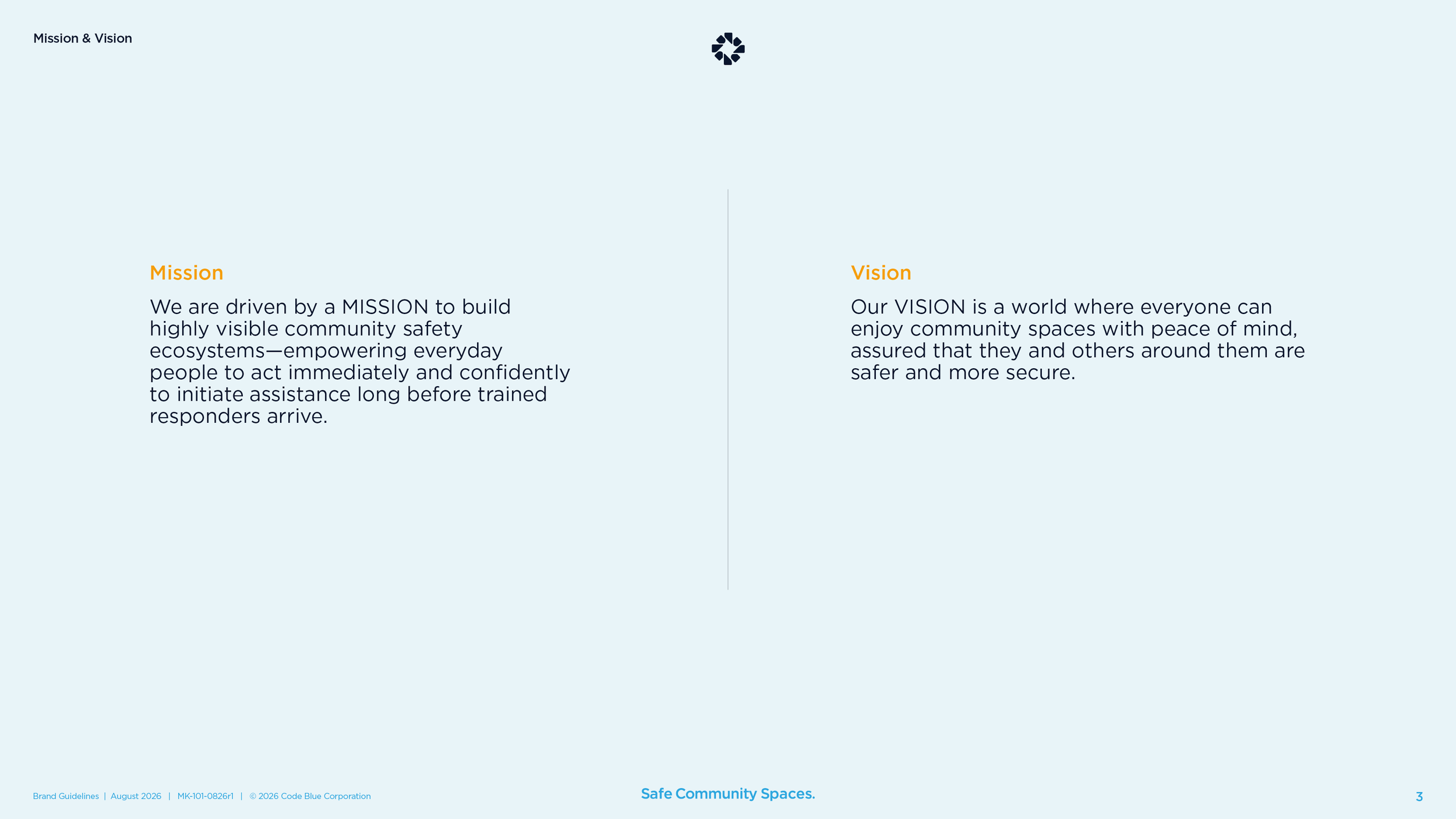
The identity project kicked off in September 2025. The leadership team chose the symbol by the end of October, and the first brand guidelines shipped in November. By spring the new brand was on the website, the 2026 product catalog, the trade show booth, and the partner logo kit, and the logo had its own animation. The guidelines Code Blue carries today open with the same three sentences we wrote with them, word for word. The tagline named a campaign. And when someone asks what Code Blue is, the company has a one-line answer. It is a security, network, and technology company committed to aiding and enhancing community safety, and its commitment goes far beyond the blue light.
FAQ’s
-
It is the decision about what your company is, who it is for, and why someone should buy from you instead of the next line in the catalog. Code Blue made the original blue light phone and was still shopped on price, because the position in the buyer’s mind was “phone.” Positioning changes what the buyer compares you to. The logo, the website, and the sales sheets come after, and they all get easier. Here is how we do brand positioning for manufacturers.
-
Positioning first. A logo makes a promise in one picture, so you need to know the promise first. Code Blue took its position to final before anyone sketched a symbol. When the design work started, every choice had something to answer to, and the leadership team made its calls in two review meetings.
-
It is one company name over everything the company sells. Products carry a plain descriptor and lock up under the master brand the same way. The other choices are a house of brands, where each product is its own brand, and an endorsed model in between. Code Blue chose a branded house because one name was already known and every new product could borrow from it.
-
Longer than the logo. Code Blue’s work ran about a year and a half from discovery to the first brand guidelines, and the identity itself took about three months once the position was final. Then the real work started, which is getting the brand onto every product, page, and sheet. Plan on the order, then plan on the rollout. We wrote brand guidelines the same way for Stiles Machinery and National Heritage Academies, and a full rebrand for a manufacturer is its own page.
Services
Brand discovery · Brand positioning · Brand architecture · Tagline · Logo design · Identity system · Color system · Typography system · Iconography · Brand guidelines · Logo production files · Sub-brand lockups · Stationery and templates · Video standards
Known for one product when you have become a lot more? Start with what is true.
Start a conversation
Wit & Craft is the brand agency for owner-led manufacturers and trades, in Grand Rapids, Michigan, since 2015.