How Upfit Supply grew into a brand for the trades
Wit & Craft repositioned Upfit Supply, the online store where tradespeople buy the shelving, racks and liners to outfit their own work vans, and built the brand the company had grown into. It started in 2021 as an experiment with a logo bought on Fiverr, and the business soon outgrew the logo. Customers found it by searching for a part number, bought once, and went back to the search bar the next time. So we did the work in order. First we found out what was true about the company and wrote it down as a position. Then we drew a symbol a tradesperson would wear on a hat, built the identity around it, and wrote a 53-page book of brand guidelines. Then we planned the launch. The new brand went live in June 2025, on the website, the videos, the shirts and the business cards.
The challenge
Upfit Supply sells the equipment that turns a cargo van into a mobile workshop. Shelving, ladder racks, floor liners, partitions, locks and steps, more than 4,000 products from the brands tradespeople already know, shipped to the door with a video that shows how to put them in. The founder started the company in 2021 as an experiment, a place to apply what he knew about digital marketing to a brand of his own. He bought a logo on Fiverr to get the site up. The experiment worked, and the logo stayed.
By 2024 the brand had not kept up. On our first call the founder said the logo looked elementary and the marketing felt like one-off pieces with the logo stuck on. Our discovery work that fall found the same three weaknesses from every angle. Little awareness beyond the people already searching for a part. A transactional business, where a customer bought once and went back to Google the next time. And a reputation built on price, which is the easiest thing for a competitor to match.
The biggest direct competitors were established distributors whose websites had been an afterthought, and the install videos and guides Upfit Supply had made for years put it ahead of all of them on content. What the company wanted was to be remembered, with a brand a customer would think of when the next van arrived and its own people would be proud to wear. It had held off on shirts, hats and trademarks until it had a logo worth putting on them.
Why we started with the words
A new logo was the ask, and it would have been the fastest way to put a fresh coat on a brand nobody could describe. So the work ran in order. Discovery first, in a workshop with the team and a hard look at the market. Then the position, the few sentences that say why Upfit Supply exists, how it works and what it is. Then the identity, with every design decision answering to those sentences. The order paid off in the logo reviews. When the team could not agree on a symbol, the question was never which one looked best. It was which one said we exist to empower tradespeople, and which one a tradesperson would wear.
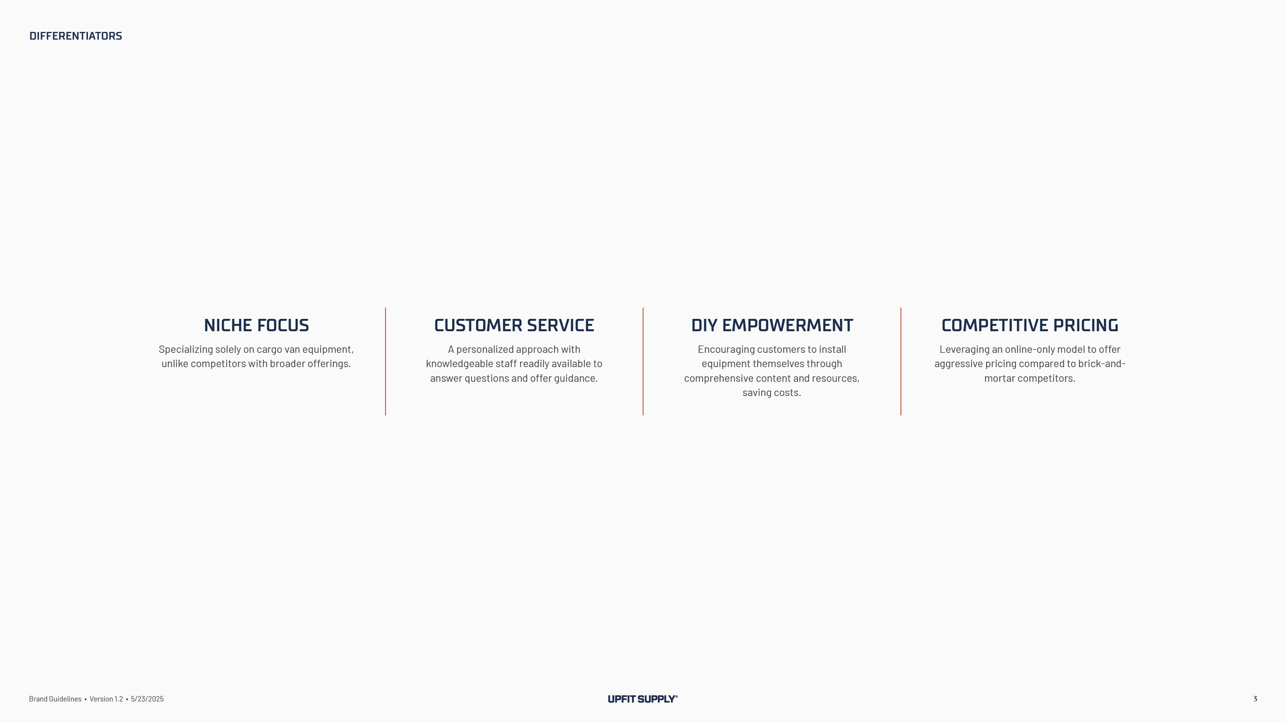
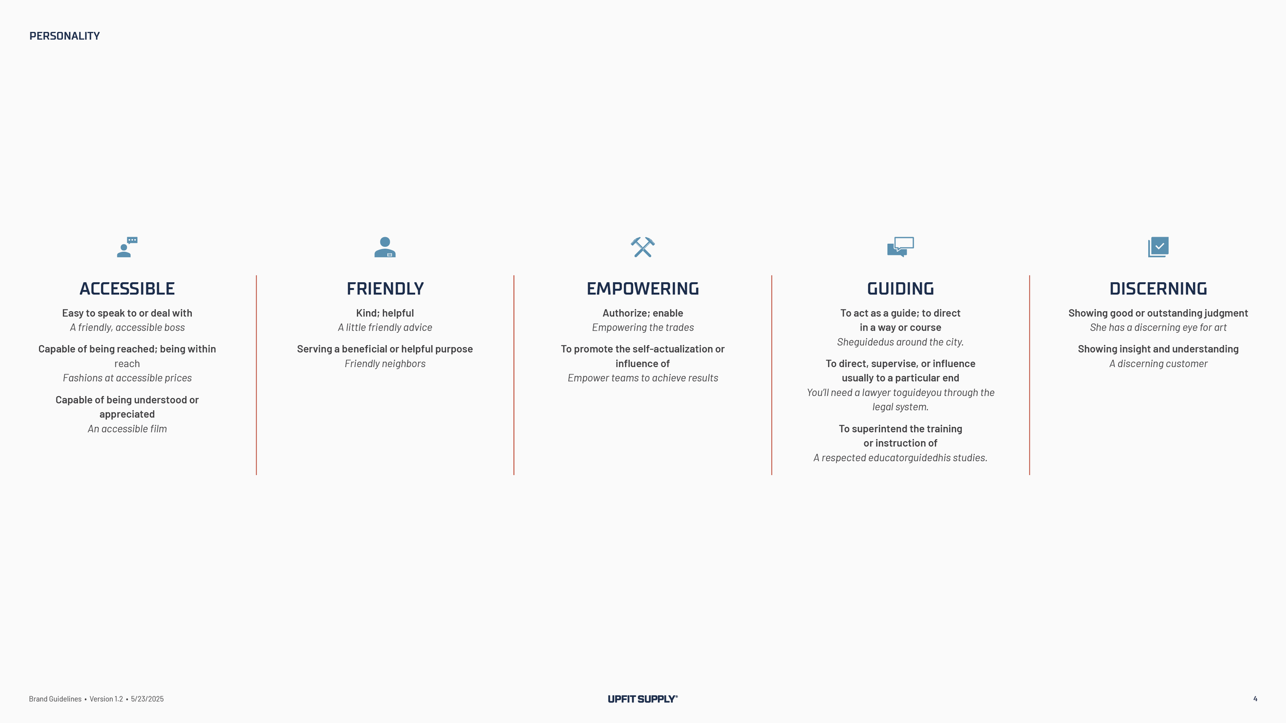
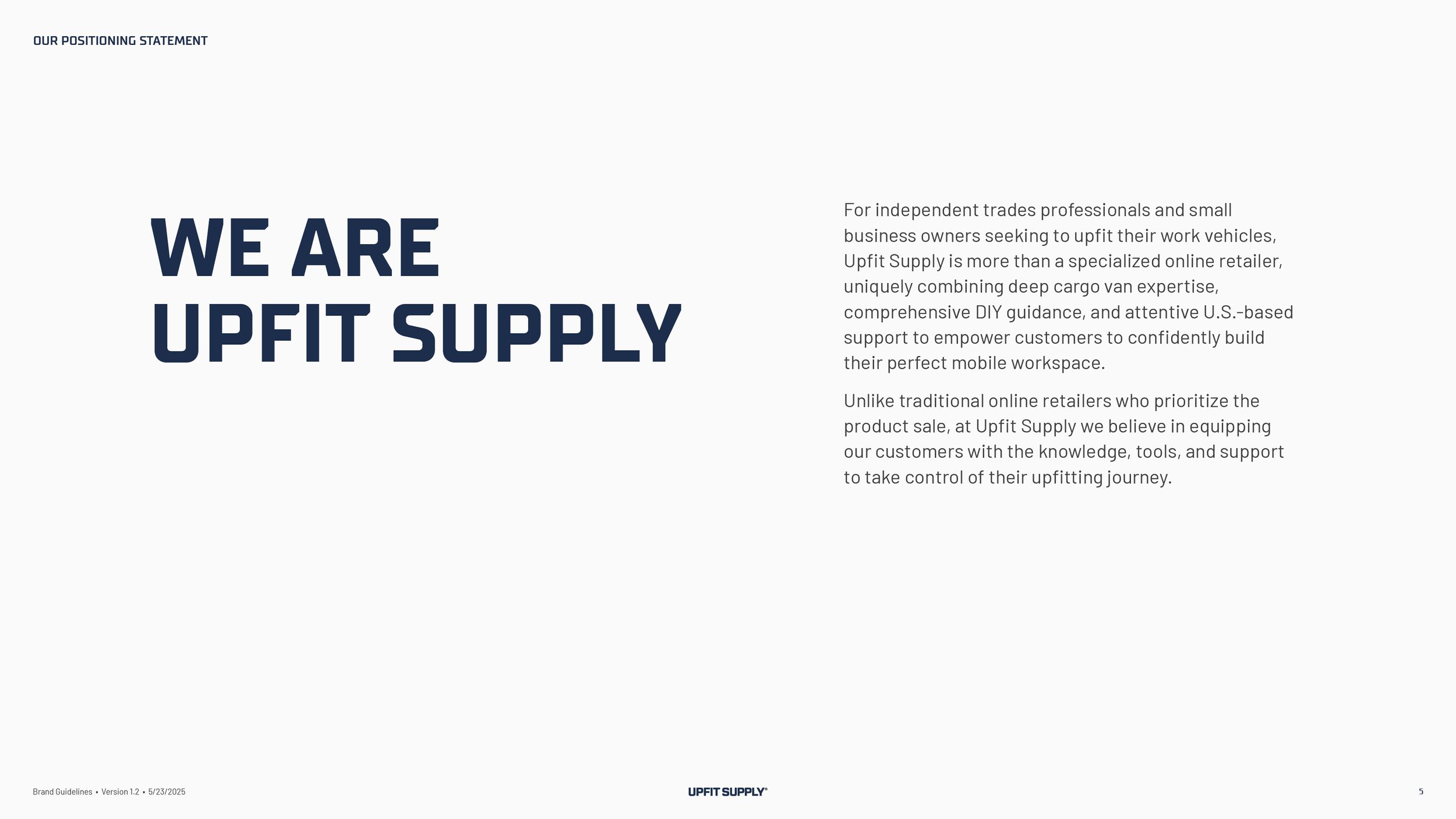
The position named four things that set the company apart. A focus on cargo vans and nothing else. People who answer the phone and know the product. Content that teaches a customer to install the part without paying an installer. And prices an online-only store can hold. It gave the brand five traits, accessible, friendly, empowering, guiding and discerning. And it drew the line the positioning statement turns on. Most online retailers are built to close the sale. Upfit Supply is built to hand the customer the knowledge, the tools and the support to take control of the job.
The Brand Position
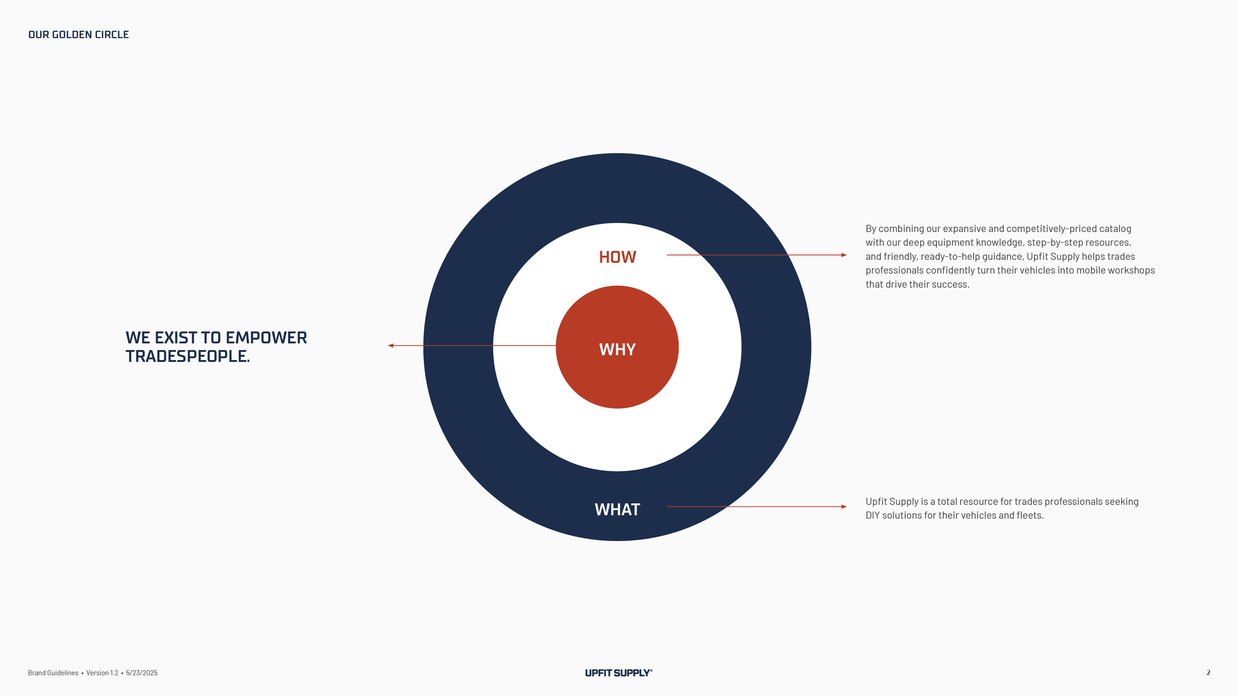
Why.
“We exist to empower tradespeople.” Five words, and the brand guidelines open with them.
How.
“By combining our expansive and competitively-priced catalog with our deep equipment knowledge, step-by-step resources, and friendly, ready-to-help guidance, Upfit Supply helps trades professionals confidently turn their vehicles into mobile workshops that drive their success.” The catalog and the price sit in the same sentence as the knowledge and the help, on purpose.
What.
“Upfit Supply is a total resource for trades professionals seeking DIY solutions for their vehicles and fleets.” A resource first, and a store second.
The Brand Identity System
The symbol.
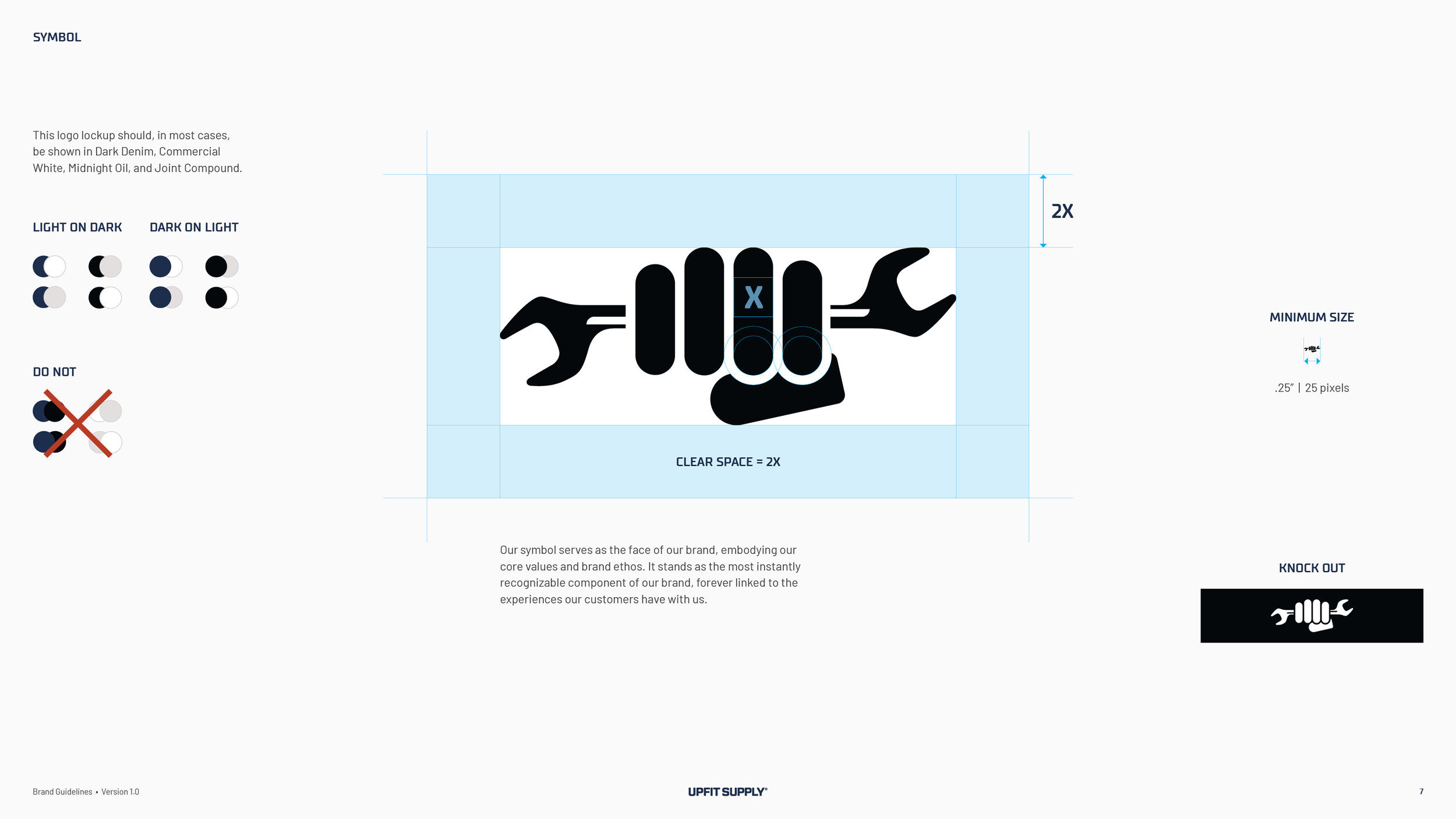
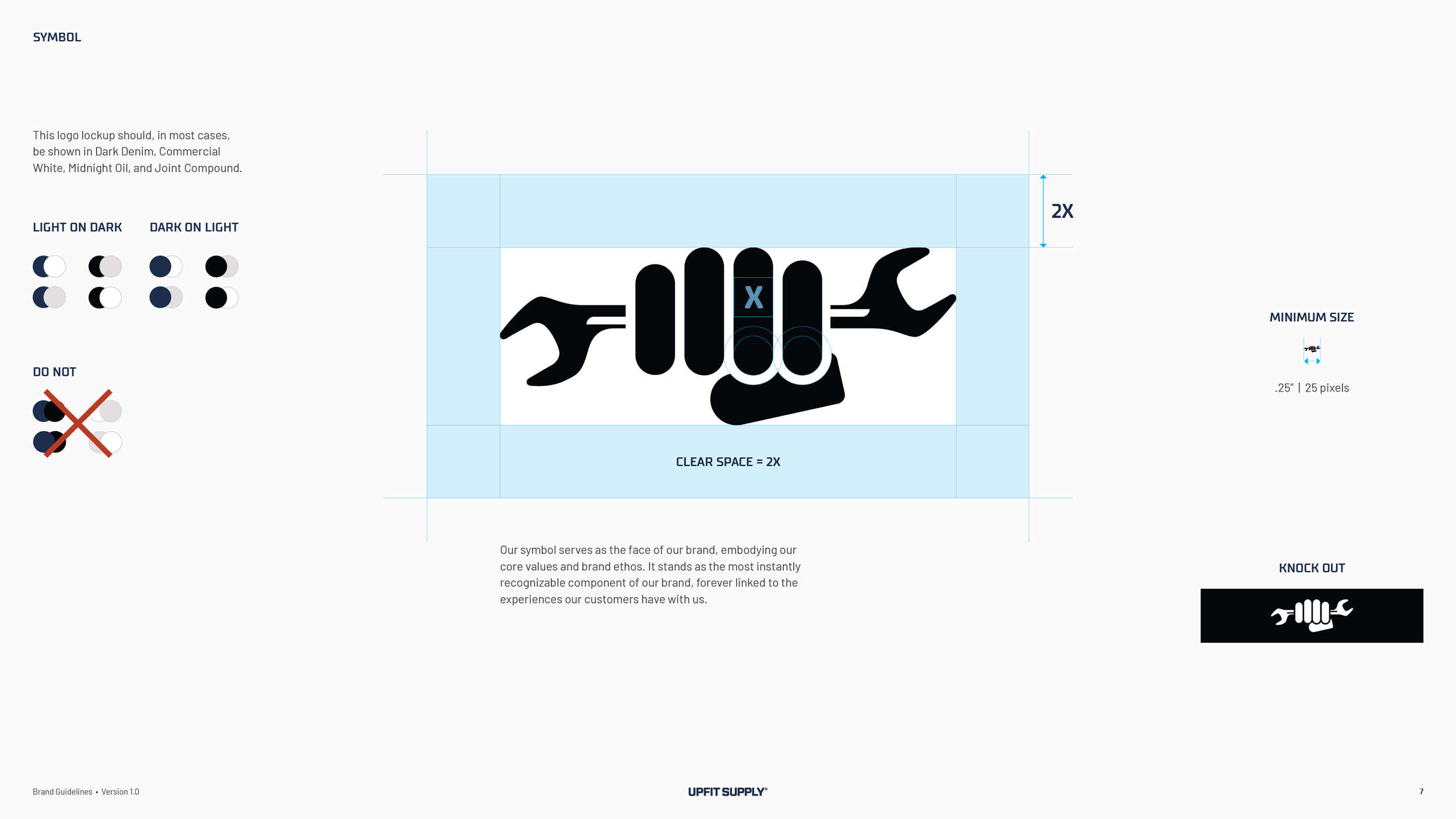
A fist around a wrench. The idea surfaced in a logo review, when the founder wondered whether the answer lay in a hand, and we drew it for the next round. It stands for the customer, a tradesperson who puts the part in with their own hands, and for the fist bump at the end of a good job. It is also the one symbol in the category that is not a set of initials. On the call where the team compared it with the competition, the founder lined up the other marks and found an AV, an AO, a WV, a US and an R. The symbol reads at a quarter inch, and it goes on a hat.
The logo system.
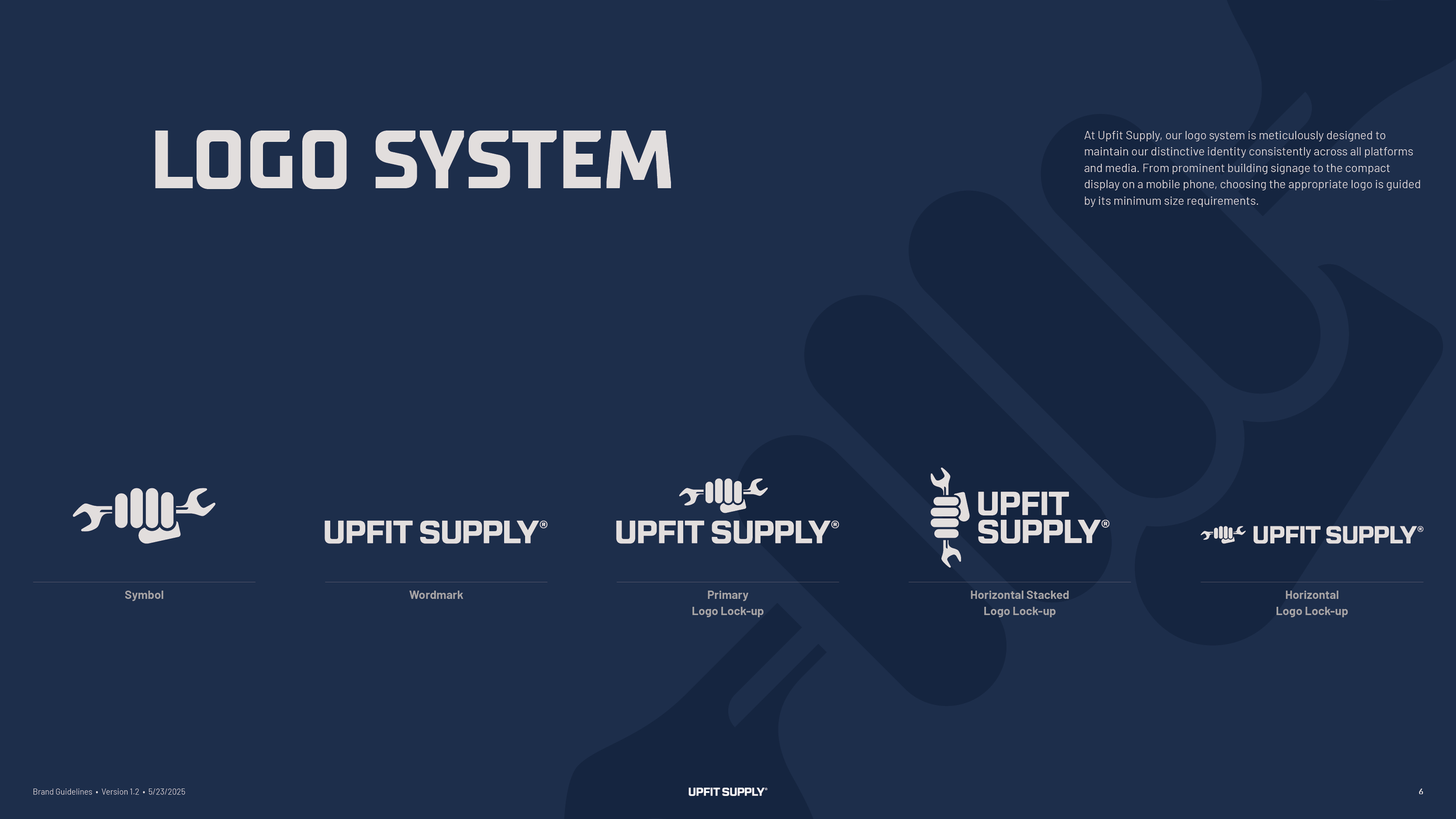
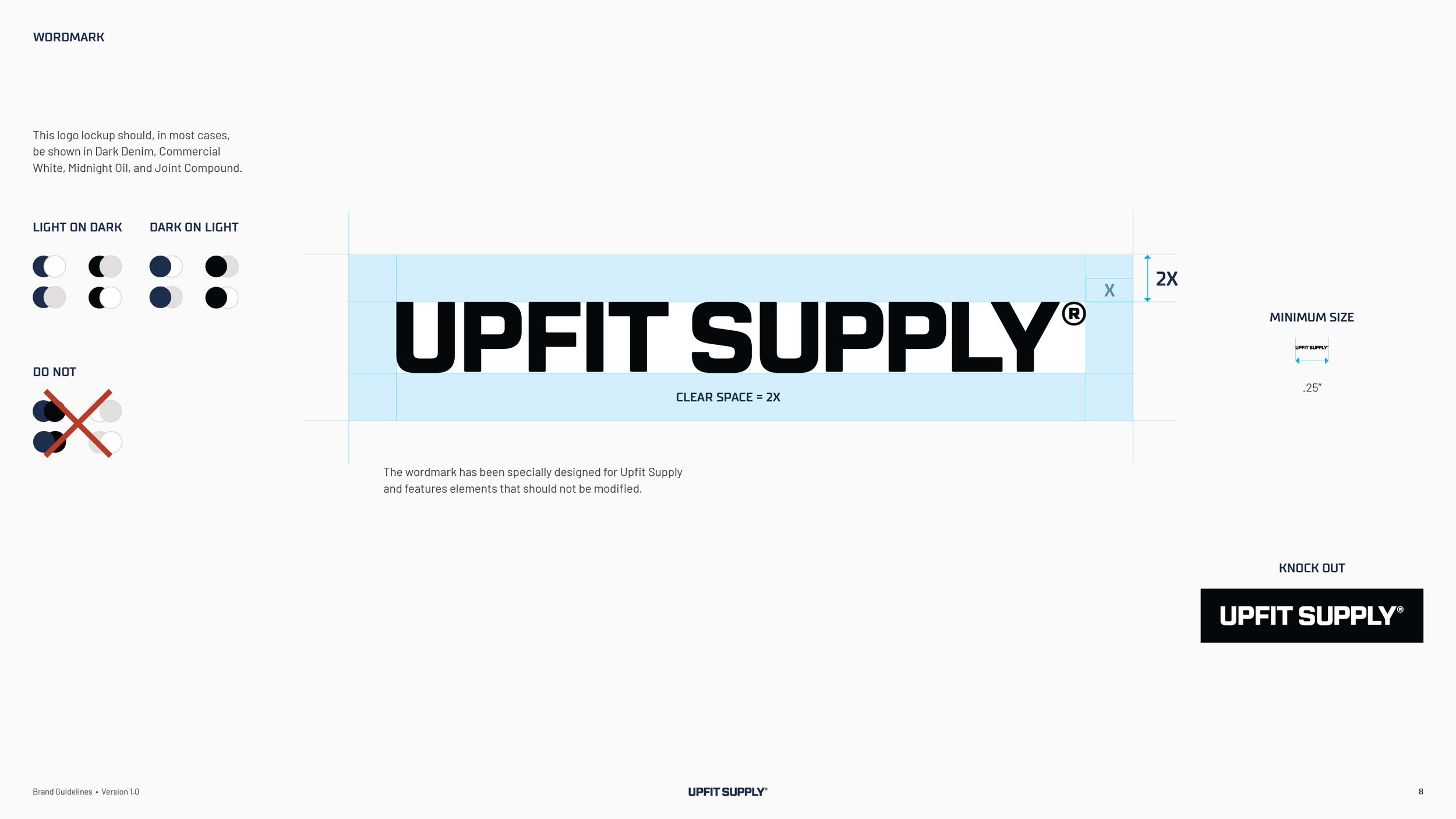
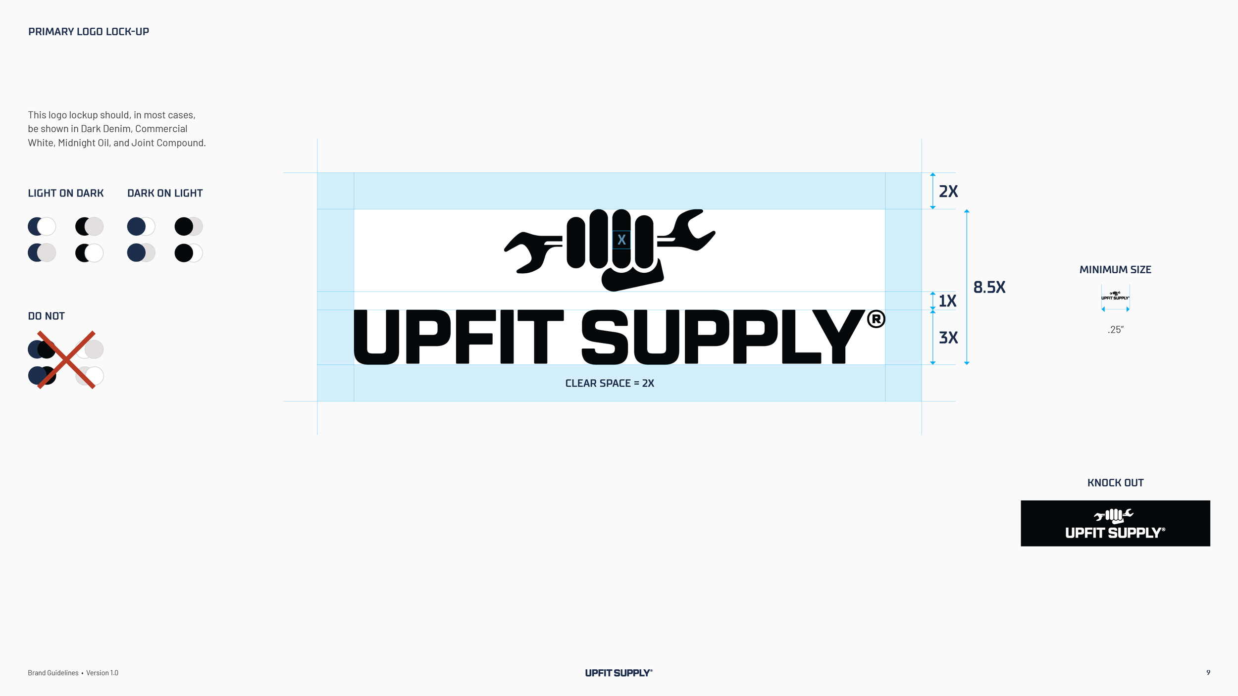
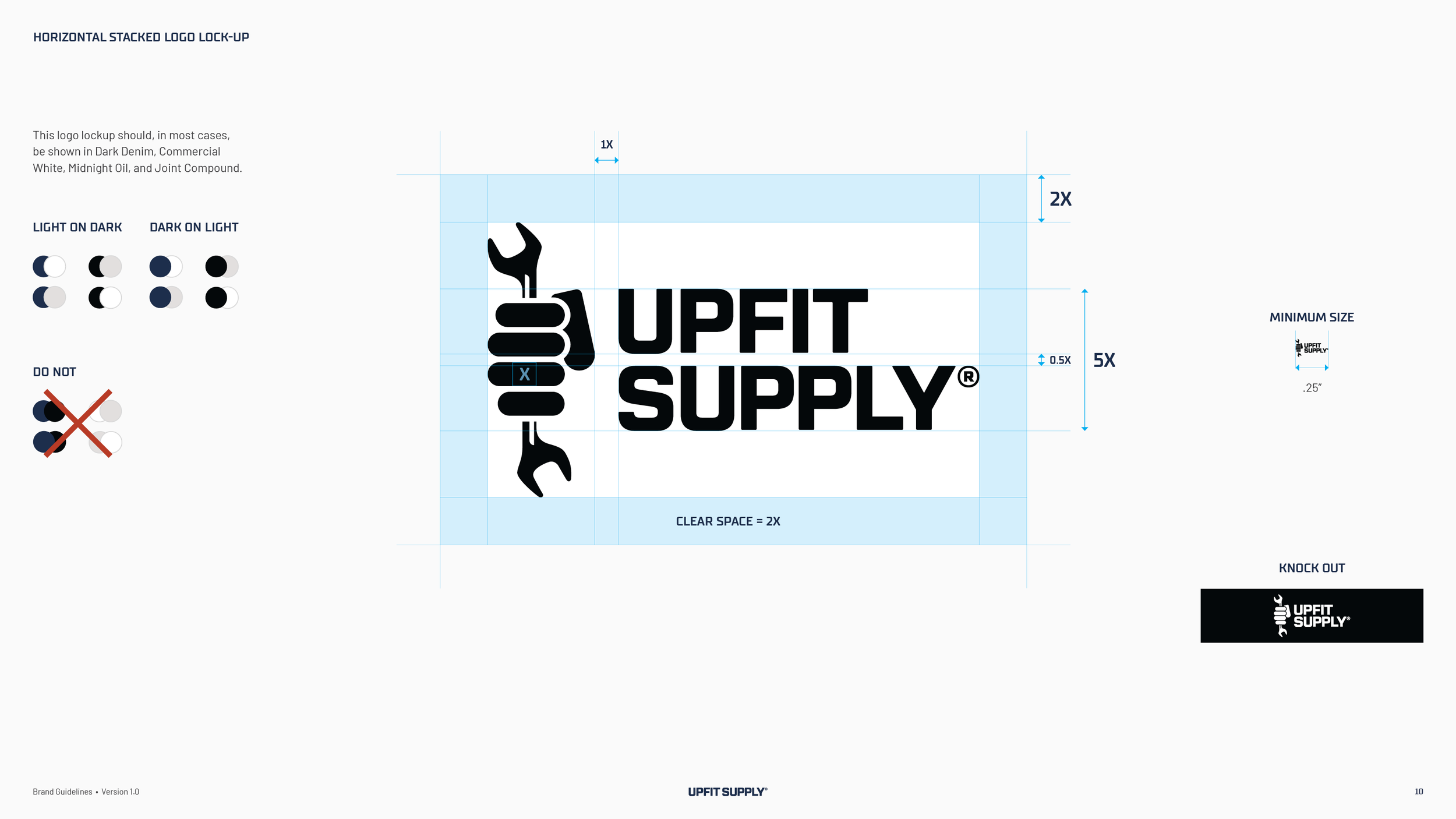
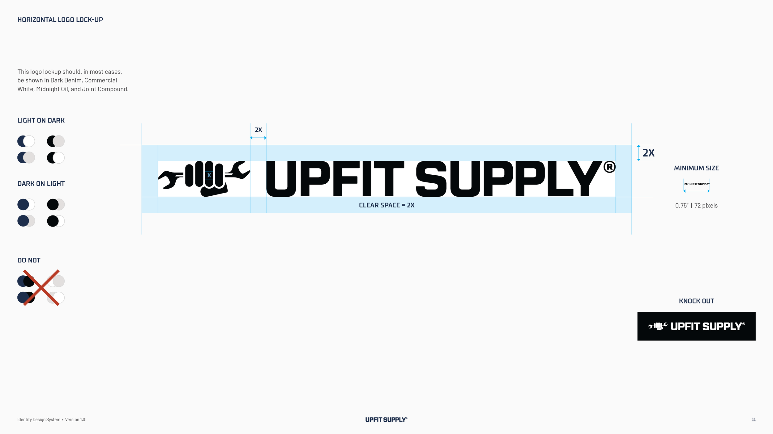
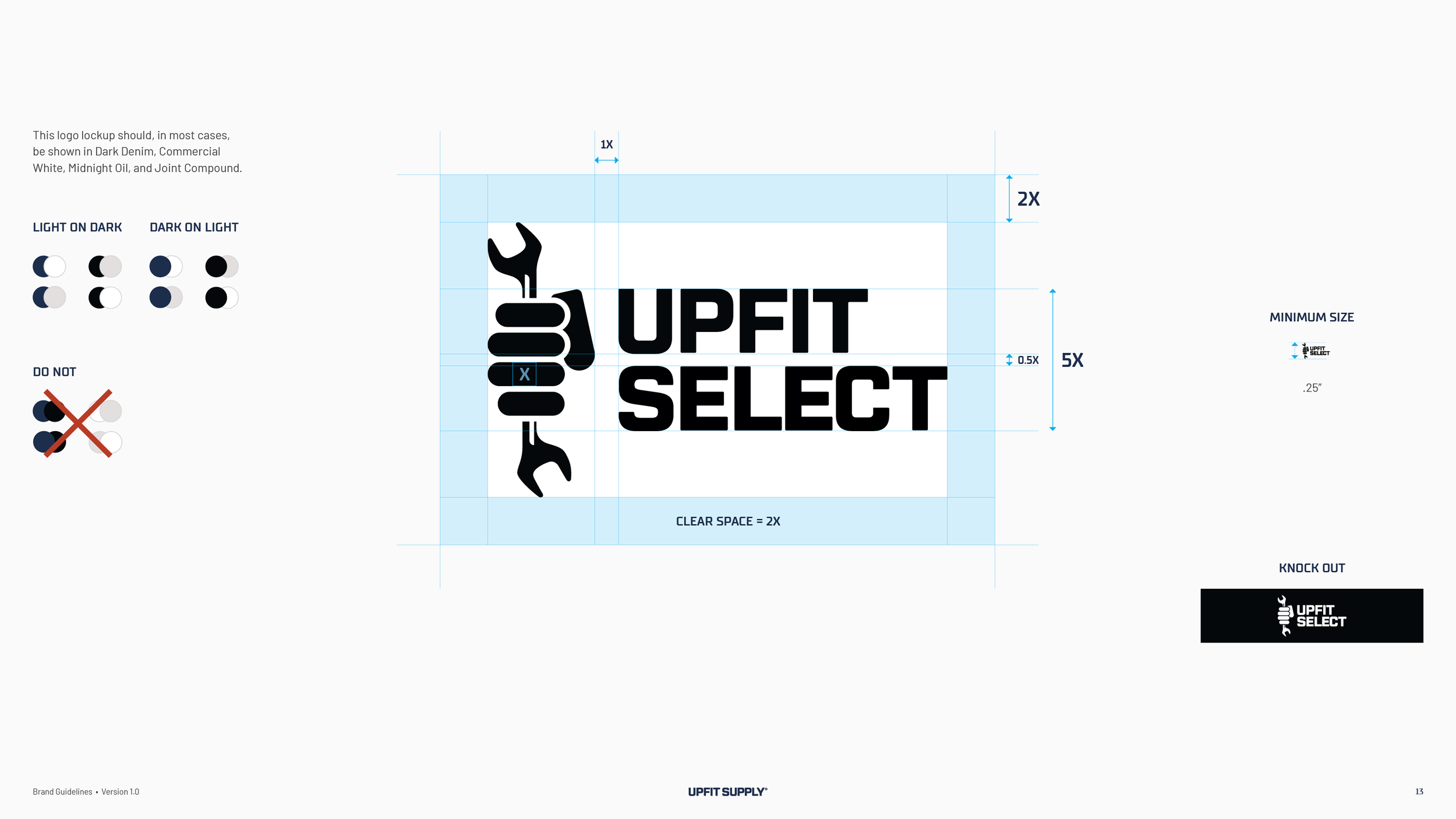
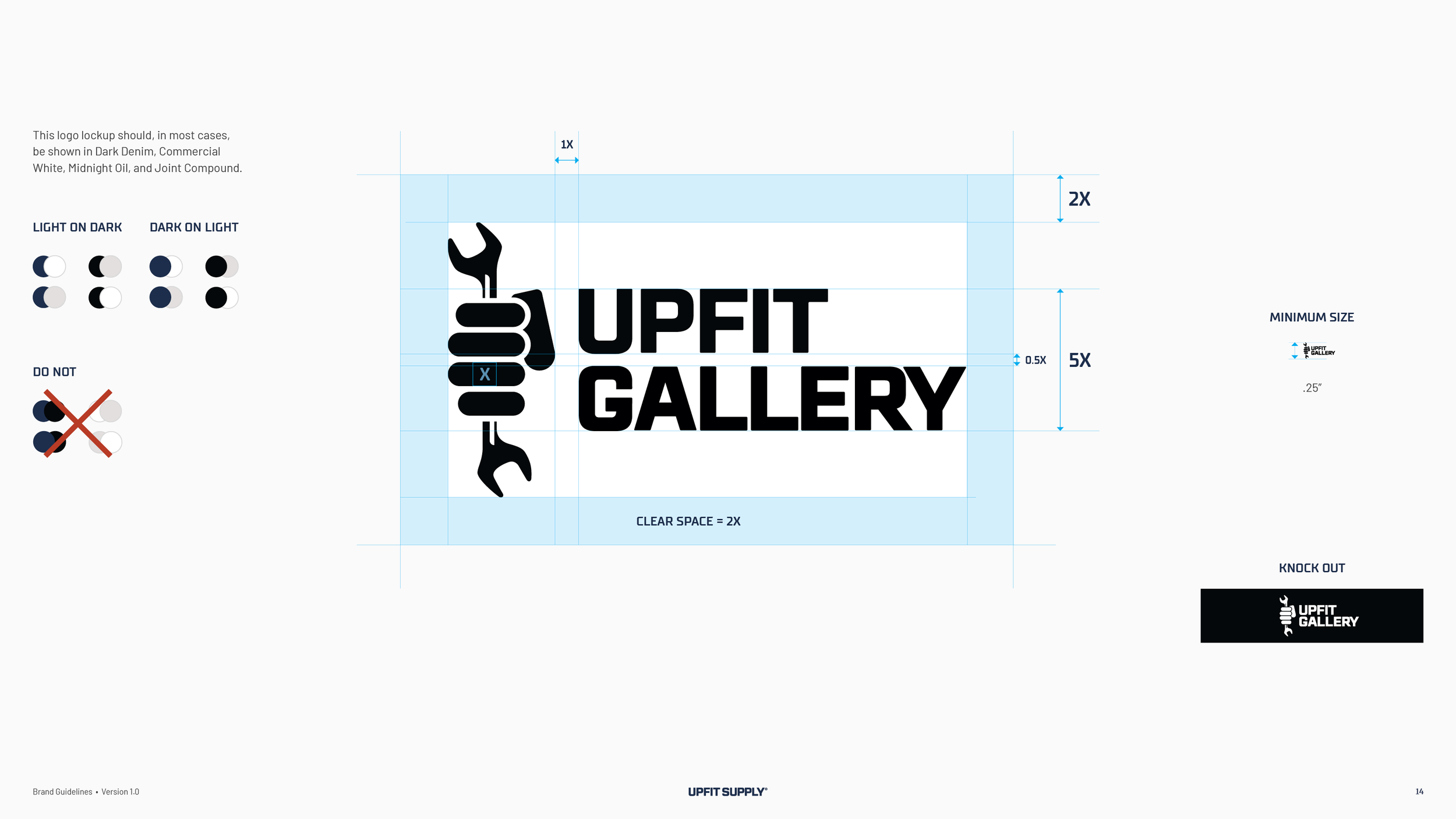
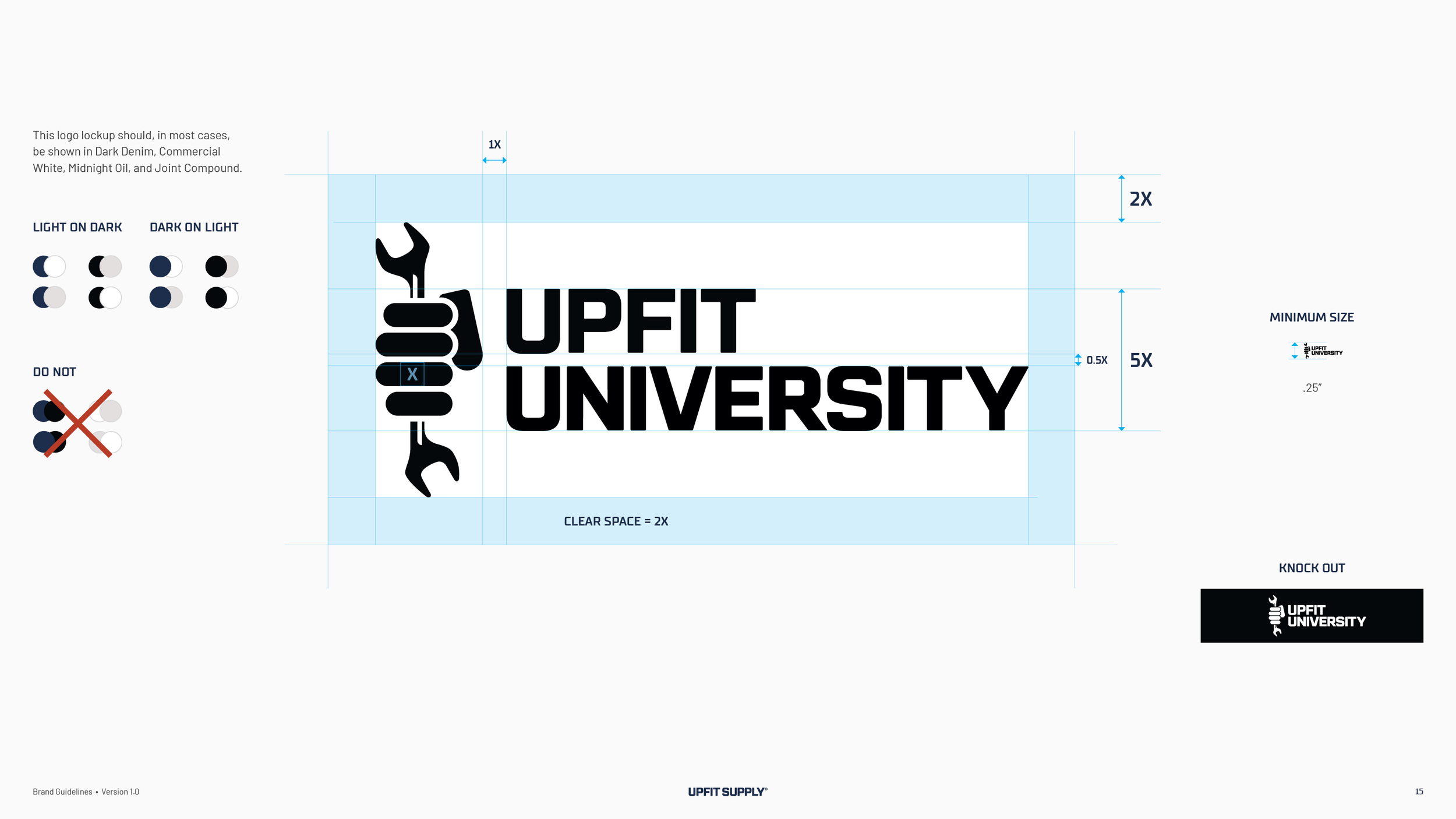
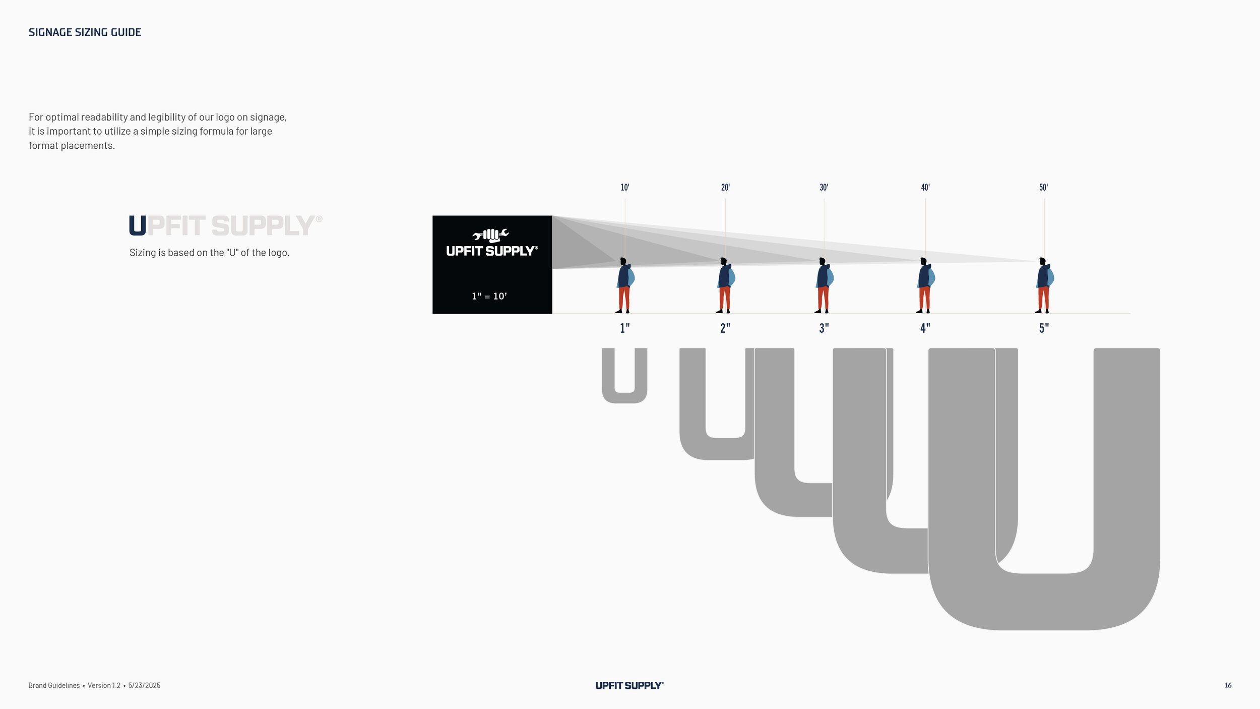
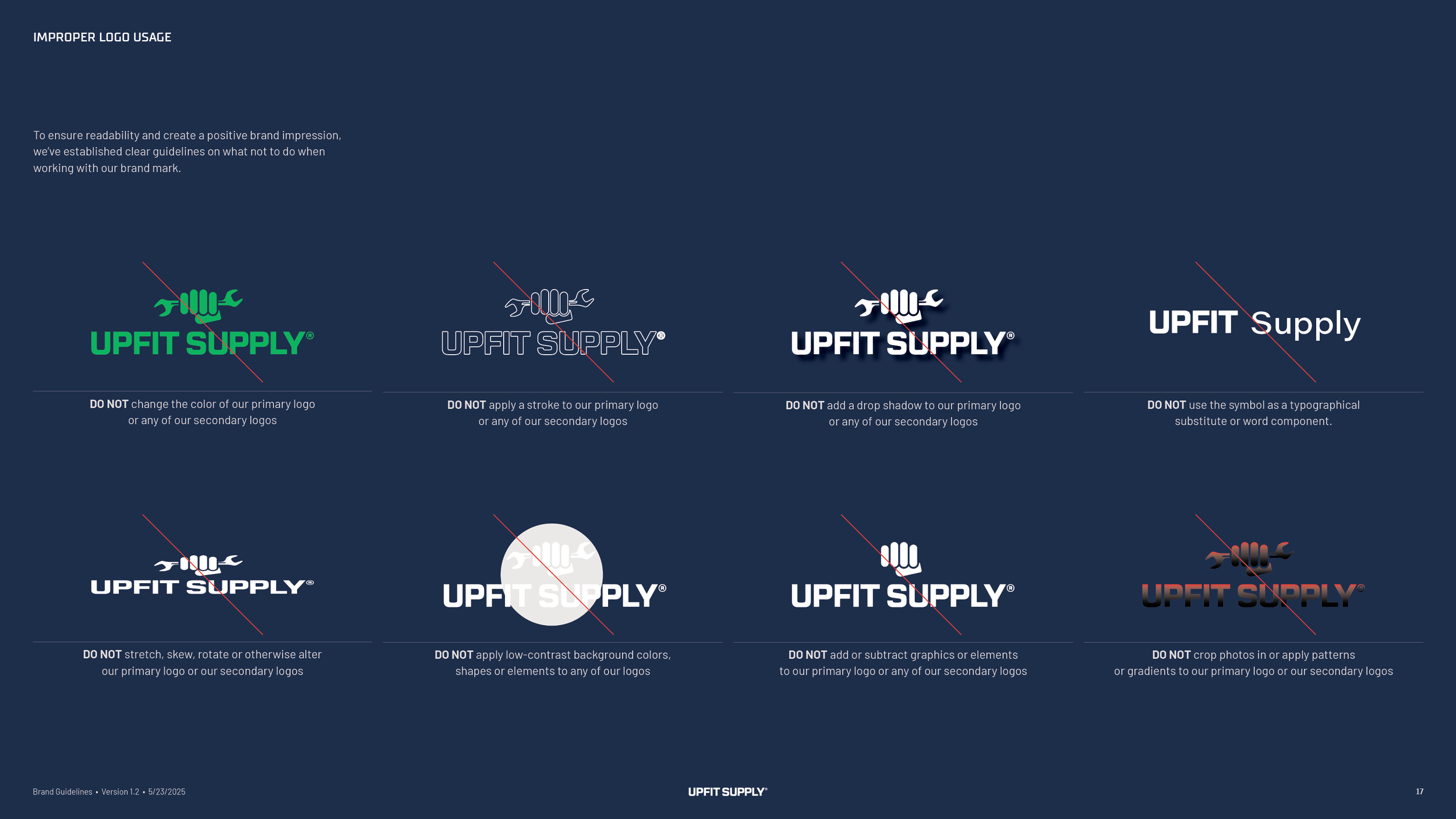
Five approved versions. The symbol alone, the wordmark alone, the primary lockup with the symbol over the name, a stacked version with the wrench turned upright beside the name, and a horizontal one for narrow spaces. Each has its clear space and minimum size, measured in a unit taken from the width of one finger on the fist, and a signage rule gives one inch of logo for every ten feet a reader stands away.
The badges.
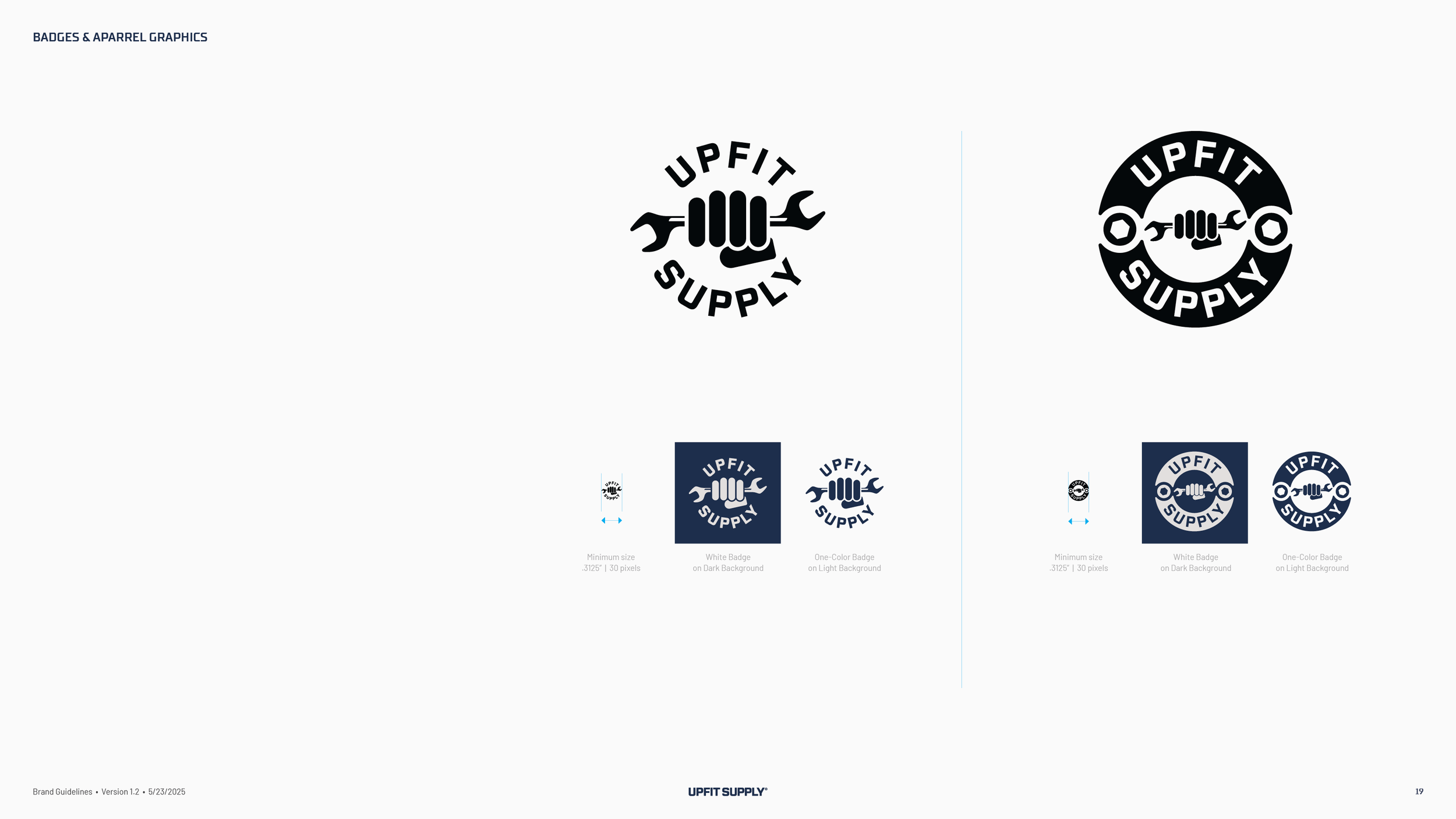
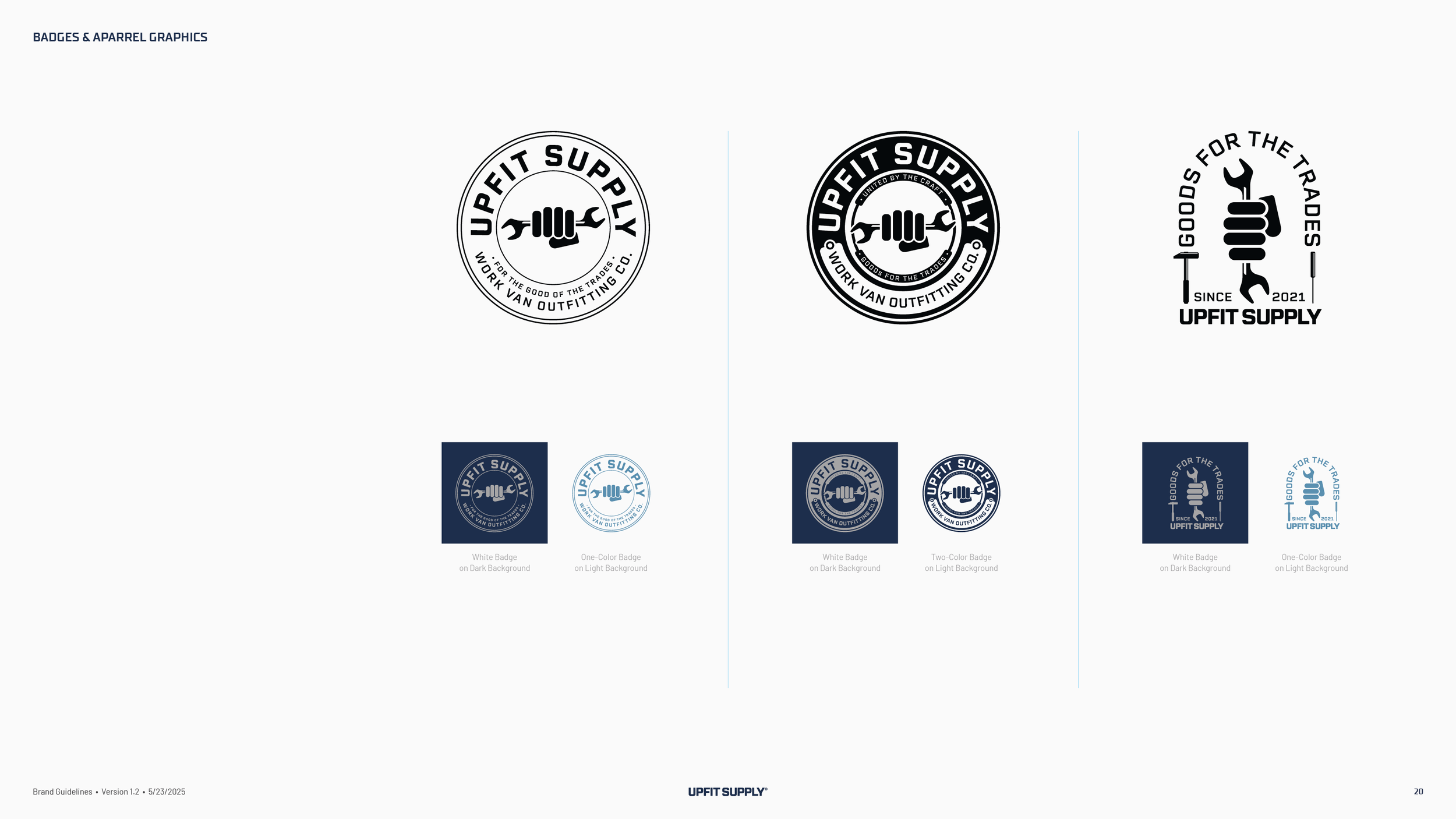
Two round badges, one with the name circling the symbol and one with hex bolts in the ring, built for shirts, hats, stickers and the shop banner. The badges survived from the first round of concepts, when the team liked them before it liked any symbol, and they are the piece the crew wears.
Color.
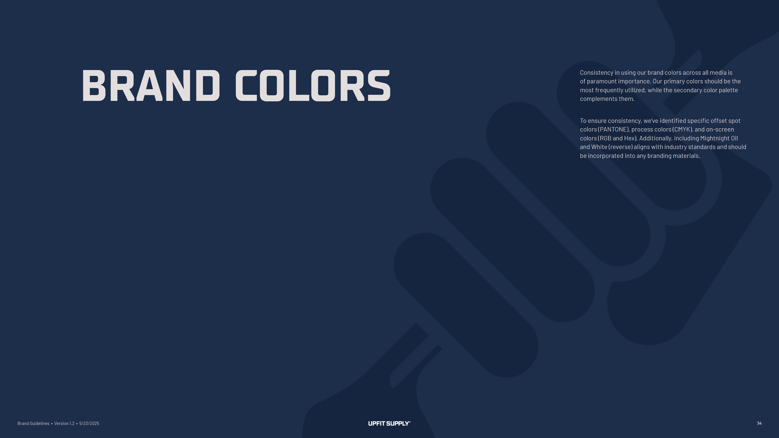
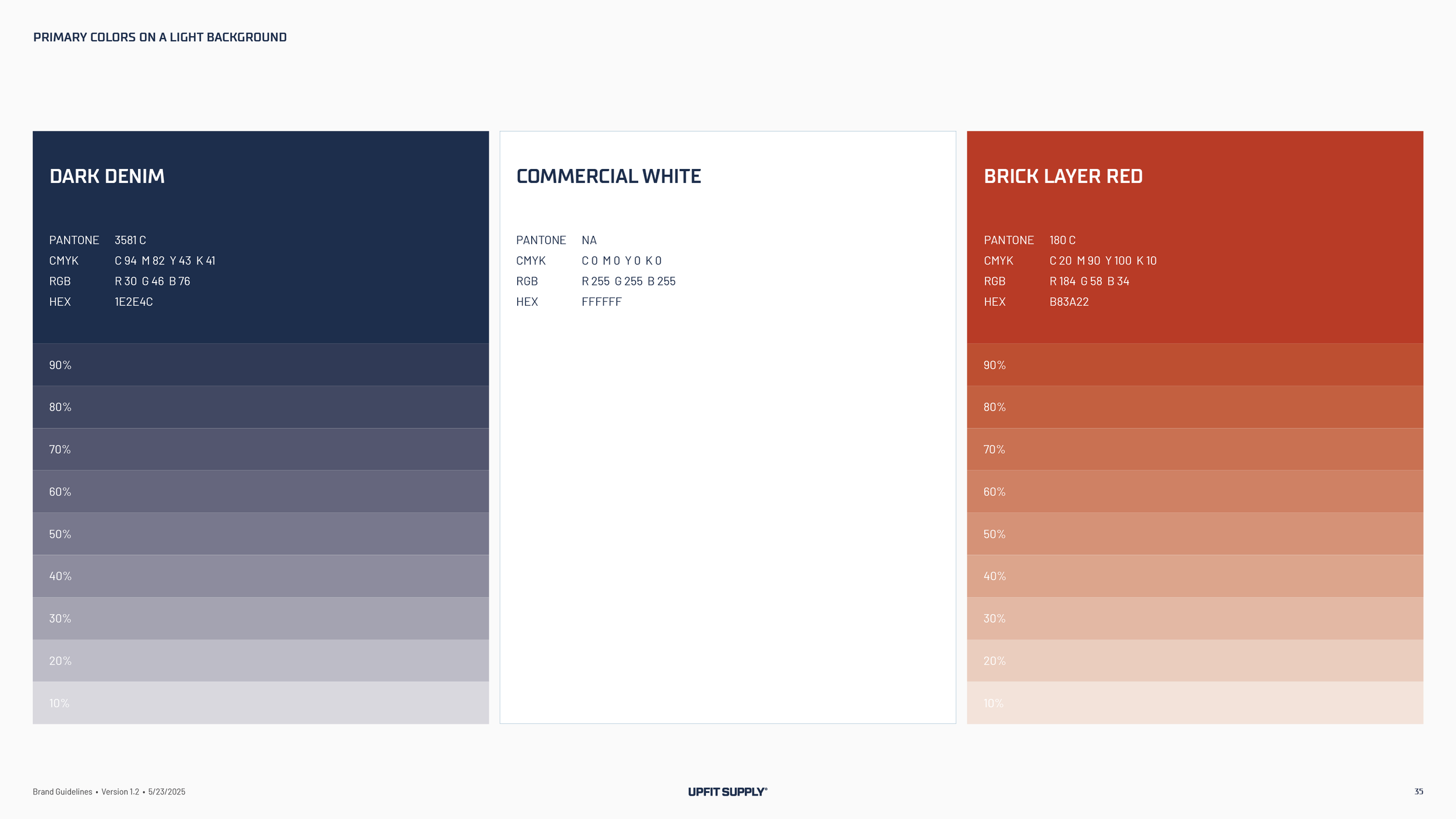
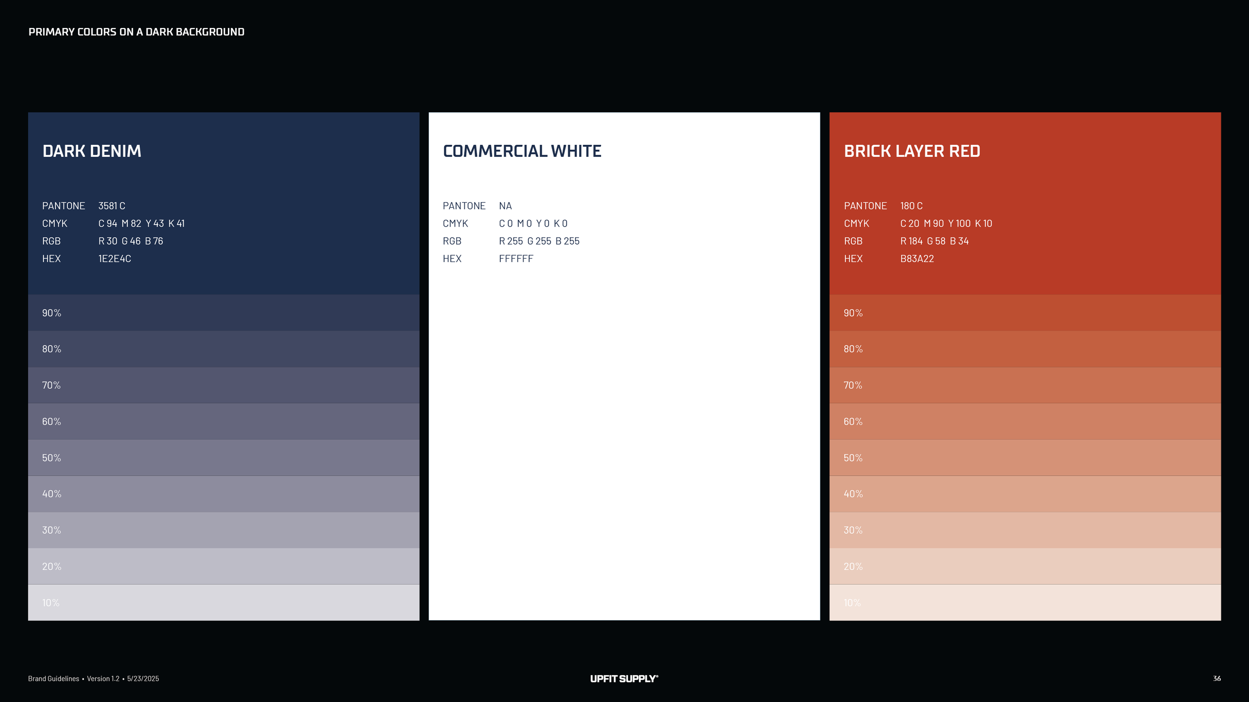
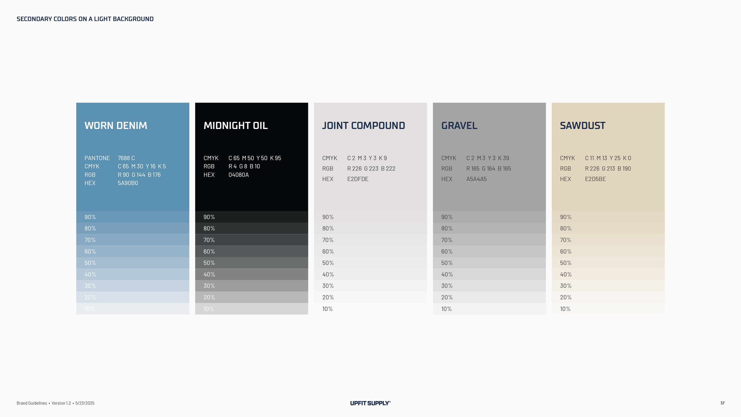
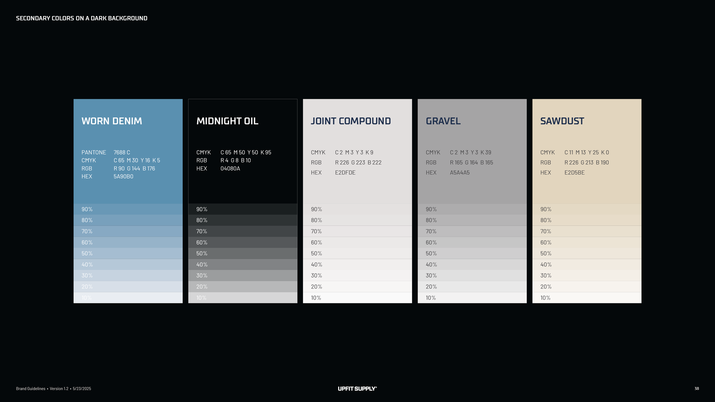
Three primary colors with job-site names. Dark Denim, Commercial White and Brick Layer Red. Five secondary colors named the same way, Worn Denim, Midnight Oil, Joint Compound, Gravel and Sawdust, each with a run of tints for light and dark backgrounds. The red was the one color the founder checked again before approving, because it had to hold up in print.
Typography.
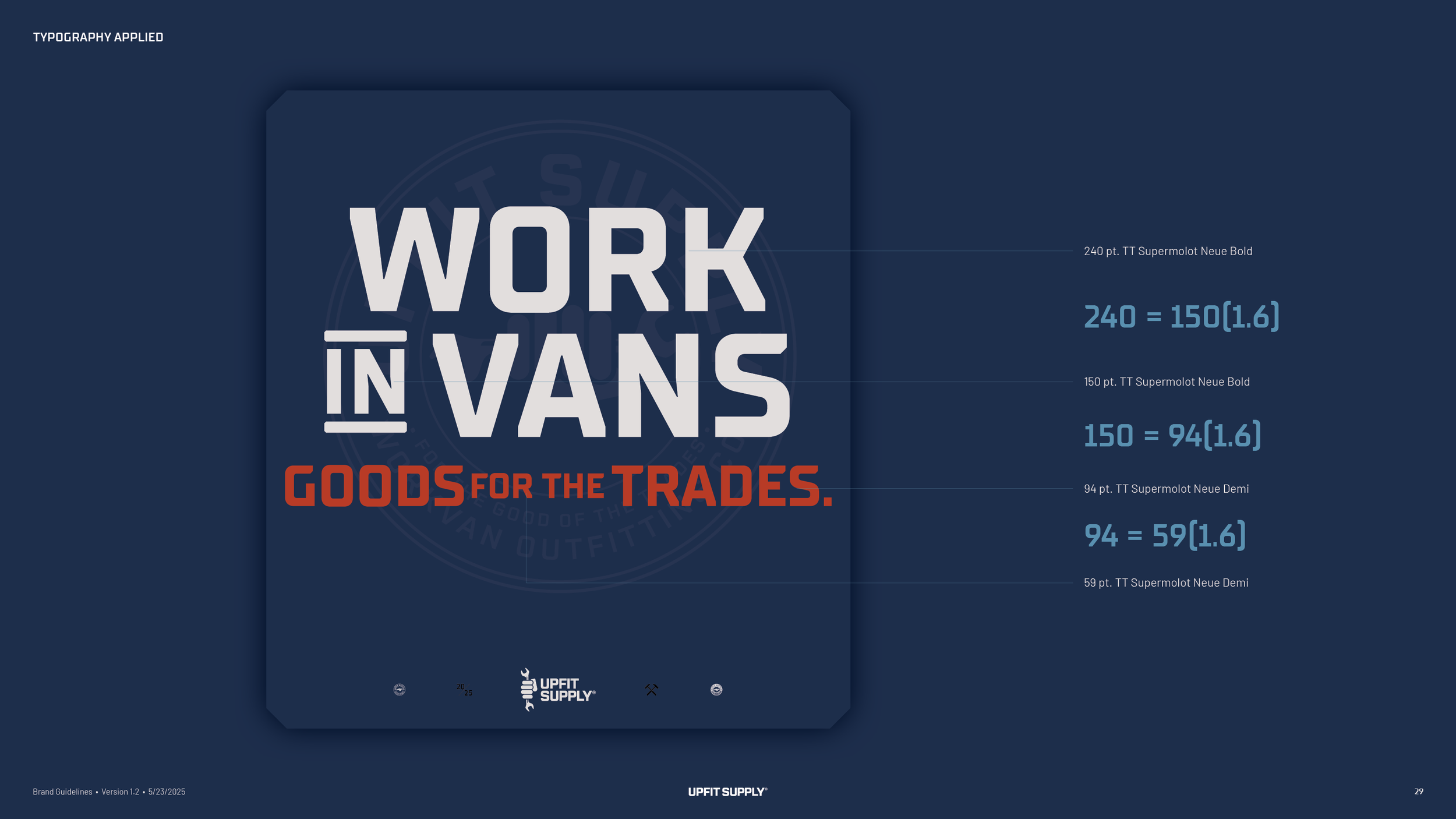
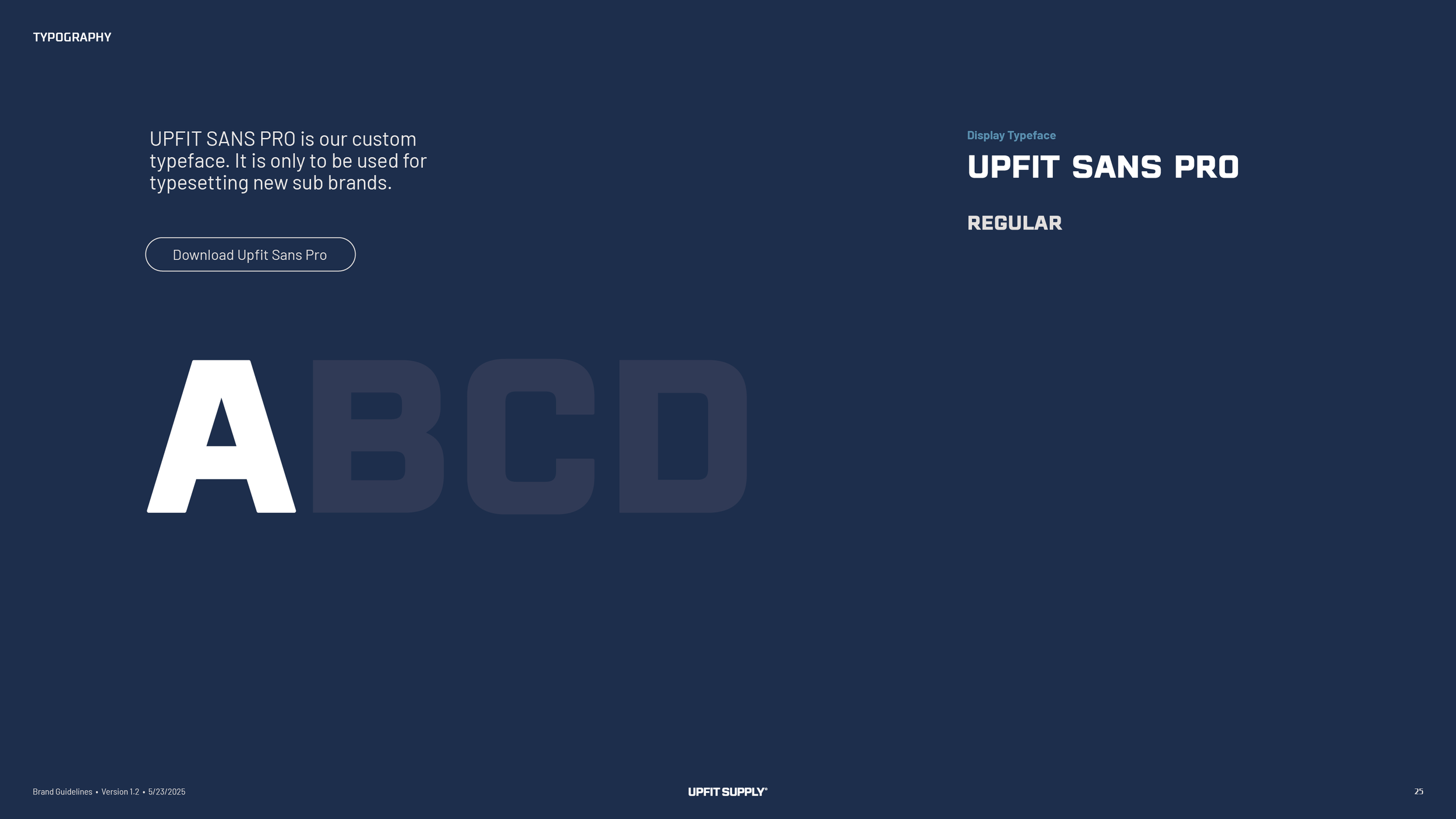
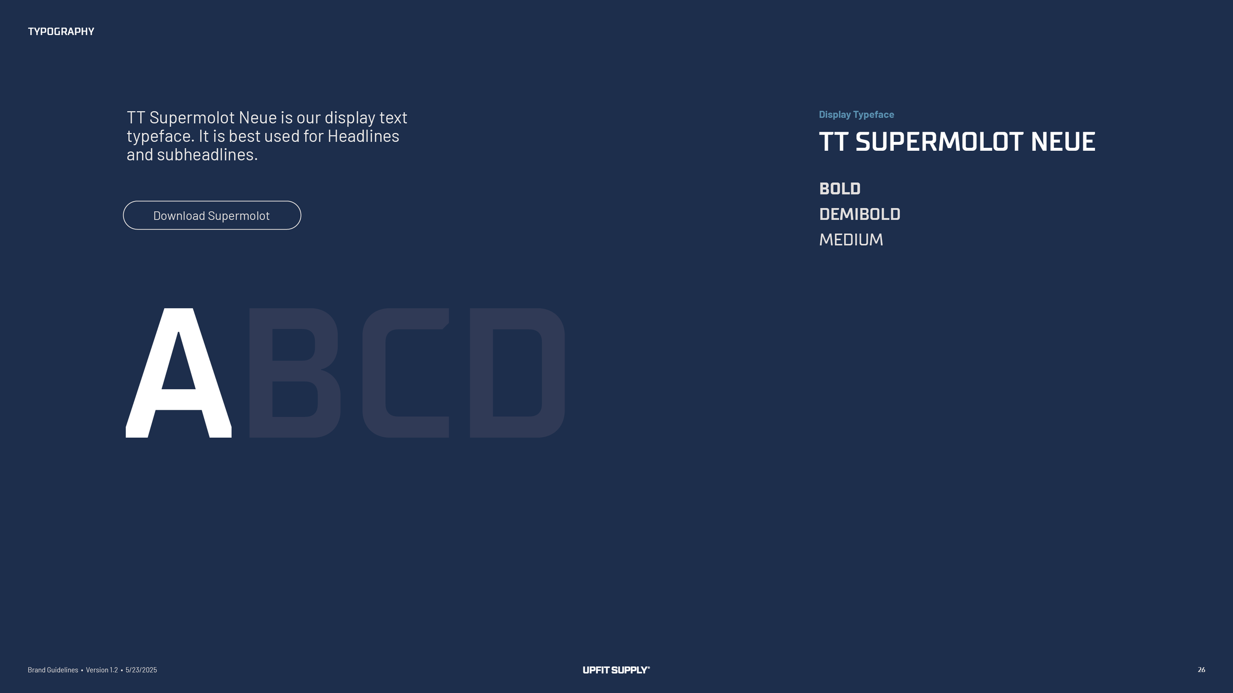
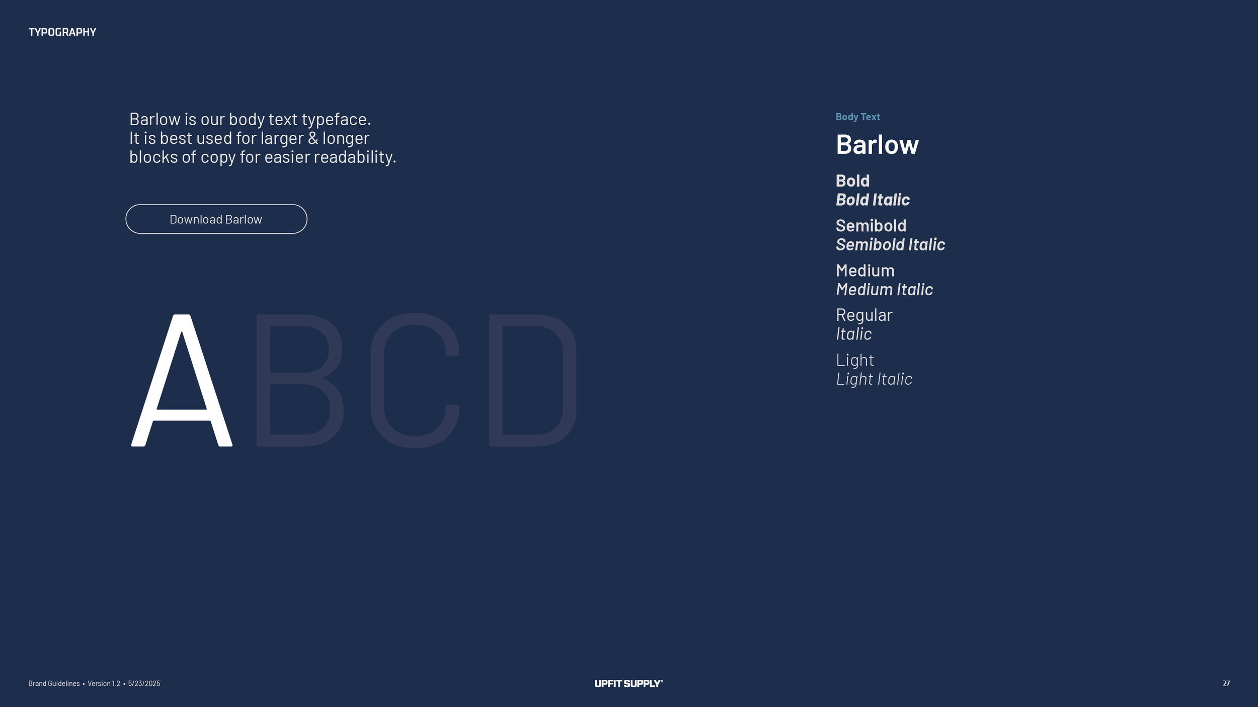
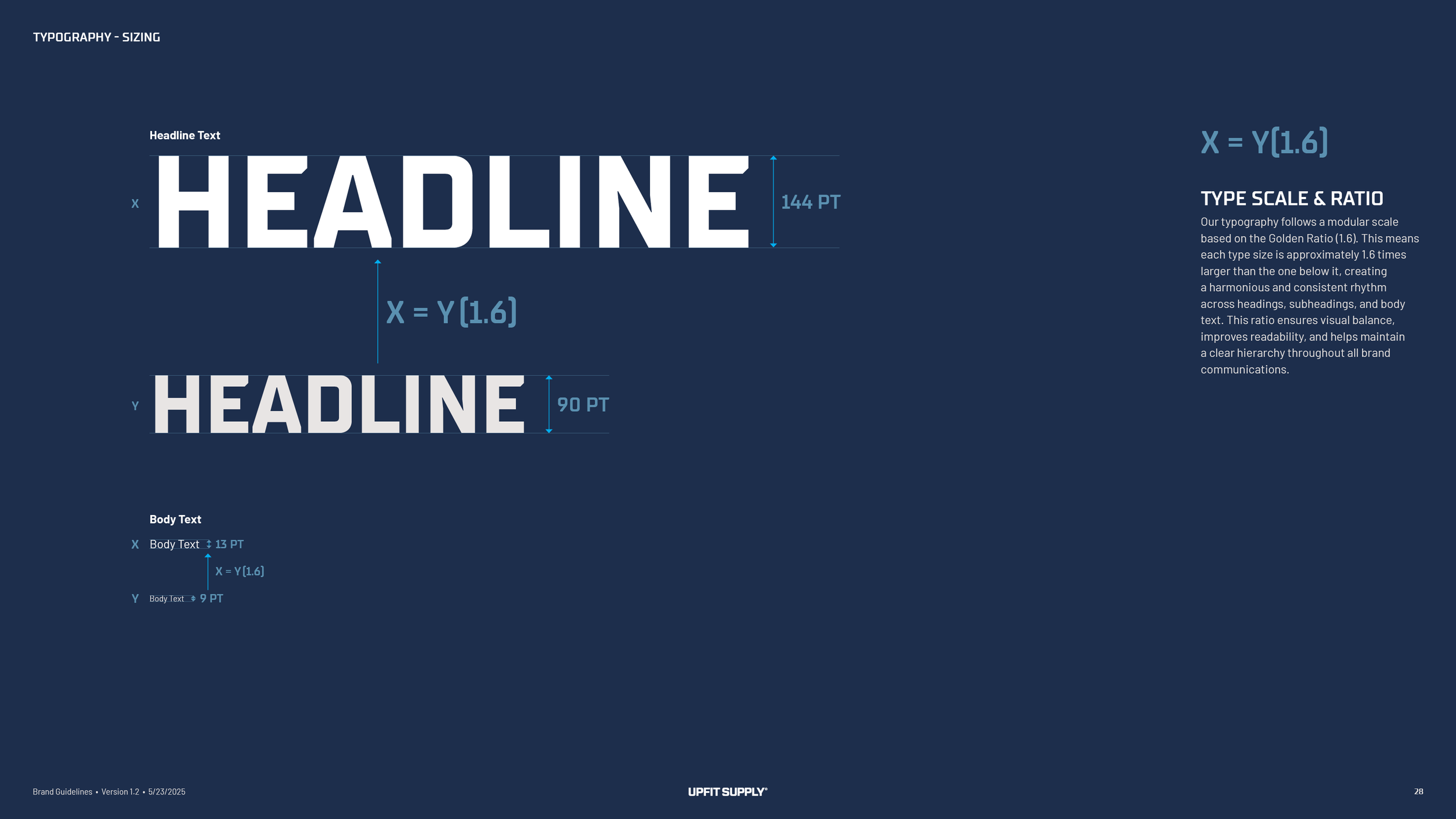
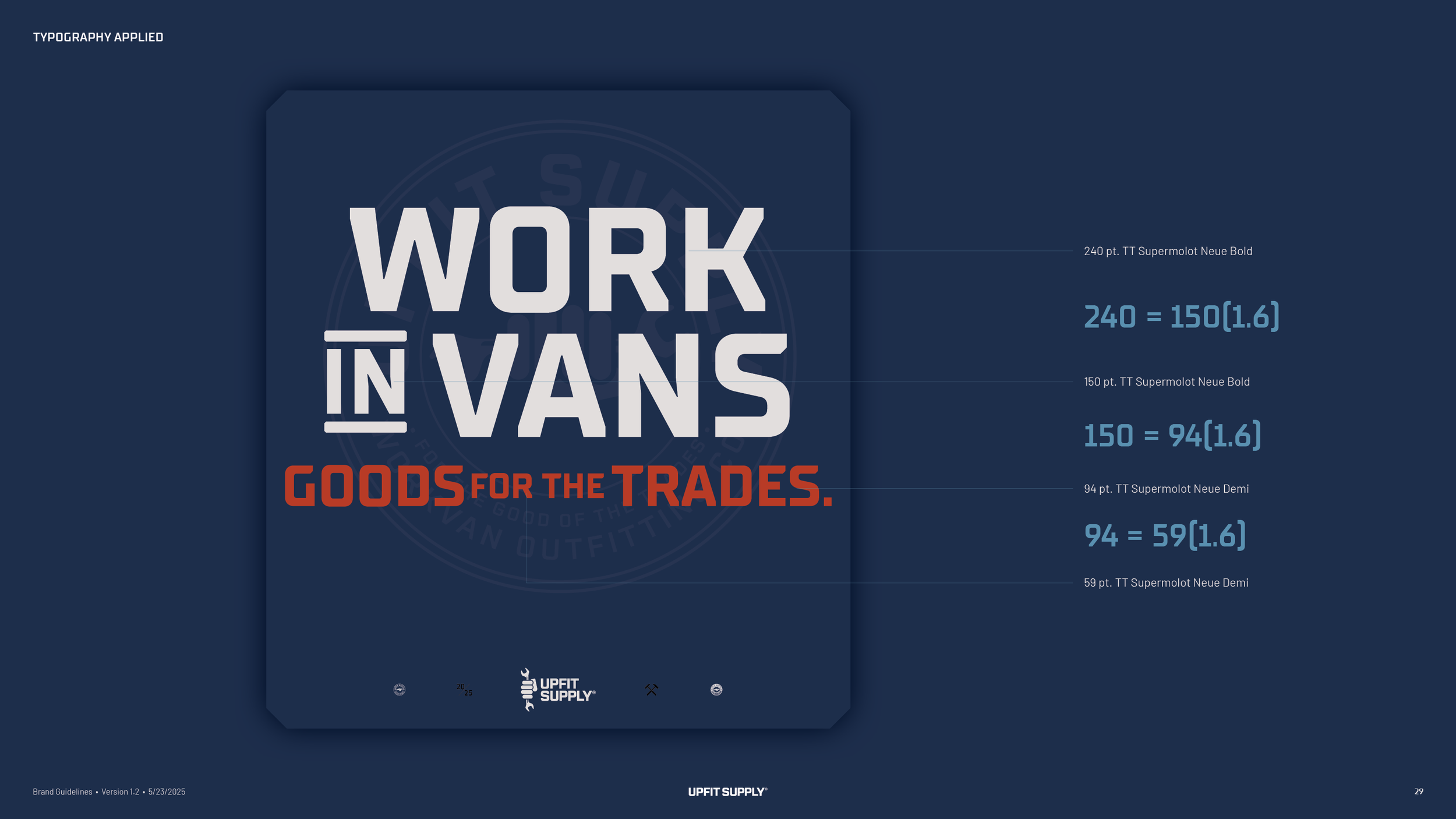
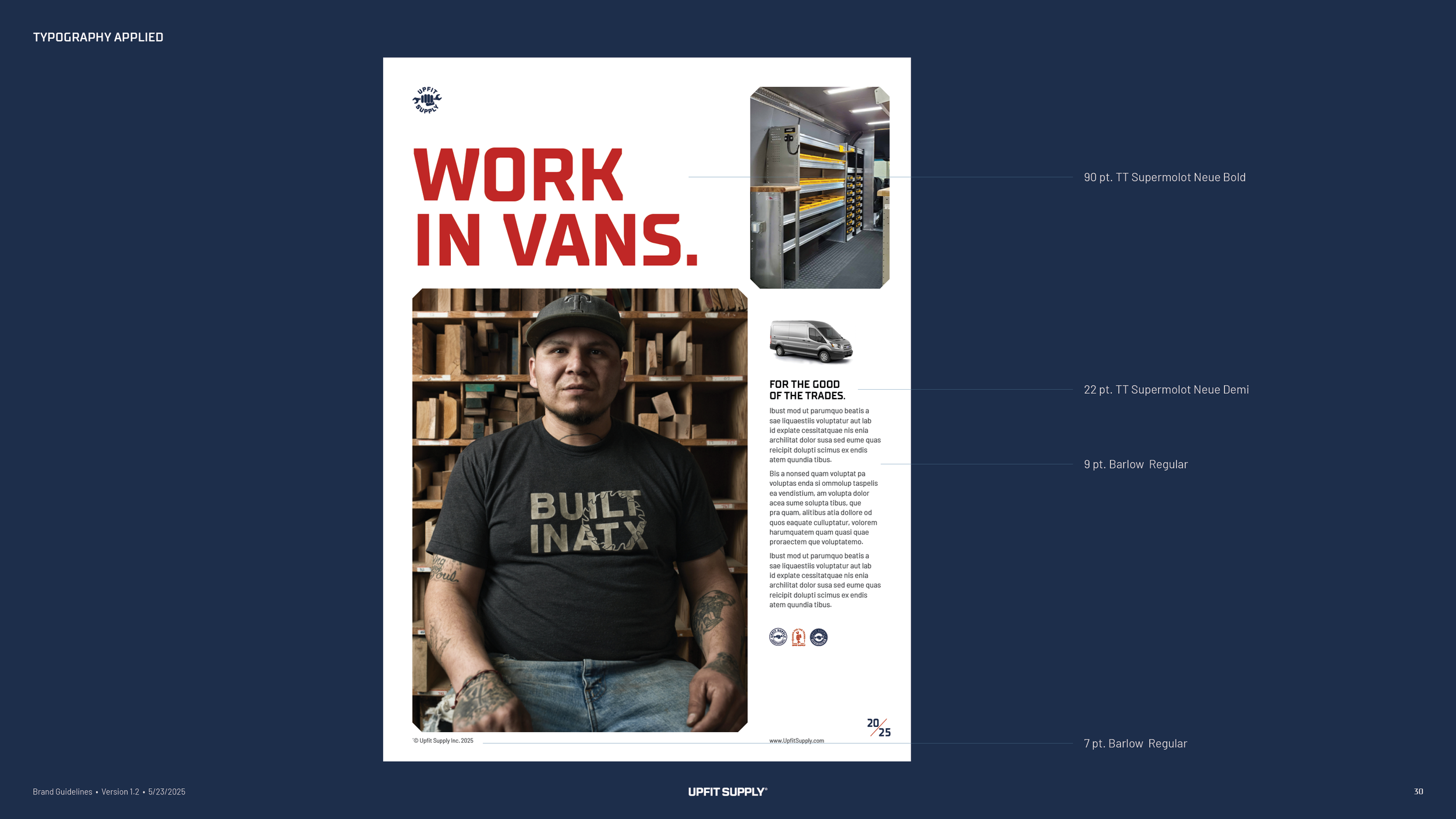
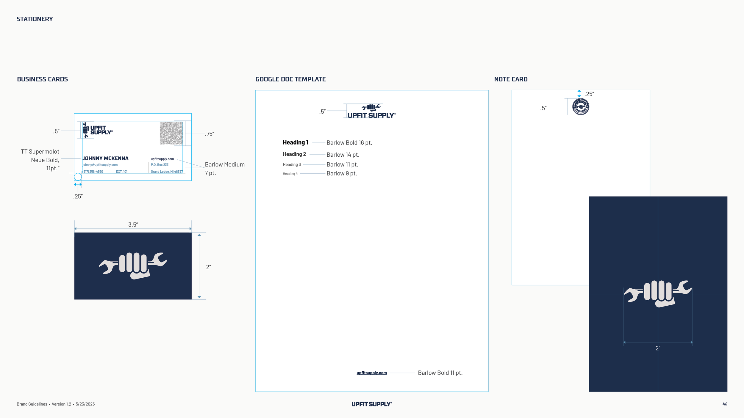
TT Supermolot Neue for headlines, a squared-off face that sits well beside the wordmark, and Barlow for everything long. Sizes step up by 1.6, so a headline, a subhead and a paragraph keep the same rhythm on a thumbnail, a web page and a business card. A third face, Upfit Sans Pro, was drawn for one job, setting the names of new sub-brands.
Icons.
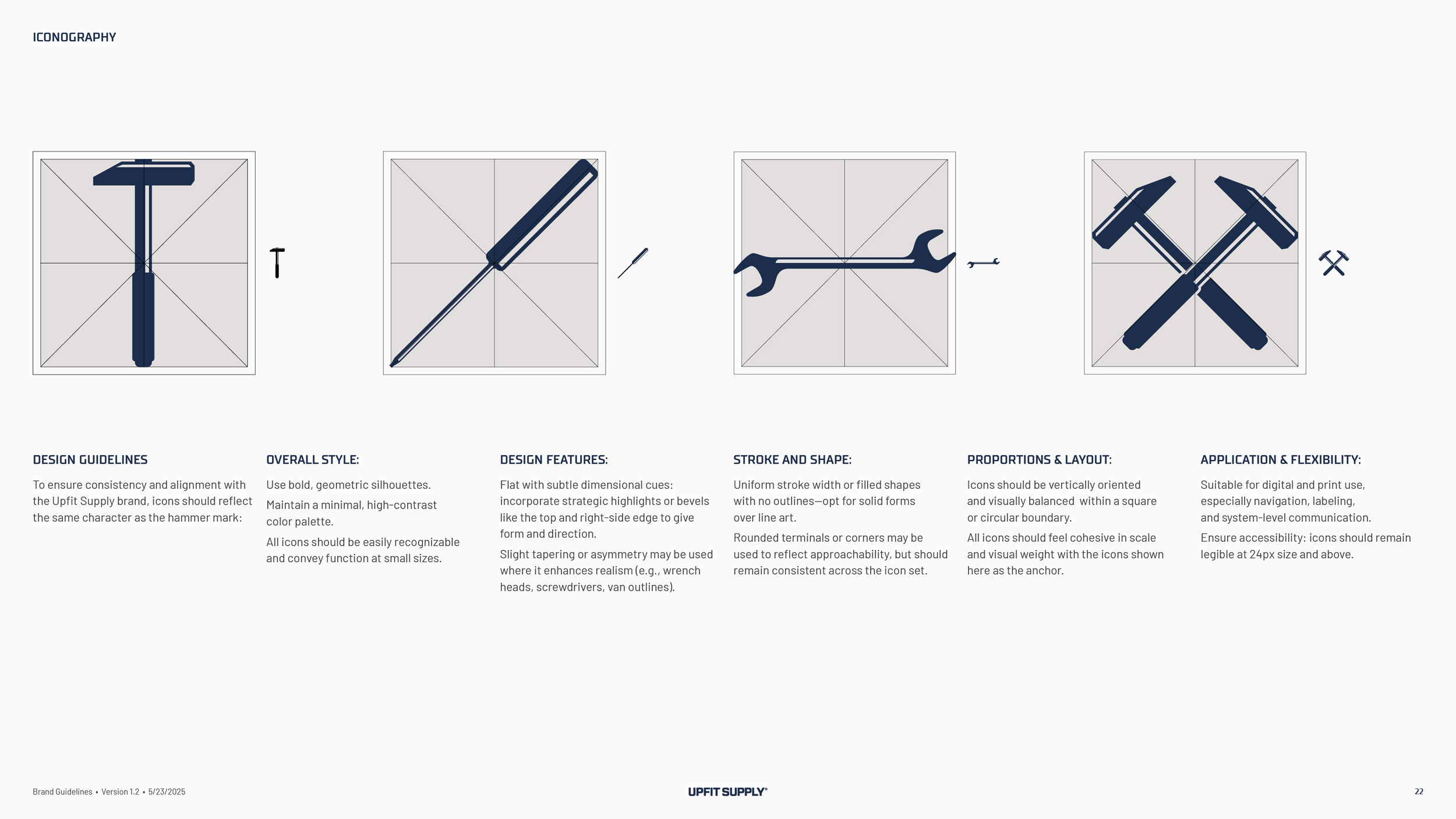
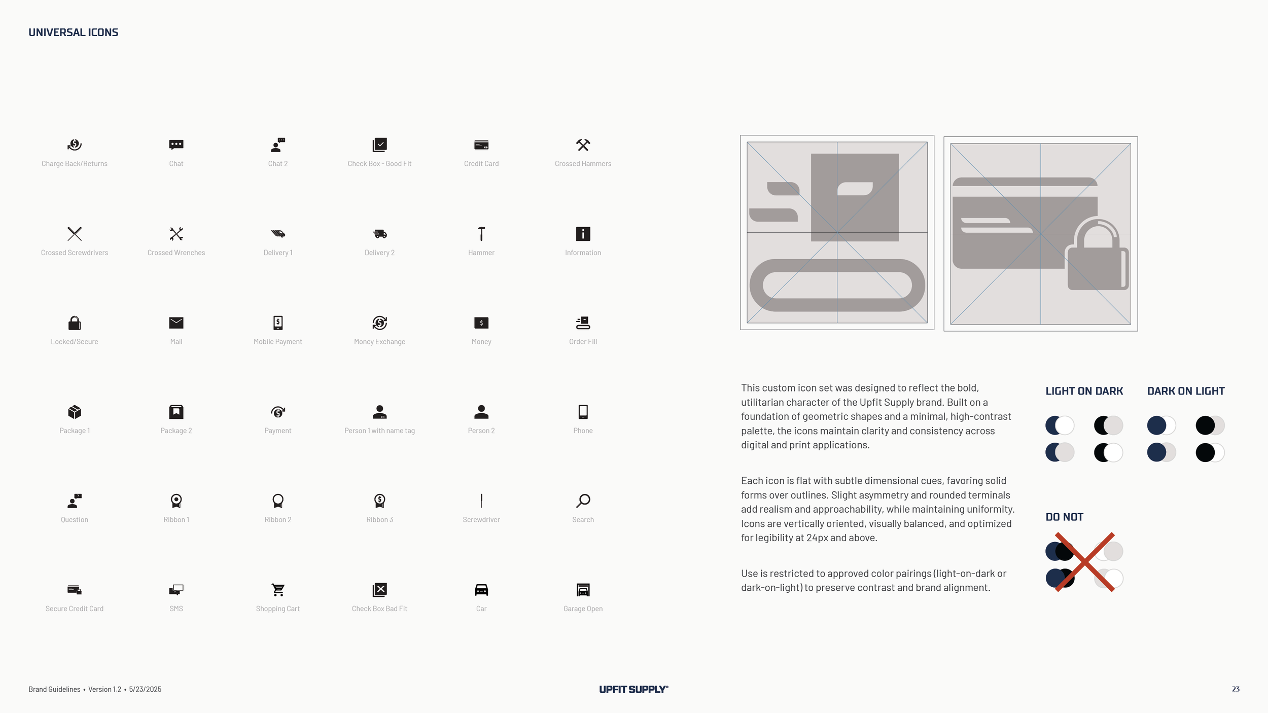
About three dozen icons drawn in the same hand as the symbol, solid shapes with a highlight on the top and right edges. Wrenches, hammers and screwdrivers for the trades, and a cart, a package, a card, a phone and a chat bubble for the store. They were the first thing built after the guidelines, because the website needed them, and the book gives the rules for drawing the next one.
Sub-brand logos.
Upfit University, Upfit Gallery and Upfit Select each got a mark of their own, set in Upfit Sans Pro under the same clear space and size rules as the main logo, so the next sub-brand will look like it belongs to the first three.
YouTube graphics.
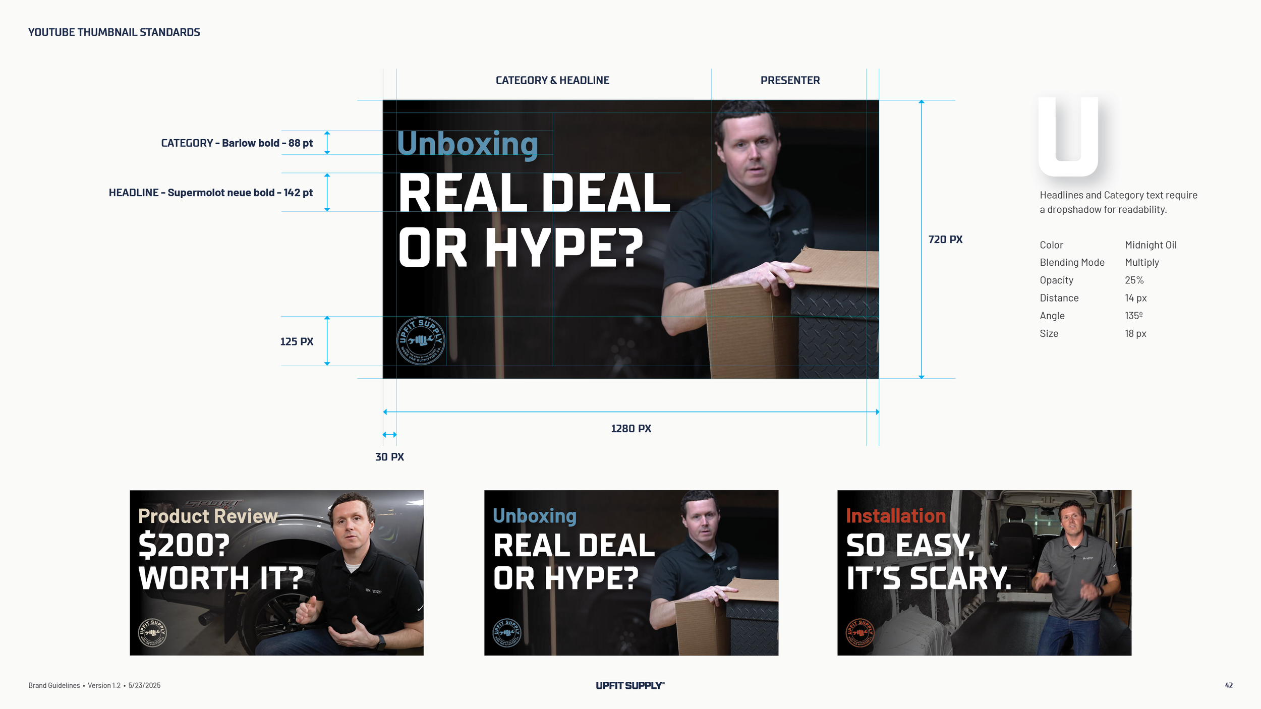
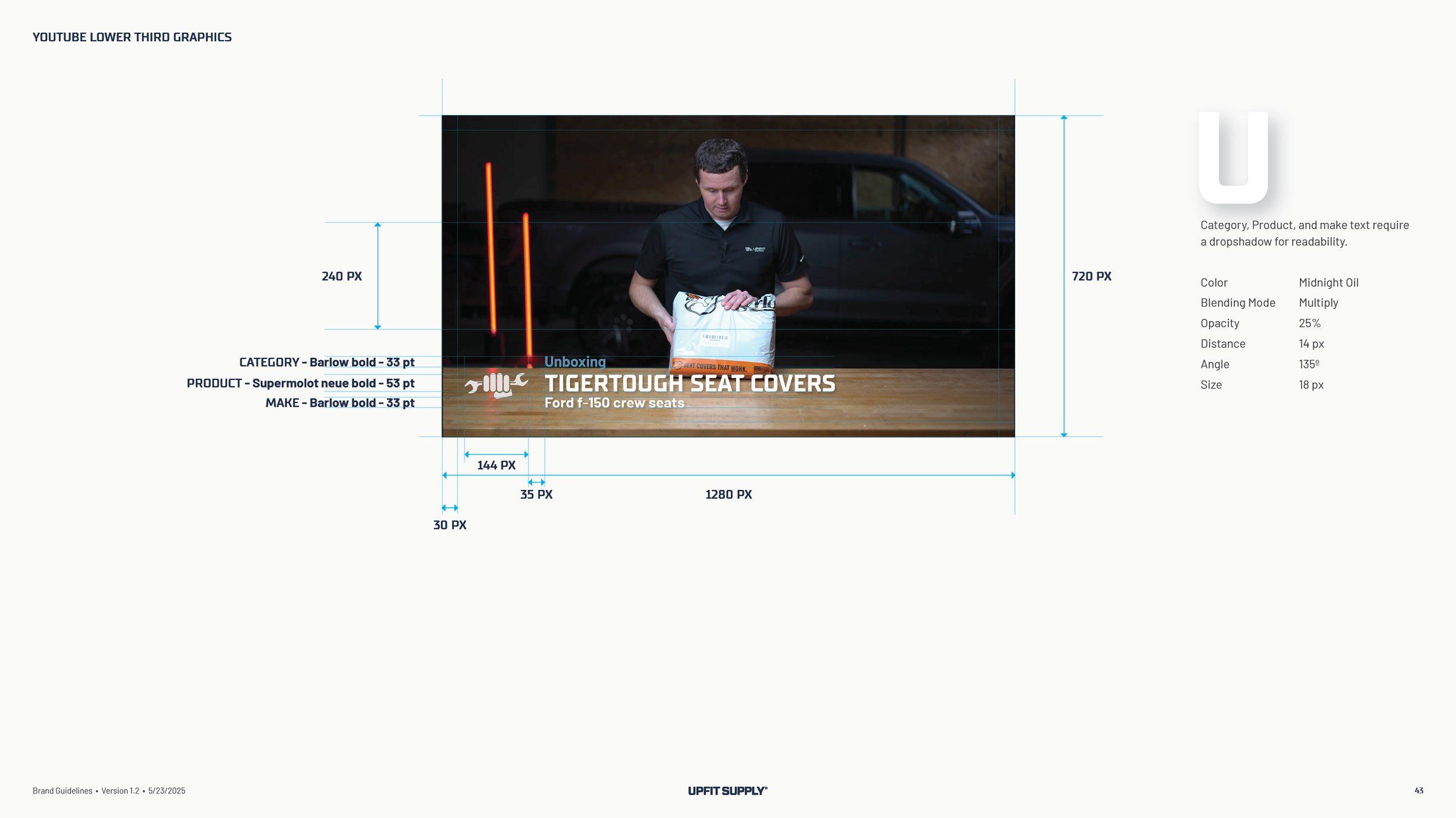
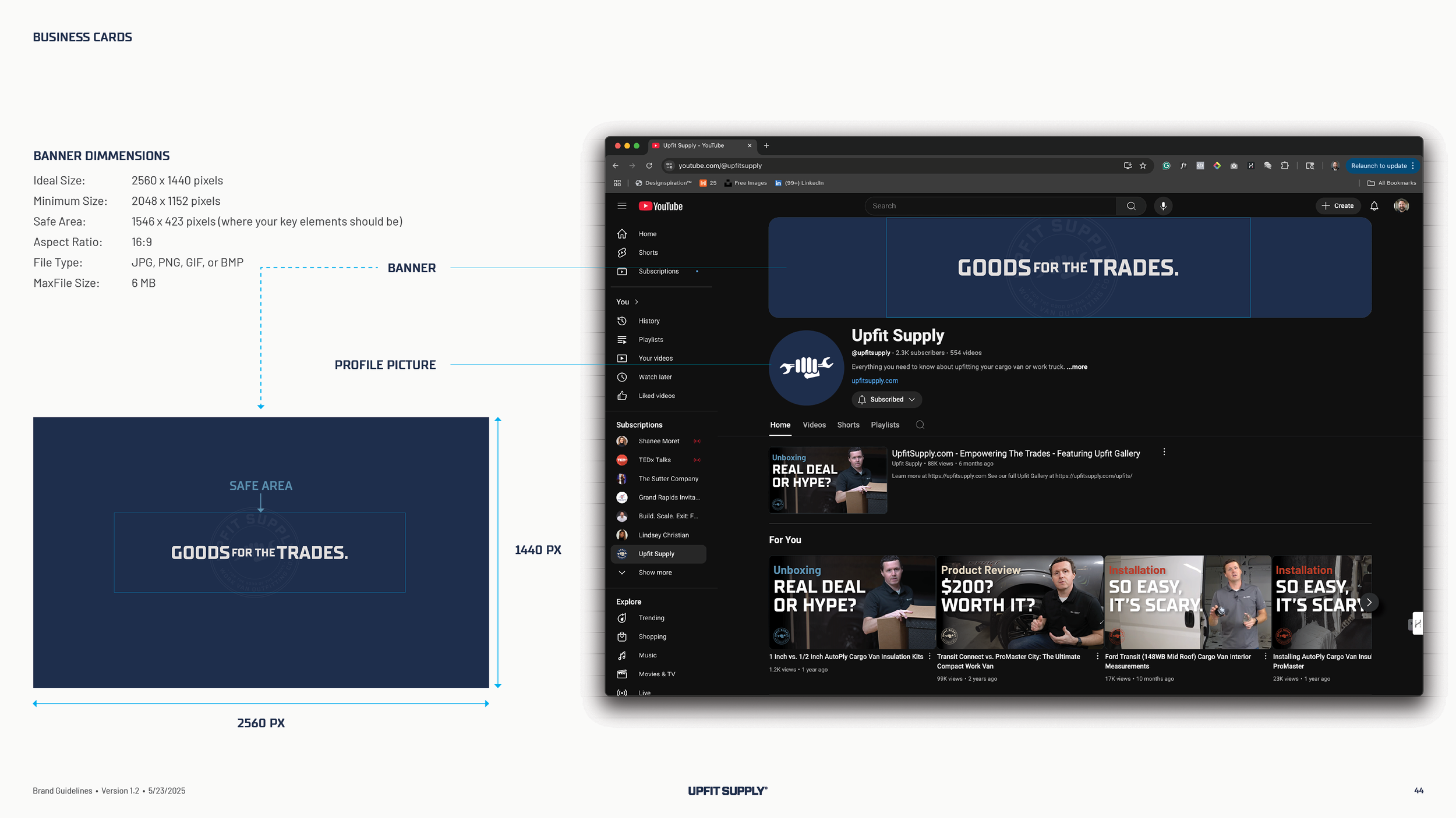
Upfit Supply teaches on YouTube, so the guidelines set standards for the thumbnail, the lower third and the channel banner. The category in Barlow, the headline in Supermolot at a size that reads on a phone, the presenter on the right, the badge in the corner, and a drop shadow spec so the type stays readable over a garage. The templates went to the video team as InDesign files with the fonts.
Stationery, templates and voice.
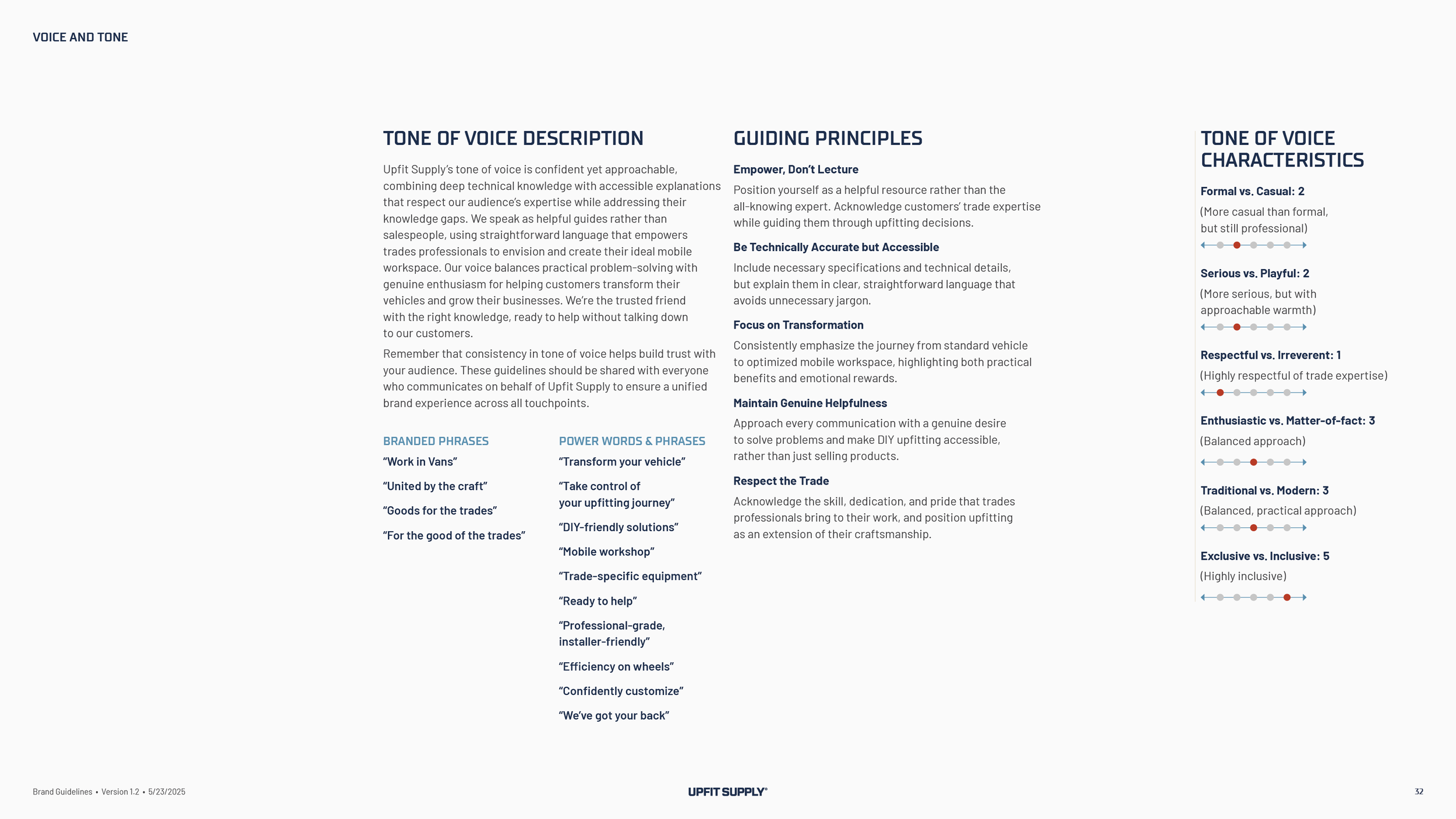
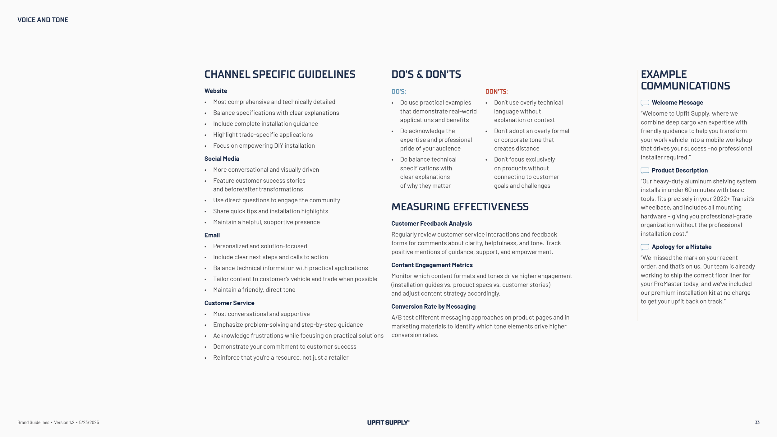
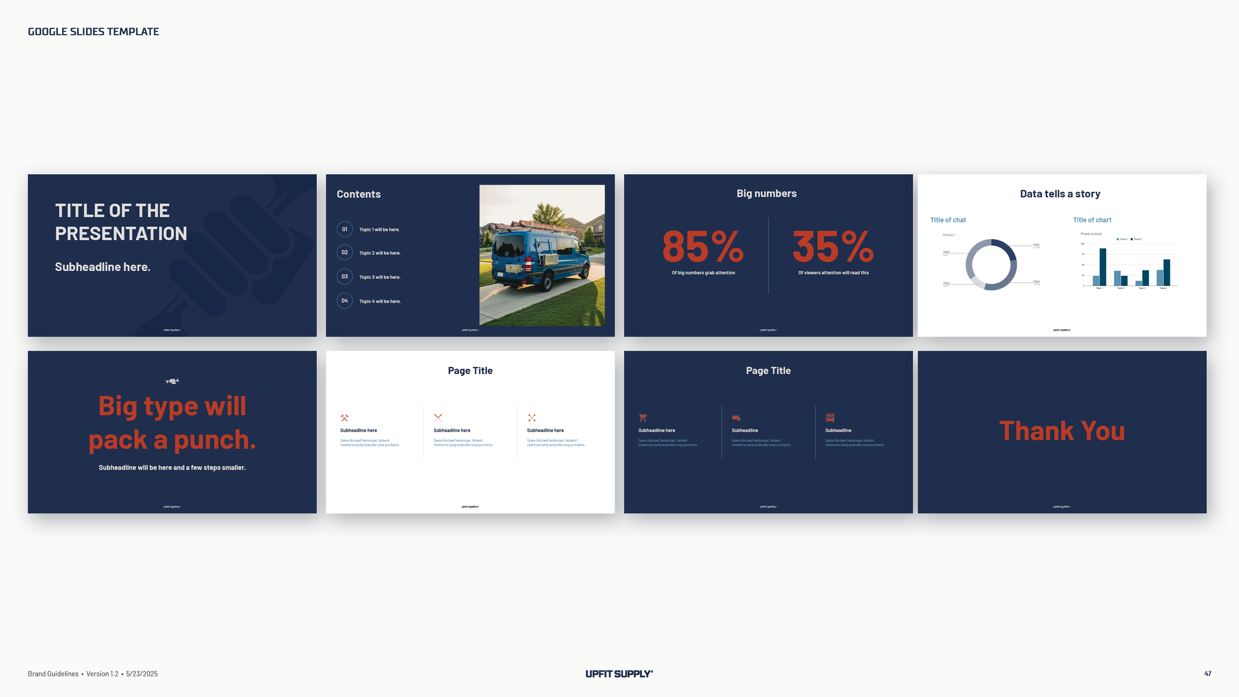
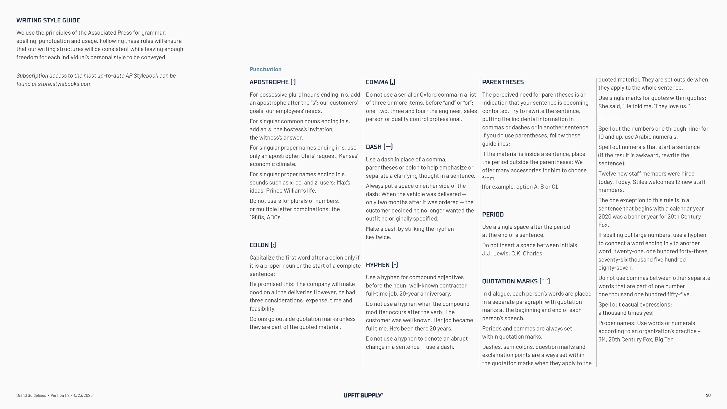
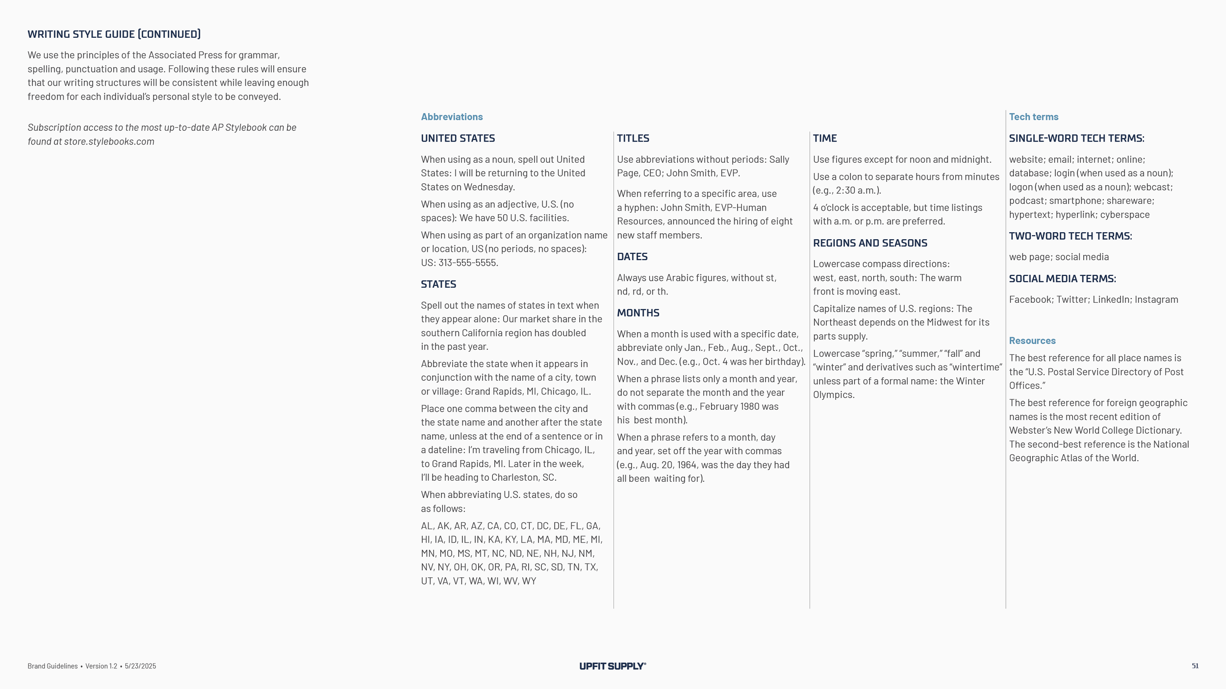
Business cards, a note card, a Google Doc letterhead and a Google Slides deck, each with its point sizes set. A voice and tone guide with four phrases the team can put on anything, Work in Vans, United by the craft, Goods for the trades, and For the good of the trades, and a writing style guide so the website, the emails and the customer service scripts sound like one company.
What came with the guidelines
The custom typeface
Upfit Sans Pro, the face drawn for the sub-brand names, delivered as font files with one rule for when to use it, so the next sub-brand looks like it belongs.
Logo production files
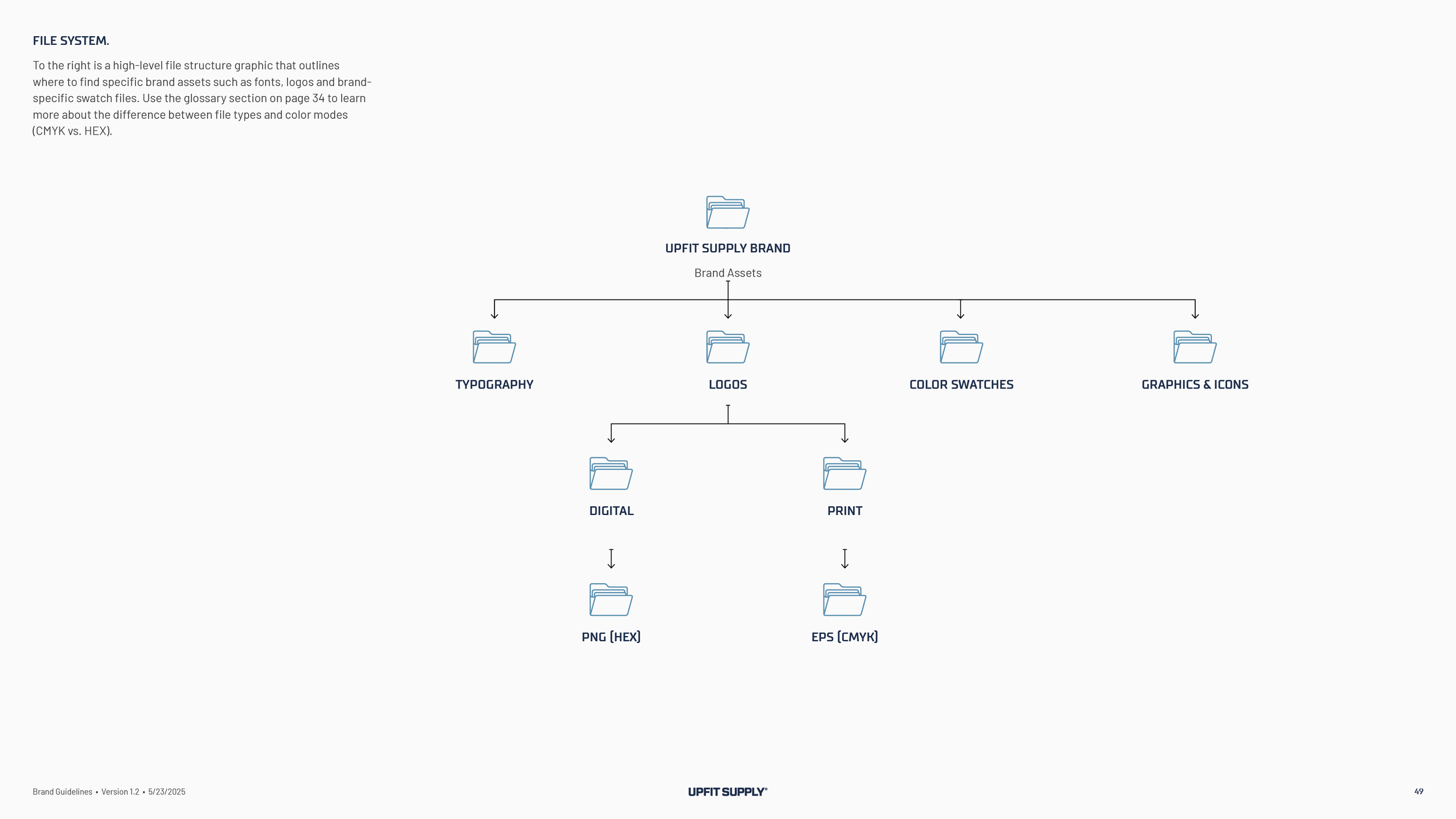
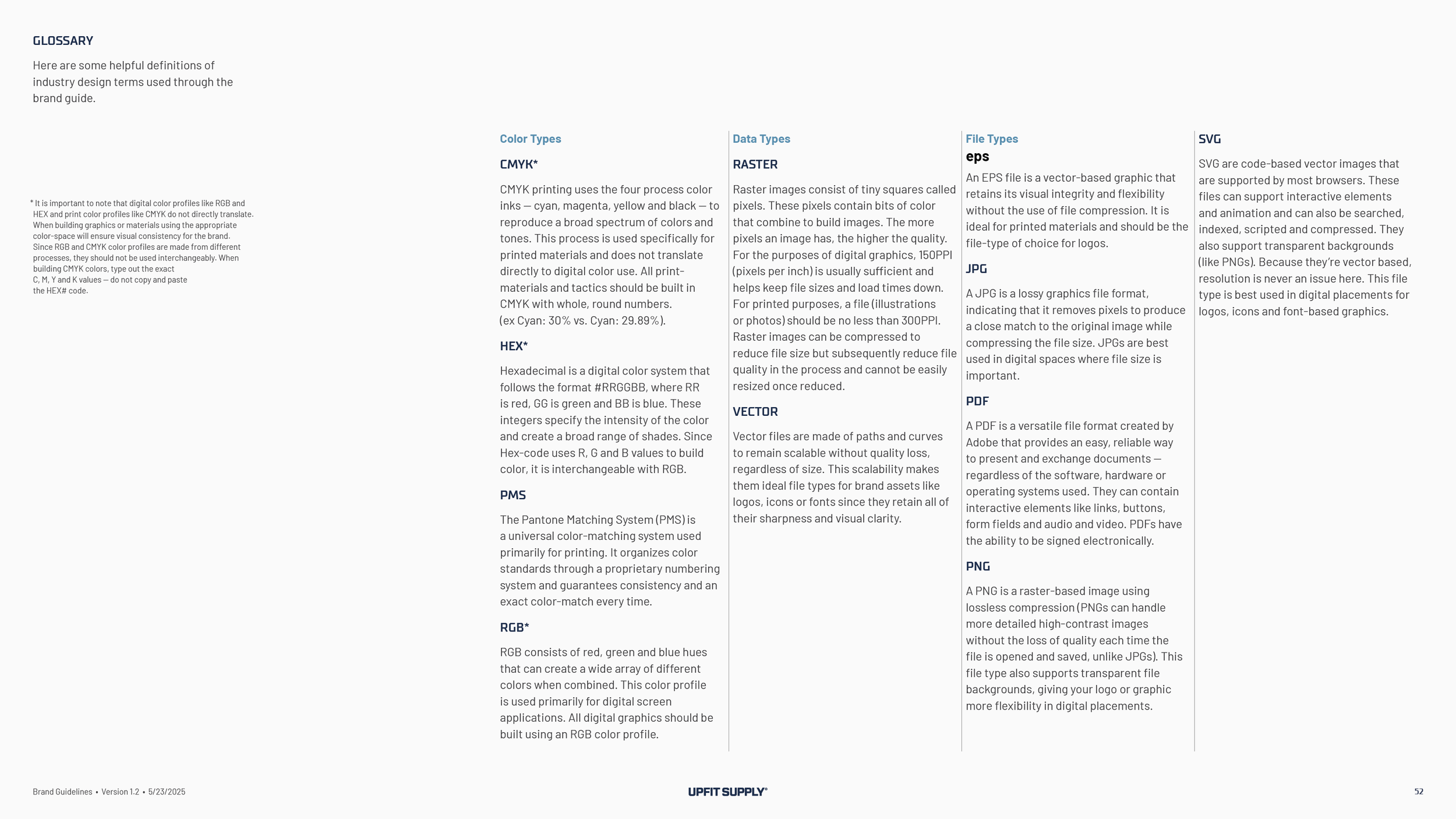
Every version of the logo in print and screen formats, in Dark Denim, Commercial White, Midnight Oil and Joint Compound, plus the badges and the full icon set, so nobody rebuilds the mark from a screenshot.
Templates
The YouTube thumbnail, lower third and banner as InDesign files with the fonts, the letterhead and slide deck saved as templates in the company’s own Google Workspace, and the business cards, note cards, shop banner and stickers as print-ready files the company orders itself.
The results
The first call was in late October 2024. The position was presented in December and approved in the new year. The team chose the symbol in the middle of March, approved the identity system in the first week of April, and had the brand guidelines in hand on April 24, 2025. The launch plan the team wrote with us in February set June 1, and the new brand was on the website and LinkedIn by June 2. Shirts, polos and a hat were on the team within two weeks. The YouTube graphics, business cards, note cards, stickers and shop banner followed by the end of June, and the guidelines were updated in July to cover them. The company that had put off shirts and trademarks until it had a logo worth them now has the shirts, and its trademark attorney has told it to register the symbol and the wordmark together.
FAQ’s
-
The same five tests as any logo. Simple enough that a child could draw it. Memorable after one look. Timeless, so it is not tied to this year’s van body. Versatile, so it works on a favicon and a shop banner. And appropriate, so it says something true about the brand. Then one more test for the trades. Would the customer wear it? A logo’s job is to identify the company, and the badge on a hat does the rest.
-
Say so, and keep going. Upfit Supply saw four concepts in February 2025. The team liked the typeface, the badges and the phrases, and it did not love the symbol. A refined version got the same answer. So we went back to the position, listened to what the team kept saying about hands and tools and vans, and brought three more symbols, including one with a van. The team chose the fist and the wrench within a week. The symbol is the part of a brand you live with longest, so it has to be the one you are proud of.
-
If it wants to be more than a search result, yes. Upfit Supply was winning the part-number search and losing the customer afterward, because nothing about the brand gave anyone a reason to come back. The position changed what the company is to its customers, from a store to the resource that teaches them to outfit the van, and the identity, the videos and the voice all follow from it. Here is how we do brand strategy consulting.
-
With a plan written before the logo is final. Upfit Supply’s launch plan came out of one workshop in February. It listed who hears the news first, vendors, customers and the company’s own team. It put the website and the email templates at the top of the list, set June 1 as the day, and gave every task one owner. The brand went live on schedule. For the same order of operations at a manufacturer’s scale, see the Code Blue case study, and a full rebrand for a manufacturer is its own page. A company launching to the public for the first time takes a longer road, and the Verdant Graphics case study walks it, from a first discovery session to a brochure, a website and a team presentation a year later.
Services
Brand discovery · Brand positioning · Brand personality · Inspiration boards · Logo design · Logo system · Badges and apparel graphics · Color system · Typography system · Custom typeface · Iconography · Sub-brand logos · Brand guidelines · Launch plan · Voice and tone · YouTube graphics · Stationery · Logo production files
Outgrown the logo you started with? Start with what is true.
Start a conversation
Wit & Craft is the brand agency for owner-led manufacturers and trades, in Grand Rapids, Michigan, since 2015.