How Sleep Outfitters put a new word on mattress shopping
Wit & Craft in partnership with Wessels & Associates positioned Sleep Outfitters, a mattress retailer that started in Kentucky in 1983, and built the brand it took across the chain when four regional store names became one.
Shopping for a mattress is a chore people dread, and every store in the category looked and sounded the same. So the work ran in order. First we found what was true about the company and wrote it down as a position, with one idea at the center, smarter sleep solutions, and one word the category did not have. The salespeople became Outfitters, and the customers became guests. Then we built the identity, from the monogram to the paint on the store walls, and wrote the brand book and the guidelines the stores and the advertising follow. When the launch campaign was tested with mattress shoppers, they understood the word at once.
The challenge
Sleep Outfitters sells mattresses and everything that goes with them, in stores across several states. It grew from a family business, and it carries the brands shoppers already trust. By 2019 it had a new plan. Build a store around what customers actually want, deliver the service the category does not, and change the way people shop for a mattress. It also had four regional store brands to bring under one name, a launch to plan across every market at once, and a new website to build for the same day.
The customer buys a mattress so rarely that she has no idea how much has changed since the last one. She is overwhelmed by the choices, she does not trust the prices or the people selling to her, and she sees the trip to the store as something to get through. The brand book put her words on one page. It is time for a new mattress, but there are too many choices and I dread shopping. I just want to find the mattress that will actually help me sleep. The industry’s own research says most shoppers want a low-pressure store and a salesperson who knows the product, and most do not get either.
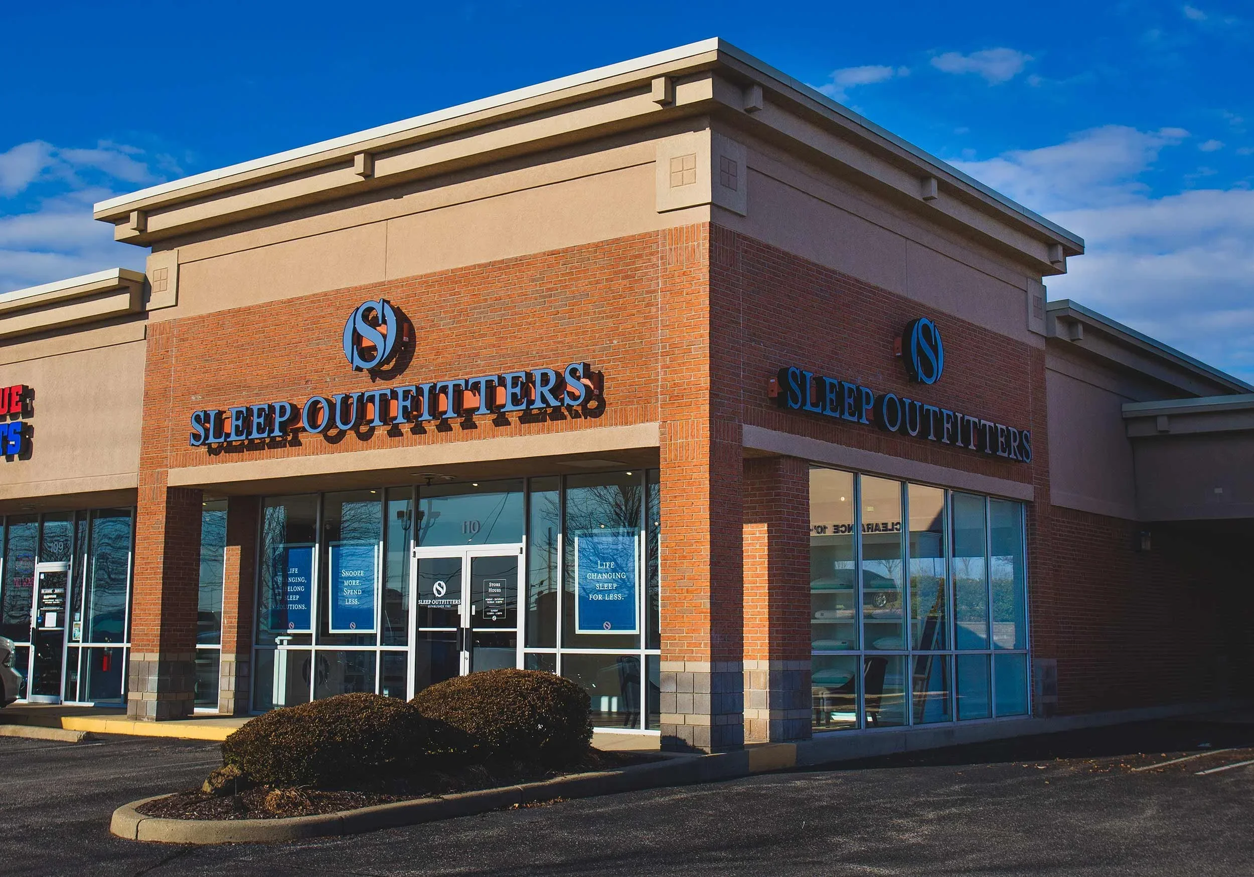
Our discovery visits found stores that did not match each other. Signs, layouts and the whole experience changed from one store to the next. Floor models were packed into small rooms with no clear place to start, the wayfinding talked about mattress construction, and product brand signs were everywhere, so a store felt like a dealer’s floor and not a brand’s. Deep discount signs at the front door made the visit about price before a guest was through it. The competitors were no help as a model. Discount chains, furniture stores, online bed-in-a-box brands and the other specialty stores all said the same things about selection and price, and none of them had a clear position. What the company had that the others did not was a team that knew the product and wanted to solve the customer’s problem.
Why we started with the words
The ask was a new identity and a launch campaign, and the fastest answer would have been a new logo over the same sale signs. So the work ran in order. Discovery first, in the stores, in a hard look at seven competitors, in the industry’s research on how people shop, and in a map of where a mattress gets bought, from discount chains to a box on the porch. Then the position, the few sentences that say why Sleep Outfitters exists, how it works and what it is. Then the identity, with every design decision answering to those sentences.
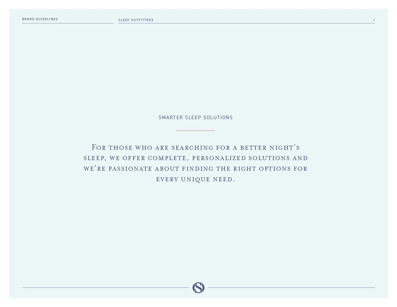
The position gave the company a word. Outfitting. An outfitter equips you for something, the way a guide outfits a trip, and this store would outfit people for sleep, with a fit process of its own, education before selling and a premium delivery at the end. The people on the floor became Outfitters and the customers became guests. The position also drew up what to stop doing. Deep-discount sale mattresses, off-brand inventory and service fees came off the list, and the fit process, the experts and the shopping experience went to the top of it. It gave the brand five traits, straightforward, knowledgeable, advocative, sincere and empathetic, and the idea that holds everything, smarter sleep solutions. And it drew the line everything else answers to. For those who are searching for a better night’s sleep, we offer complete, personalized solutions and we’re passionate about finding the right options for every unique need.
The Brand Position
Why.
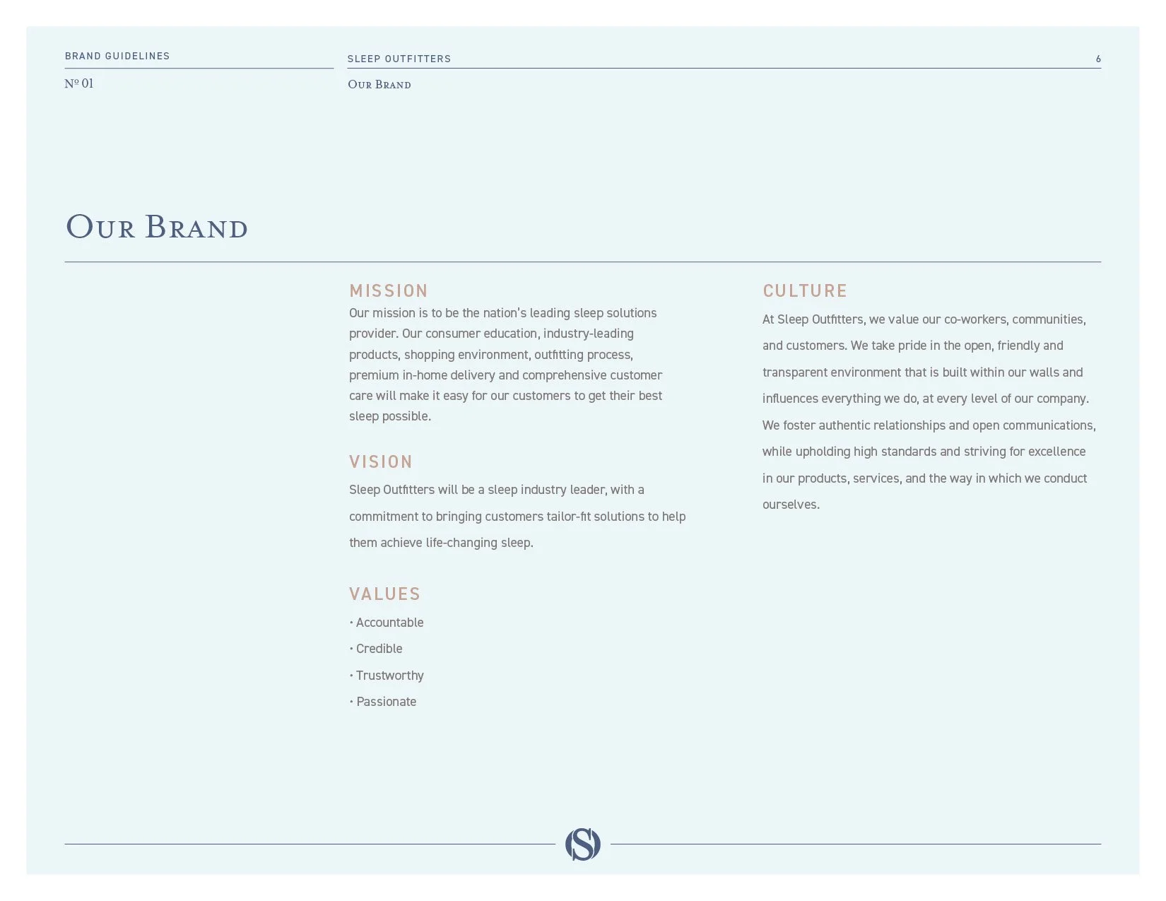
“We exist to help people find their best sleep.” Eight words, and the brand book and both editions of the guidelines open on them.
How.
“We’ve built and refined an exclusive outfitting process, driven by product expertise, an educational approach, premium delivery service, and a passion to understand and exceed customers’ expectations.” The fit process, the teaching and the delivery are the how, and the stores had to be built to deliver all three.
What.
“We offer a smart, engaging and personalized experience designed to help customers find their complete sleep solutions.” An experience first, and a mattress second.
The Brand Identity System
The monogram.
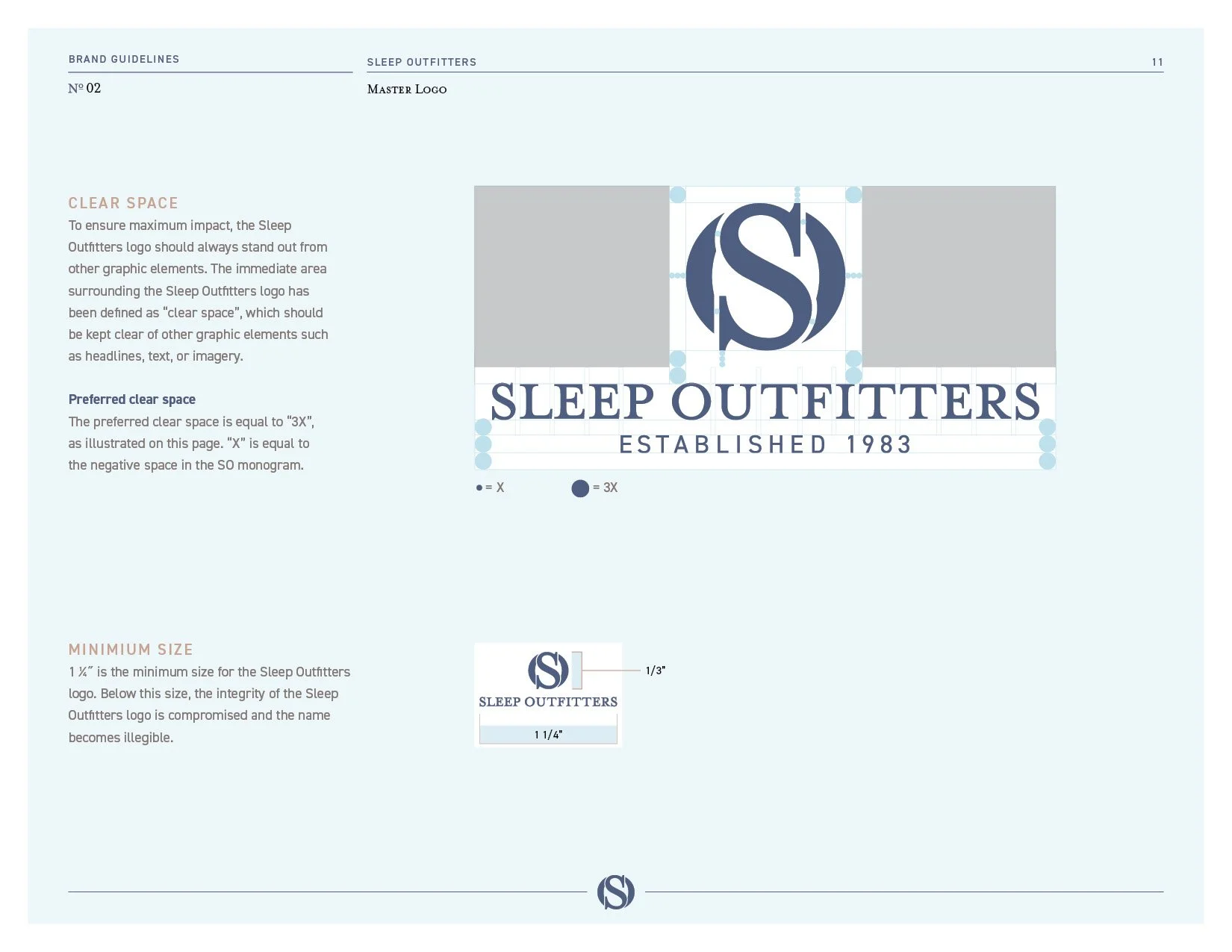
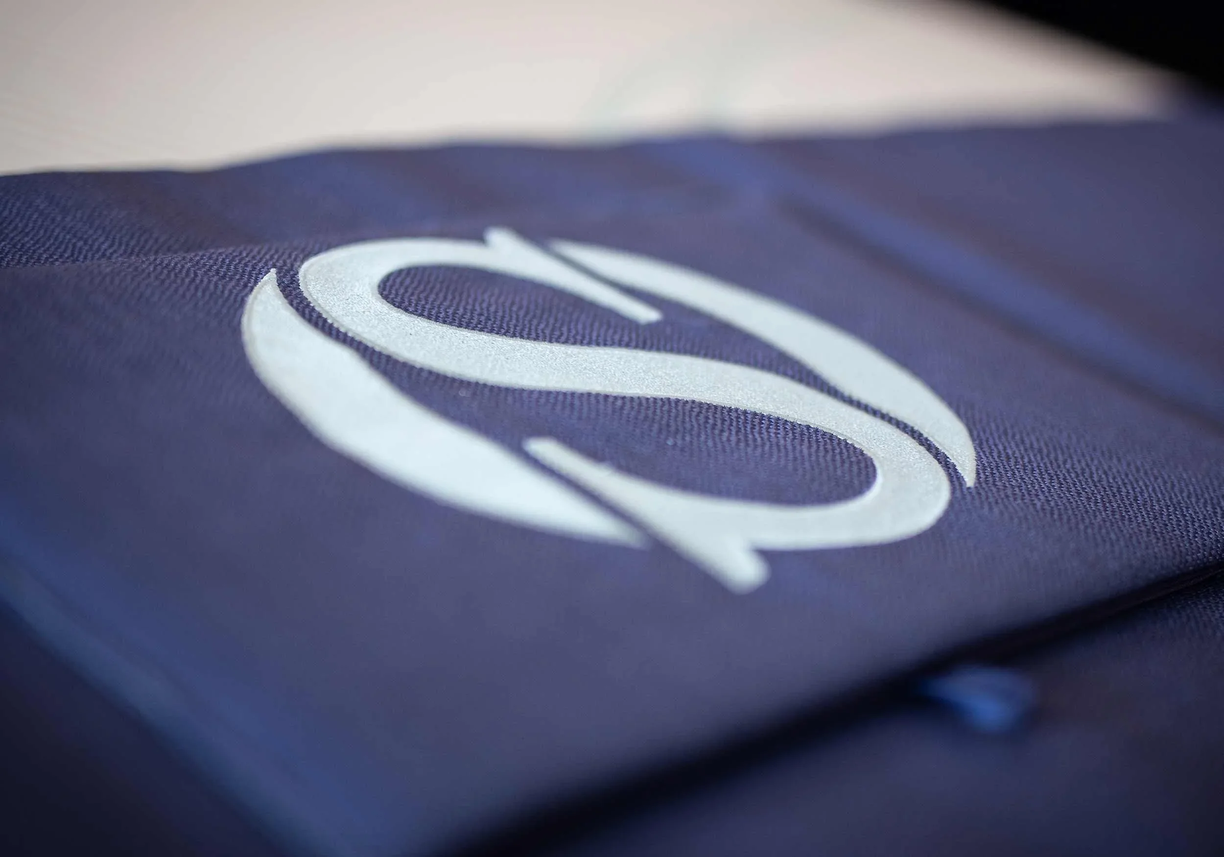
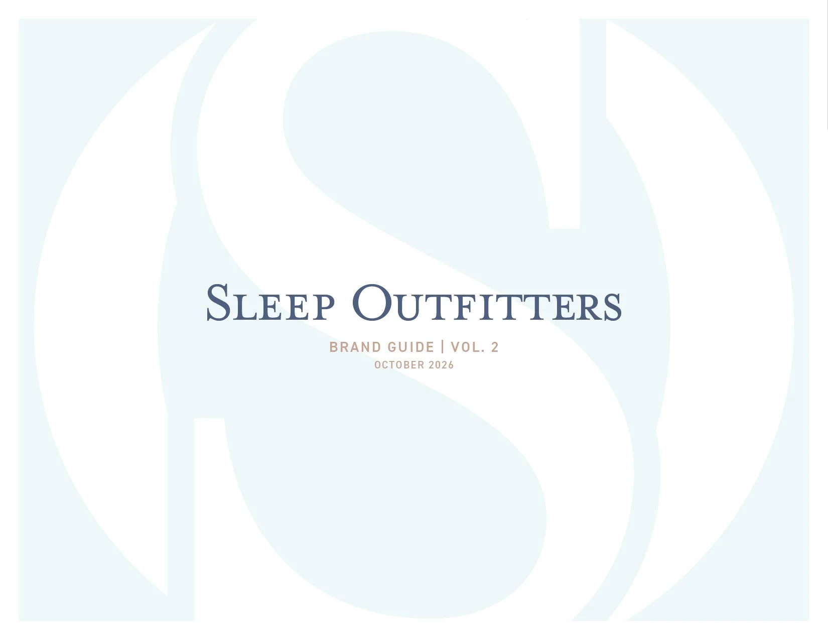
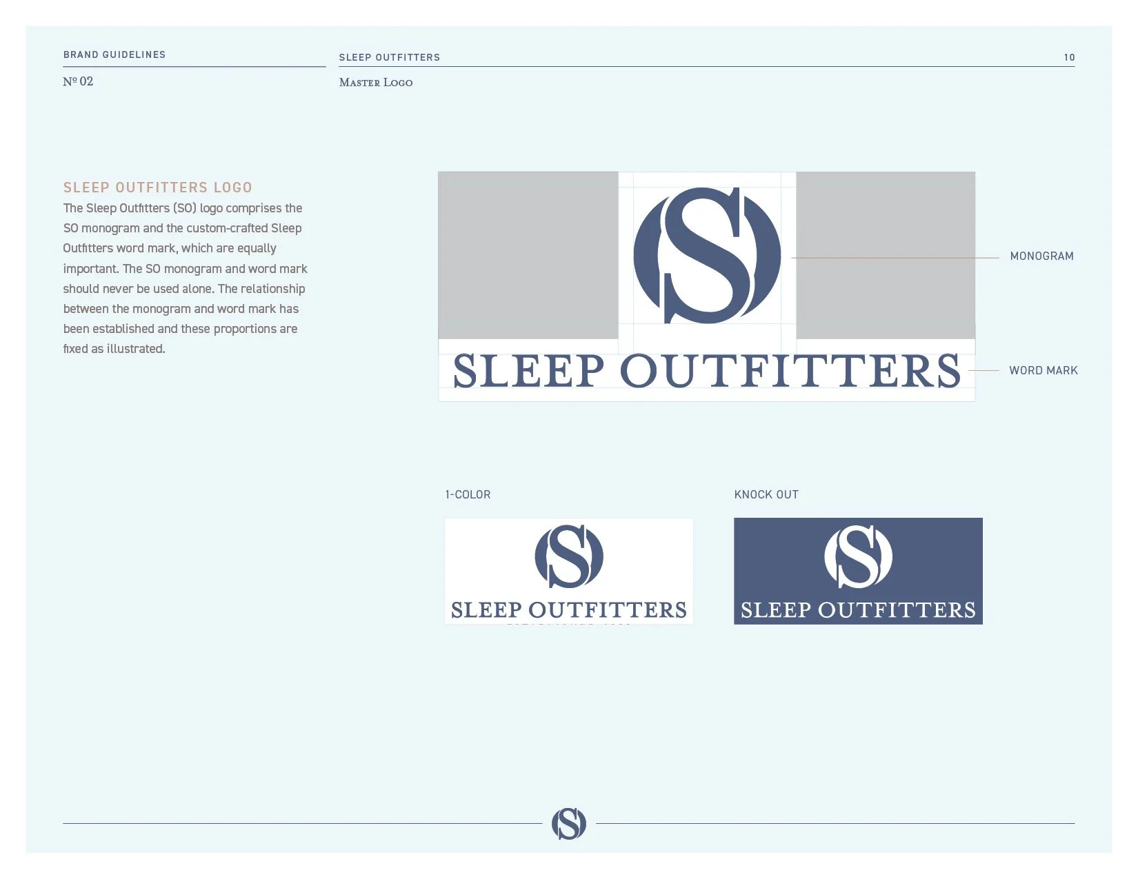
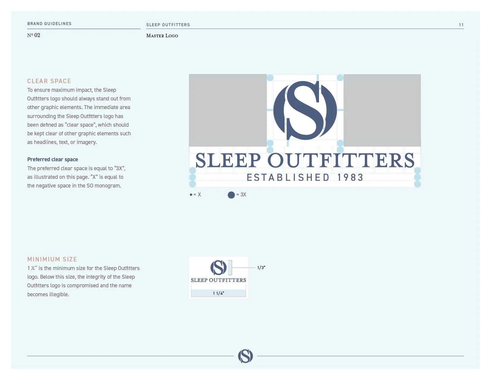
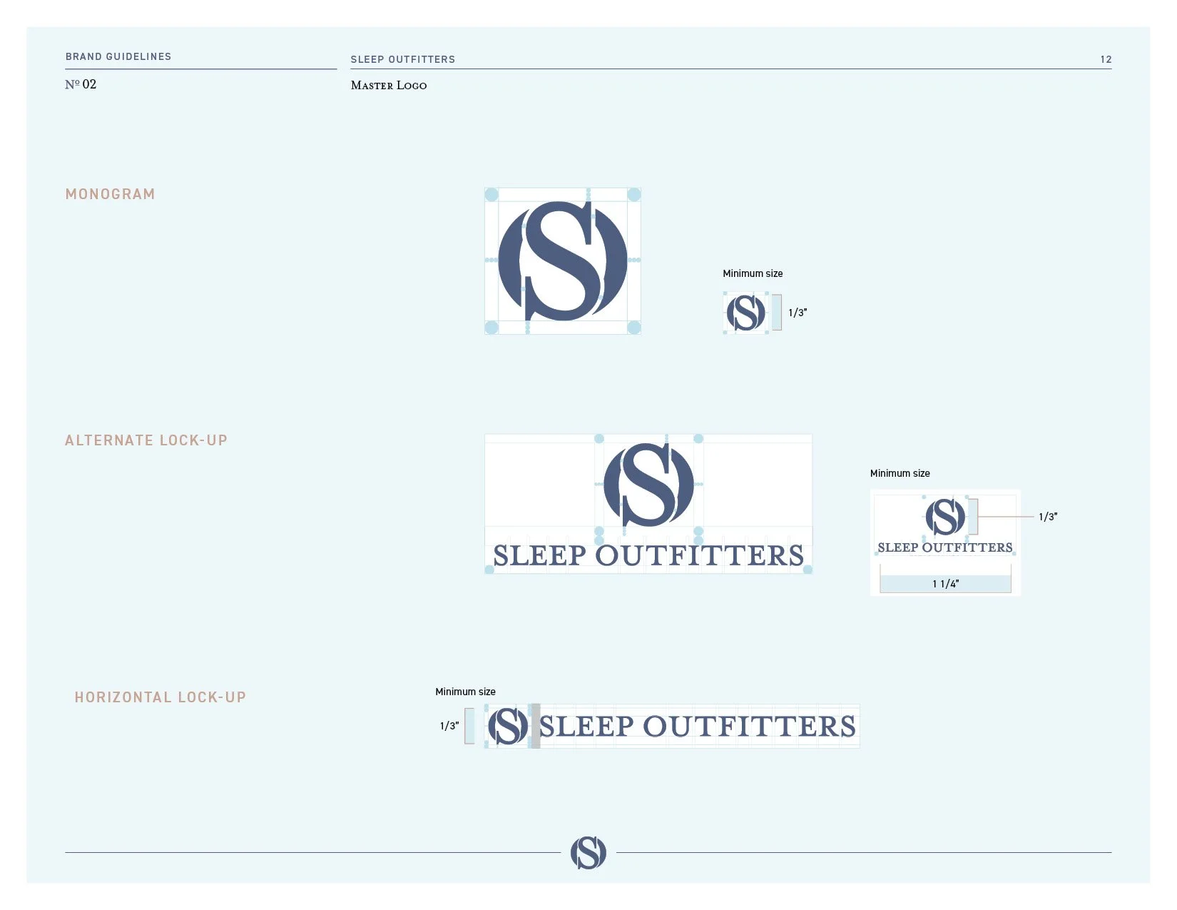
An S set inside an O, drawn as one mark. The guidelines call the monogram and the custom wordmark equally important and lock their proportions together in the master logo, and the negative space inside the monogram is the unit that sets the clear space around every version. On a store sign, a hang tag or a phone screen, it is the part of the brand you read first.
The logo system.
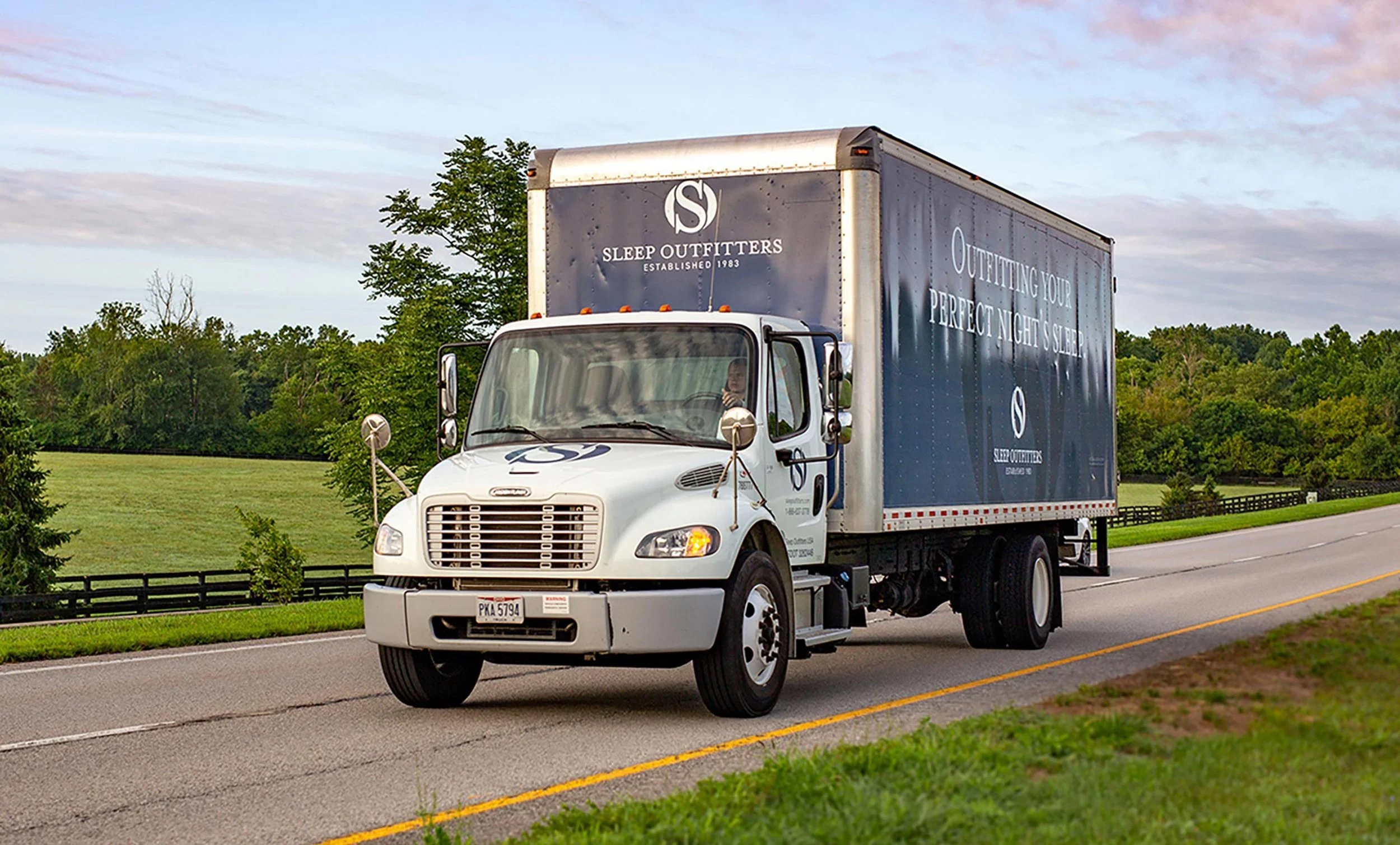
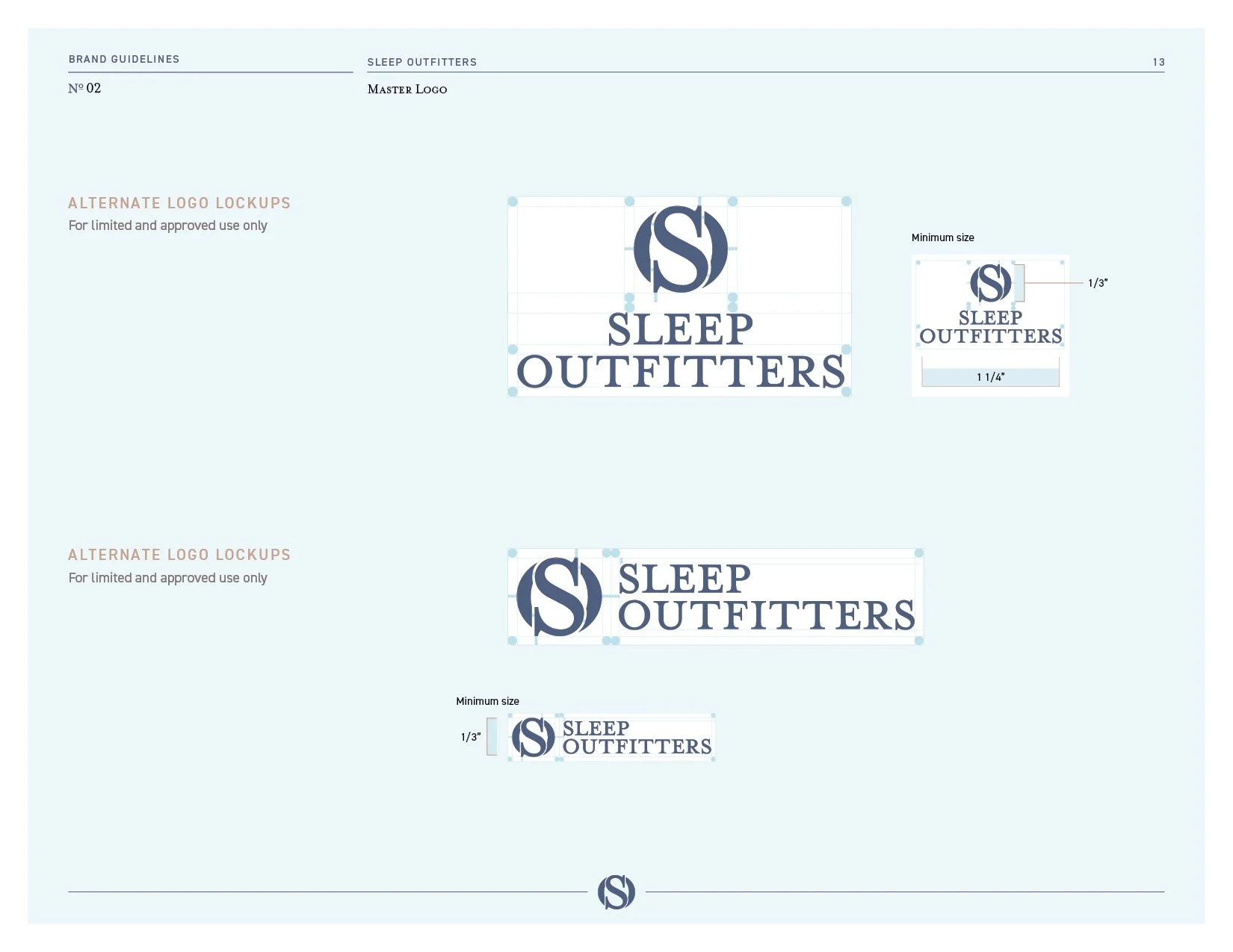
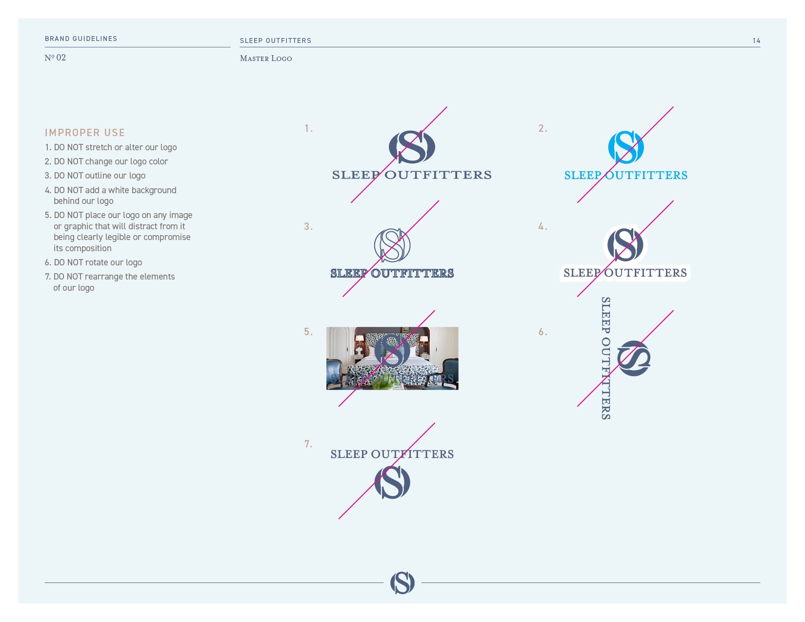
A stacked master logo, a horizontal lock-up for narrow spaces, a stacked version that carries Est. 1983, and alternate lock-ups for approved uses only. The full logo never goes below an inch and a quarter and the monogram never below a third of an inch, and the guidelines show seven improper uses so nobody stretches, outlines, recolors or rotates it.
The Est. 1983 mark.
One version of the logo says how long the company has been at this. It is the version for the moments when the history matters, because a brand that was about to change the look of every store still had decades behind it, and a guest should know that.
Color.
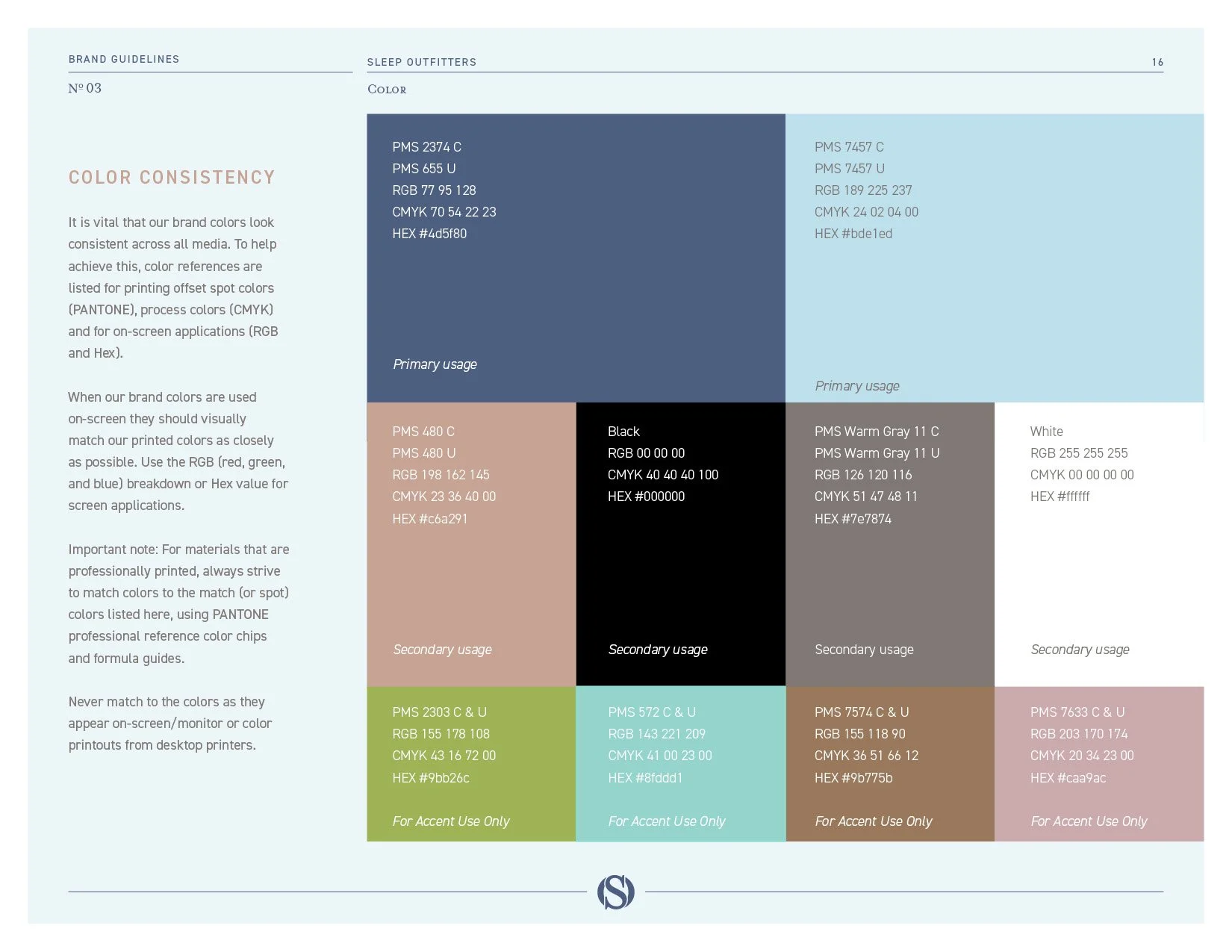
A deep blue leads, with a pale blue beside it, then a dusty tan, a warm gray, black and white, and four accent colors for limited use, a green, an aqua, a brown and a mauve. The blue is specified twice, one Pantone for coated paper and one for uncoated, and the uncoated one became the primary in October 2019 for a practical reason. Stores were already being painted while the first guide was in review, and the color on the walls had to be the color in the book.
Typography.
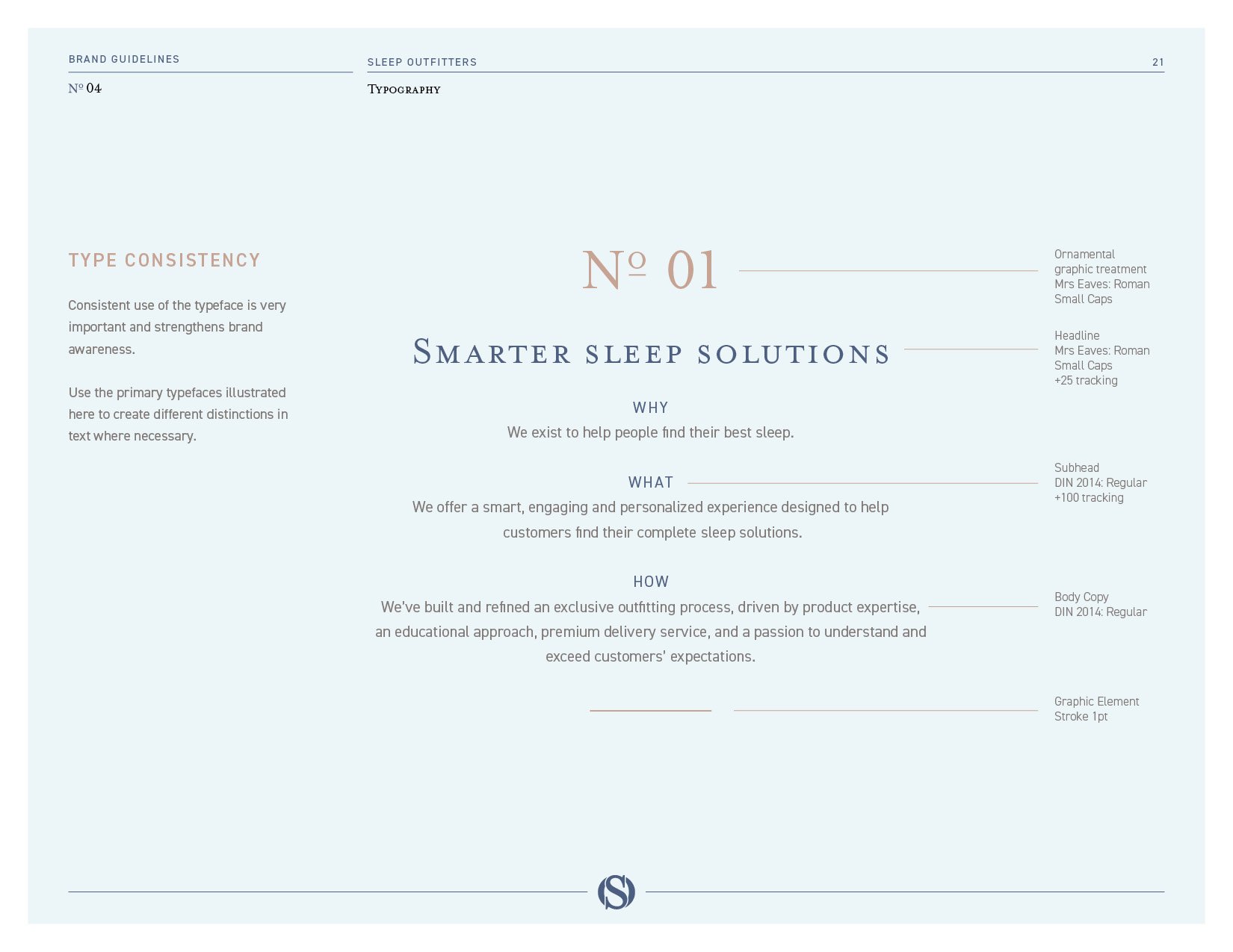
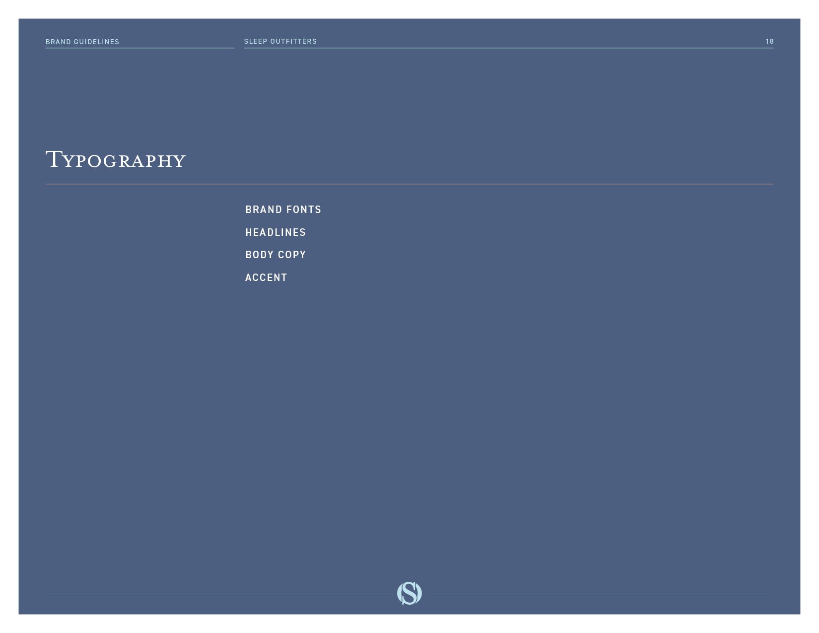
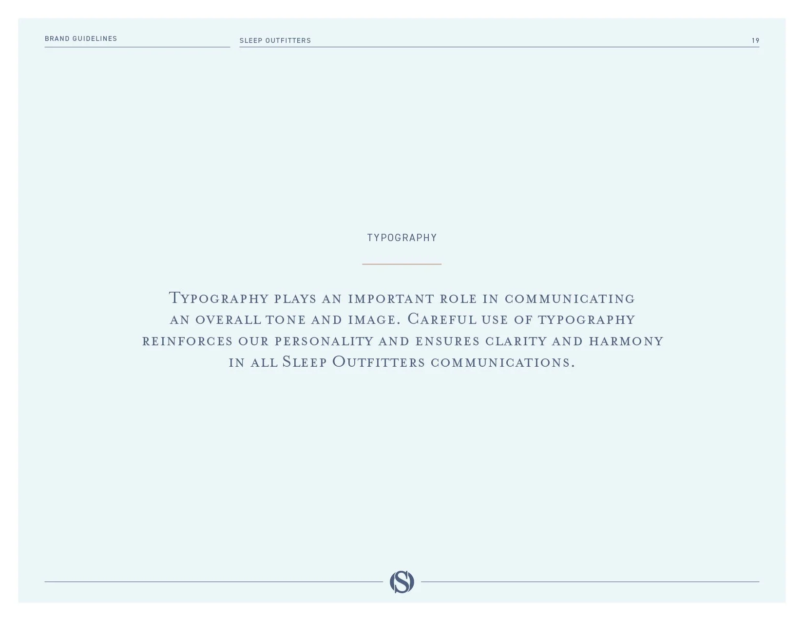
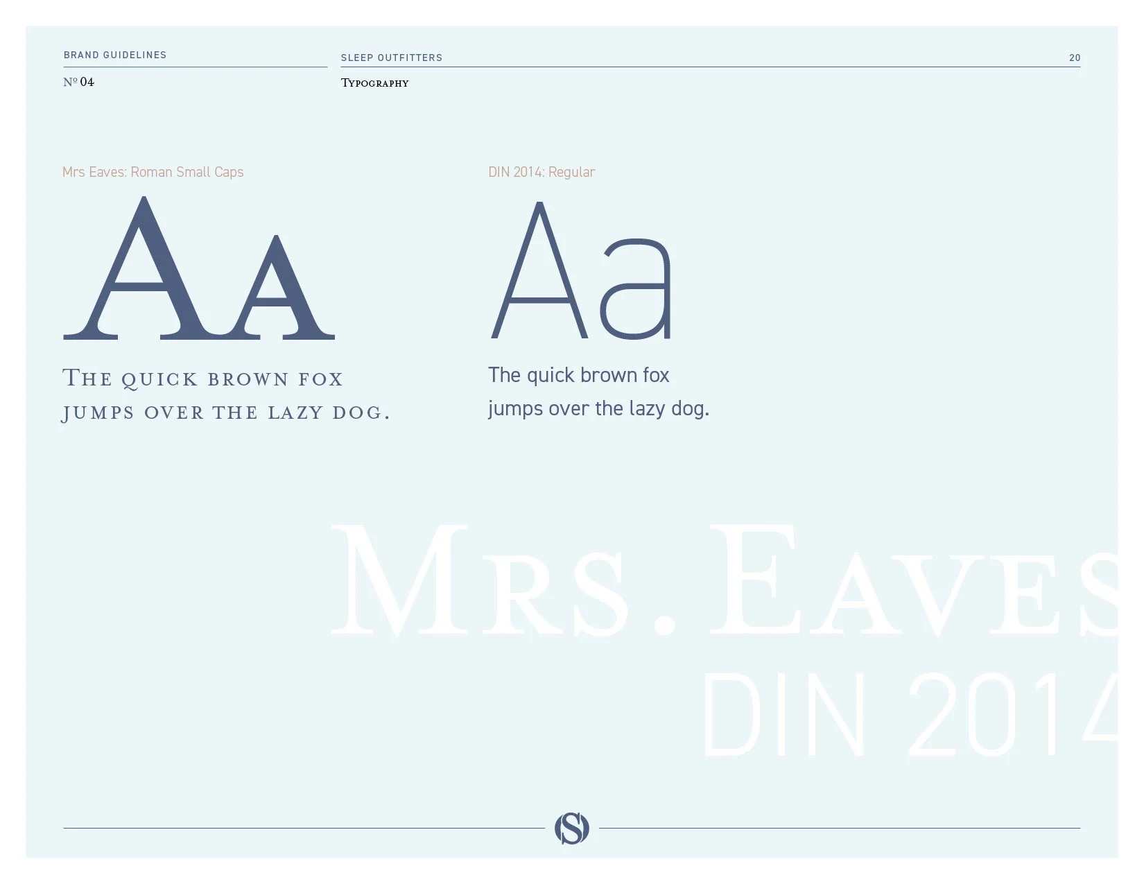
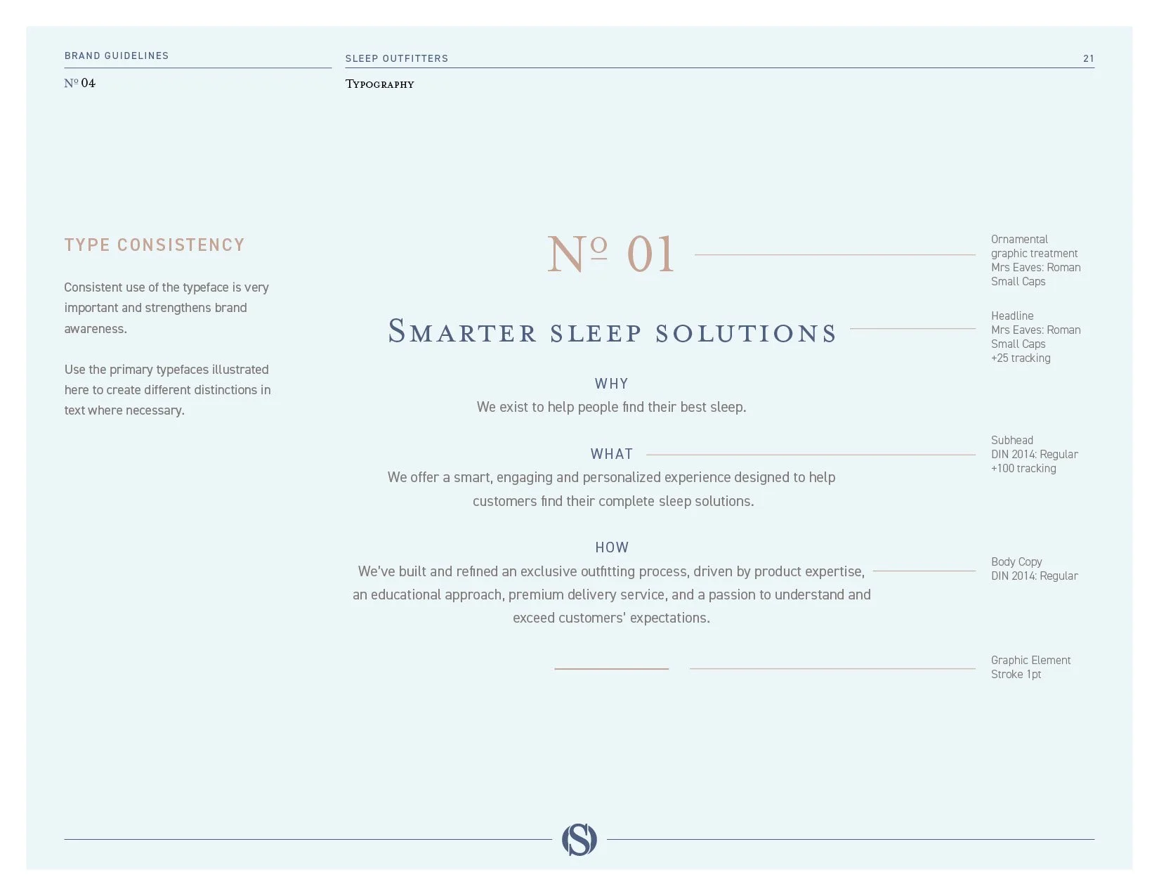
Mrs Eaves in small caps for headlines, a serif with the manners of a printed book, and DIN 2014 for everything long, a plain sans serif that reads at a glance on a sign. The guidelines set the tracking for each, wide on the headlines and wider on the subheads, with a thin rule as the one ornament, so a headline, a subhead and a paragraph keep the same rhythm on a hang tag and on a wall.
The monogram pattern.
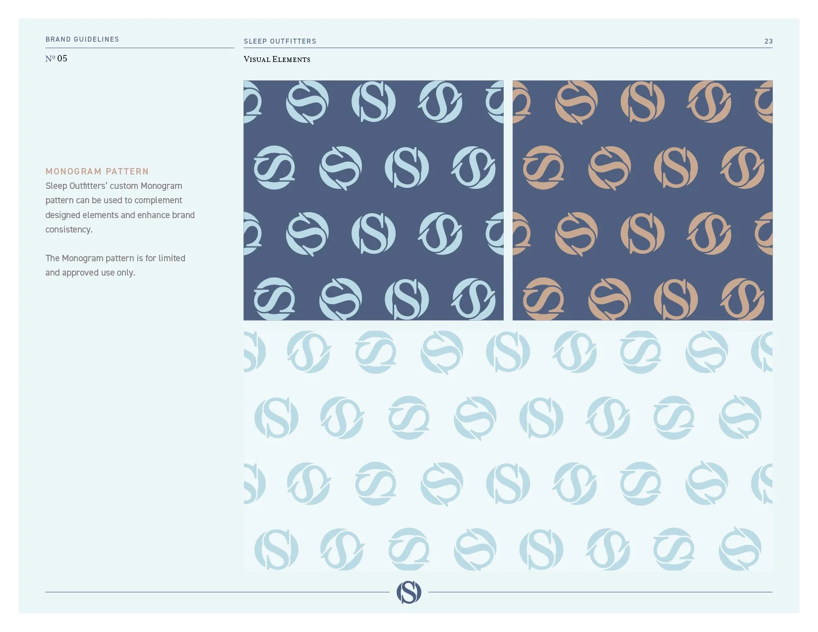
The monogram repeated as a custom pattern, for approved uses only, so a wall, a web page or a delivery piece can carry the brand without a logo on it.
The paint chips.
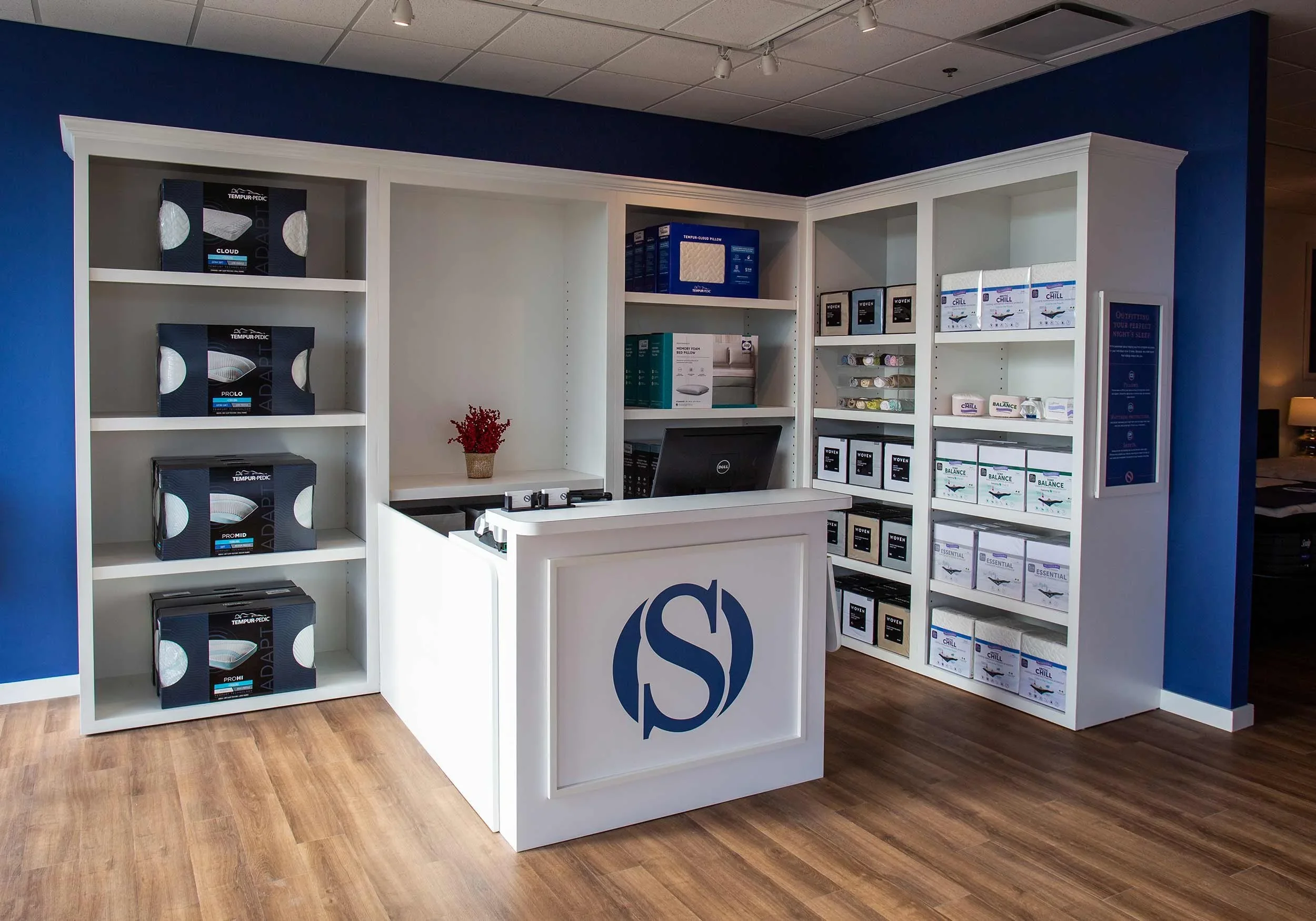
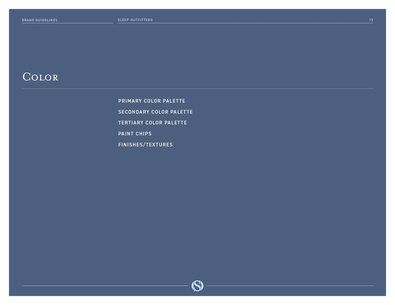
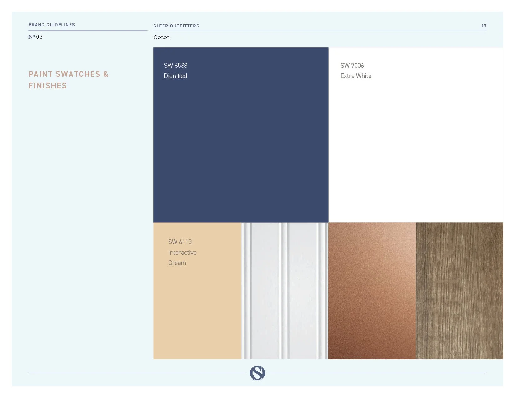
The guidelines name three Sherwin-Williams paints, Interactive Cream, Dignified and Extra White, because the store walls are part of the brand. A guest never sees a Pantone chip. She stands in the paint.
The look.
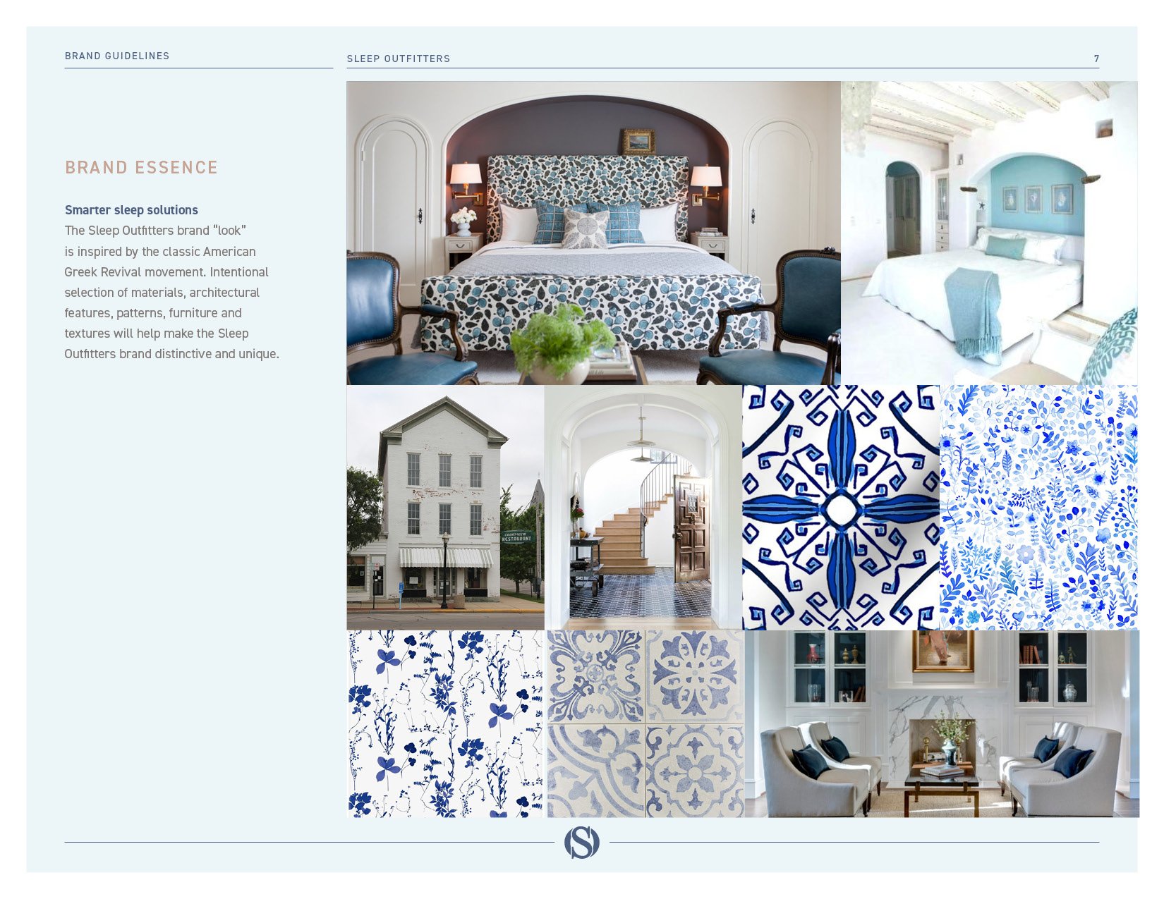
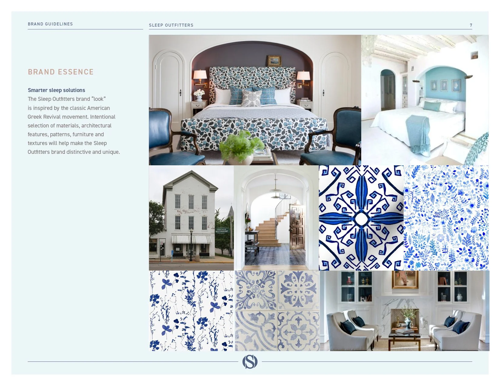
The brand look takes its cue from American Greek Revival, the columns and clean lines of early American building. The guidelines say which materials, architectural features, patterns, furniture and textures carry it, so a new store and a new ad come from the same place.
Outfitters and guests.
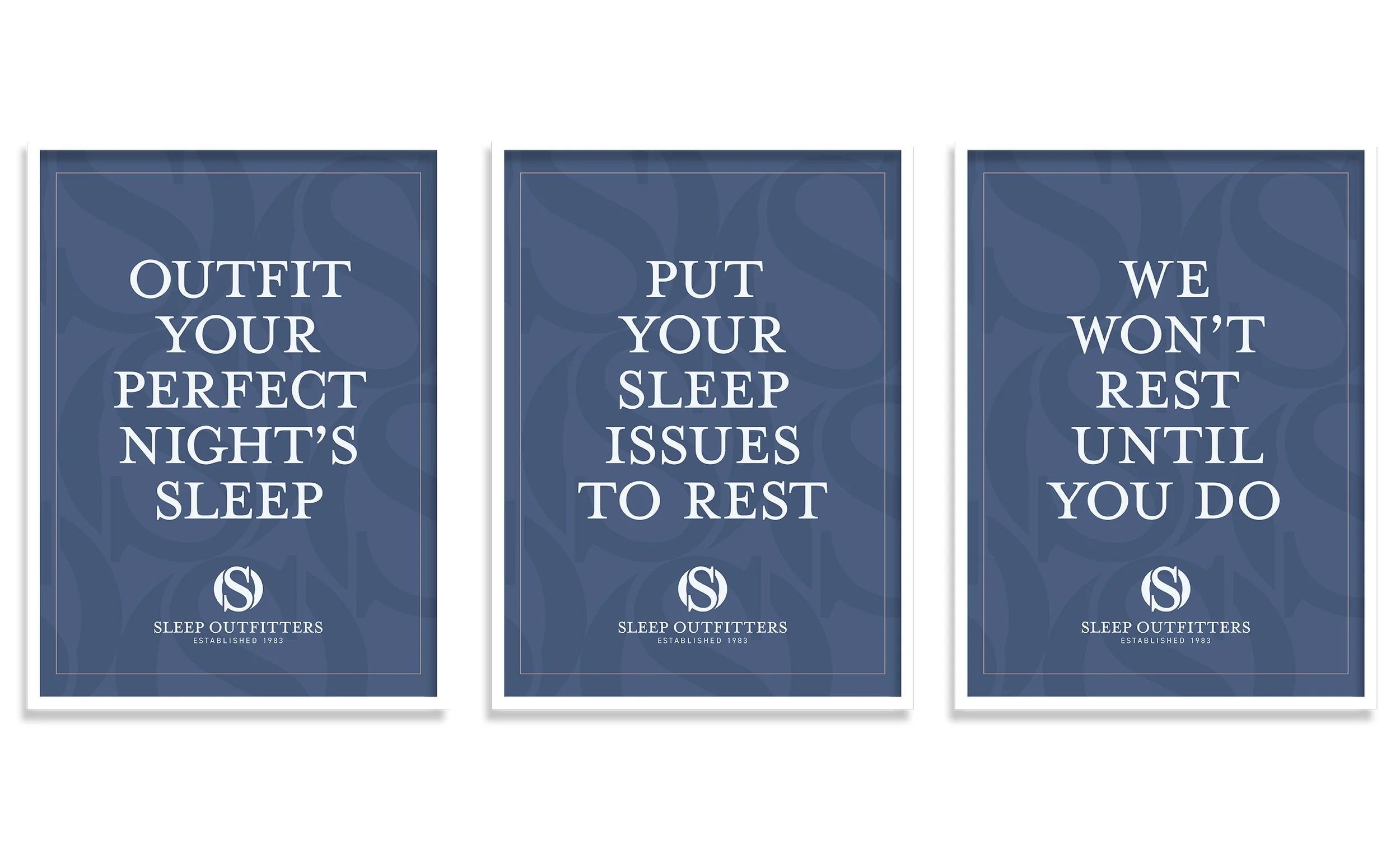
The words are part of the identity. The people on the floor are Outfitters, the customers are guests, and a sale is an outfitting, which the research said should start sitting down, with questions, before anyone lies on a bed. The launch campaign, Outfitting Your Perfect Night’s Sleep, was storyboarded as six television spots, one for each thing a guest walks in with, pressure, motion, temperature, an adjustable base, a grand opening and a sale, and tested with mattress shoppers in February 2020.

What came with the guidelines
The brand book
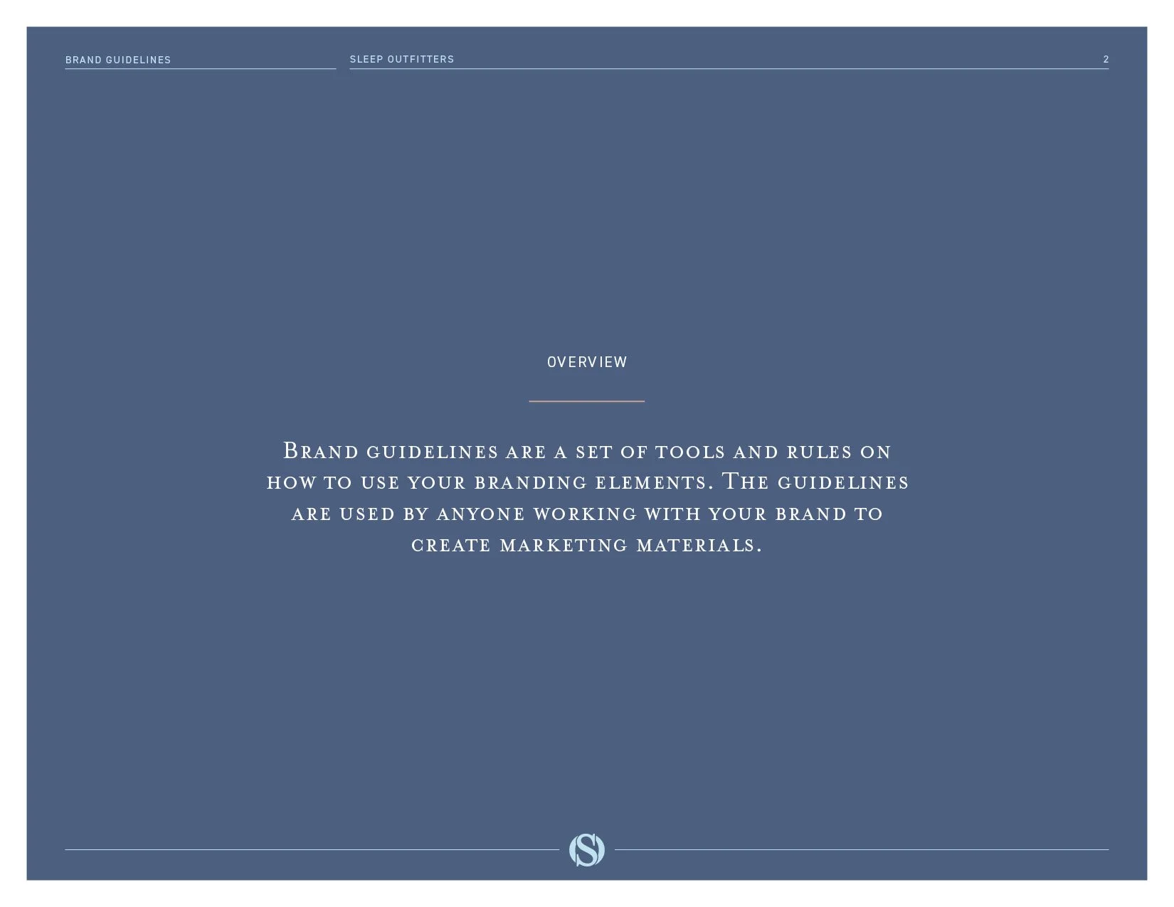
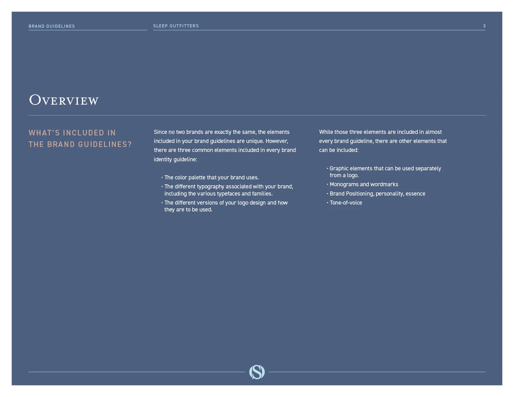
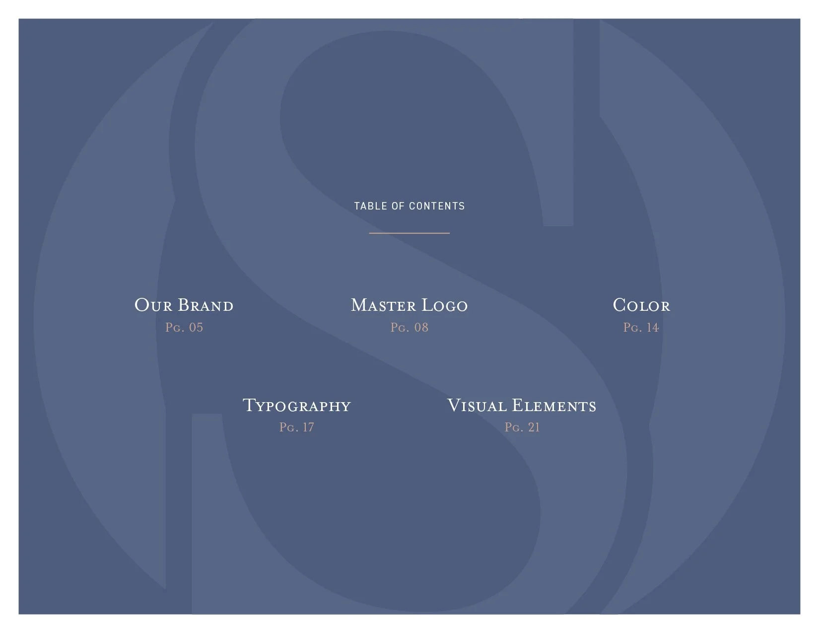
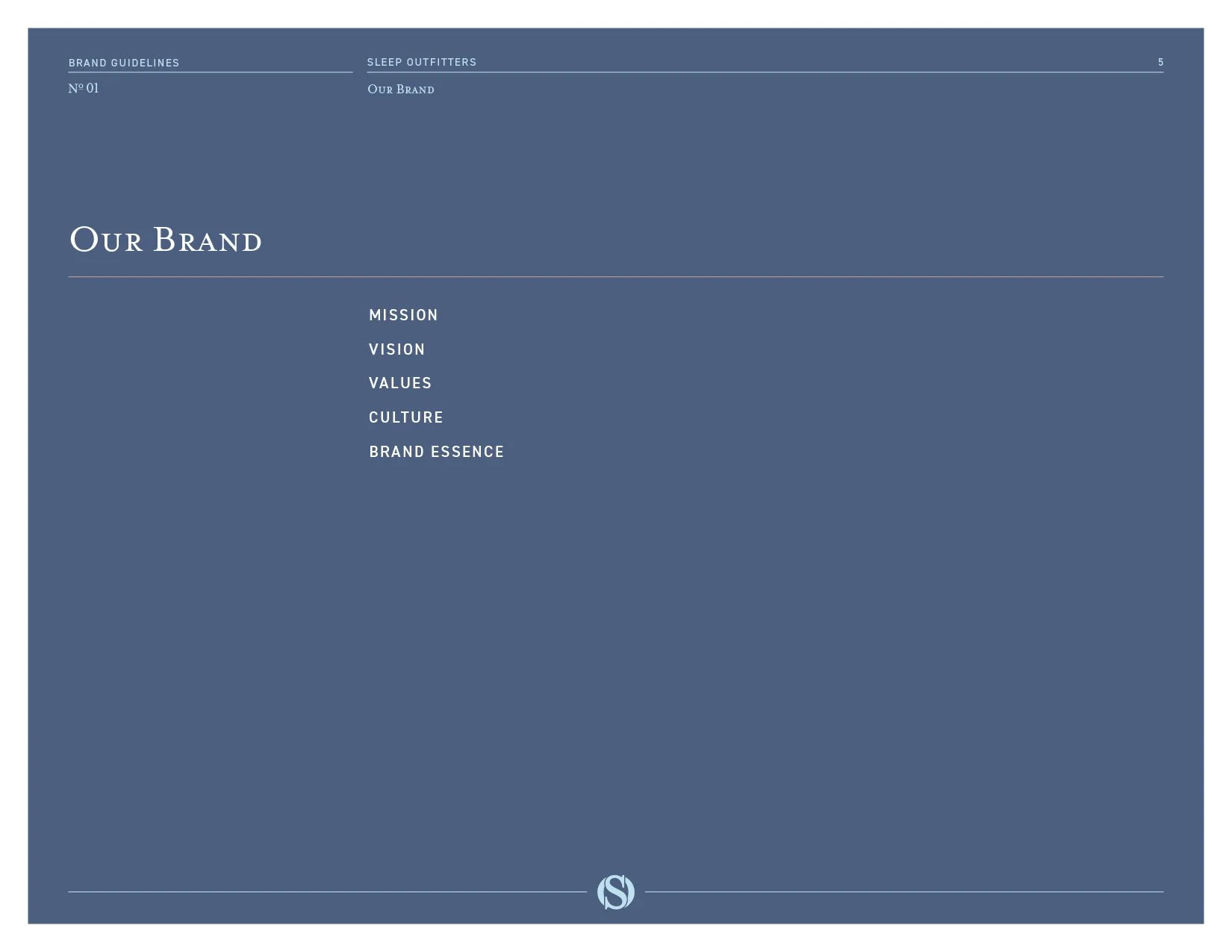
Eighty-five pages in five stages, discover, clarify, differentiate, create and apply, with the store visits, the competitive audit, the market numbers, the shopper research, the SWOT, the position and the identity in one place, dated January 9, 2020. A new marketing hire or a new agency can read how every decision was made.
Logo production files
The monogram, the horizontal logo, three stacked versions and the Est. 1983 logo in CMYK, Pantone, RGB and black, in every print and screen format, with the monogram pattern as a vector file and a swatch library, so nobody rebuilds a mark from a screenshot.
Personas & Story
Three customer personas built from the company’s own customer records, each with what she wants from a store and where she spends her media time. The launch campaign brief, the six storyboards and the copy test that proved the word. And the email program that followed in 2020, a welcome series, a post-purchase series and a cart series rewritten in the brand’s voice, so the first thing a new subscriber reads is an introduction to outfitting.
The results
The identity work started in July 2019 with moodboards. The first brand guide went to the client in October 2019, the week the first stores were being painted, and the brand book and the second edition of the guidelines followed in January 2020. The six storyboards were tested with mattress shoppers in February 2020, and they understood the word at once. Outfitting read as unique among mattress stores, and the salesperson they had wanted to avoid became someone they wanted to find. The brand went across the chain in 2020, with the website, the stores, the advertising and the email program on it. A brand study across nine markets in 2021 found Sleep Outfitters buyers more willing to buy again, and more willing to recommend the store, than the buyers of any national competitor in the study. Six years on, the name is still on the stores and on sleepoutfitters.com.
FAQ’s
-
Because the old one was the problem. Shoppers dread being hovered over by someone who wants a sale, and that dread was keeping them out of every mattress store. An Outfitter asks questions first and equips a guest for sleep, mattress, base, pillows and all. In the copy test, the shoppers who had wanted to avoid a salesperson said they would seek one out. The word came out of the position, and the people on the floor still carry it. Here is how we do brand strategy consulting.
-
One position, then one look, then one launch date. The stores came first, paint, signs and wayfinding, because a guest meets the brand on the floor before she sees an ad. The launch campaign and the new website were set for one date across every market, so no town got the new brand before its store was ready. For the same order of operations at a manufacturer, a full rebrand for a manufacturer is its own page, and the Code Blue case study shows one house brand holding every product.
-
Everything a store manager, a new agency or a new hire needs to make a decision without a meeting. The Sleep Outfitters book runs in five stages, discover, clarify, differentiate, create and apply, so the research, the position and the rules sit together, and the guidelines go as far as the paint on the walls and the type on a hang tag. A brand book built for a hundred schools is in the National Heritage Academies case study.
-
About a year from the first moodboard to the launch, when the stores are part of it. Moodboards in July 2019, the first brand guide in October, the brand book in January 2020, the copy test in February and the launch across the chain in 2020. A company launching a brand to the public for the first time moves on about the same clock, in the Verdant Graphics case study. One that kept its name and added a program brand under it took eight months, in the La Isla Network case study.
Services
Brand discovery · Store audit · Competitive audit · Consumer personas · Brand positioning · Brand personality · Brand book · Logo design · Logo system · Color system · Typography system · Store paint and materials · Brand guidelines · Launch campaign · Storyboards · Copy testing · Email strategy · Logo production files
Selling what everyone else sells, the way everyone else sells it? Start with what is true.
Start a conversation
Wit & Craft is the brand agency for owner-led manufacturers and trades, in Grand Rapids, Michigan, since 2015.