How brand guidelines took the new NHA brand to more than 100 schools
Wit & Craft wrote the brand guidelines that let National Heritage Academies (NHA) launch its new logo across more than 100 charter schools in nine states without losing control of it. NHA had decided on the mark. It did not have the rules, and schools were already asking to put the logo on things. In a little over three weeks we refined the logo system, wrote a rule for every version of it, built a template for school lockups, and delivered a master file NHA's own team keeps editing. Schools got one brand. The creative team got a page to point to instead of a request to answer.

The challenge
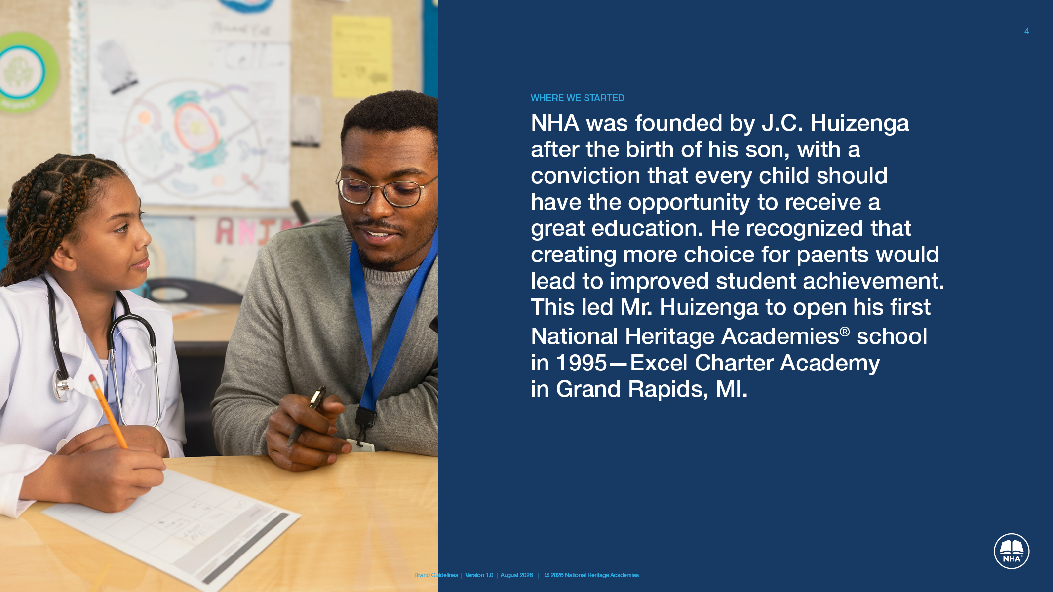
National Heritage Academies opened its first charter school in Grand Rapids, Michigan, in 1995. Today it manages more than 100 schools in nine states. For most of that time the marketing led with the school, and many families never knew theirs was part of a larger network. NHA's research found real brand equity sitting unused in the parent name. So the marketing flipped. National Heritage Academies comes first now, and the school near you comes second.
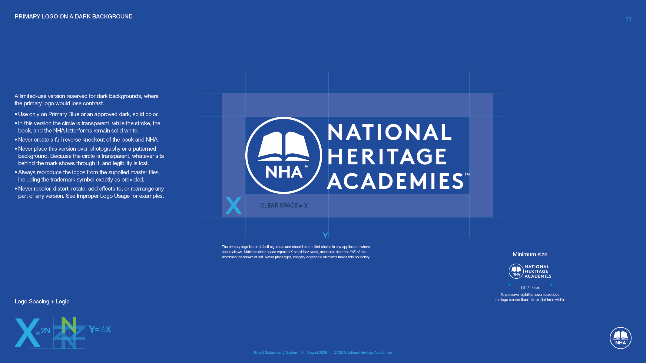
The logo had to catch up. Most schools carried a book logo, a few carried a crest, and a bridge logo had pulled both under the NHA name as a first step. After more than a year of work, NHA had decided on its next mark, an open book and the letters NHA inside a blue circle beside the full name. Then a newly acquired school needed a brand right away. Rather than set it up with the bridge logo and change it again in the fall, NHA chose to launch the new brand now.
That left a three-person creative team deciding things on the fly. Where does the trademark symbol sit? There are signs to print, so pick. A school emailed to ask for the new logo on tumblers. The team had seen this before. The bridge logo went out without written rules, every request came back to the designers, and projects slowed while they thought each one through. This time they wanted the rules written before the requests arrived, and they wanted fresh eyes on them.

Why a phased guide?
The team had weeks, and it had already weighed a full rebrand and set it aside as too big a change for the organization. We did not propose one. We proposed phases. Phase one was the logo system, the type and the colors, the three things a launch cannot go without, written tight enough that a school office can follow them without calling corporate. Phase two wrapped the rest of the book around it. We drafted both together so NHA could review the whole thing in one sitting, and a launch version hid the sections still being decided.
A brand guide should set the tone without boxing people in. Rules for every case put the internal team, the vendors and the brand itself in a box, and the brand stops growing. So we wrote guardrails. Strict where a loose rule would be misused, which at NHA meant the logo. Open where a school's own judgment is fine.
What the brand guidelines cover
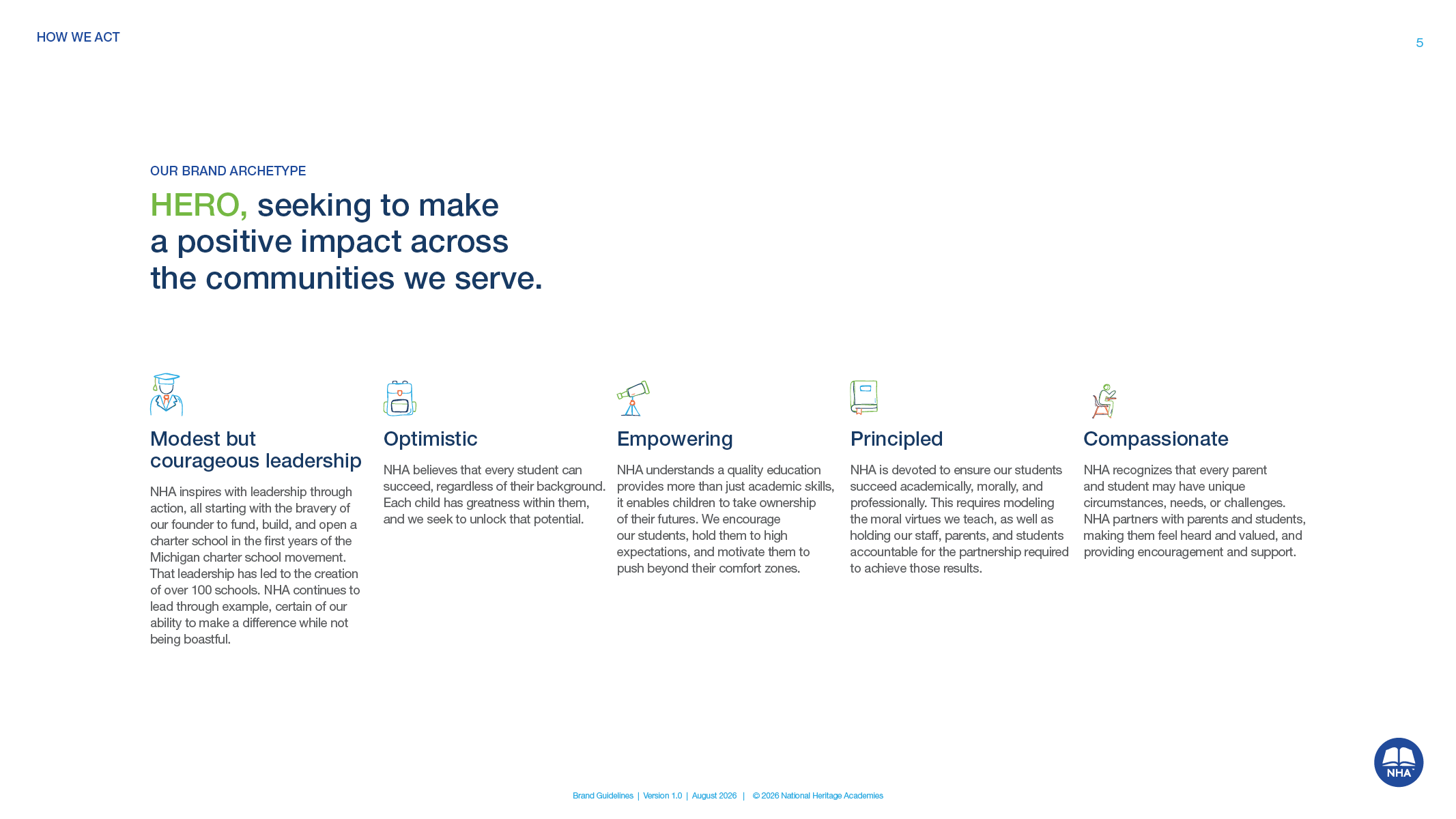
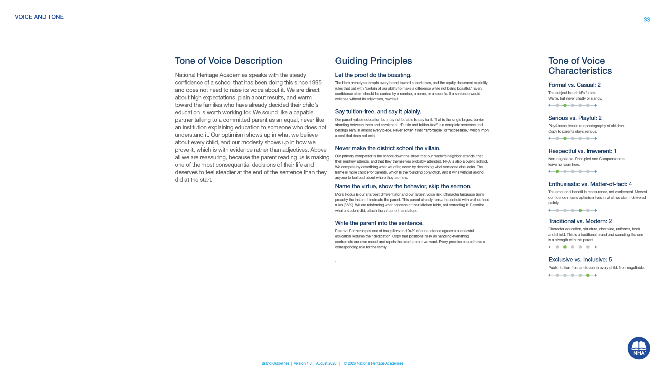
Who NHA is.
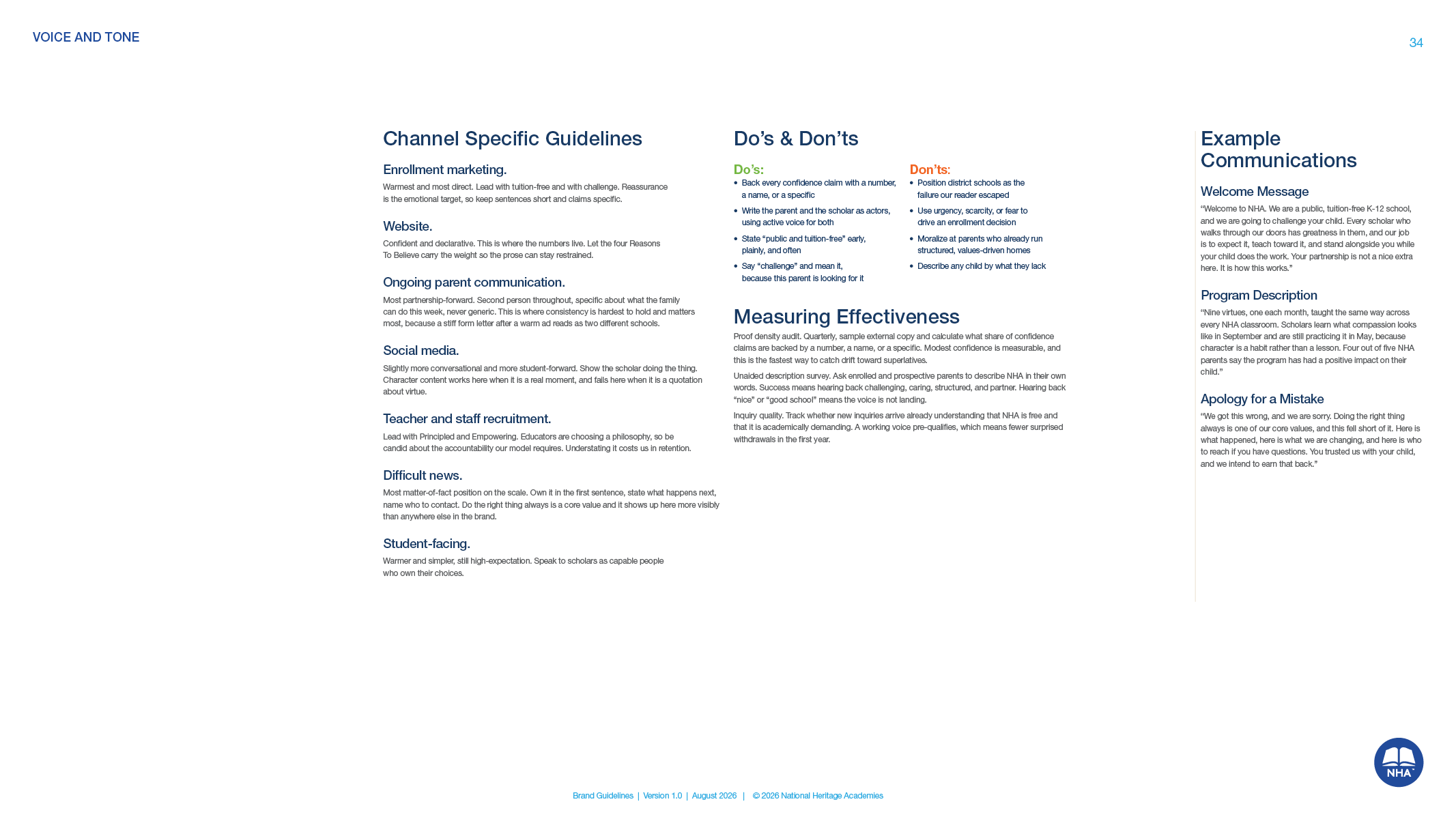
The belief, the purpose, how the company started, its personality, and the parents it serves, so every rule that follows has a reason behind it. A voice and tone section sits in the master file for a later release.
Logo system.
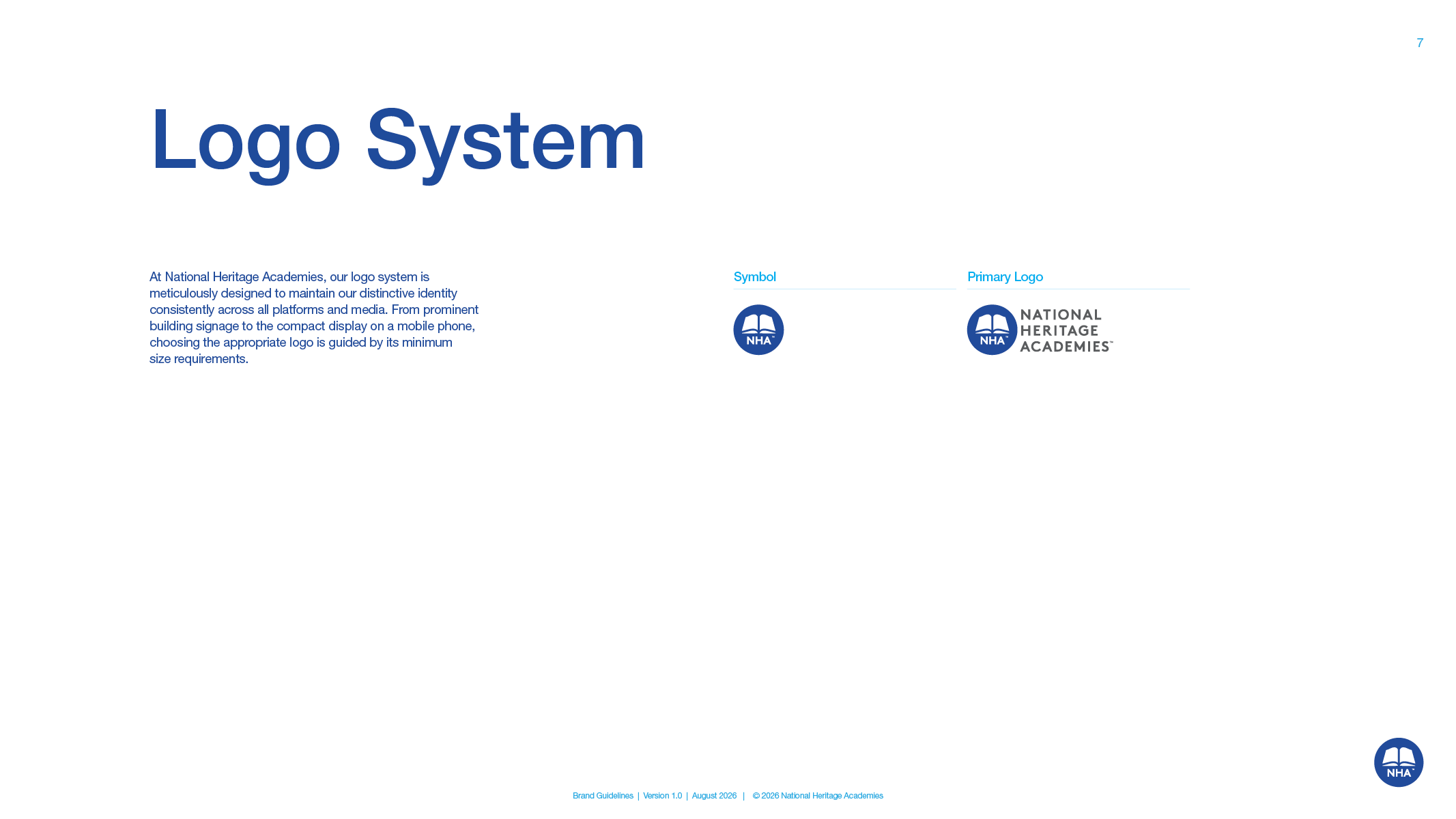
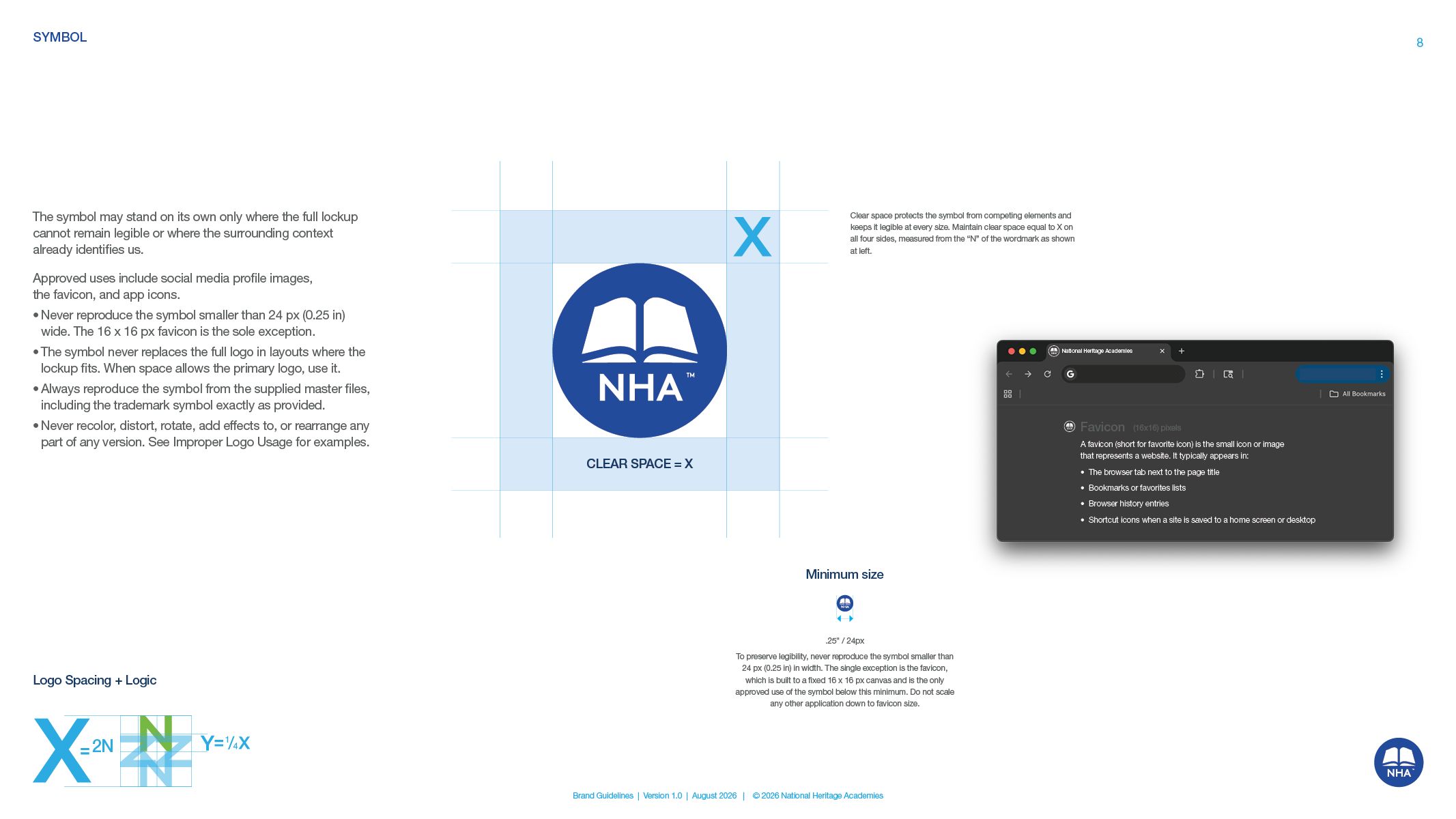
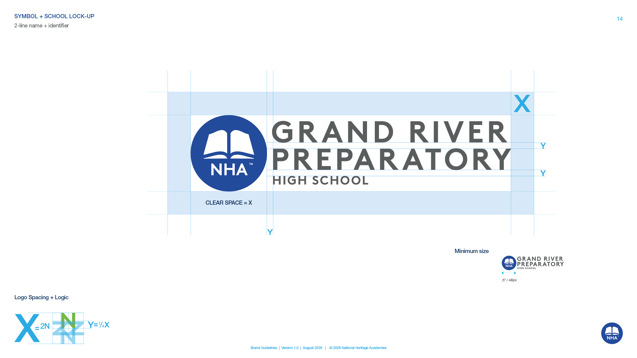
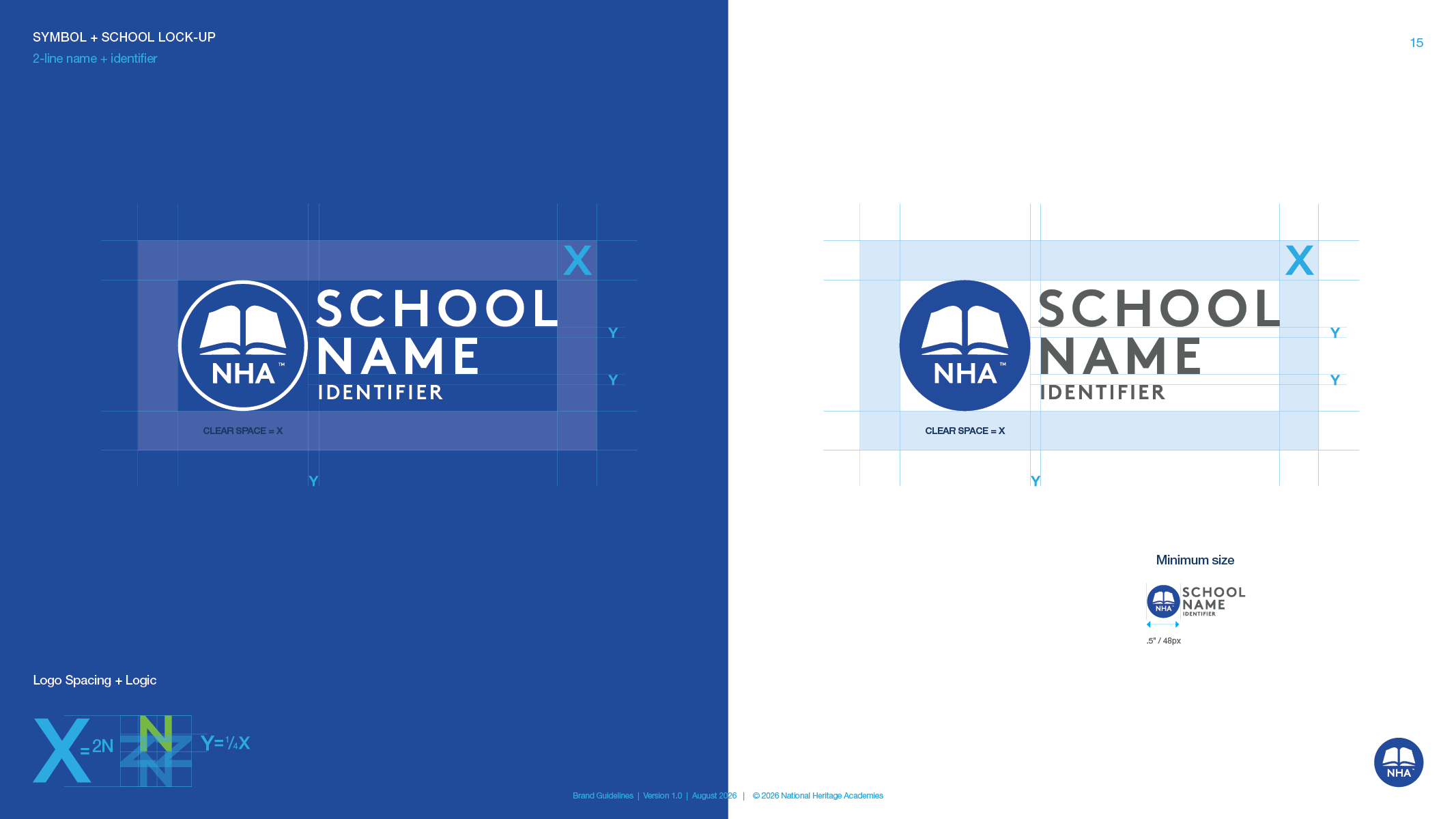
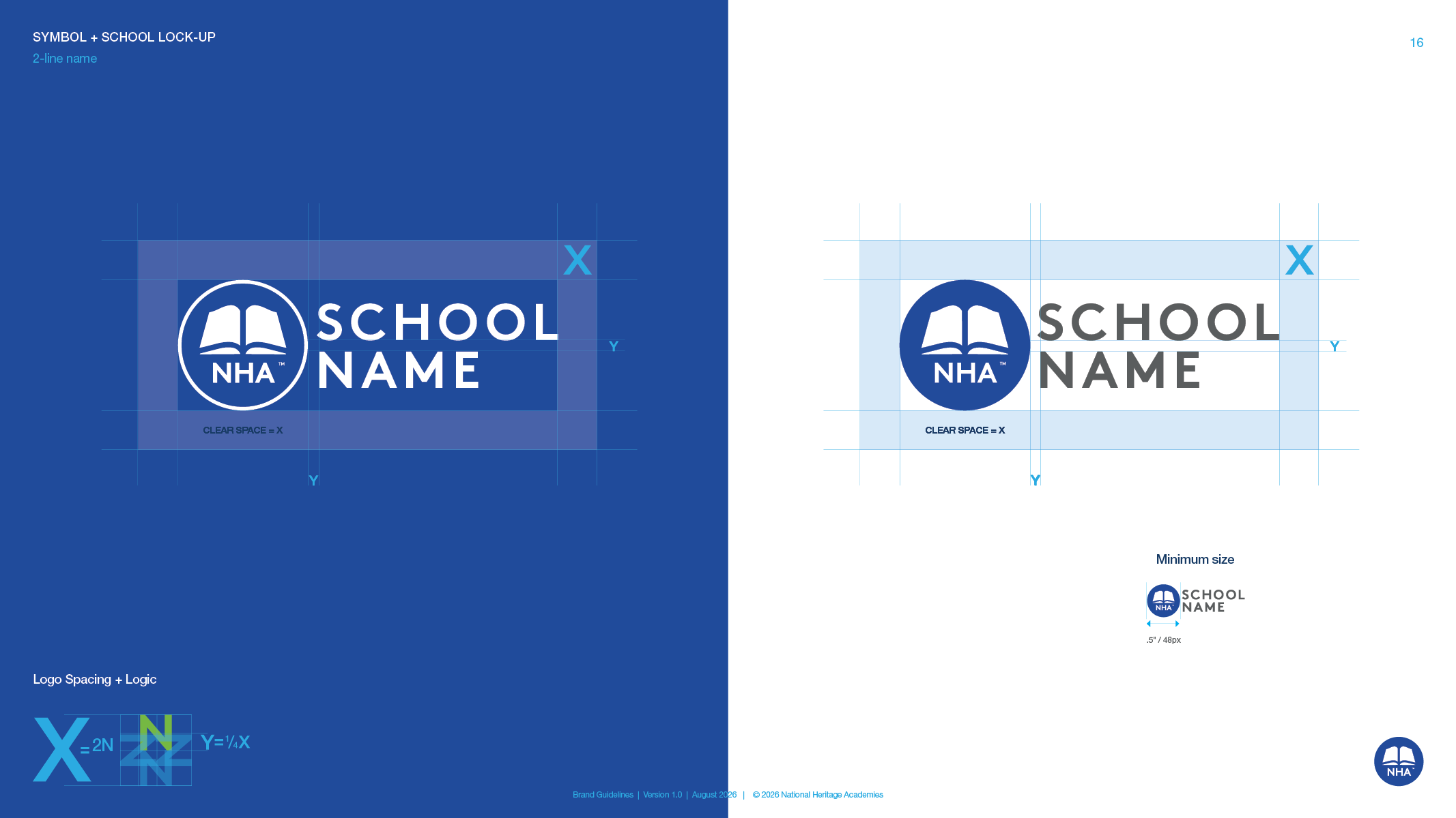
The symbol and the primary logo, with clear space measured from the N in National and minimum sizes down to the favicon. Each version has its own rule. Blue and gray in most cases. White only on dark backgrounds, with the circle left open. Black or blue only for the rare print job that allows nothing else. The symbol alone only where the full logo cannot fit.
School lockups.
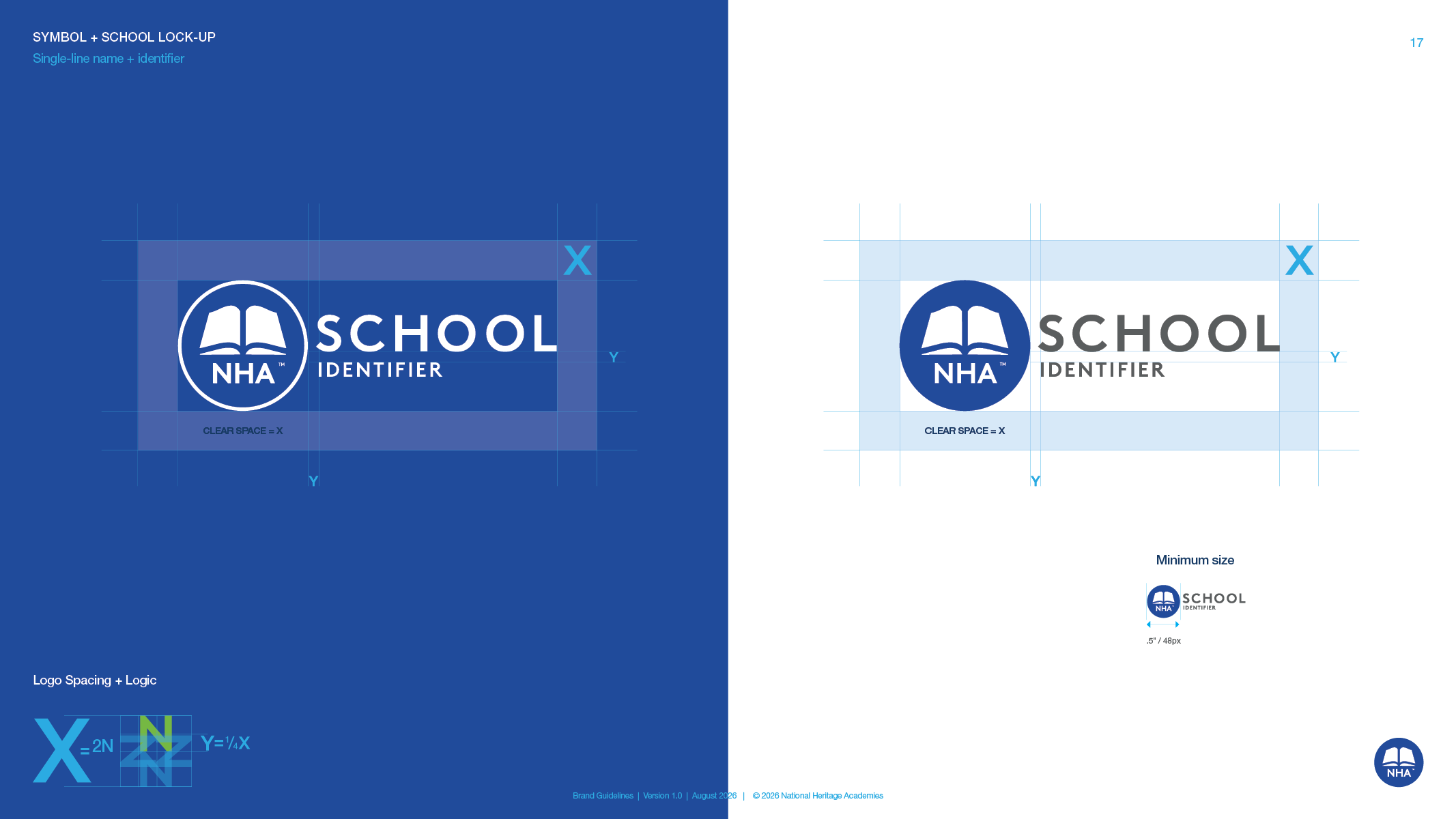
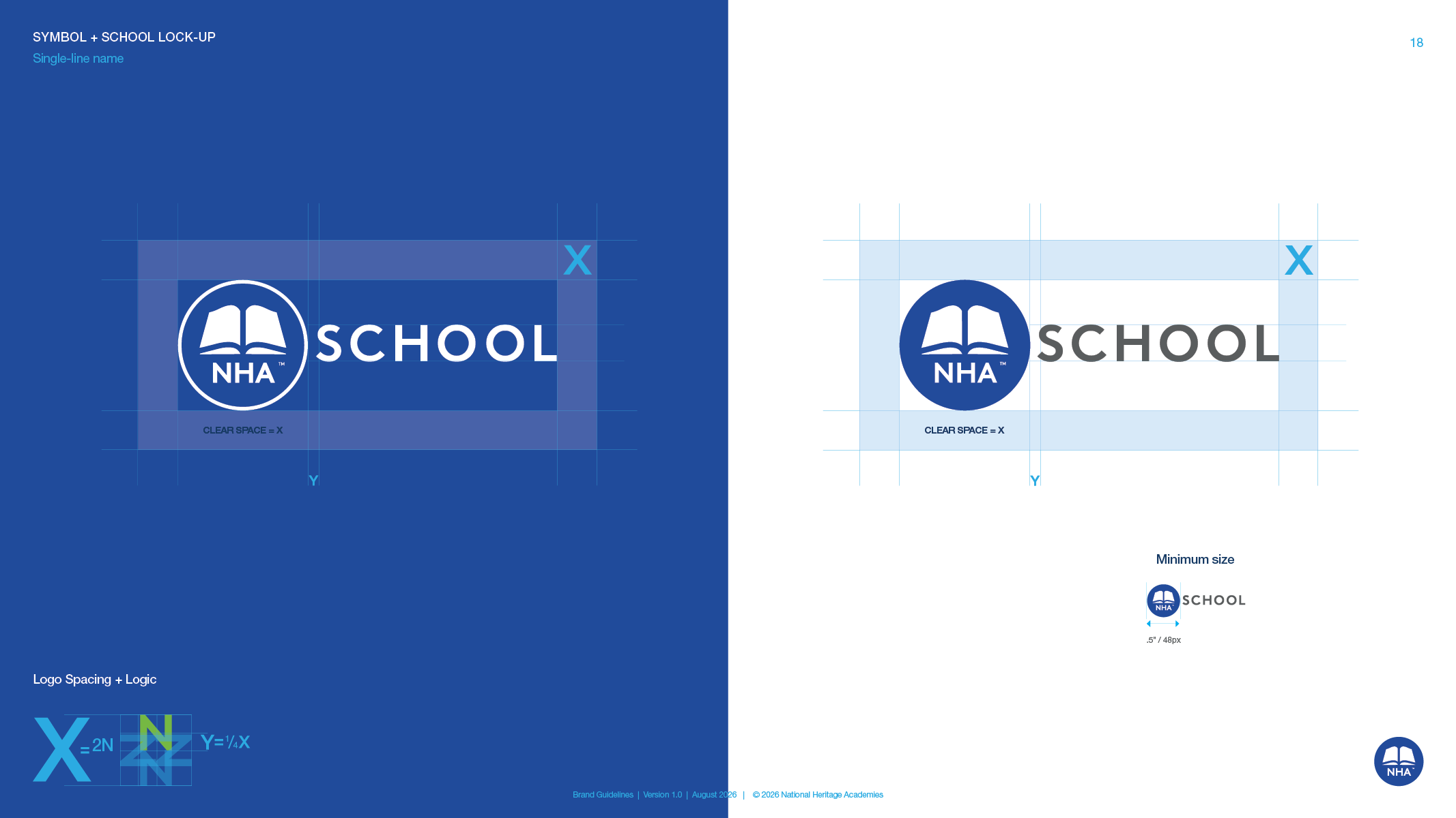
How any school name, two words or five, locks up with the symbol. Four layouts, one clear-space rule and one minimum size, so more than 100 schools read as one family.
Improper logo usage.
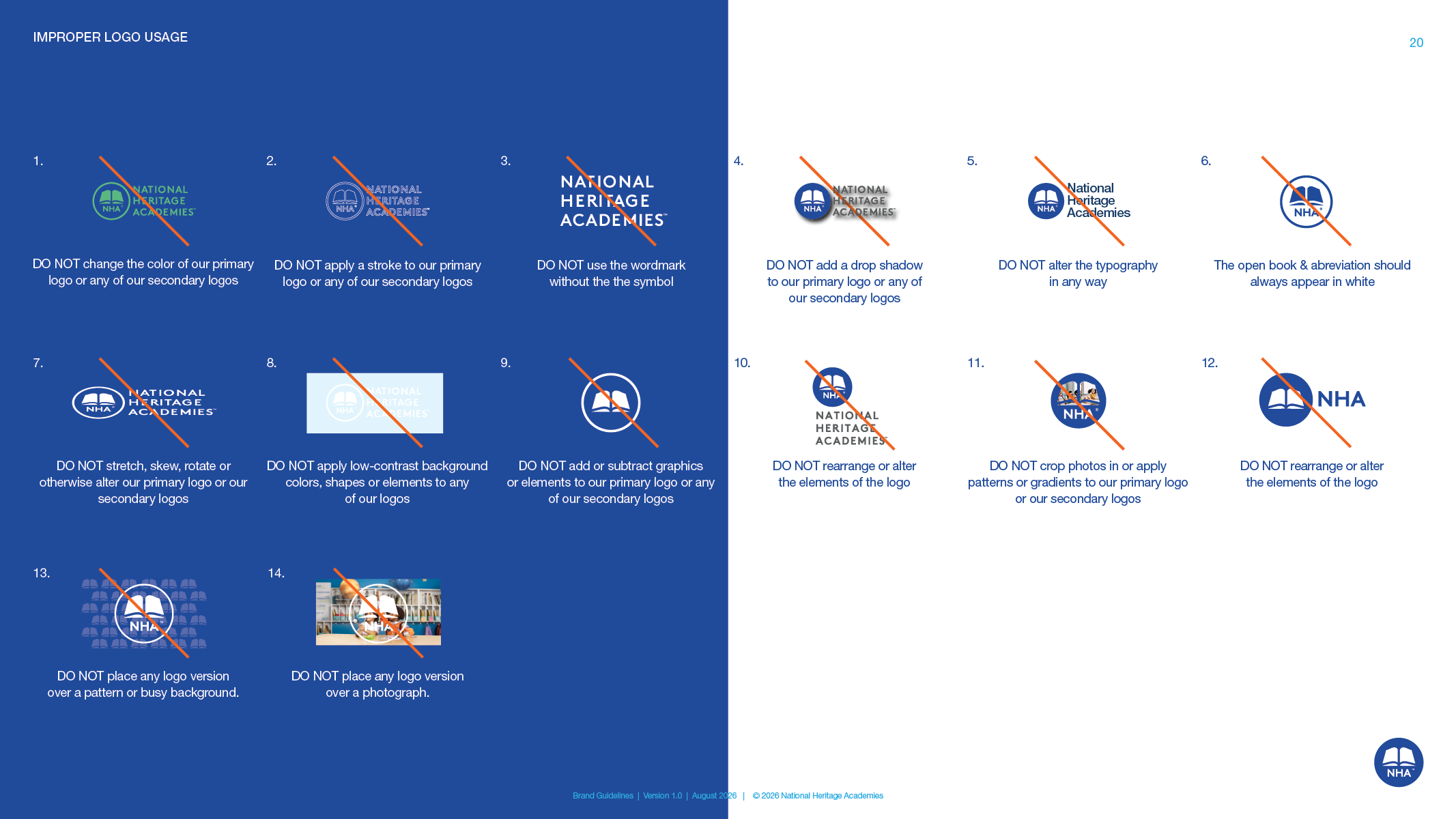
Fourteen don'ts, each with a picture, including the two that caused the most trouble. Never over a photograph. Never over a pattern.
Signage sizing.
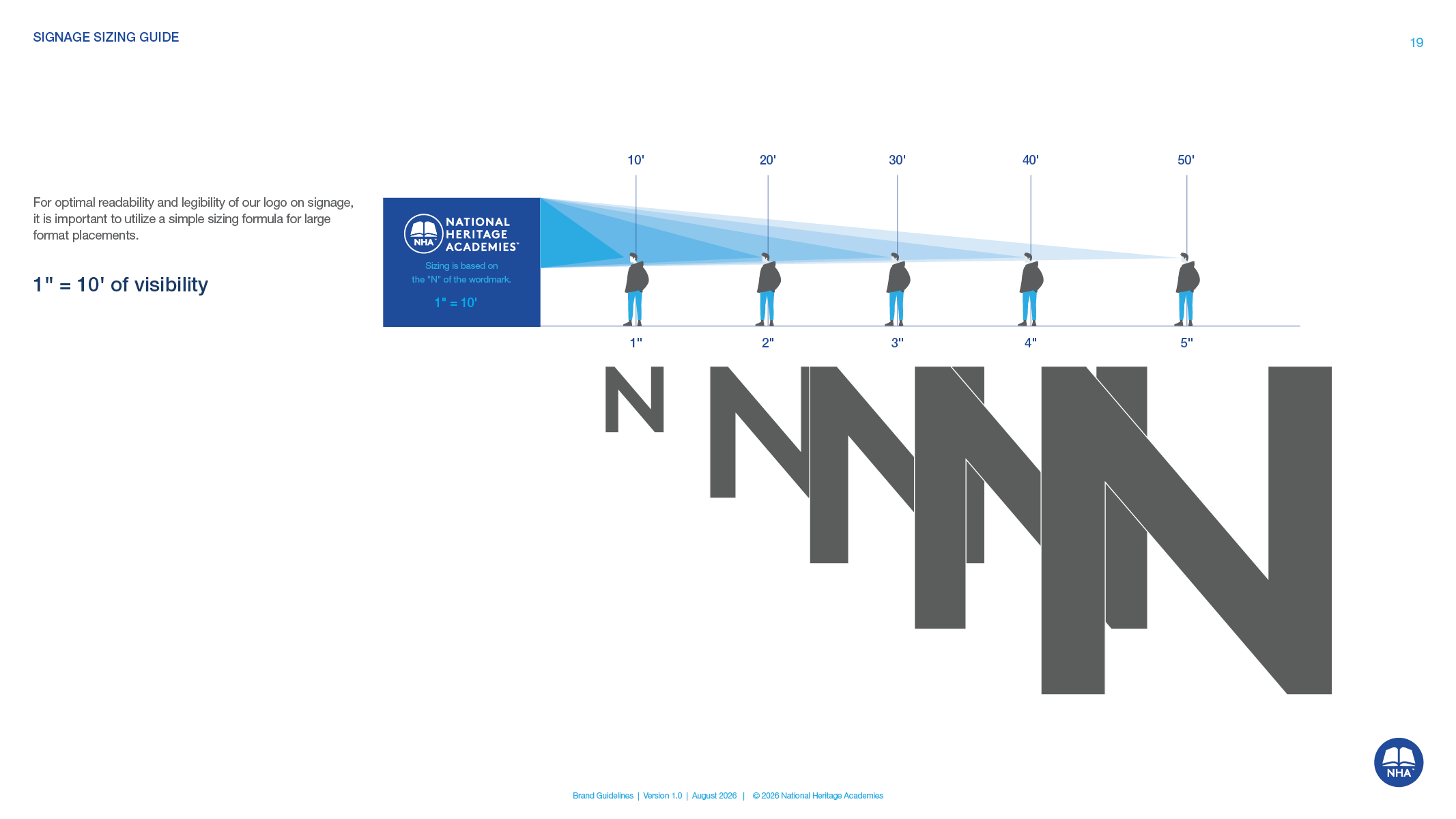
One inch of letter height for every ten feet of viewing distance, measured on the N, so a sign reads from the parking lot.
Color.
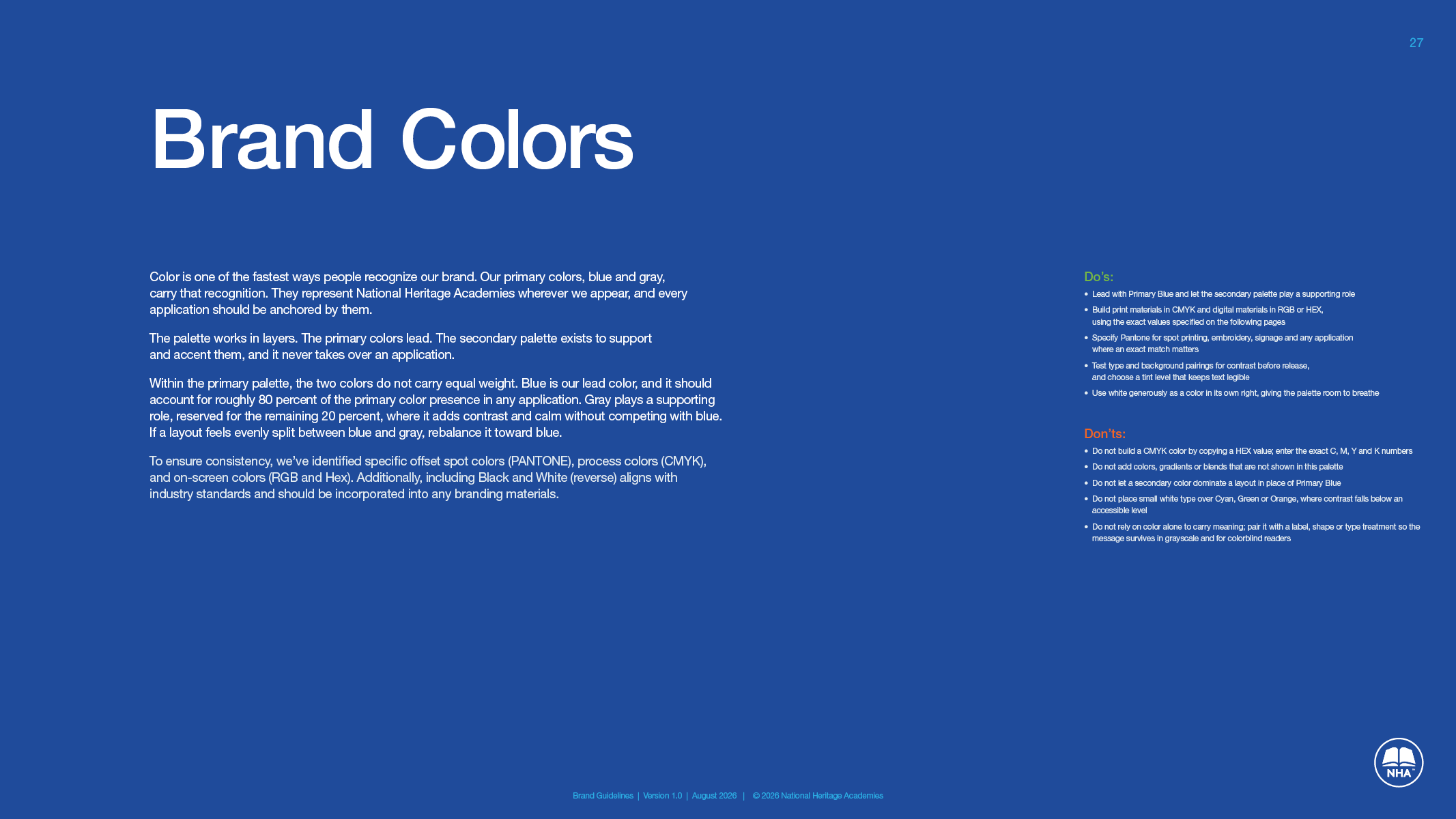
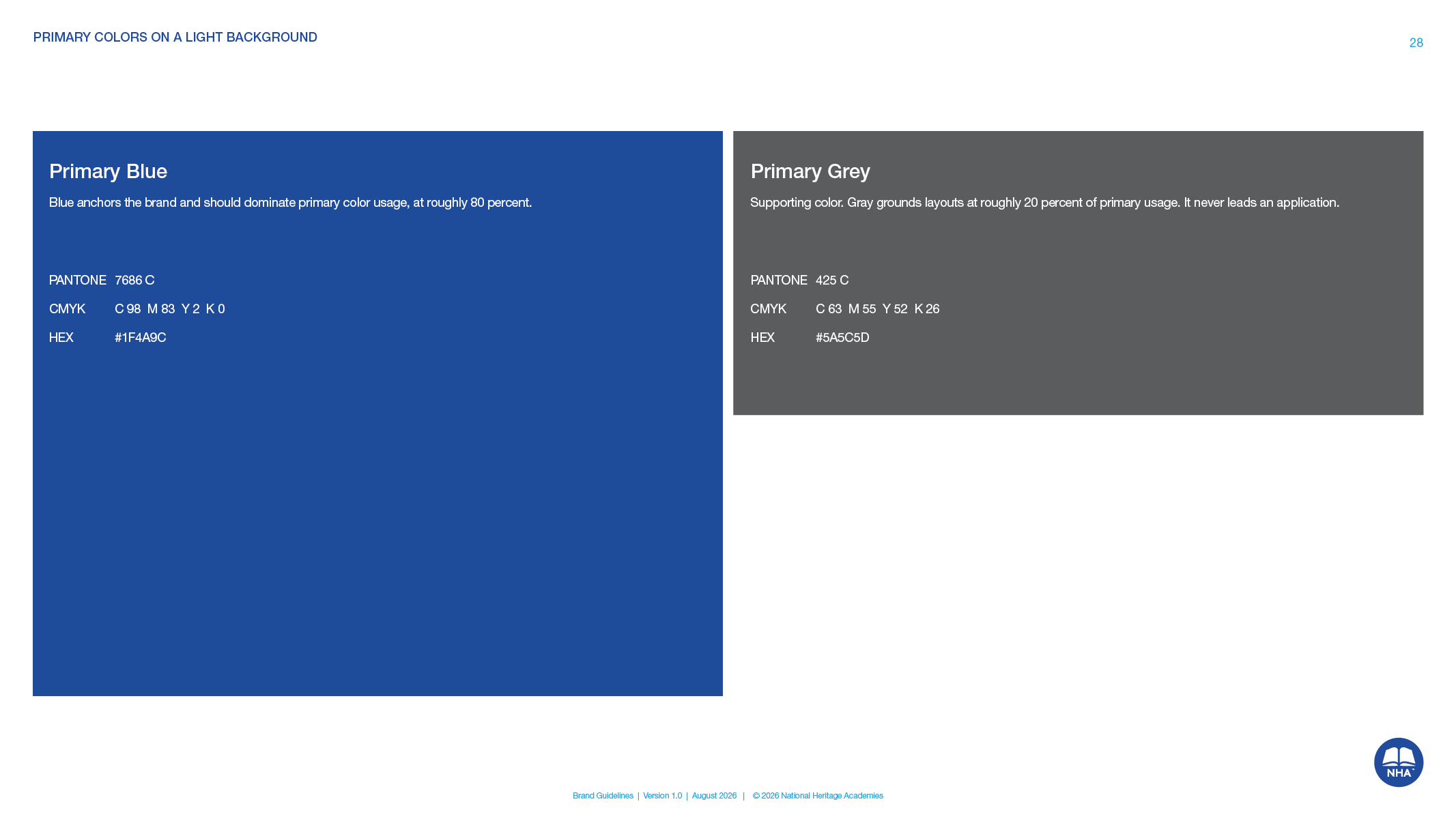
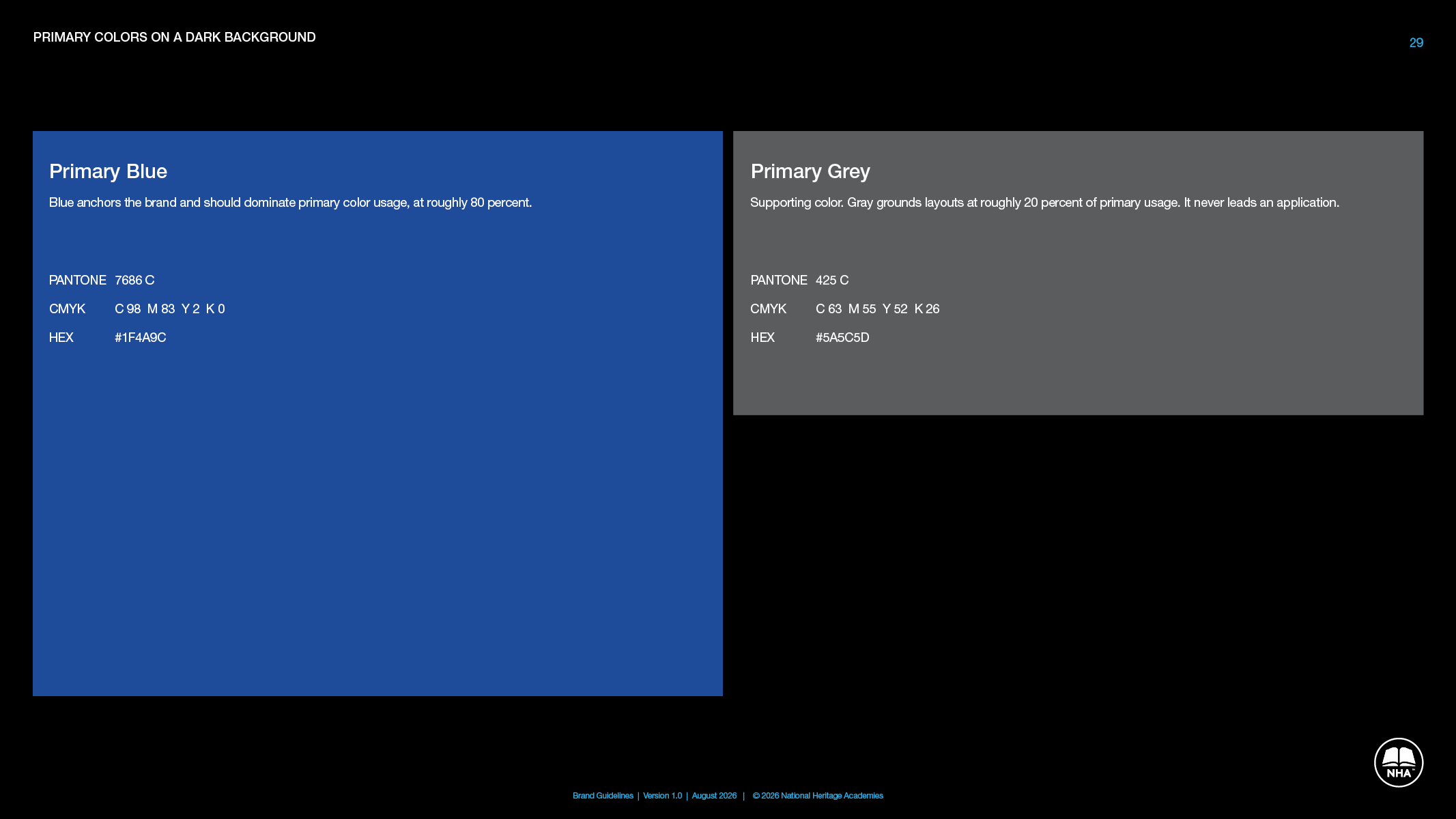
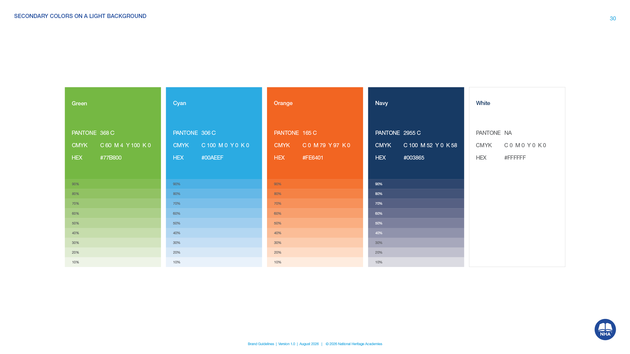
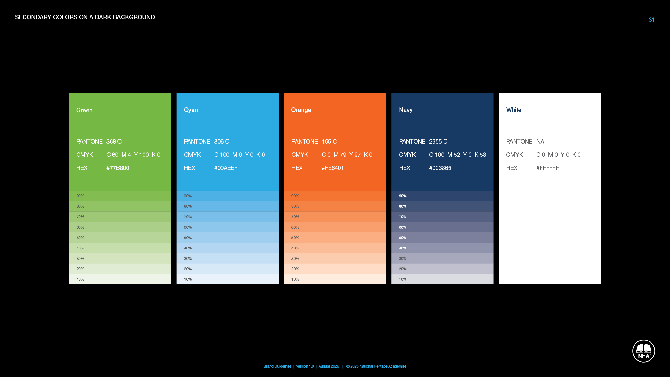
Primary blue and gray with the split written down, roughly 80 to 20, so layouts stop coming out half and half. A secondary palette of green, cyan, orange, navy and white with tints, the print and screen values for each, and when to call for a Pantone match.
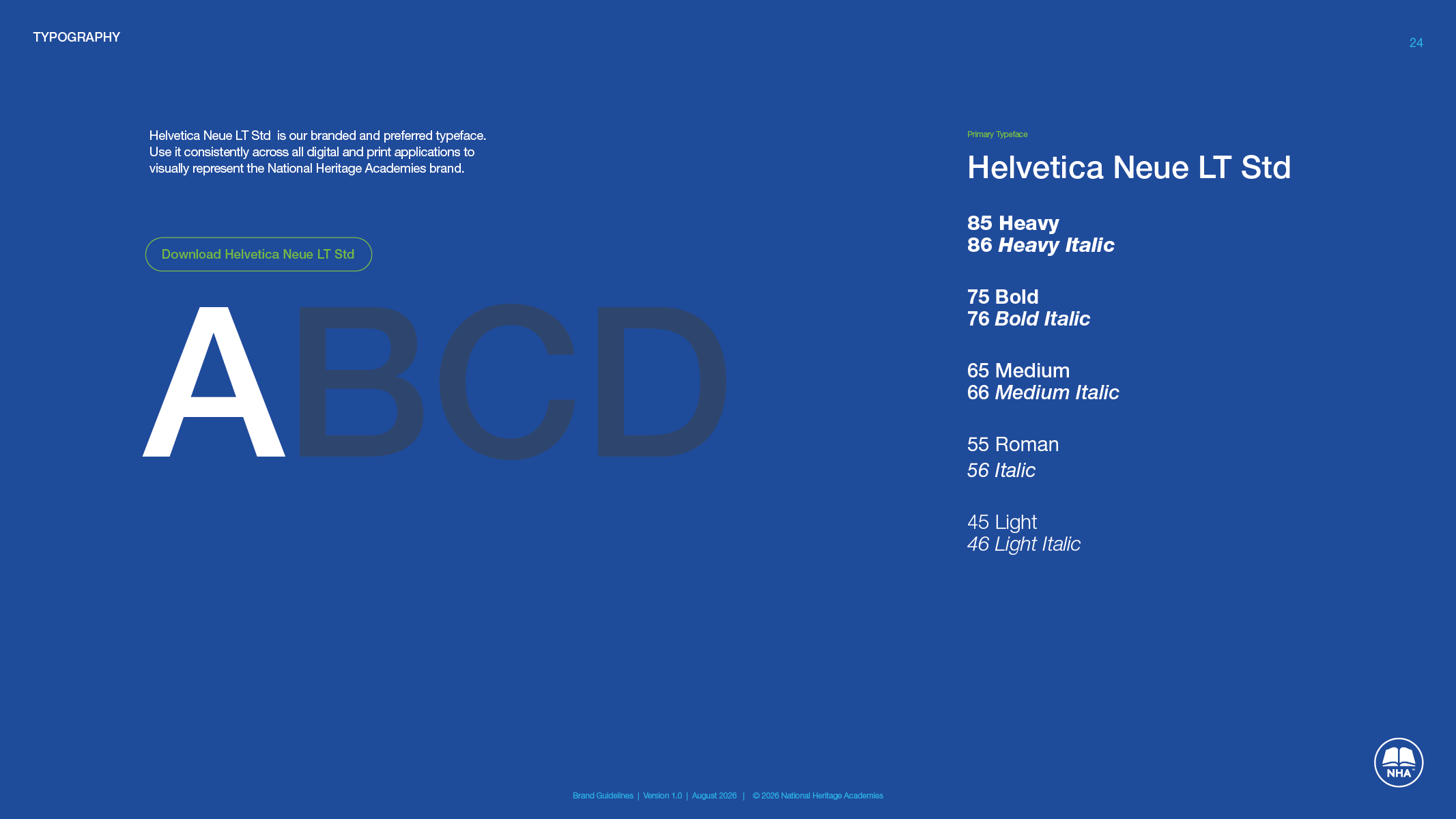
Typography.
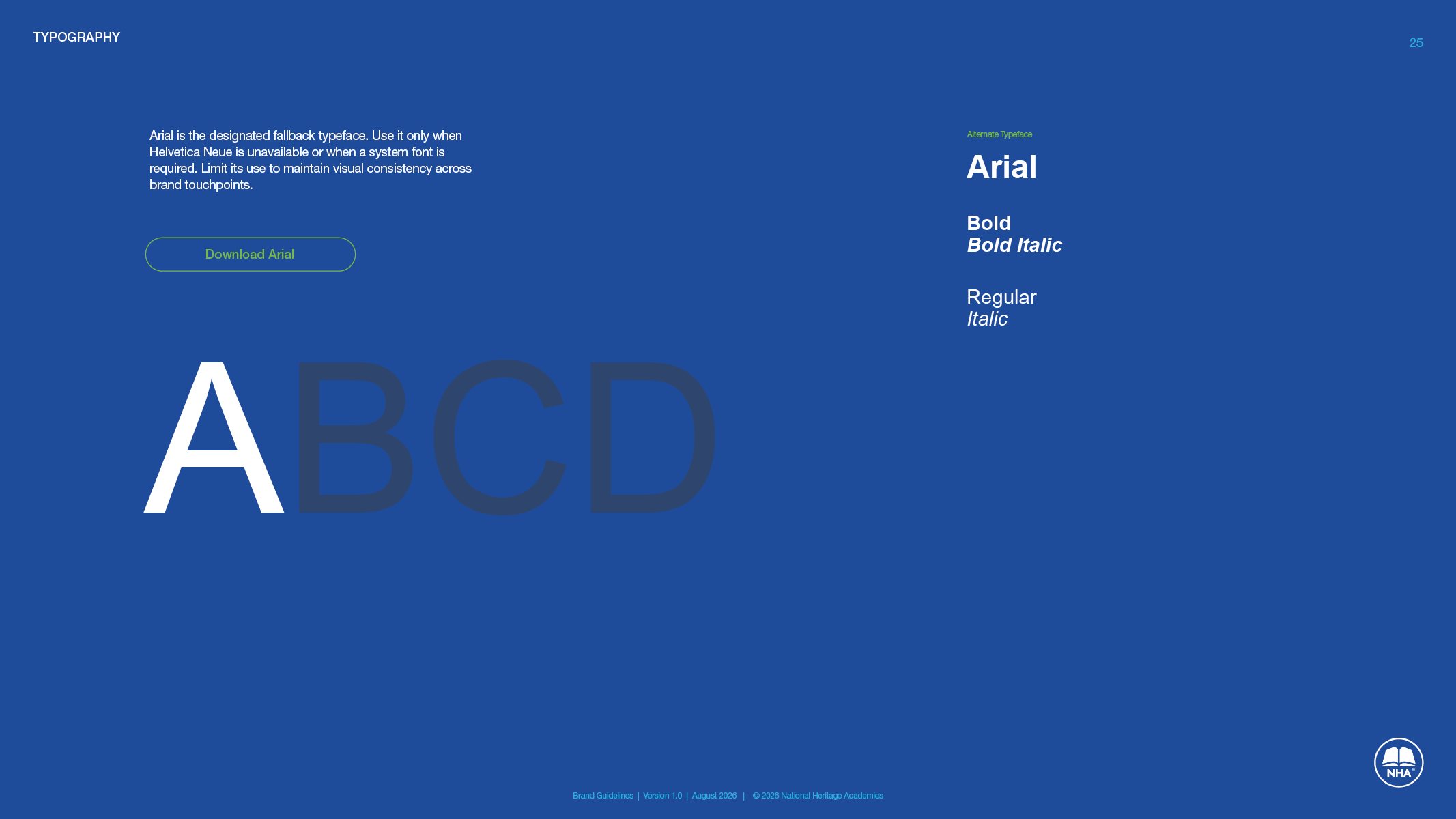
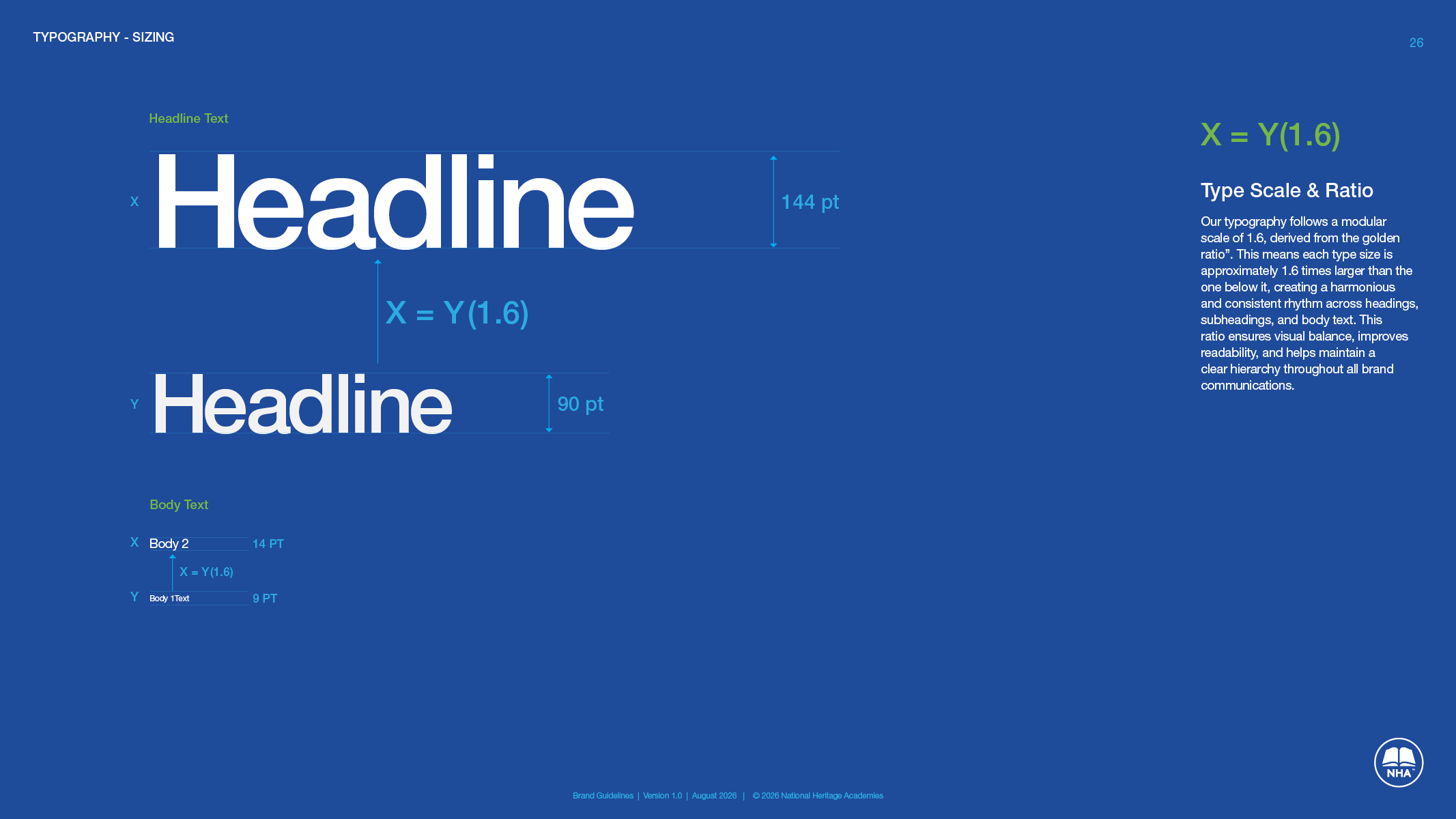
Helvetica Neue for the brand, Arial when it is not available, and a type scale of 1.6 so headings and body text keep the same rhythm on a sign, a website and a flyer.
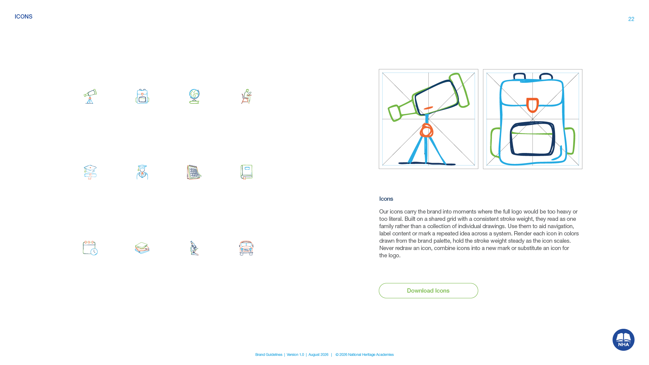
Icons and art direction.
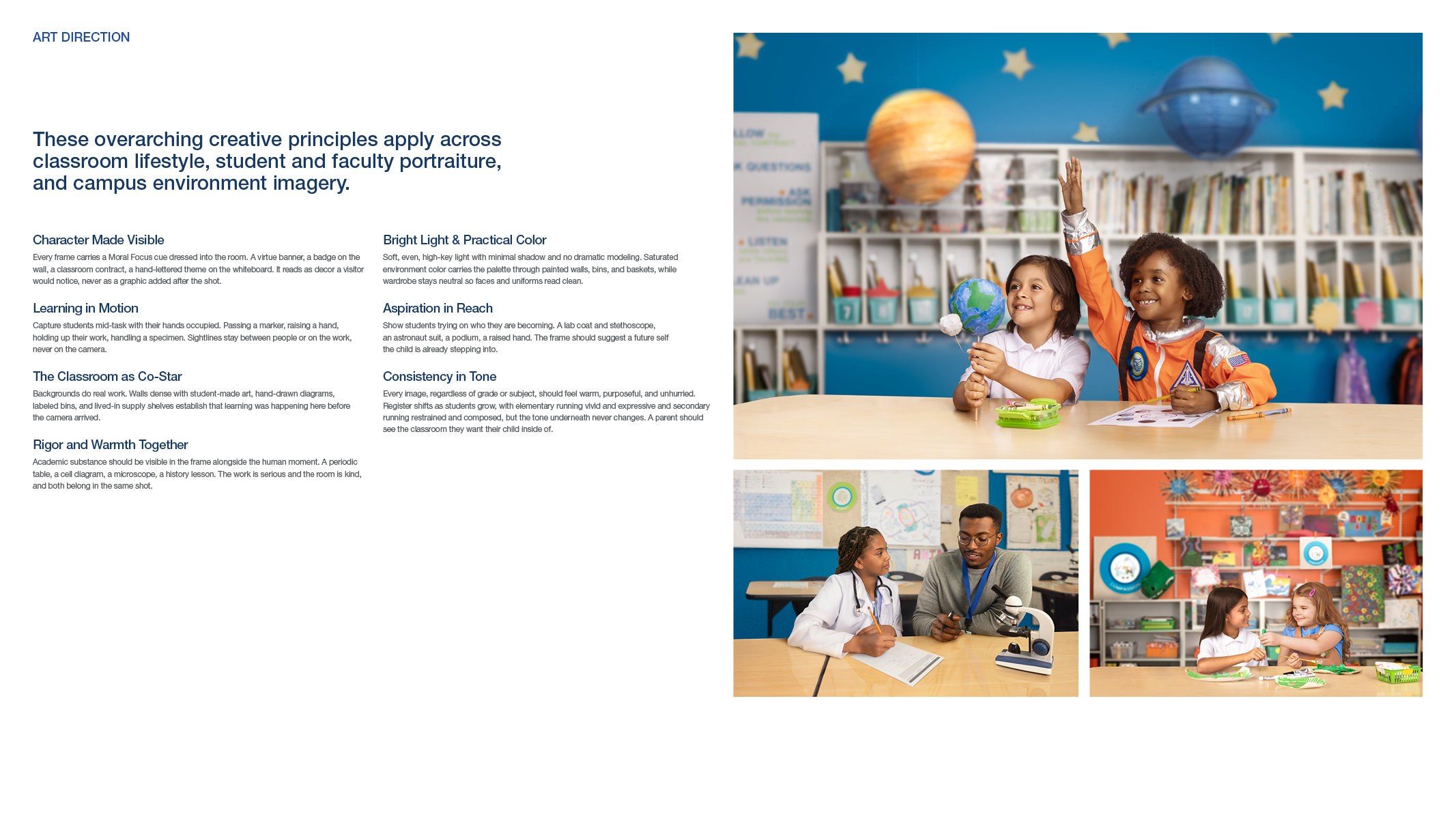
A shared grid and stroke weight for the icon set, and photo principles for classrooms, portraits and campuses, so the next shoot looks like the last one.
Email signature.
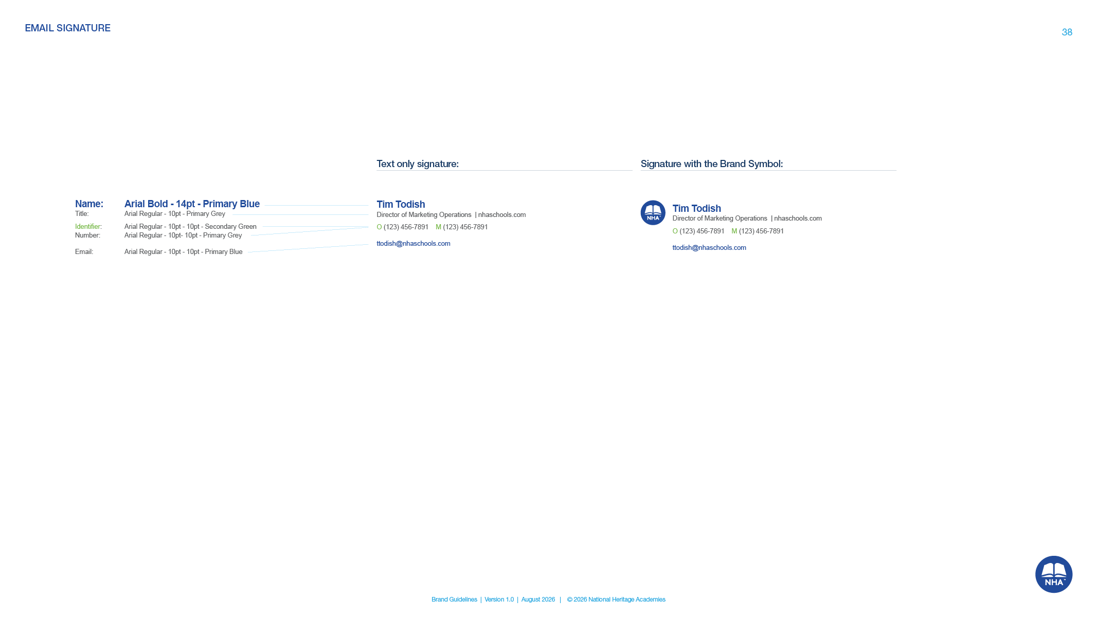
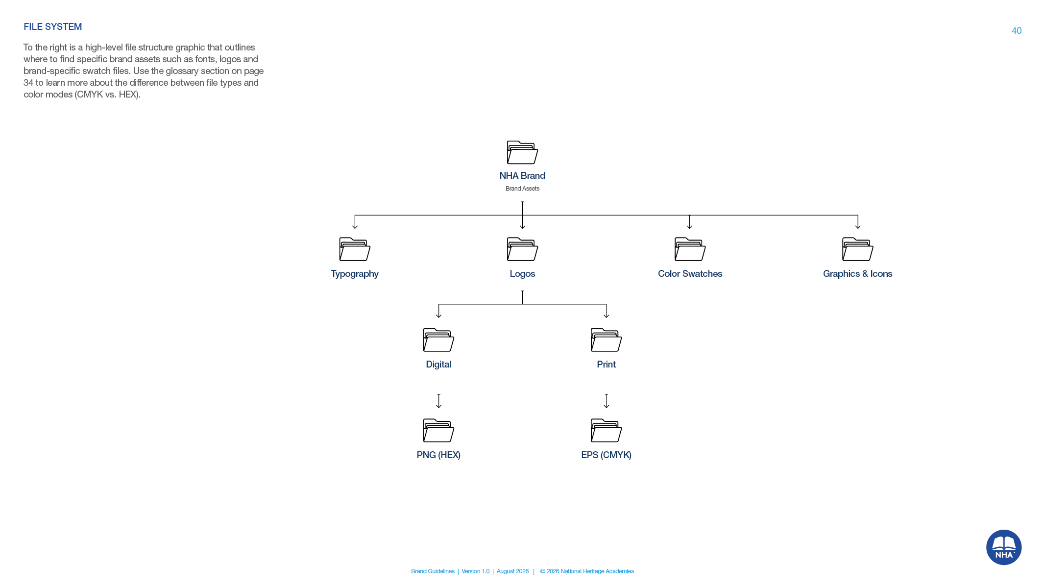
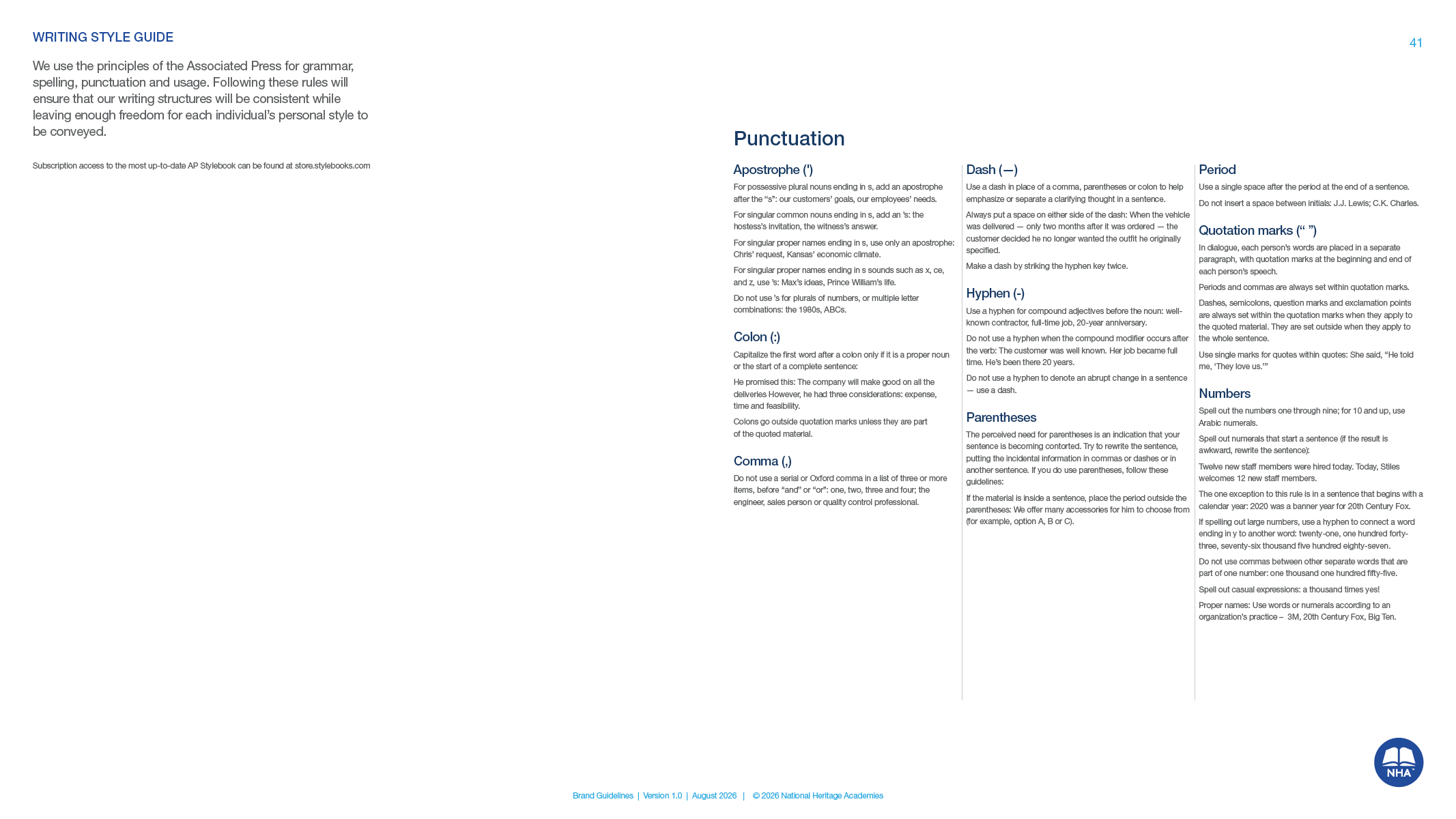
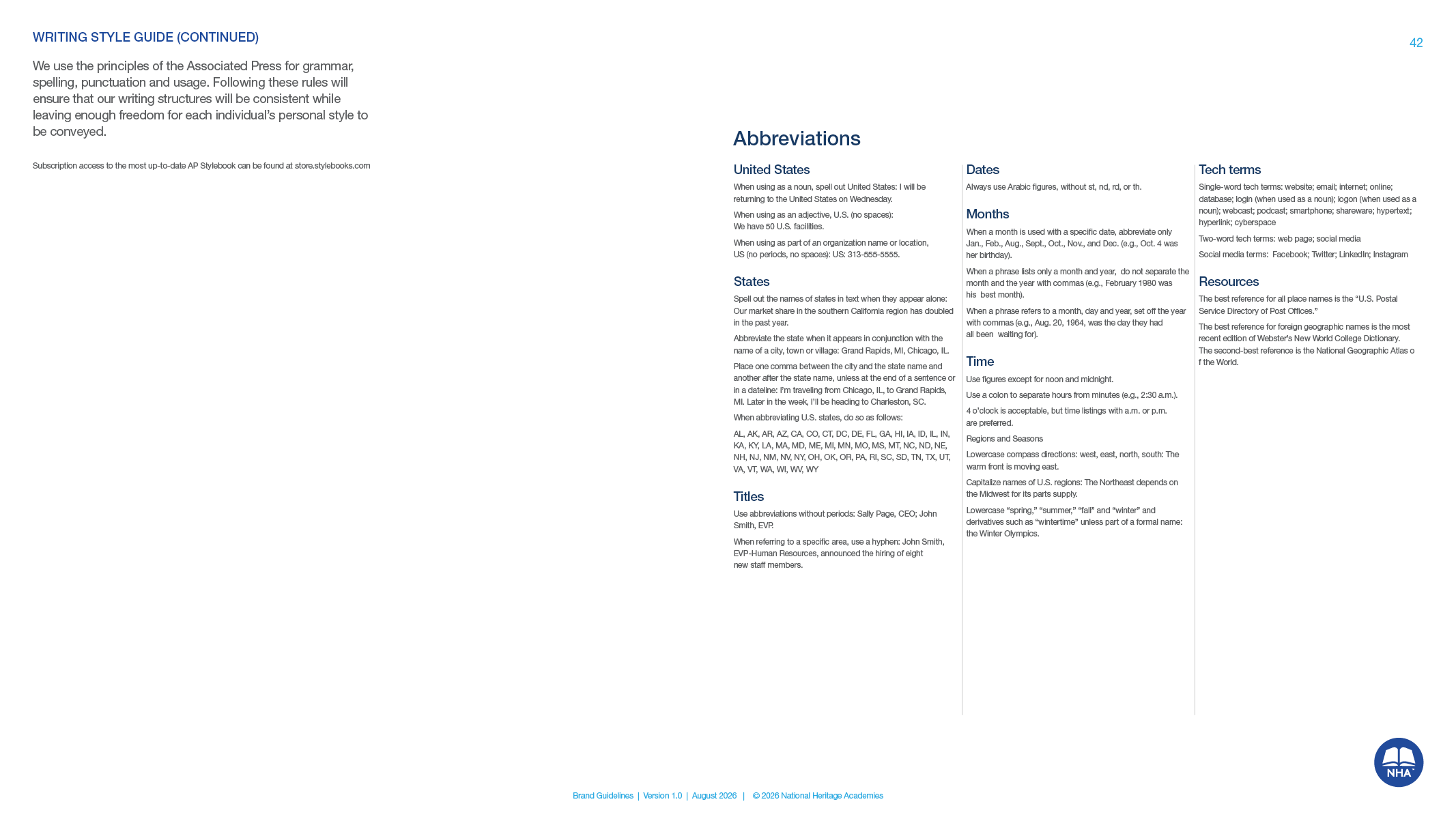
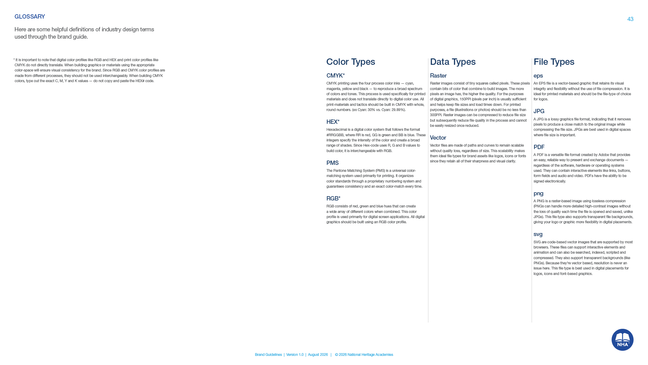
Text only and with the symbol, down to the point size and color of each line, because it was the question the marketing team heard most. An appendix adds the file system, punctuation and abbreviation rules from NHA's own writing guide, and a plain glossary of color types.


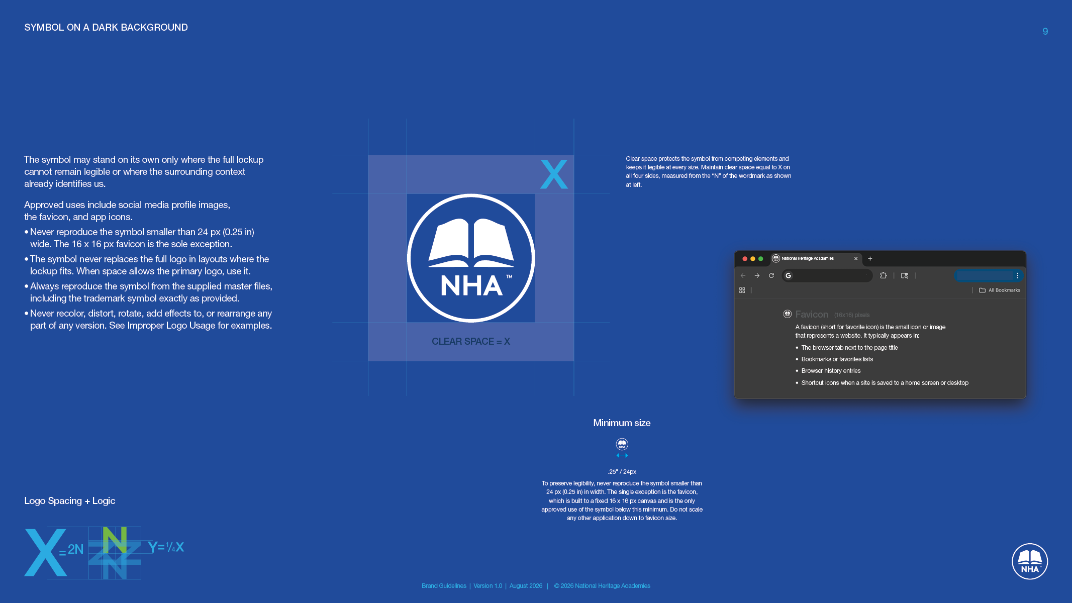
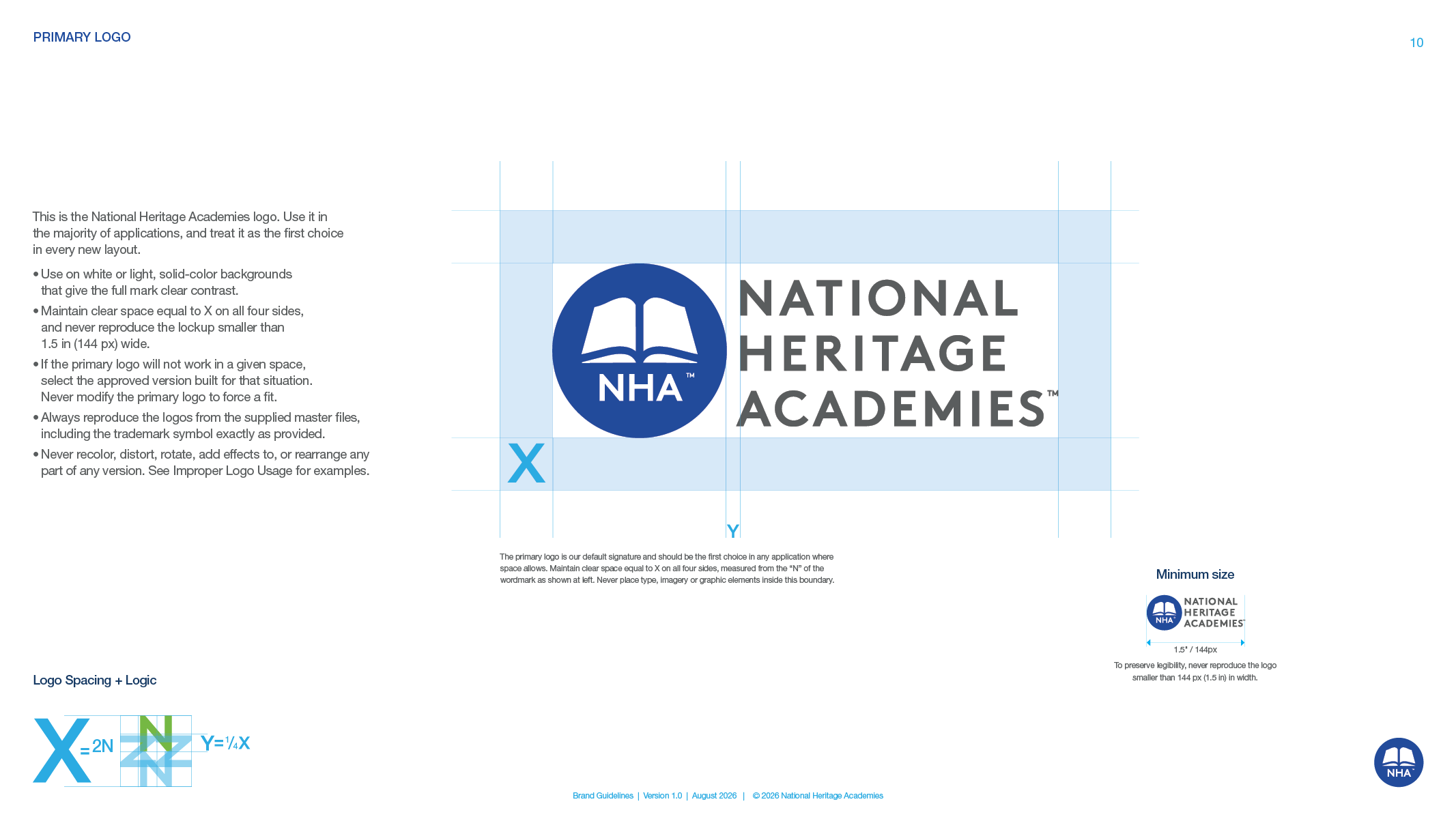
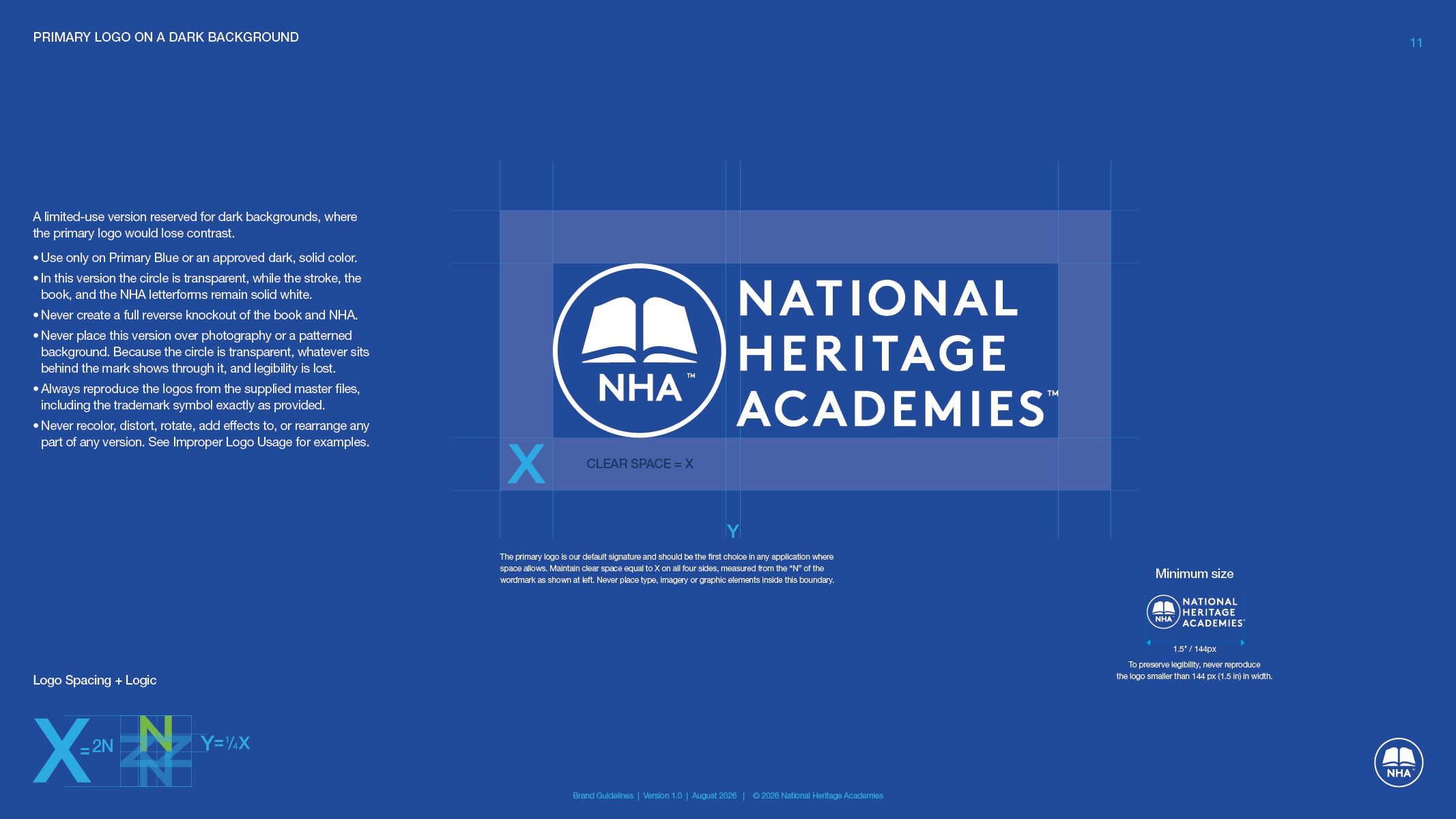
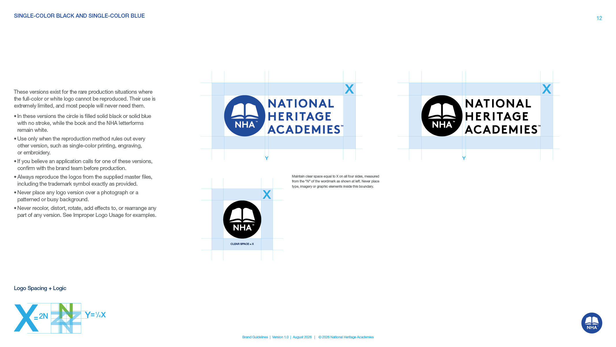
What came with the guidelines
Logo production files
Every version of the symbol and the primary logo in print and screen formats, with the master files, so nobody rebuilds the mark from a screenshot.
School logo template
An Illustrator file with the symbol, spacing and guides locked and only the school name live, plus a read-me layer that walks a designer from fonts to the outlined export. NHA builds every school's lockup itself, and they all match.
A master NHA can edit
The InDesign file, with a launch version that hides the pages still under discussion, so NHA's team could make its own edits the week it went out and keep the book current without calling us.
The results
The final guidelines went to NHA on a Thursday, a little over three weeks after kickoff, and NHA launched the brand the following week. The three-person creative team that had carried every decision for more than a year handed the rules to more than 100 schools and kept the master file. Within a few weeks NHA was running the rollout in house, which is what written rules are for.
FAQ’s
-
Write the rules for the people farthest from the brand team, then give them the files. NHA's guidelines say which logo version goes where, how a school's name locks up with the symbol, and what never to do, with pictures. A locked template builds each school's lockup the same way every time, and corporate keeps the master file so the rules stay current.
-
A lockup is a fixed arrangement of a logo and something else, such as a school name, with the spacing and sizes decided once. NHA has more than 100 schools with names from two words to five, so its guidelines give four lockup layouts, one clear-space rule and one minimum size. A new school gets a lockup that matches every other school in minutes.
-
No. NHA had tried it with an earlier logo. Without written rules every request came back to three designers, and projects slowed while they decided each case. This time the rules shipped with the logo. If the launch cannot wait, start with a short guide that covers the logo, type and color, and add the rest after.
-
If the mark is decided and people already know the company, you may only need the rules. NHA had its new logo and its purpose. It needed a book that told more than 100 schools how to use them. If the brand no longer fits what the company has become, that calls for a rebrand, which is a bigger job. We wrote guidelines for Stiles Machinery the same way.
Services
Brand guidelines · Logo refinement · Logo production files · School logo template · Color system · Typography system · Signage sizing · Icon standards · Art direction · Email signature
Launching a new brand to a lot of hands? Write the rules before the requests arrive.
Start a conversation
Wit & Craft is the brand agency for owner-led manufacturers and trades, in Grand Rapids, Michigan, since 2015.