
How La Isla Network grew its brand without changing its name
Wit & Craft positioned La Isla Network, the research and advisory organization that protects workers from heat stress, and built the brand standards it needed to grow beyond sugarcane and Central America. The CEO came to us in 2019 to brand a new consulting arm, and a new name was on the table. Discovery found the opposite. The development banks and producers who funded the work trusted La Isla because it had come up from the field as a nonprofit, and the name was the asset. So the work went in order. First we found what was true and wrote it down as a position, with a mission in six words. Then we kept the logo we had drawn for the organization in 2016, set the colors, drew the PREP program brand under it, and wrote the standards. The brand went out in November 2020, and the island is still the logo on laislanetwork.org today.


The challenge
La Isla Network is named for a community in Nicaragua where so many sugarcane cutters had died of kidney disease that people called it the Island of Widows. The foundation that took the name spent years in that community proving what was killing the men. Heavy work in extreme heat, without enough rest, shade or water, was driving a kidney disease that had nothing to do with diabetes or blood pressure. Then it proved the disease could be prevented, with a program at a sugar mill that gave cutters water, shade and rest on a schedule and measured what happened. We first worked with the organization in 2016, when the foundation became La Isla Network and needed a logo for its new website. We drew the island and its reflection.
By 2019 the work had outgrown its first home. The Adelante Initiative, a partnership of the sugar mill, the national sugar producers’ association, the Bonsucro certification body and the German development bank DEG, had put the program to work in Nicaragua’s cane fields, and the CEO wanted to carry what it had proven to every industry where the same risk was present. The next fields were rice in Asia, steel and salt mining in India, construction and fishing. He came to us in May 2019 to brand a new research and consulting arm that would do that work for corporations, producers, insurers, development banks and governments. The first estimate carried naming as an option, in case the new arm needed a name of its own. The start waited on funding, and it came in March 2020, the week the world shut down.
Our discovery work that spring found an organization that was famous in one place and unknown a few steps away. In sugar and in Central America, everyone knew La Isla. Outside them, awareness thinned fast, and even people who knew the name could not say what made it different. The organization described itself differently from one channel to the next. Its world was a thicket of acronyms and initiatives, a program inside a program inside a network, hard for a newcomer to untangle. Its mission ran to nearly fifty words. And the people it most needed to reach, the sustainability officers at development banks and the compliance and legal teams at the brands, were buying lower risk, and the research was only the proof. The banks, though, liked that La Isla had come up from the field as a nonprofit, and they trusted the story. A new name would have thrown that away.

Why we started with the words
The ask in 2019 was a brand for a new consulting arm, and the fastest answer would have been a new name and a new logo for a thing nobody could describe yet. So the work ran in order. Discovery first, with a long list of critical questions for the core team and its research partners, a read of what the organization had published, and a study of the development banks’ own reports on why they fund sustainability. Then the position, the few sentences that say why La Isla exists, how it works and what it is. Then the identity, with every design decision answering to those sentences.
The position decided the name question first. La Isla Network stays the organization, the name with a decade of work, credibility and funding behind it. PREP, the four-part method of protection, resilience, efficiency and prevention, becomes the program under it, the brand that goes out on studies and partnerships. The position gave the organization five traits, committed, astute, collaborative, assertive and expert, and three values, people, efficacy and positive change. It cut the mission to six words. Protecting workers in a changing climate. And it drew the line everything else answers to. The La Isla Network is the leading global resource focused on eliminating the impact of heat stress and CKDnT on global health and productivity through expert research, analysis and prevention.
The Brand Position
Why.
“The La Isla Network exists to protect workers in our changing climate.” One sentence, and the six-word mission is cut from it.
How.
“Through our expertise and extensive understanding of the deadly impacts of job-related heat stress, we provide fact-based work practice improvements and protective measures based on detection, etiological research and prevention.” The research and the fix sit in the same sentence on purpose, because La Isla does not stop at the study.
What.
“We are the global leaders in identifying occupational safety and health related to heat stress and attenuating its impacts on affected populations.” It says leaders plainly, because the CEO’s one request after discovery was to say the organization had no peers without being obnoxious about it.
The Brand Identity System
The symbol.
An island and its reflection. The land above the horizon line in green, the water below it in blue, drawn as one simple shape so it reads at a quarter inch and on a favicon. We drew it in 2016 for the organization’s first website as the Network, when the brief was a mark that would still work years later. In 2020 it got a light refinement and a full set of rules, and the organization’s own designer confirmed the change was right before the rest of the system was built.
The logo system.
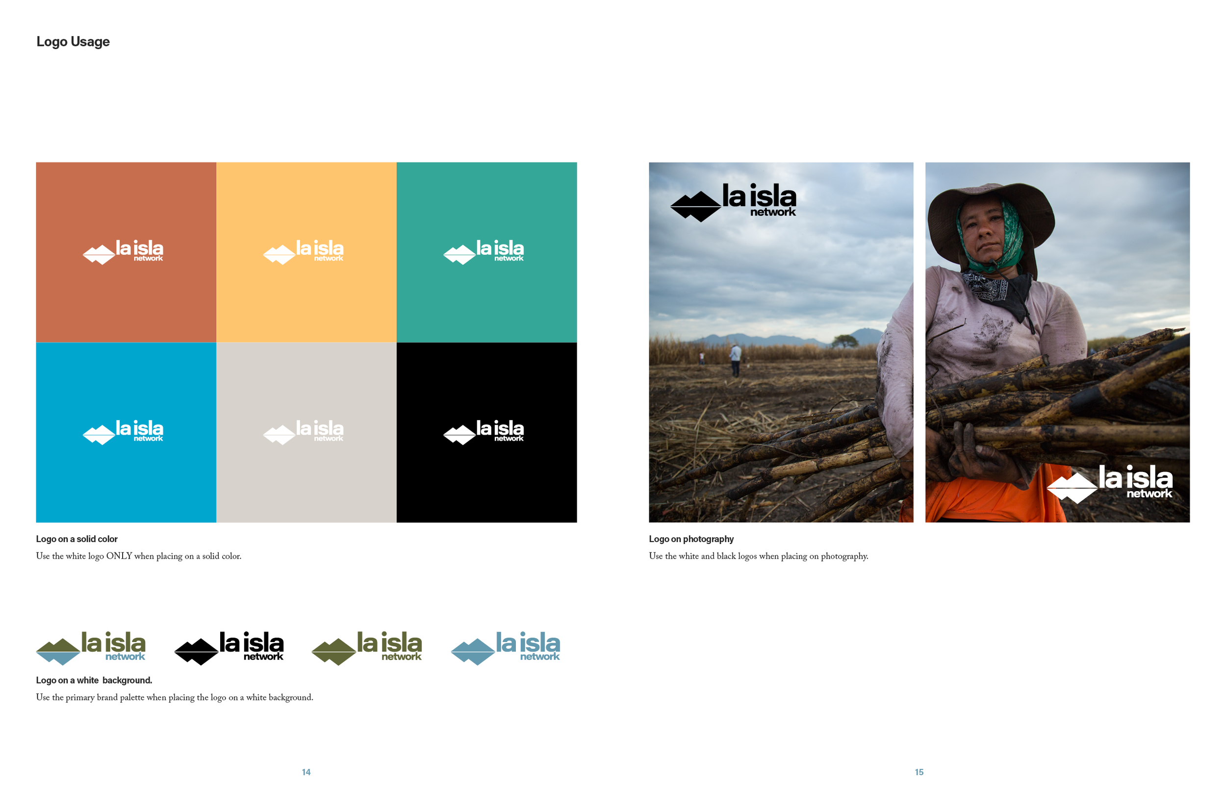
The symbol beside the name set in bold lowercase letters, with the proportions fixed. The standards give one rule per background. The white logo on a solid color, the green and blue logo on white, and white or black on photographs. Each version has its clear space and three minimum sizes, down to a quarter inch, and a signage rule gives one inch of logo for every ten feet a reader stands away, measured on the letter a.
PREP by La Isla.
The program got a wordmark of its own, prep in bold lowercase, with a small parent brand identifier, by la isla, set under its last letters. The identifier is the whole brand hierarchy in three words. A study or a partnership can go out under PREP and still carry the name the banks trust.
Color.
Two primary colors, an olive green and a steel blue, the same two inks the logo has worn since 2016. The 2020 work tried a brighter pair first. The organization’s designer wanted a deeper blue, and the CEO asked to hold, because a research and advisory body has to feel grounded. A month of exploration later, the primaries stayed where they were and the change went into a new set of accents, a terracotta, a teal, a cyan, a yellow, a warm gray and black, with tints of each, which carry the icons and the templates.
Typography.
Acumin Pro for display, the clean sans serif the 2016 logotype was drawn from, and Adobe Caslon Pro for reading, a serif first cut in 1722 and, as the standards note, the face of the Declaration of Independence. The standards show the two in use on a report page, headline, subhead, body and call-out each at a set size, so a report written on one continent and a newsletter on another look like the same organization.
The PREP icons.
Four icons, one for each part of the method. An octagon for prevention, the shape of a stop sign. Two bending lines for resilience. A plus for efficiency. A shield for protection. They are drawn as vector shapes in the accent colors, so they can go in print, on the web or into a pattern, and the standards say not to blow them up, because the line weight stops matching. The prevention icon was an X in the first round, and the stop sign replaced it on the CEO’s call.
The brand hierarchy.
One page of the position draws the family tree. La Isla Network at the top, the organization that funds, oversees and supports the work. PREP under it as the program. The initiatives under PREP, the Adelante Initiative in the cane fields and the DEGREE study that measures the disease around the world. Then the studies and projects, and at the bottom the outcomes, worker health, economic and social impact, healthcare systems and policy. A newcomer can see in one look where a report comes from.
The Adelante Initiative logo.
The field program that proved the method had a logo of its own, and the standards bring it into the family, with the same clear space and minimum size rules as the parent and production files in black, color and PMS, so the three marks sit together on a page as one organization.
The written style guide.
The standards also set rules for writing. Apostrophes, commas, hyphens, parentheses and quotation marks, on the Associated Press model, so a team spread across several countries and two languages writes the same way. The visual brand and the written one were handed over in the same book.





What came with the guidelines
The brand standards
One book of about forty pages with the position, the mission, the vision and the values up front, then the logo, its uses and misuses, the colors, the type, the writing rules, the signage sizes, the PREP logo and icons and the Adelante logo. It was walked through with the CEO and the organization’s designer on November 18, 2020, corrected on the call, proofread and delivered the same day.
Logo production files
The La Isla Network, PREP by La Isla and Adelante Initiative logos in black, white, CMYK and PMS, in every print and screen format, plus the four icons, packaged with the standards so nobody rebuilds a mark from a screenshot.
Four document templates
A report, a summary report, a newsletter header and an engagement piece, the four documents the team sends most, rebuilt on the new brand as single-page layouts in InDesign for the organization’s own designer, with Spanish editions in mind because two of the four always go out in both languages. Presented in December 2020 and delivered before the new year.
The results
The first estimate went out in May 2019 and waited on funding. The work started in March 2020, in the first week of the pandemic, and ran on video calls from start to finish. The situation review was May 18, the position was presented in June, and the identity on August 24. The color question took September, the CEO approved the system on October 13, and the brand standards and logo files were delivered on November 18, 2020. The templates followed in December. Ten years after we drew it and six years after the standards were written, the island is still the logo on laislanetwork.org, in the same green and blue, on an organization that now describes itself as a research and advisory body working worldwide and lists partners well beyond sugar.
FAQ’s
-
If it wants funders and partners who are not already in the room, yes. La Isla had a decade of research, a program that worked and a story the banks trusted, and no two of its channels described it the same way. The position decided what the organization is in one sentence, cut the mission to six words and settled which name goes on the work. The logo rules, the colors, the program brand and the templates all follow from those sentences. Here is how we do brand strategy consulting.
-
Because the name was the asset. The 2019 estimate carried naming as an option, in case a new consulting arm needed a name of its own. Discovery found that the development banks funded La Isla because it had come up from the field as a nonprofit and had the research to show for it. A new name would have asked them to trust a stranger. So the organization kept its name, the method got one of its own, PREP, and the identifier by la isla ties the two together. We rarely suggest a client change its name, and this is why. A full rebrand for a manufacturer is its own page. The opposite case is a company with too many names. The Sleep Outfitters case study shows four store brands brought under one.
-
With a hierarchy, decided before any logo is drawn. La Isla is the organization. PREP is the program, the four-part method that goes out on studies and partnerships. The Adelante Initiative and the DEGREE study are the initiatives under it. The PREP wordmark carries by la isla, and the Adelante logo keeps the parent’s clear space and size rules, so a reader sees one organization however they arrive. The Code Blue case study shows the same idea at a manufacturer, where one house brand holds every product.
-
About eight months, once the work starts. La Isla’s discovery review was in May 2020, the position in June, the identity in August, the approval in October and the standards in November, with templates in December. Every meeting was a video call, with the team spread across several countries in the first year of the pandemic, and the schedule moved as grant deadlines came and went. A company launching a brand from scratch takes about a year, and the Verdant Graphics case study walks that road. A smaller company with one logo to replace moved faster, in the Upfit Supply case study.
Services
Brand discovery · Critical questions · Competitive review · Brand positioning · Brand personality · Brand hierarchy · Logo refinement · Program logo · Icon system · Color system · Typography system · Brand standards · Written style guide · Logo production files · Document templates
Known in one corner of your field and ready to be known beyond it? Start with what is true.
Start a conversation
Wit & Craft is the brand agency for owner-led manufacturers and trades, in Grand Rapids, Michigan, since 2015.