How Tableau became Amble House
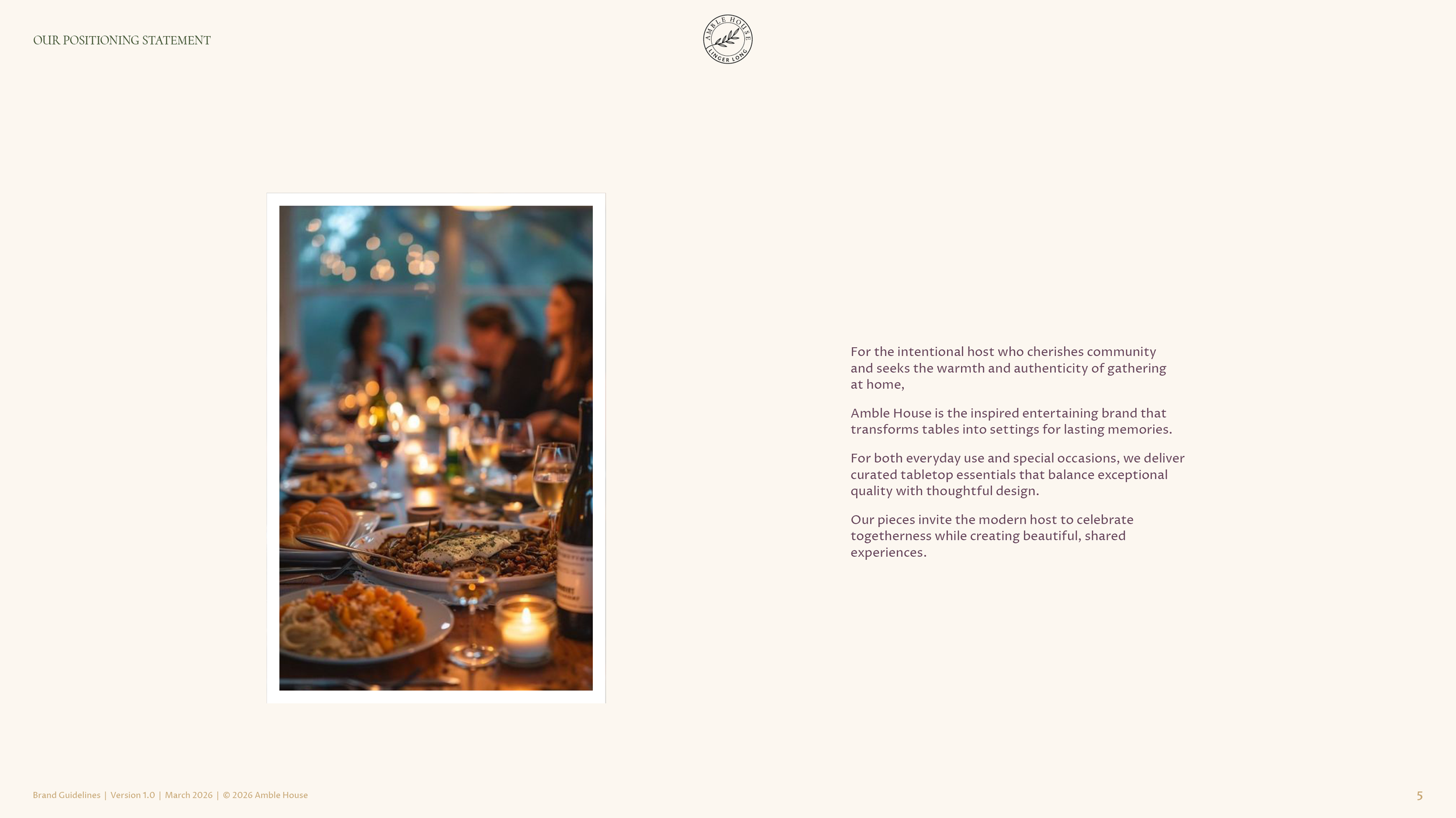
Wit & Craft positioned Amble House, the tabletop brand of Convivial Brands in Grand Rapids, Michigan, through its change of name from Tableau, and designed the identity it launched with in 2026. The brand had sold dinnerware, serveware, flatware, drinkware and table linens to stores since 2020, and a trademark meant the Tableau name could not go where the company wanted to take it. So the work ran in order. First we found what was true about the brand and wrote it down as a position, with one belief at the center, the nourishing power of gathering. The name was chosen against that position. Then we built the identity, an olive branch, a wordmark, two typefaces and six colors, and wrote the guidelines the company now works from. Today the positioning statement is on amblehouse.com, word for word.
The challenge
Tableau started in 2020 as a line of tableware, home décor and entertaining pieces sold through stores. It is part of Convivial Brands, the Grand Rapids family of companies that also runs a national greeting card publisher and the print shop in our Verdant Graphics case study. Five years in, the brand was unknown to the people who would buy it, its catalog did not show the products the way people buy them, and the brand had never been given a clear direction of its own.
Then came the problem that forced the decision. A trademark meant the Tableau name could not follow the brand into selling direct to customers and into new products. A rename was coming either way, and the company chose to treat it as a relaunch, with a focused assortment, a clear target, a direct to customer store to open in 2026, and a deadline. The new brand had to be far enough along for a sourcing trip to Frankfurt in February.
The category gave no cover. Tabletop is a commodity business where the mass retailers win on convenience and price, the home furnishing brands carry their equity into every launch, and the specialty brands people love, the ones with a story behind each piece, are small and sophisticated marketers. What Tableau had that the others did not was the product. Quality and attention to detail at a price most of America can pay, and a parent company with the creative and sourcing skills to build a line around a point of view.
Why we started with the words
The ask was a new name and a new look, fast. The fastest answer would have been a list of names and a logo to match the deadline. So the work ran in order. Discovery first, in a session with the leadership team on October 8, 2025, in a market summary of how people shop for the table, and in a look at the competition across five kinds of store, from the mass retailers to the specialty brands. Then the position, the few sentences that say why the brand exists, how it works and what it is. Then the name, chosen against that position, and only then the identity.
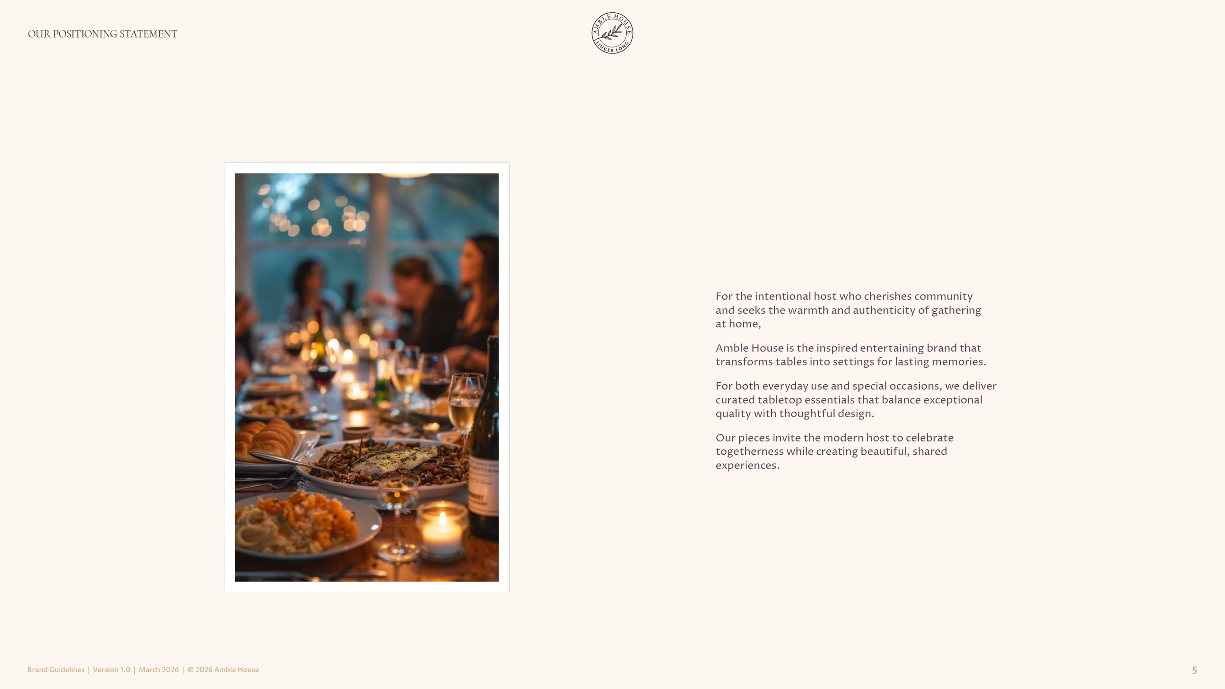
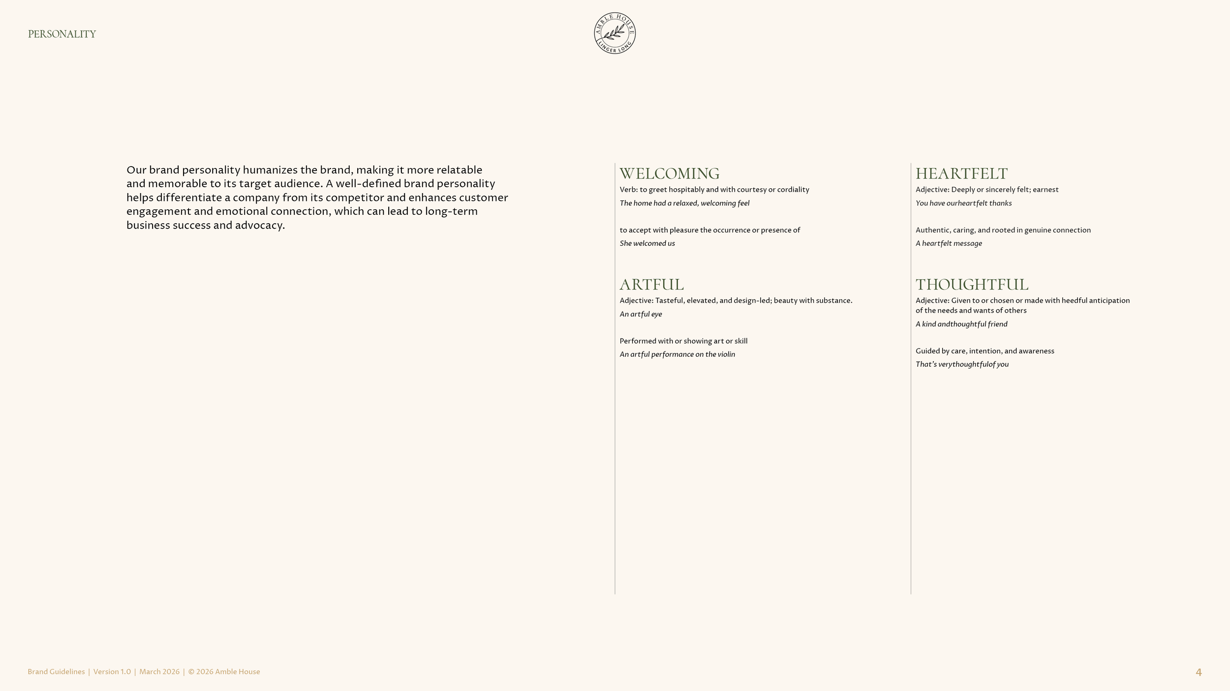
The position gave the brand its center. Gathering. The people at the table, before anything on it. It gave the brand four traits, welcoming, artful, heartfelt and thoughtful, and a reader to write for, the intentional host who cherishes community and seeks the warmth of gathering at home. The naming brief was written from those sentences and handed to a naming partner, whose search ran past three hundred names before the company’s lawyers cleared the strongest of them. The company chose Amble House. A house you can wander through. A table you can linger at.
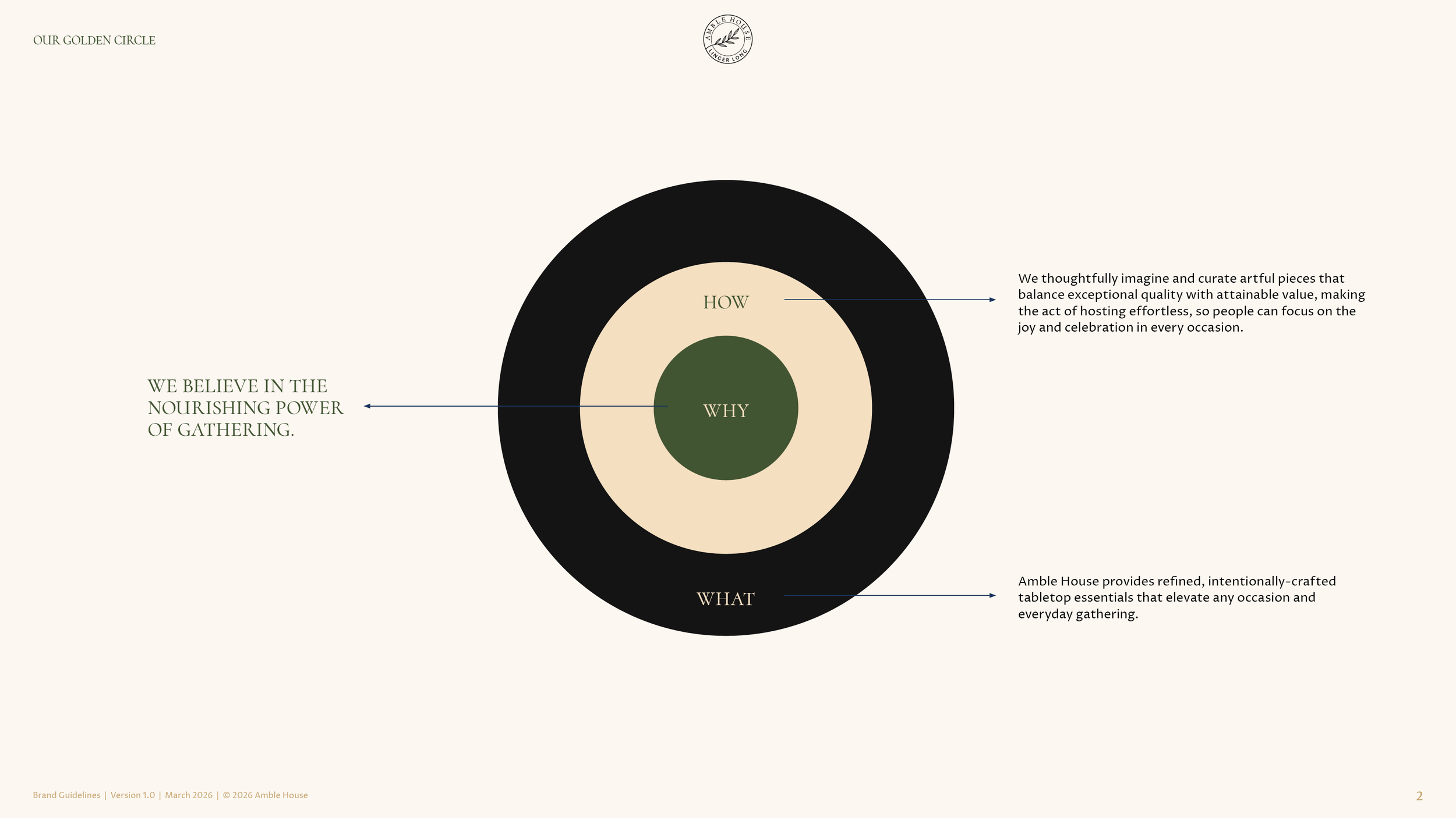
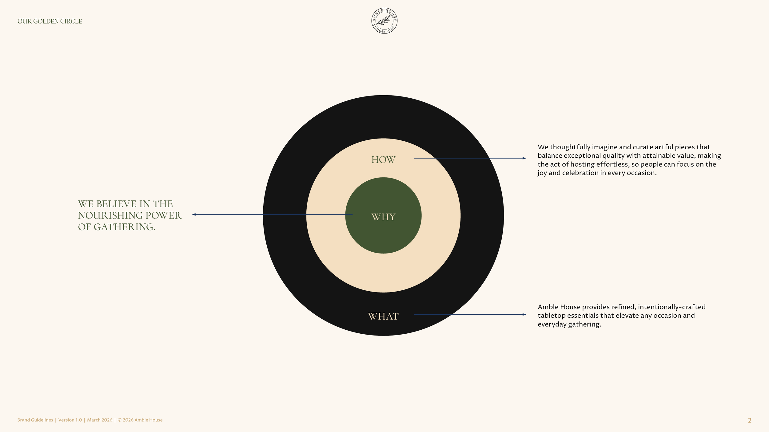
The Brand Position
Why.
“We believe in the nourishing power of gathering.”
How.
“We thoughtfully imagine and curate artful pieces that balance exceptional quality with attainable value, making the act of hosting effortless, so people can focus on the joy and celebration in every occasion.”
What.
“Amble House provides refined, intentionally crafted tabletop essentials that elevate any occasion and everyday gathering.”
The Brand Identity System
The symbol.
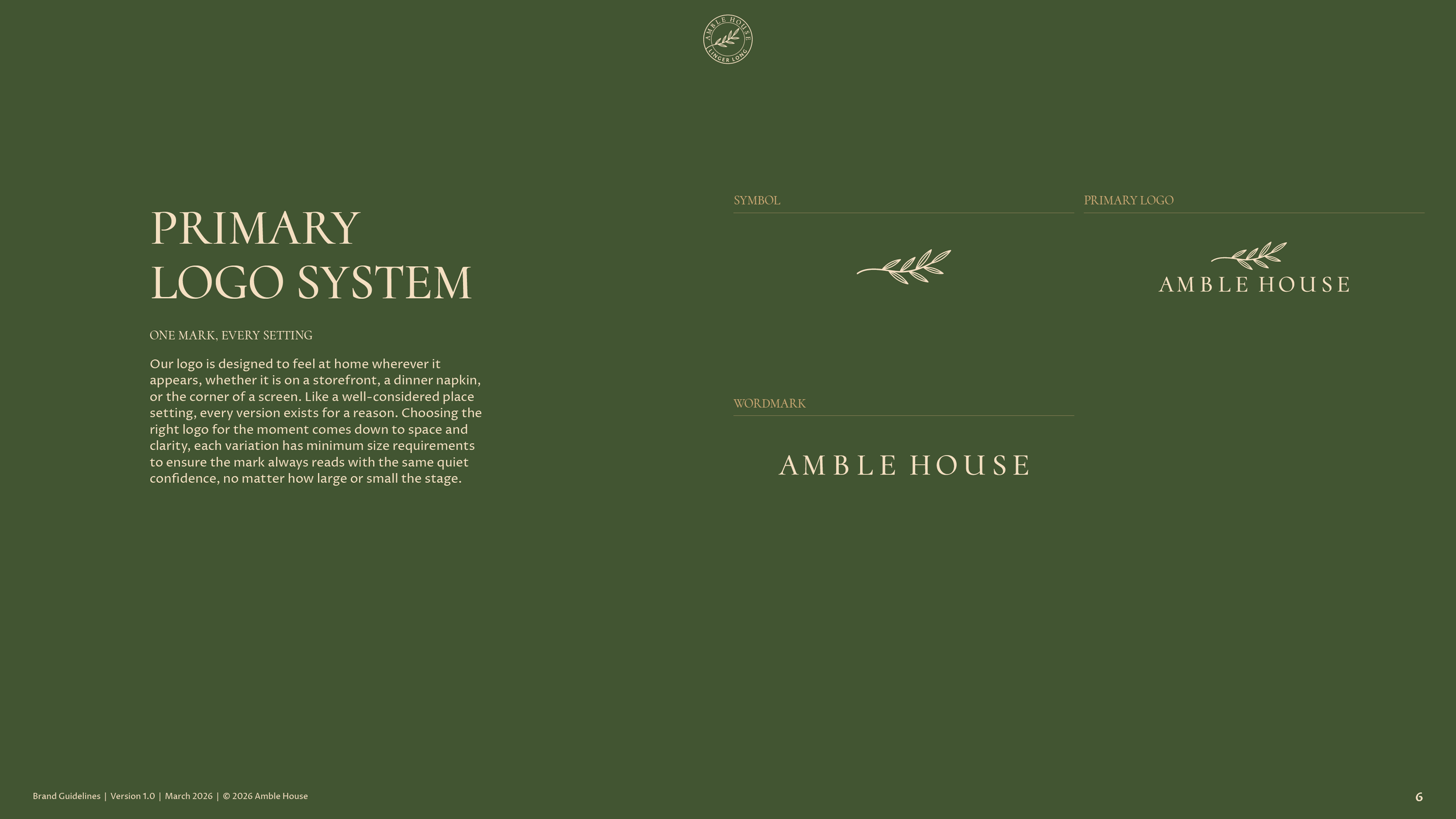
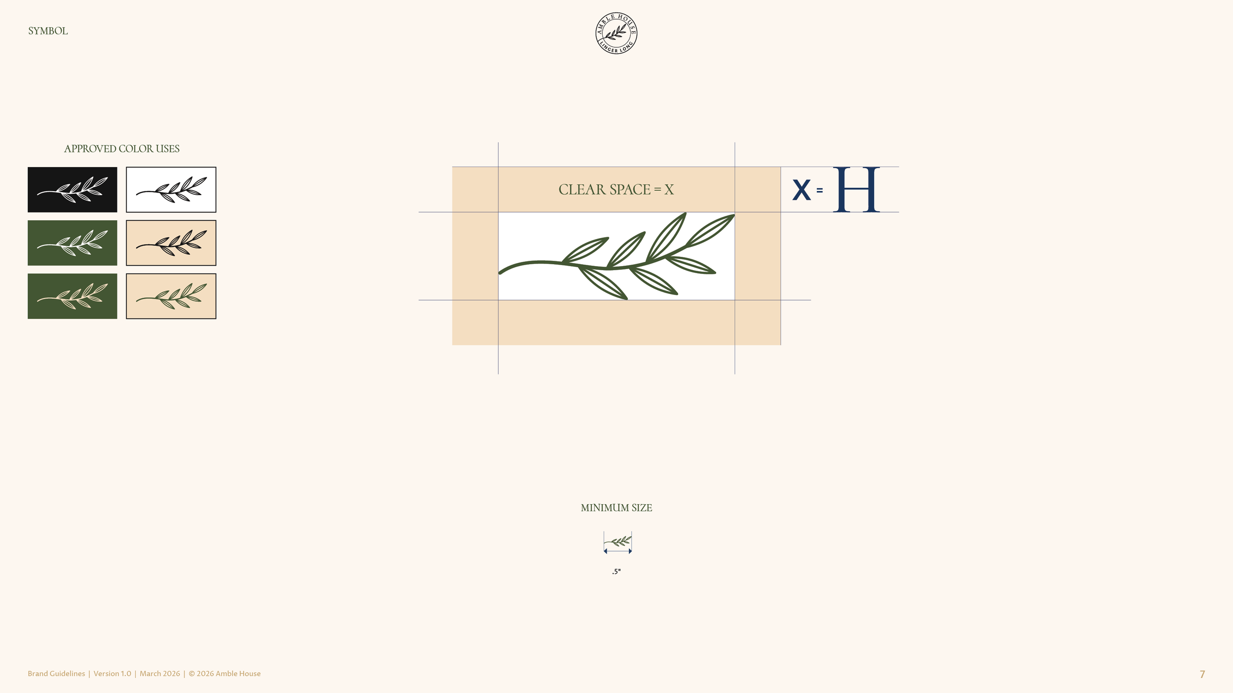
An olive branch, drawn in one thin line, a stem and its leaves. Four concepts went to the team on January 30, 2026, a signature, a sheaf of wheat with a house in it, the branch and a monogram in clay-like letters, and the branch won for its warmth. The team asked for it to be simpler, and it was redrawn until it read as an olive branch at any size.
The logo system.
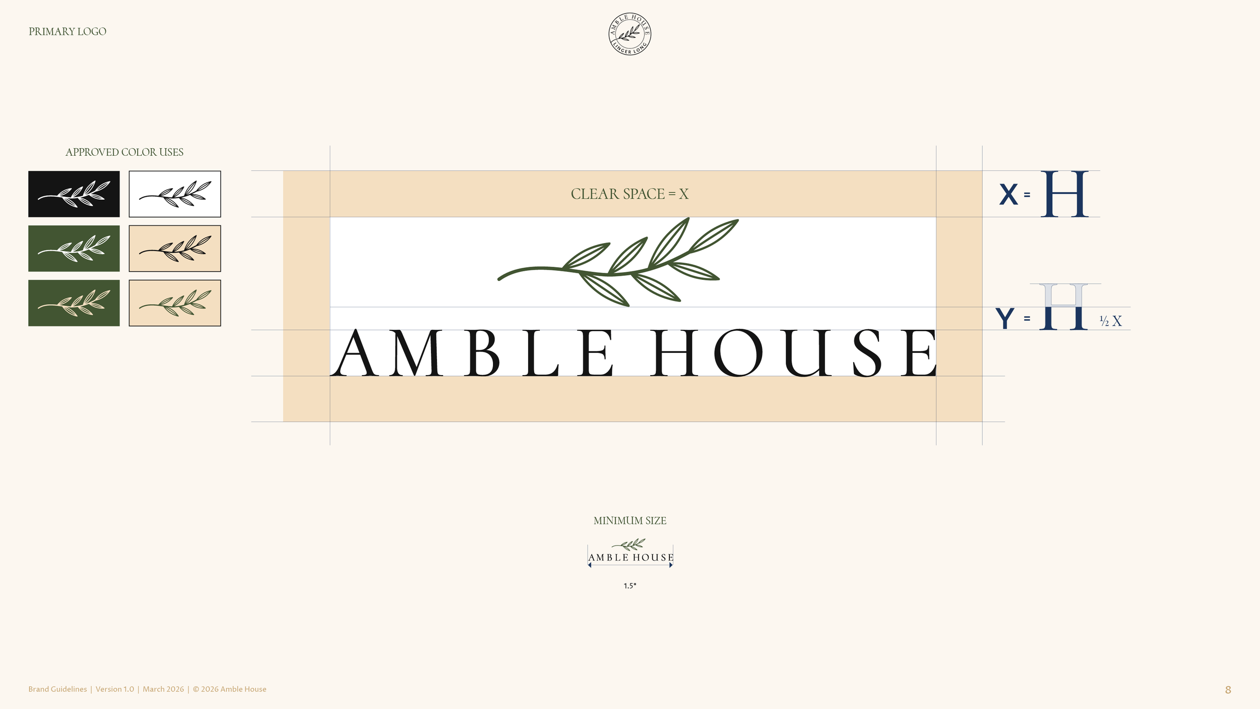
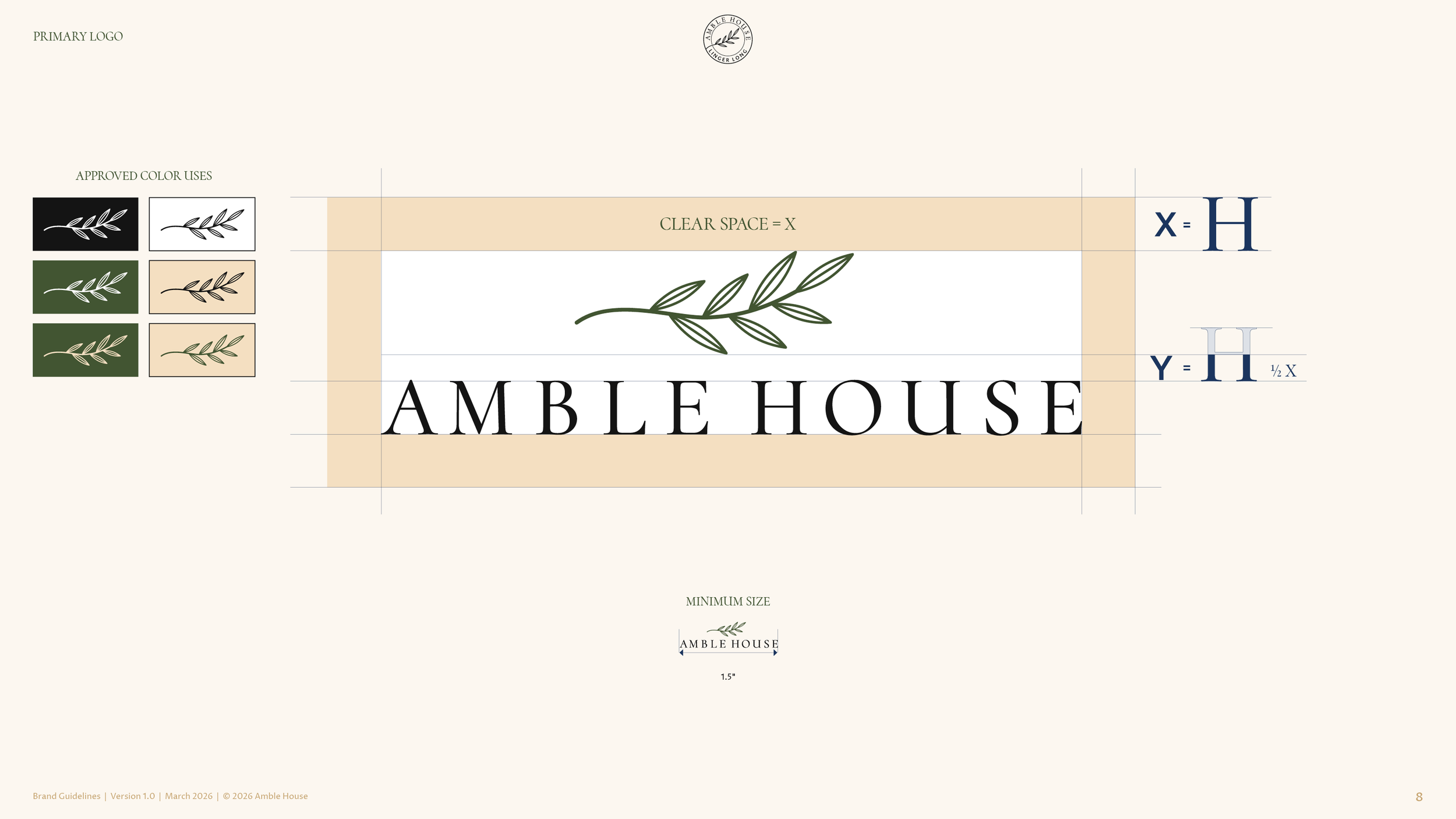
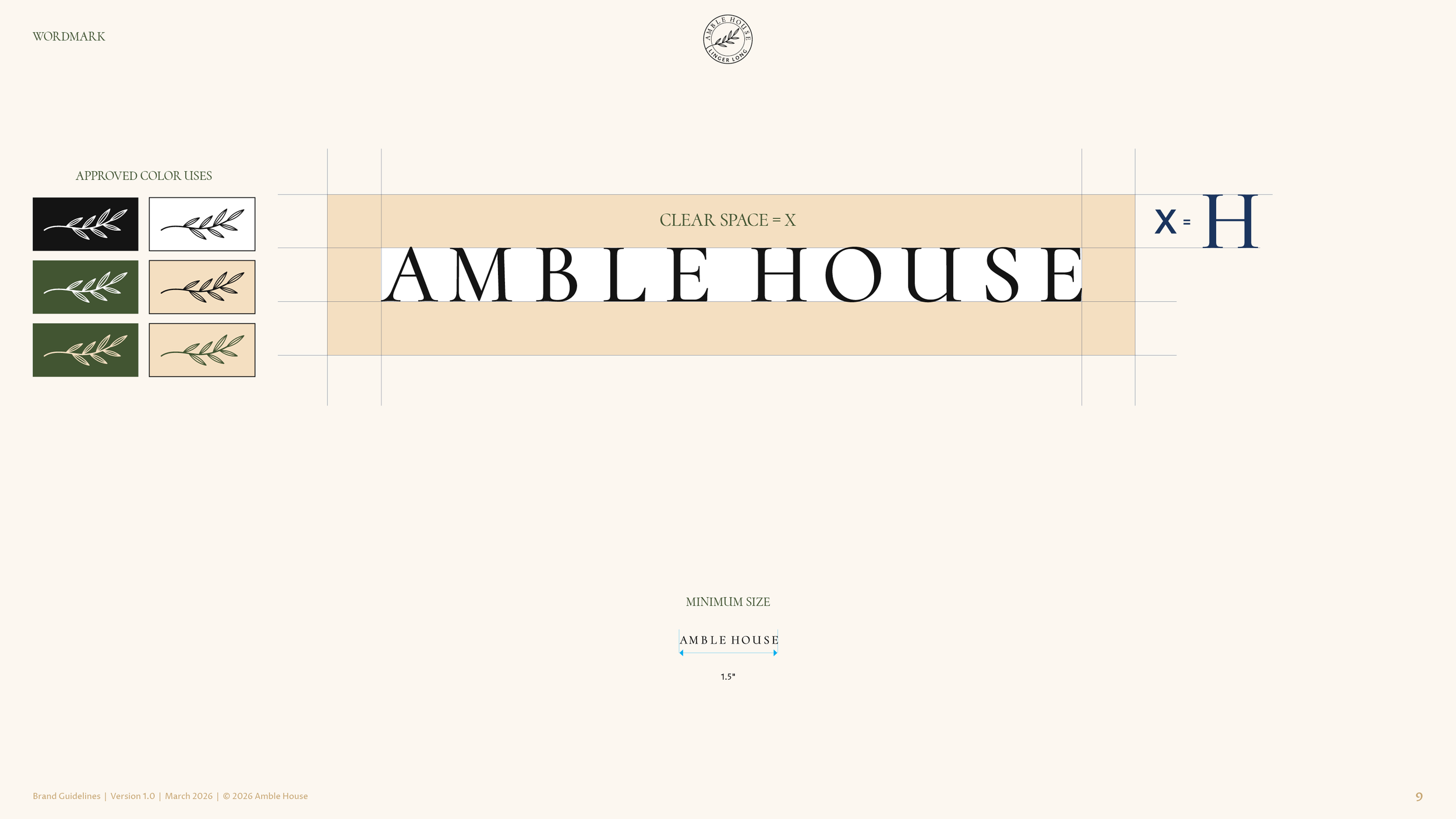
The branch above the wordmark is the primary logo. The wordmark stands alone where space is tight, and the branch stands alone where the name is already known. Each one has a clear space and a minimum size, so the mark reads the same on a storefront, a napkin or the corner of a screen.
The wordmark.
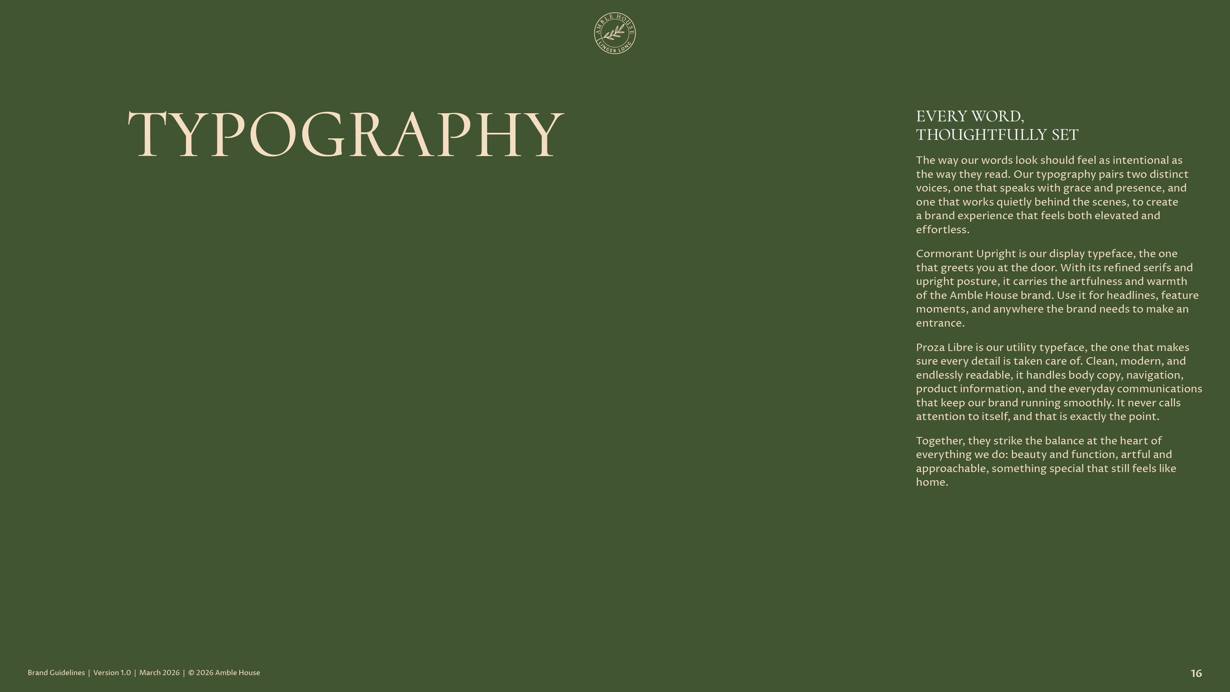
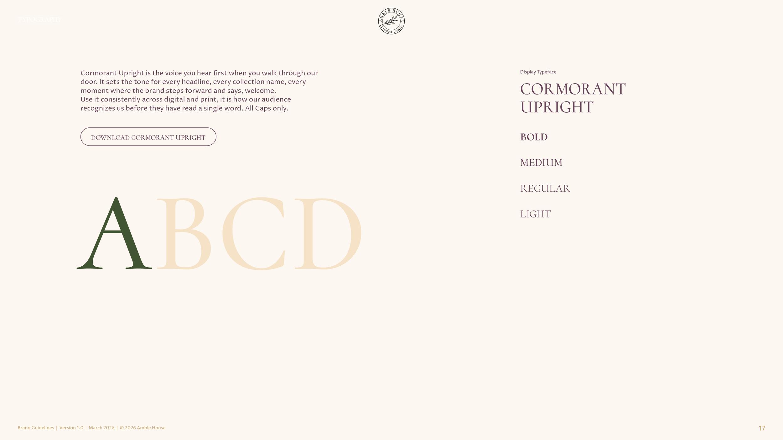
Amble House in Cormorant Upright capitals, a typeface the company’s team chose and we then made its own. We lowered the crossbar of the A, closed the gap between the A and the M and balanced the H, O and U, so the name cannot be set by anyone who owns the same font.
Color.
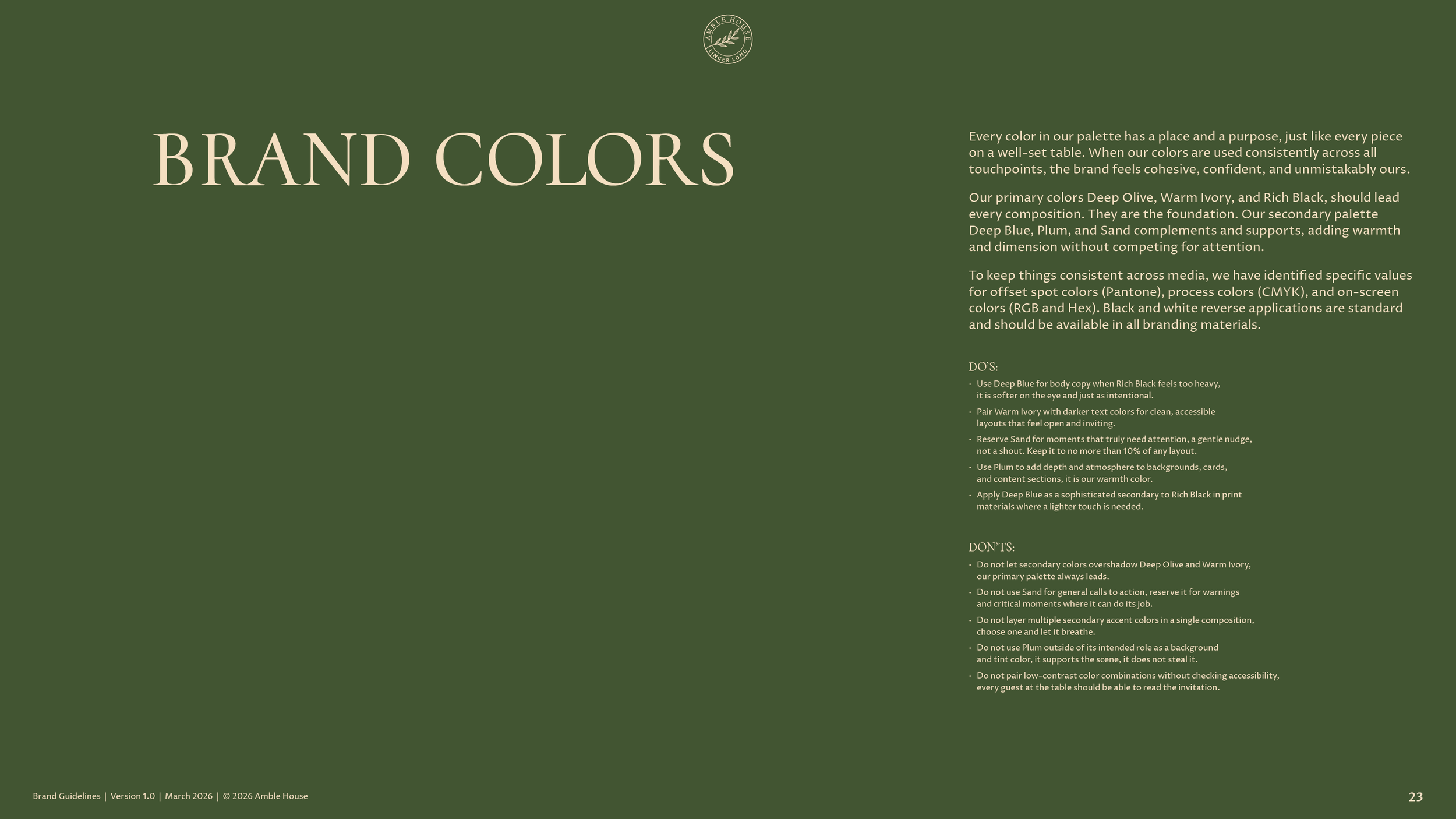
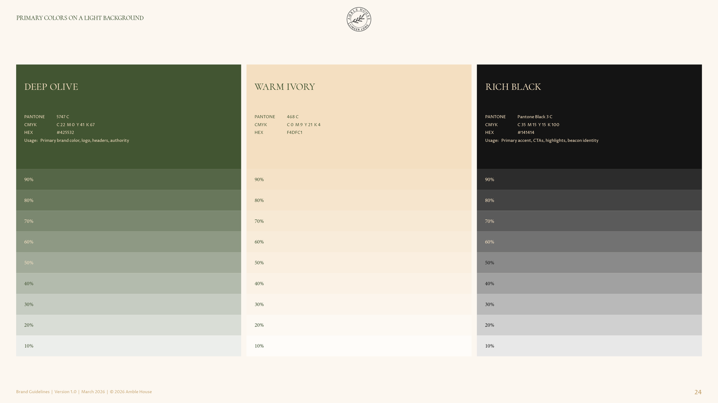
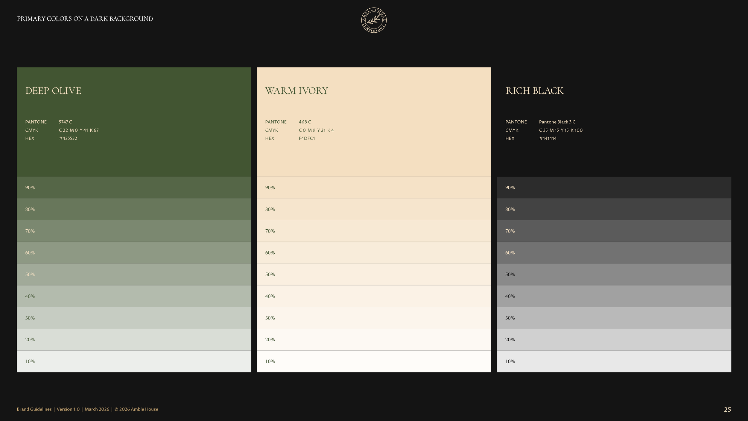
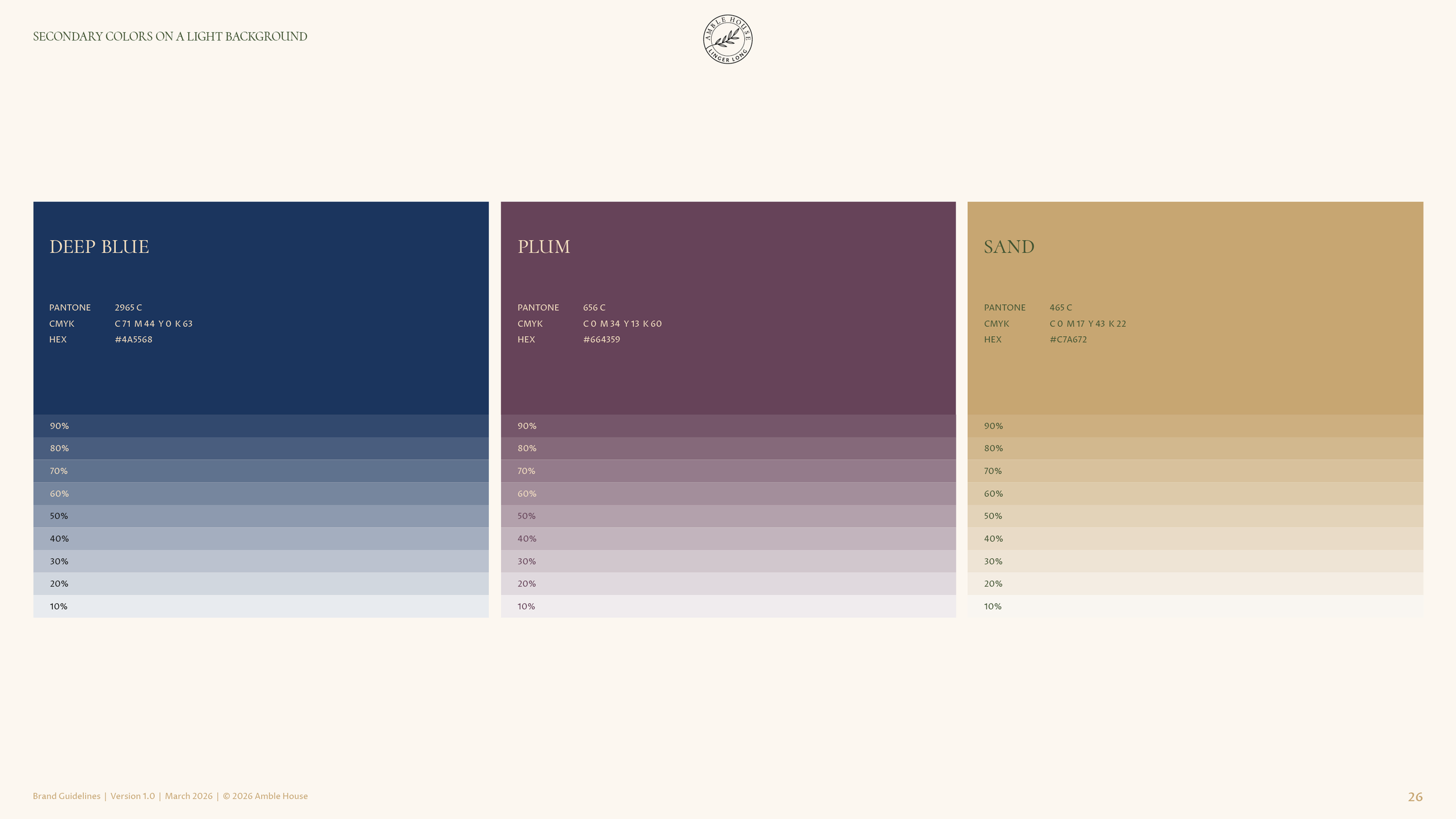
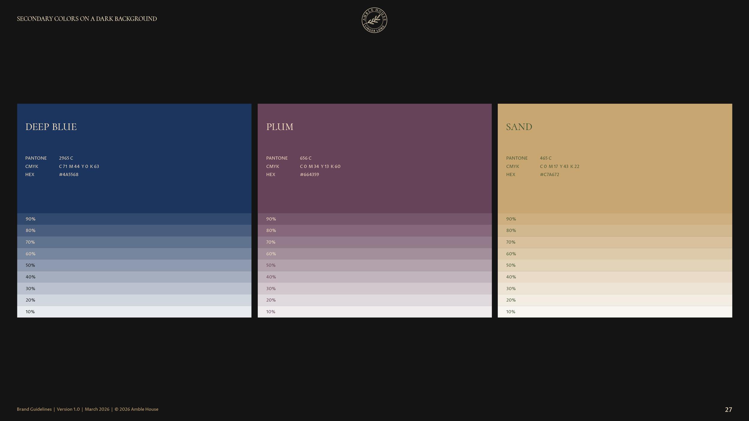
Six colors, decided with the team. Deep Olive, Warm Ivory and Rich Black lead every layout. Deep Blue, Plum and Sand support them, with Sand kept to one small moment per layout. The team chose the greens and tans from our boards and added the navy themselves.
Typography.
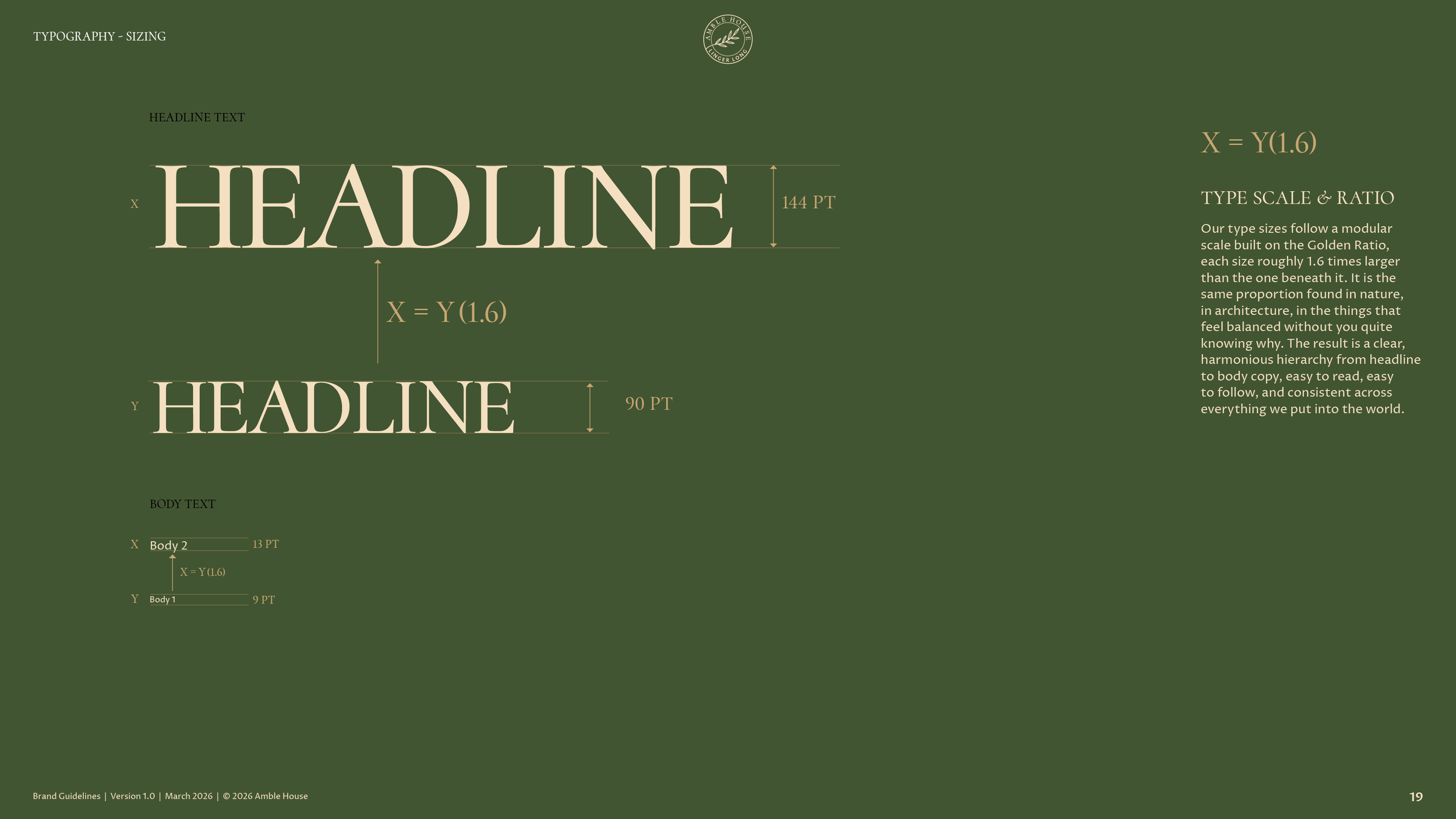
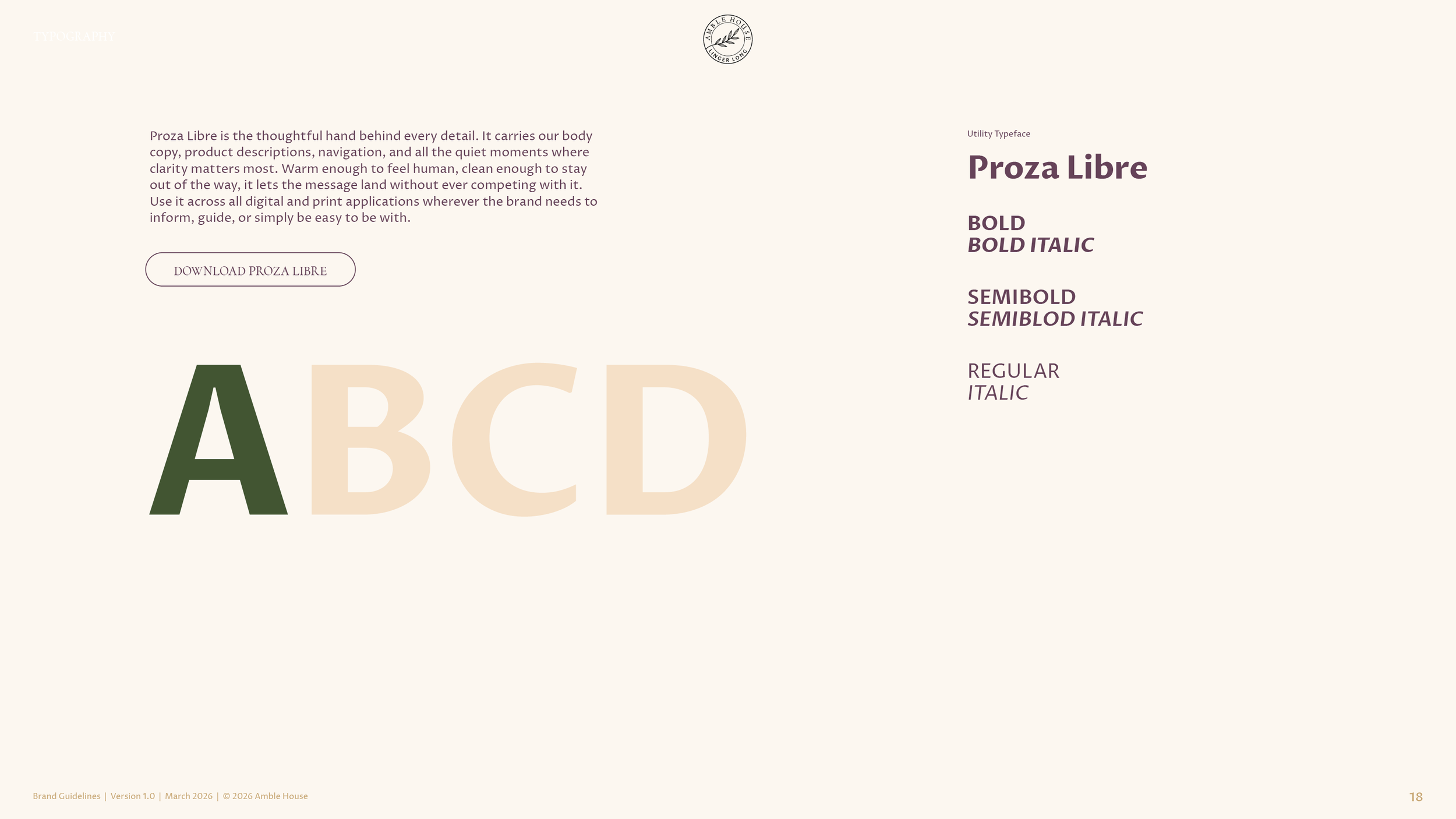
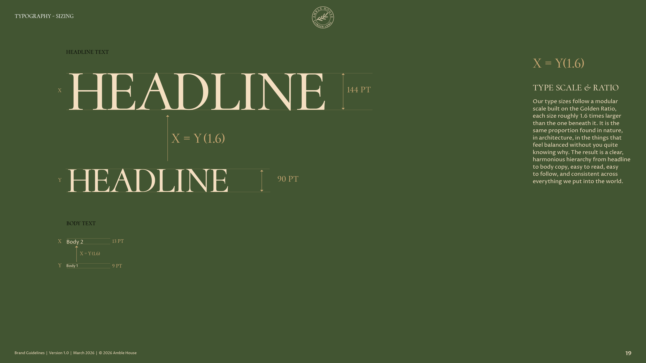
Cormorant Upright for headlines, in capitals only, the voice that greets you at the door. Proza Libre for everything else, body copy, navigation and product details. The type scale steps by the golden ratio, so each size is about 1.6 times the one below it.
The secondary logos.
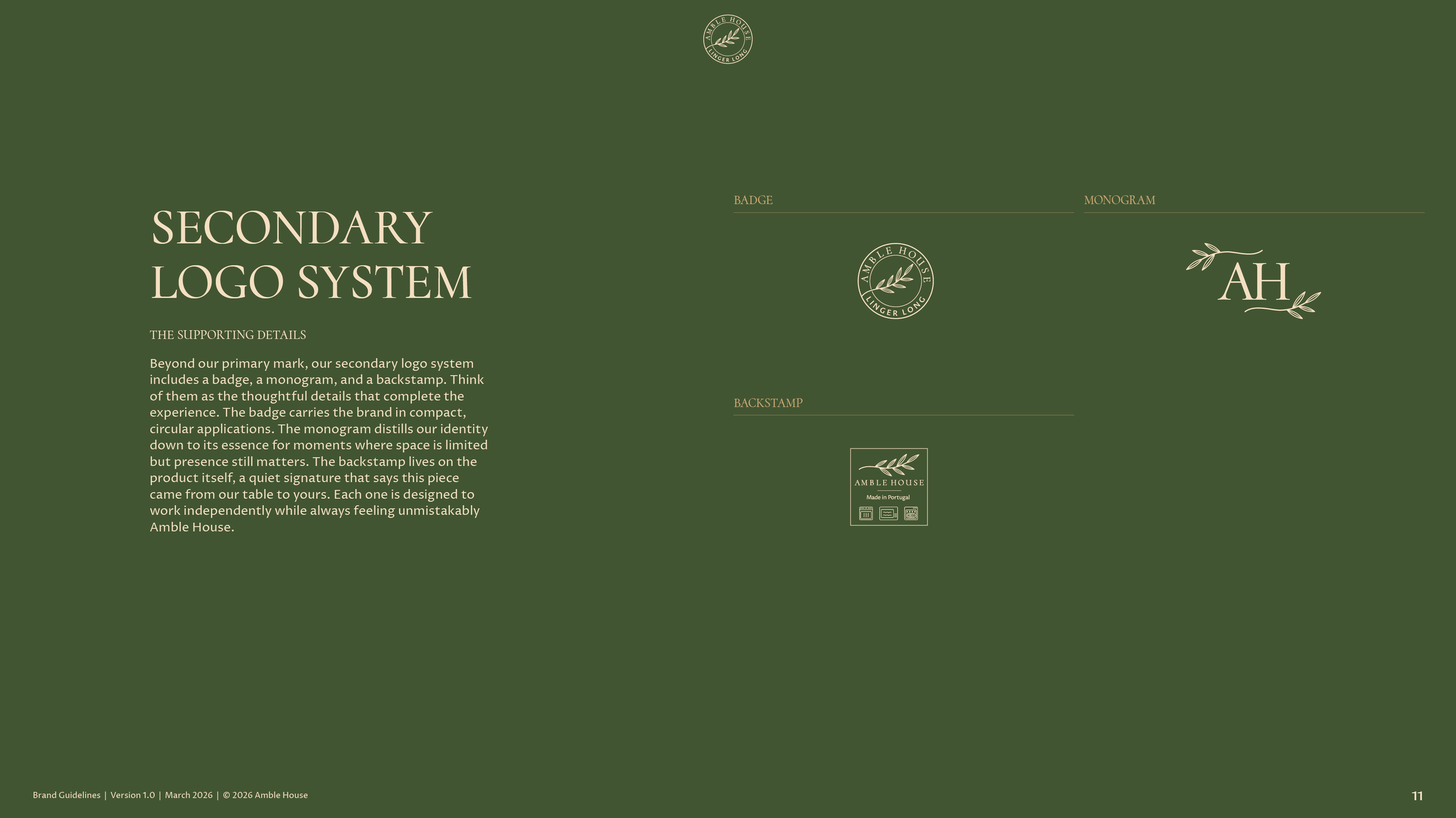
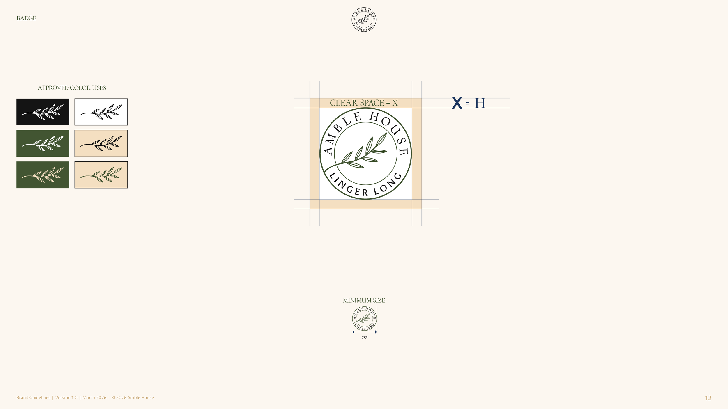
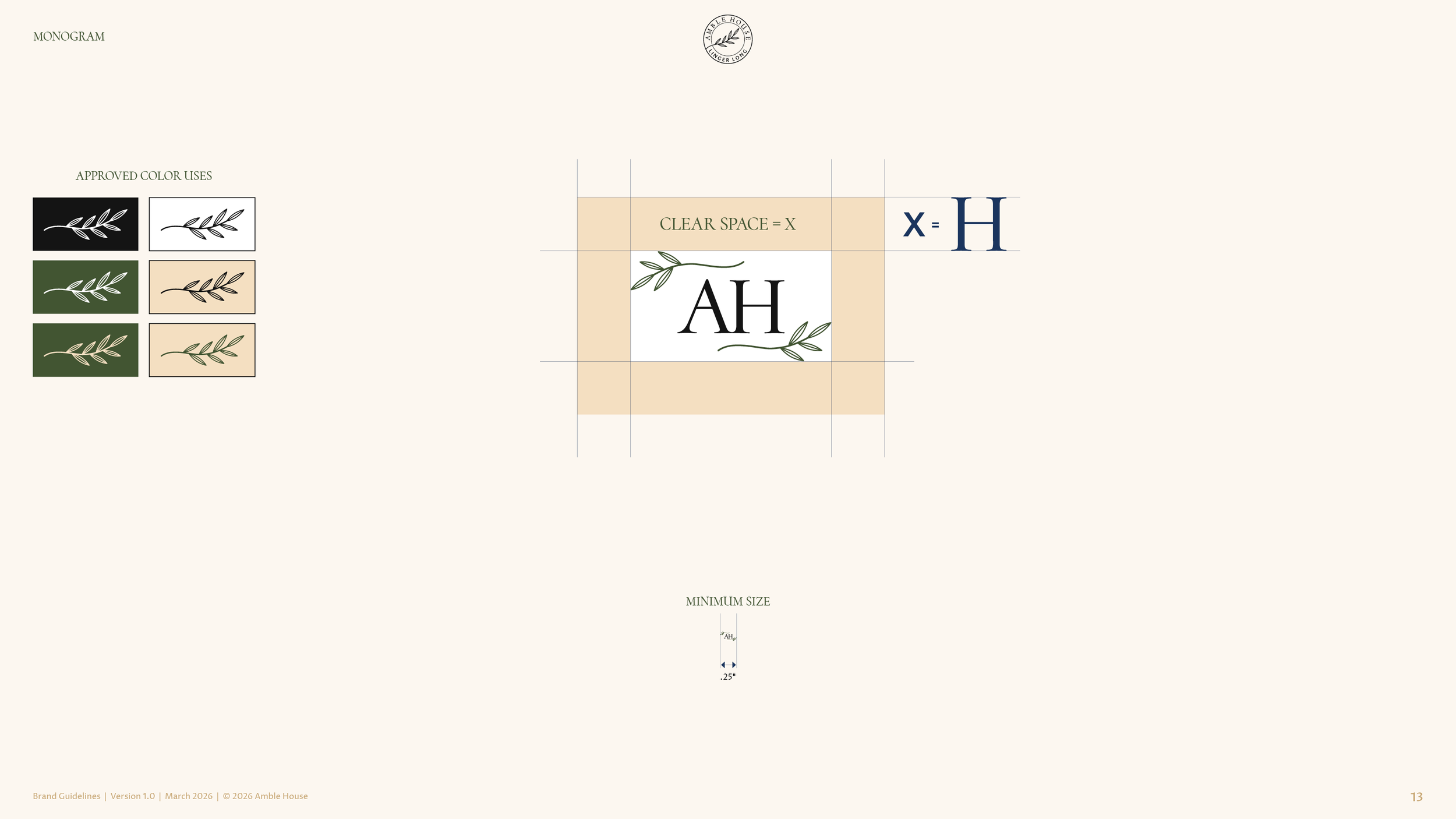
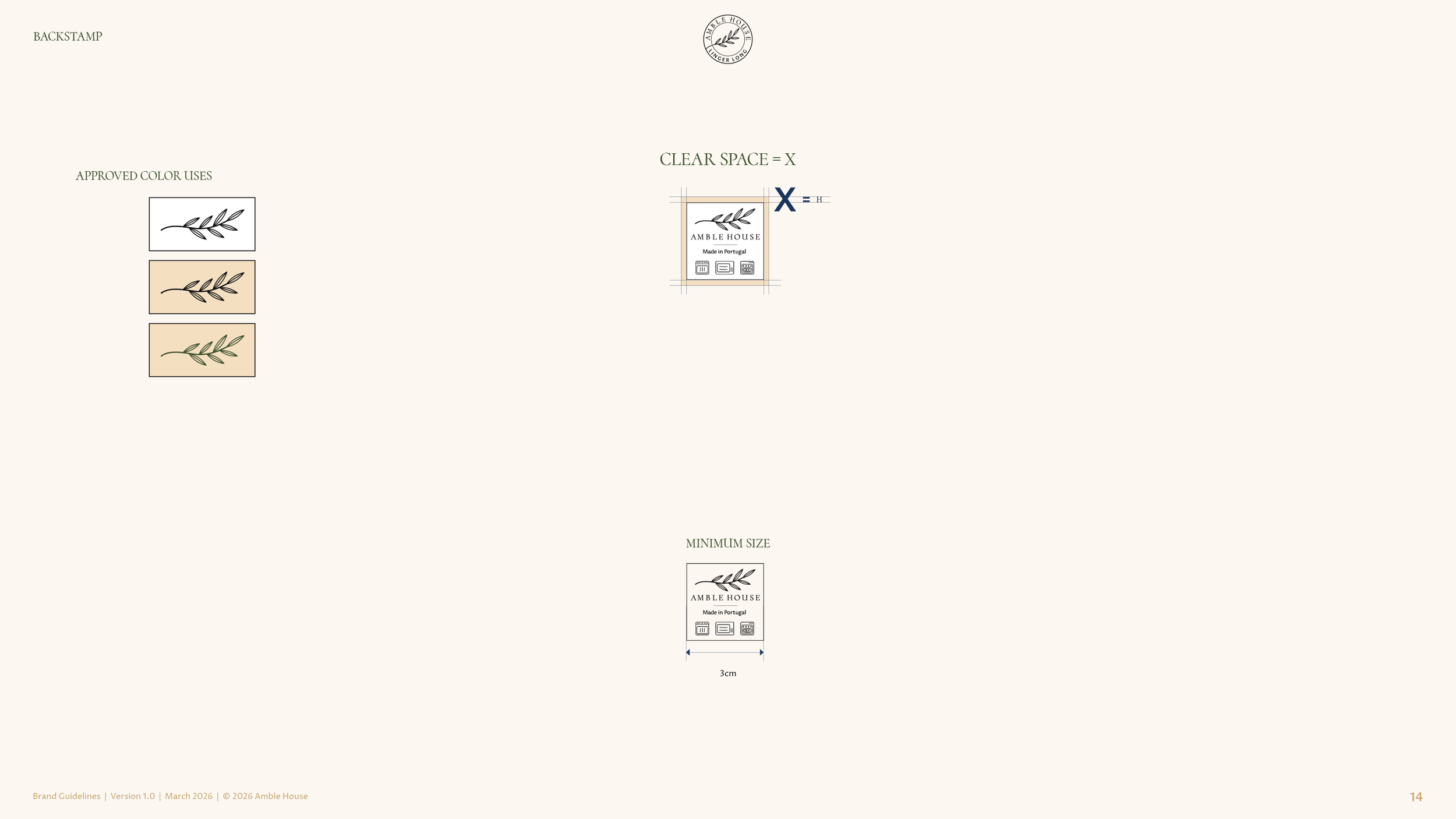
A round badge that reads Amble House, linger long, for compact and circular uses. A monogram, the A and the H with a sprig of the branch, for the smallest spaces. And a backstamp for the underside of each piece, a quiet signature that says this piece came from our table to yours.
Voice and tone.
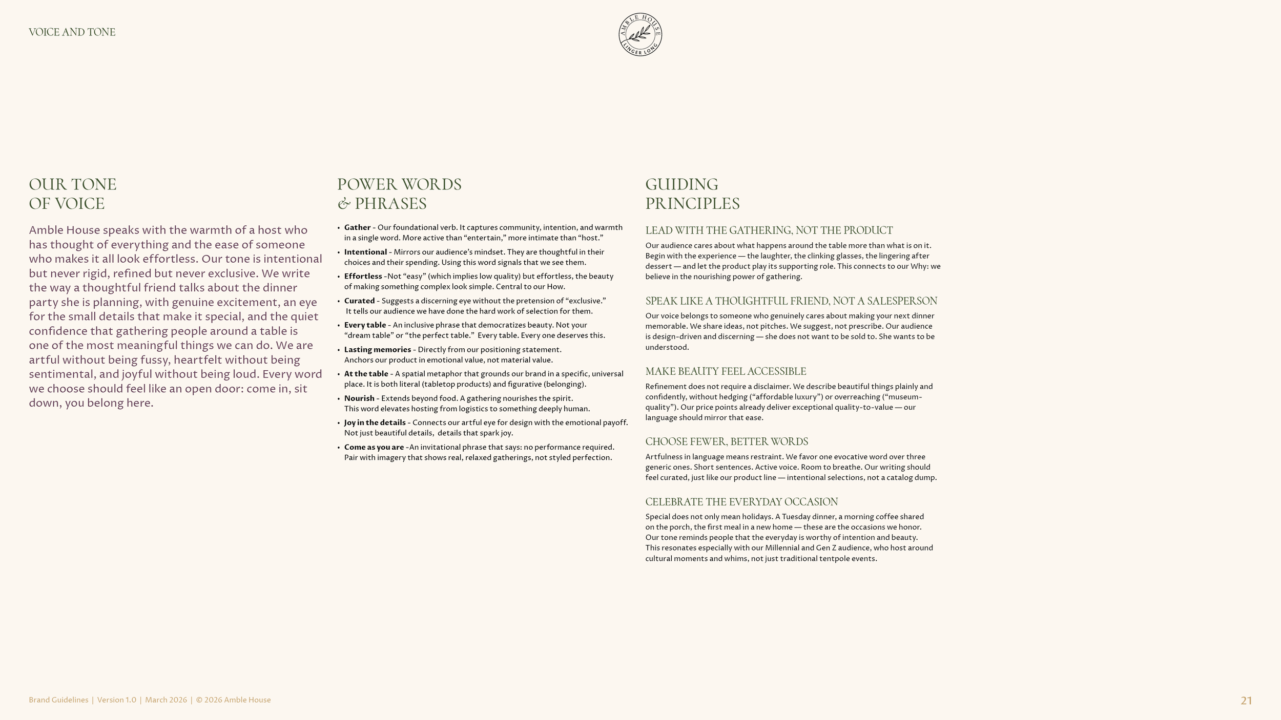
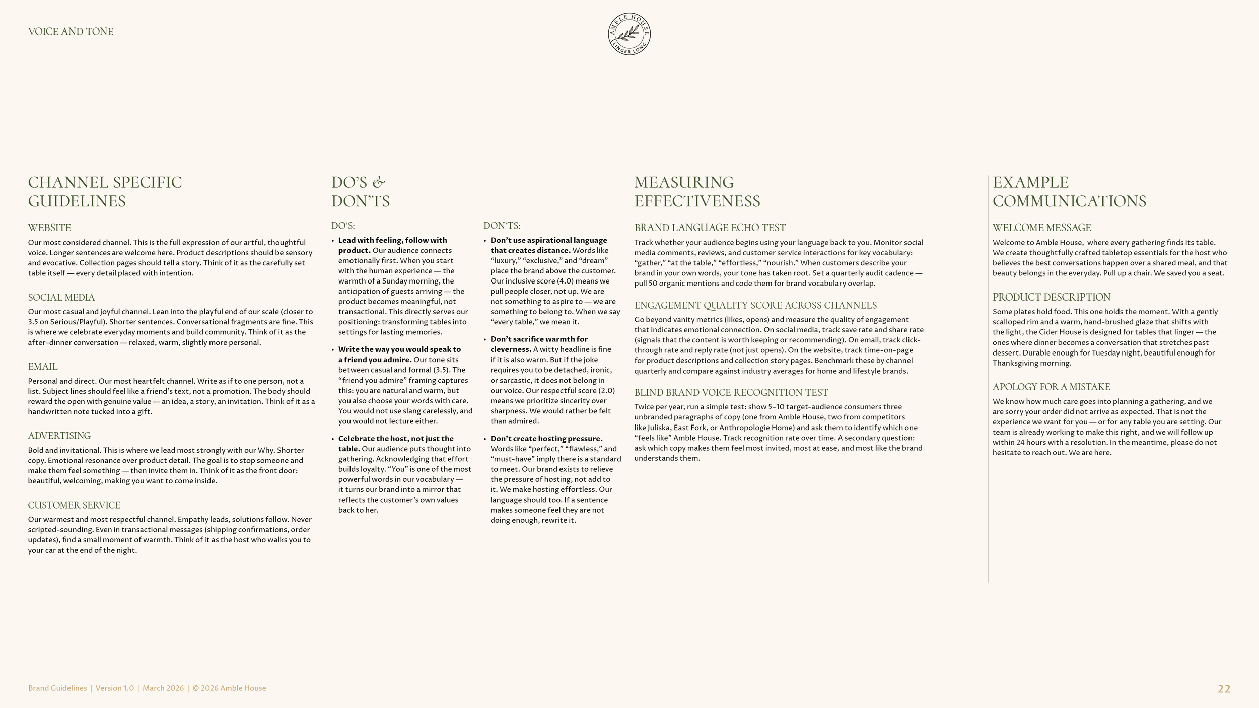
Ten power words, with gather as the foundational verb and effortless, curated and every table beside it. A tone that speaks like a host who has thought of everything. Five guiding principles, the first of them lead with the gathering, not the product. Dos and don’ts, example copy for a welcome, a product and an apology, and channel guidelines for the website, social media, email, advertising and customer service.
Measuring the voice.
Three tests, written into the guide so the voice can be checked. A brand language echo test, which counts how often customers use the brand’s own words back. An engagement quality score by channel, saves and shares over likes, replies over opens. And a blind voice recognition test twice a year, where target customers pick the Amble House paragraph out of three.
The written style guide.
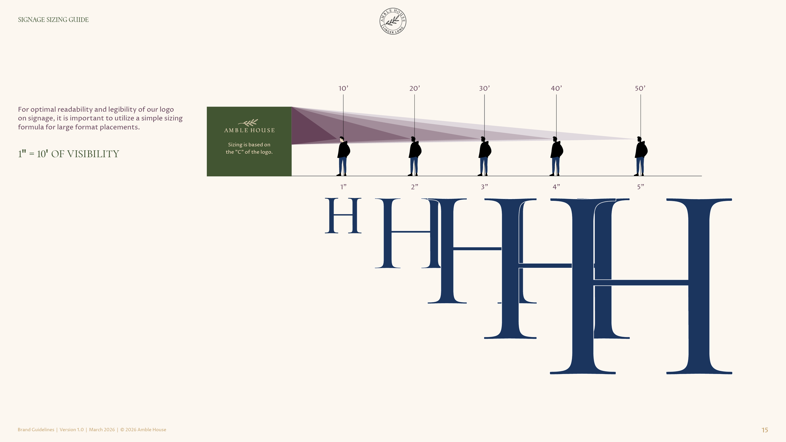
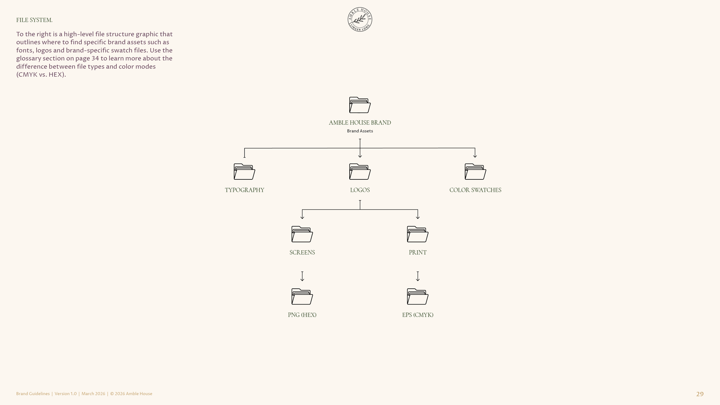
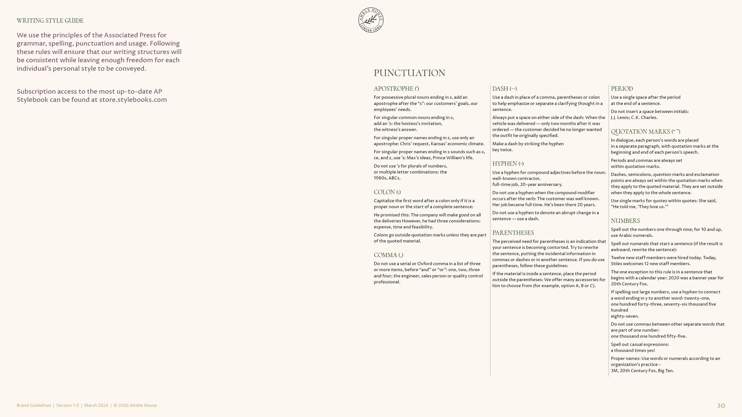
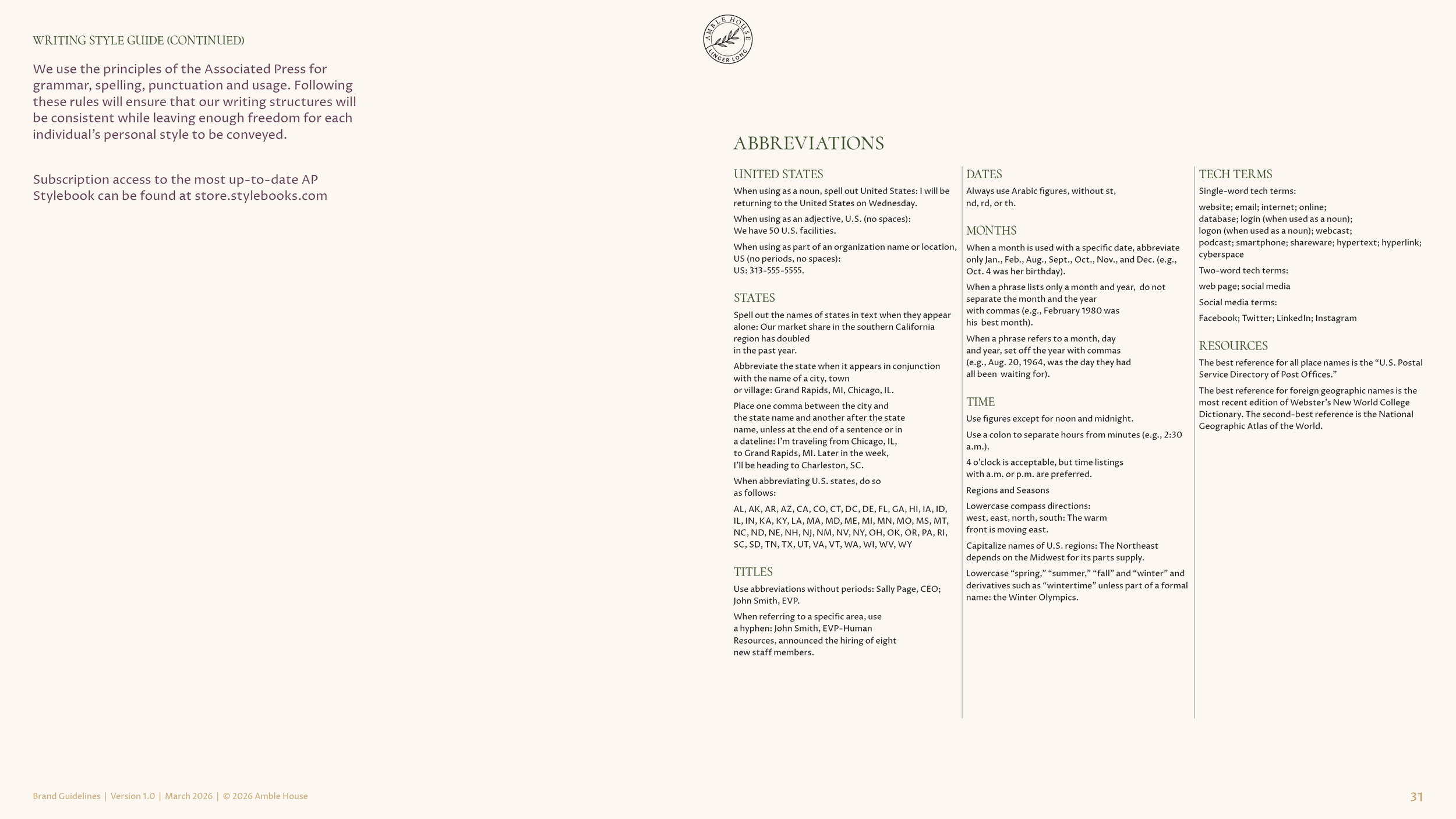
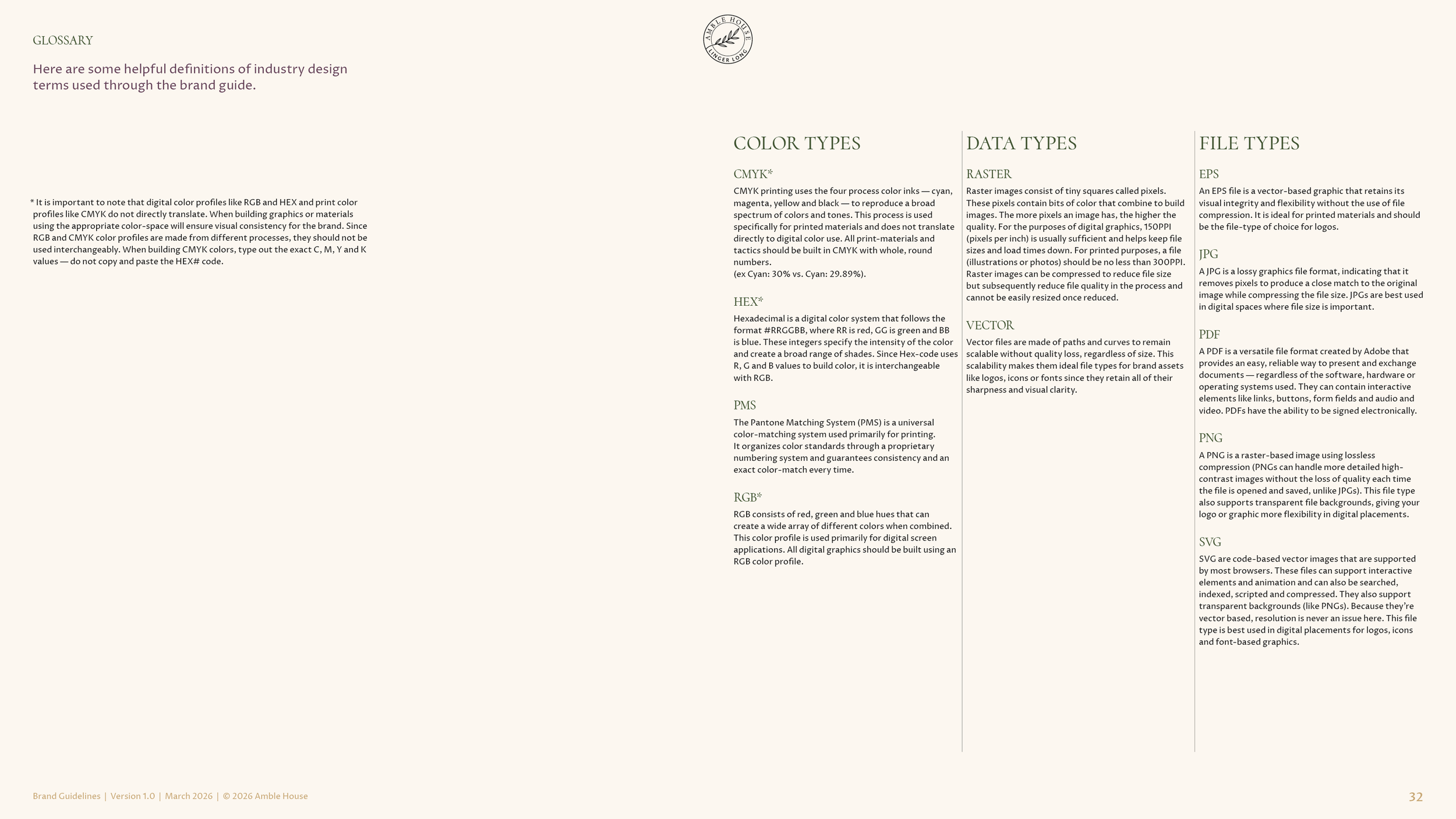
The standards for punctuation, numbers, abbreviations, dates and tech terms, on the Associated Press rules, plus a signage sizing guide, one inch of logo for every ten feet of viewing distance, and an appendix with the file system and a glossary of color and file types.
What came with the guidelines
The brand guide
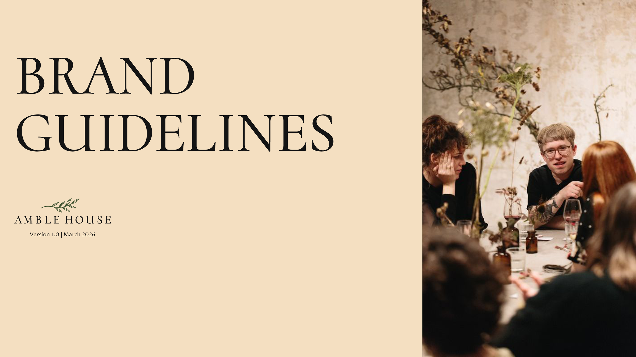
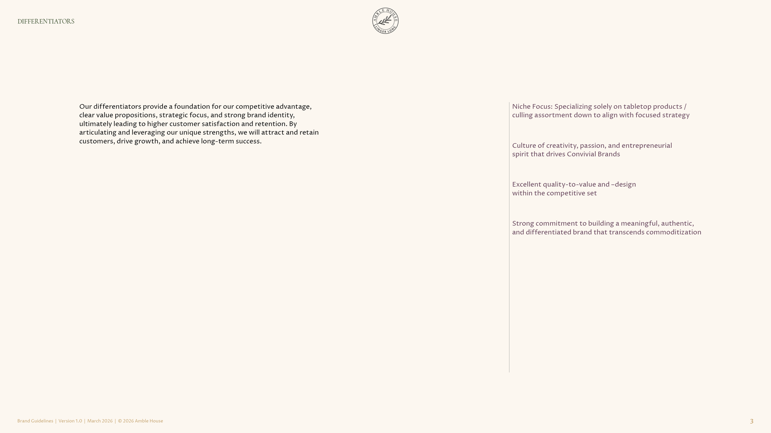
Thirty-three pages, version 1.0, March 2026. The position, the four traits, the differentiators and the positioning statement up front, then the logo systems, the typography, the voice and tone, the colors and the appendix. Presented to the team on March 27, 2026 and delivered the same day.
Logo production files
The primary logo, the wordmark, the symbol, the badge, the monogram and the backstamp, in every approved color, as EPS files for print and PNG files for screens.
Color swatches and fonts
Swatch files for print and for screen, and the Proza Libre font package, so the team could set up the brand on its own computers.
The results
The first discovery session was October 8, 2025. The findings were presented on October 23 and the position on November 7, with the final wording a week later. The naming brief went out on November 10, the company gave its green light on November 12, the company’s lawyers cleared the strongest candidates that month, and the company settled on Amble House in early January. The team chose its colors on January 9, 2026, saw four logo concepts on January 30 and picked the olive branch on February 4, ahead of the sourcing trip to Frankfurt. The identity was refined through February and March, and the brand guide was presented and delivered on March 27, 2026. amblehouse.com launched in 2026 with the brand on it. The home page opens on the olive branch and the words linger longer, and the About page carries the positioning statement word for word, under the line founded in 2026. In May the company asked us to present Amble House to its whole team.
FAQ’s
-
Because the company had to. A trademark meant the Tableau name could not follow the brand into selling direct to customers and into new products. We rarely suggest a client change its name, and we did not suggest it here. What we did suggest was the order. Position first, so the new name had something to be true to, and the identity last, so it had something to show. The rename became the relaunch the brand had needed since 2020. Here is how we do brand strategy consulting.
-
The position. A name chosen first is a guess, and a logo drawn to it is a guess about a guess. Here the position was written and approved before the naming brief existed, the brief was written from the position, and every candidate was judged against it, by us, by the naming partner and by the company’s lawyers. The opposite case is a company that keeps its name and adds a program brand under it, in the La Isla Network case study. A full rebrand for a manufacturer is its own page.
-
Everything the company’s own team, its sales reps and its retailers need to keep the brand whole without a meeting. The Amble House guide opens with the position and the four traits, then the logo systems and the type, and then the part most guides skip, the voice. Ten words to use, five principles, channel guidelines from the website to customer service, example copy, and three tests for whether the voice is working. The Code Blue case study shows the same kind of guide at a manufacturer.
-
About six months from the first discovery session to the finished guide, with the trademark search inside that time. Discovery in October 2025, the position in November, the name through November and December, the colors in January, the logo concepts at the end of January and the guide at the end of March 2026. A company launching a brand from scratch takes about a year, in the Verdant Graphics case study, and a retailer bringing four store brands under one name took about the same, in the Sleep Outfitters case study.
Services
Brand discovery · Market summary · Competitive review · Target audience · Brand positioning · Brand personality · Naming brief · Naming partner · Inspiration boards · Color system · Logo design · Logo system · Typography system · Voice and tone · Channel guidelines · Brand guidelines · Logo production files · Brand presentation
A name you have to change, or a brand that never had a center? Start with what is true.
Start a conversation
Wit & Craft is the brand agency for owner-led manufacturers and trades, in Grand Rapids, Michigan, since 2015.