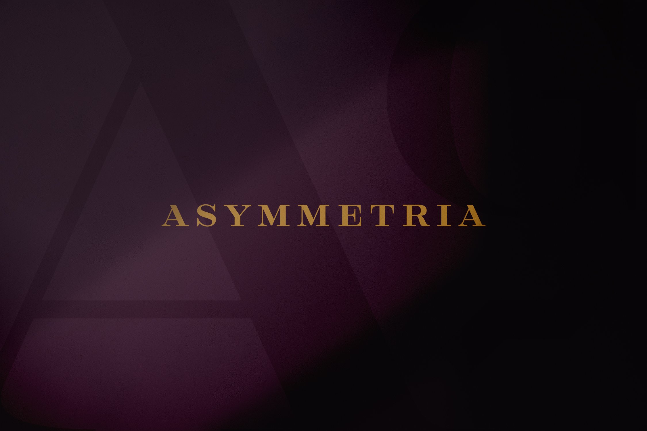
Project Overview
Bringing clarity to complexity.
The Asymmetria Group is a boutique investment firm with a distinctive approach to portfolio construction and risk management — but their brand wasn’t telling that story. They came to Wit & Craft with a need for clarity, coherence, and differentiation. Through our Brand Foundations process, we helped them articulate their unique investment philosophy and translate it into a brand identity as precise and confident as the firm itself.

The Challenge
High intellect. Low visibility.
The Asymmetria Group had the pedigree: a leadership team with decades of institutional experience and a proprietary investment methodology built around adaptive asset allocation. But their brand didn’t reflect that depth. Their visual identity was minimal. Messaging felt generic. And their website, while functional, lacked the narrative clarity to inspire trust among discerning investors and partners.
They needed more than a rebrand — they needed language and design that could match the rigor of their thinking.
Our Approach
Uncover. Align. Articulate.
We engaged Asymmetria through a 90-day Brand Foundations program, tailored to their unique positioning within the investment landscape. The process included:
Brand Strategy Brief: We synthesized competitor analysis, founder interviews, and market context to define a strategic brand foundation.
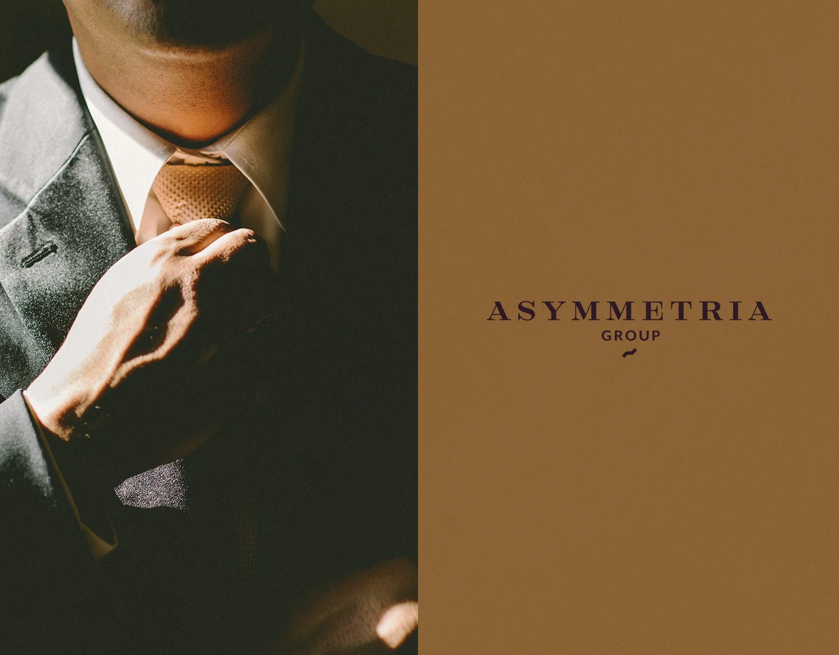
Visual Identity Development: Using moodboards and concept exploration, we created a clean, modern identity system — including logo, color palette, typography, and tone of voice — that reflected Asymmetria’s analytical precision and trustworthiness.
Website Narrative Redesign: Working in collaboration with the client, we restructured their website content to center around clarity, confidence, and authority — while simplifying the experience for time-strapped institutional partners and individual investors.
Launch Toolkit: We developed a standards guide and custom launch playbook to ensure internal alignment and consistent implementation moving forward.

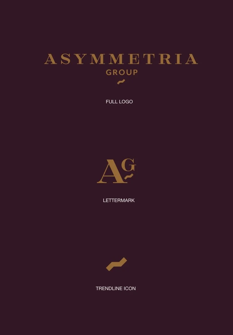
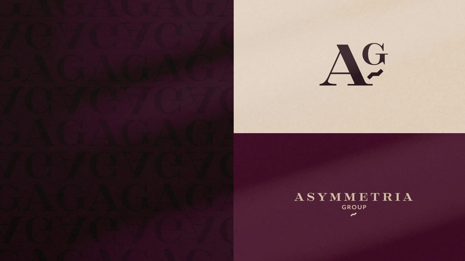
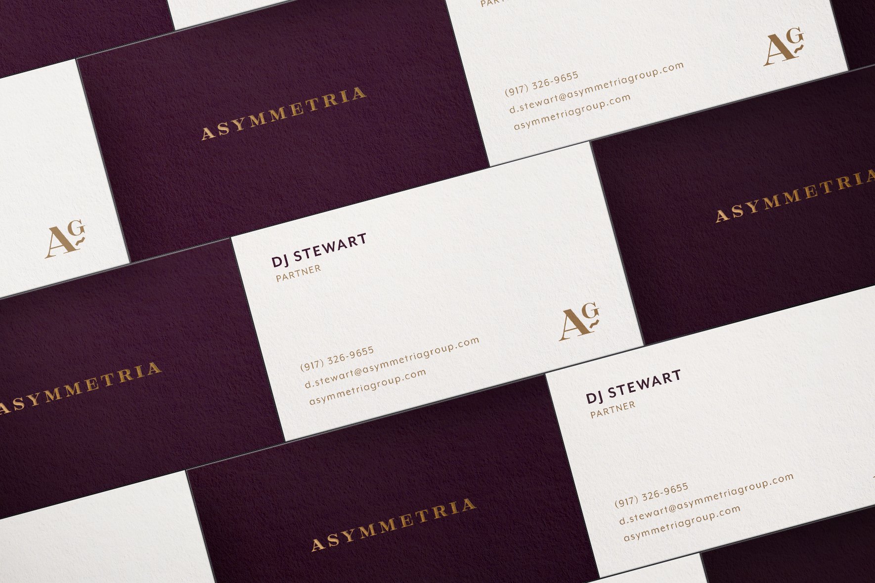
PRIMARY MARK
The primary logo is the go-to mark in most branding scenarios. This is the logo the Asymmetria clients will see most often, and the one they should expect to see when interacting with the brand.
SECONDARY MARKS
Along with the primary logo, we have three secondary brand marks. These marks are complementary to our primary one and take on a supporting role.

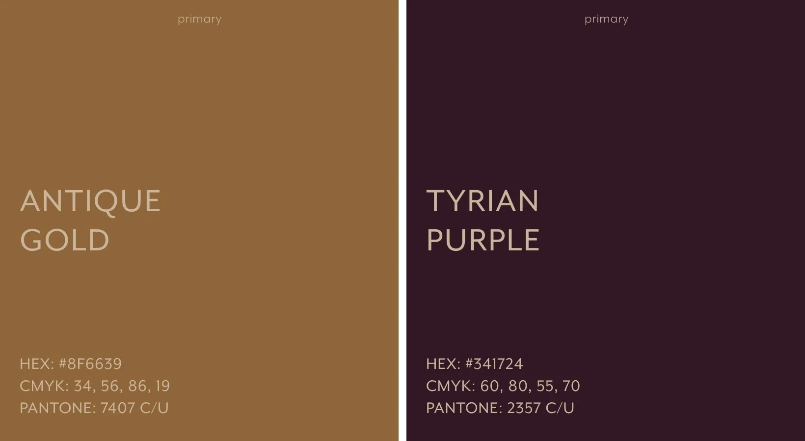
Color Theory
In a market saturated with financial blues and greens, using purple is a gauranteed way to stand out. And while it’s an uncommon color, it’s also a color steeped in elite status and history. From brighter tints of royal purple, to deeper shades of rich velvet, purple has an understated, and often undervalued, place in financial success. Take for example the color Tyrian Purple, a dye for royalty and the early social elite that was literally worth it’s weight in gold—even some Roman emperors were unable to afford a Tyrian colored robe or gown.
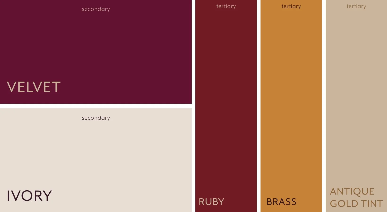
Additional Colors
A complete set of secondary and tertiary colors was necessary to expand Asymmetria’s capabilities, especially when it came to expressing investment figures, graphs and charts.
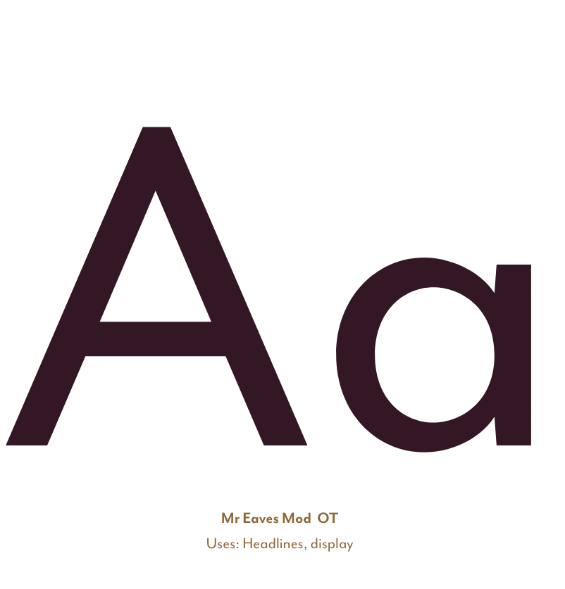
Type Styles
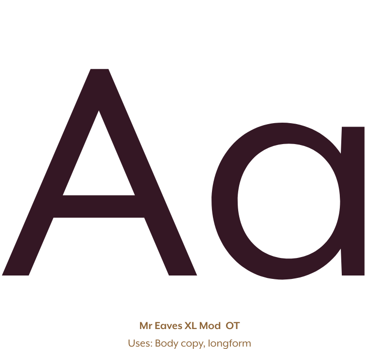
Mr Eaves Mod OT and XL Mod OT pair to create a robust and flexible type system for the Asymmetria brand. Both families are crisp and clean, with subtle contrast that prodvides modenr character and visual interest. Mr Eaves Mod OT is well suited for display type and headlines, confidently capturing attention. The XL Mod OT family was not only created for, but also ideal as body copy, longform details and small point sizes (like x- and y-axis information on charts and graphs).
We are a collective of hand-picked members with a high-standard for success.
The Outcome
From understated to unmistakable.
The final brand system gave The Asymmetria Group the clarity and confidence to own their unique space in the financial advisory world. The new identity strikes a careful balance between institutional polish and intellectual edge, with messaging that clearly communicates who they serve, how they’re different, and why that difference matters.
Key shifts included:
A clear value proposition centered around adaptive thinking and risk-based asset allocation.
A visual identity system that conveys modernity, structure, and trust — without relying on clichés.
A refreshed website experience that educates, reassures, and differentiates — all in under 90 seconds of reading time.

When your thinking is complex, your brand should make it simple.
The Asymmetria project is a prime example of how strategic brand development can transform not just how a business looks, but how it speaks — and how it’s understood. In a field where trust is currency, clarity is power. And that’s exactly what we built together.