How Papa Fisch put its story on the bottle
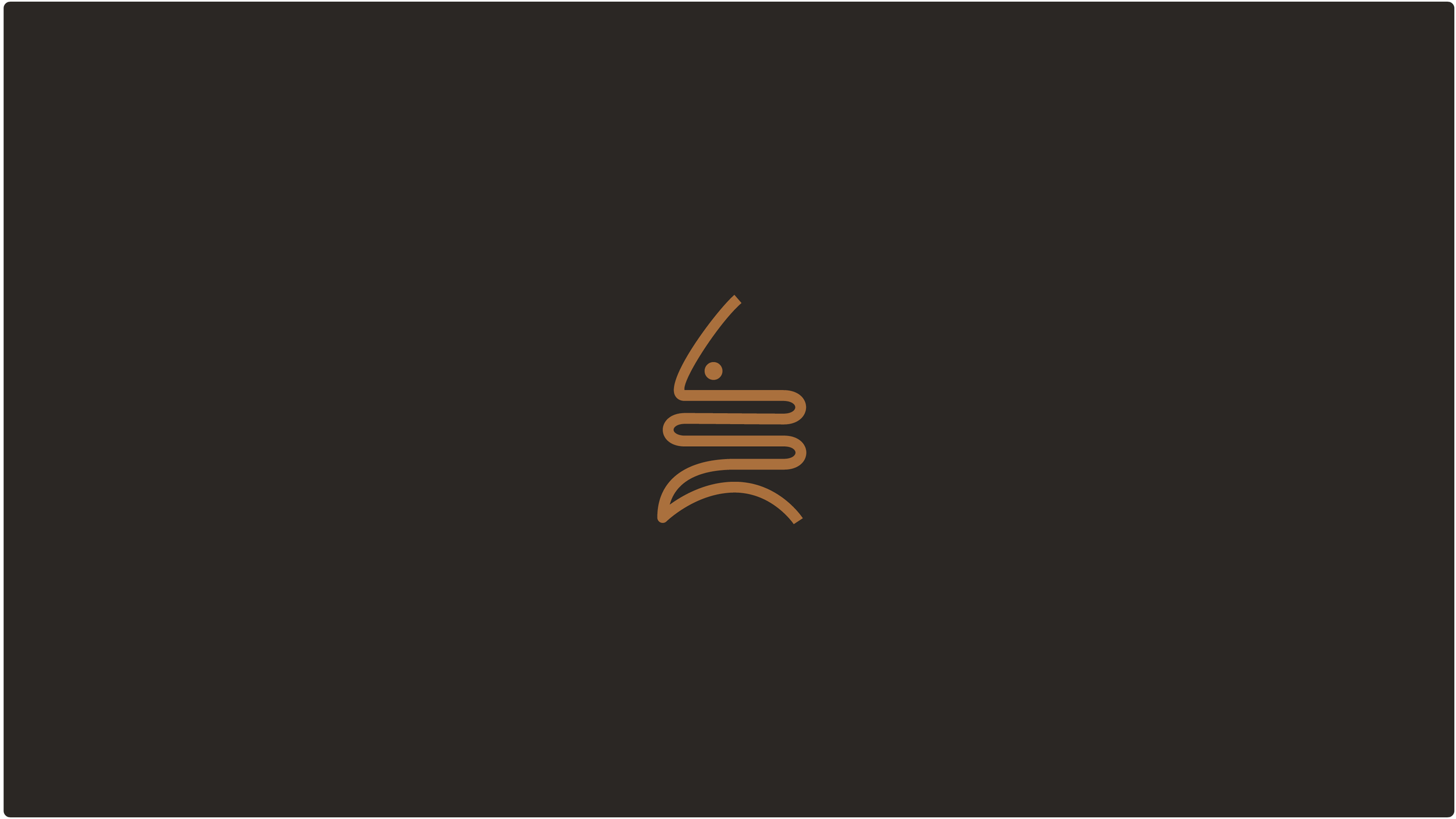
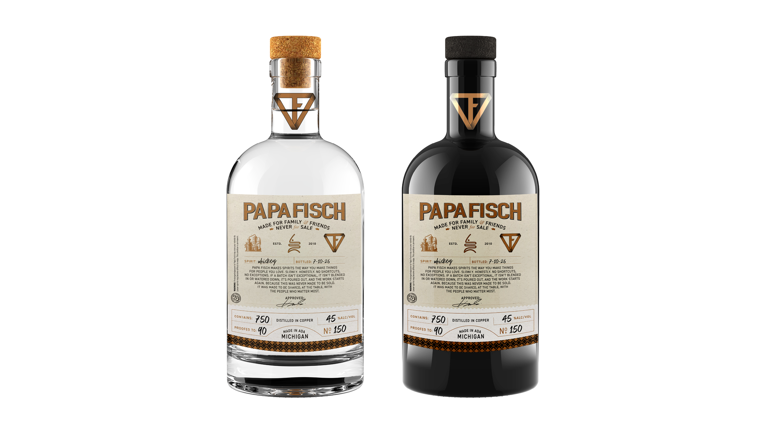
Wit & Craft gave Papa Fisch, a small-batch spirits label made for family and friends, a symbol, a wordmark, three colors and a bottle label the maker fills in by hand. The story came first. He had told it to us over a drink, and his own words became the paragraph on the label. The symbol came from the work itself. It reads as a fishbone, and turned over it is the worm of a copper still, the coil where vapor cools into spirit. One presentation, one change, and the files were in his hands in time for the next barrel.
The challenge
Papa Fisch has been making spirits since 2010, in small batches, for the people around the maker's table. Whiskey mostly, aged for years in the barrel, and whatever else the season calls for. None of it is for resale. It is made to be shared, and the bottles go to family and friends.
What it did not have was a brand. The maker had a mark of his own, a triangle with his initials drawn into it that he had used for years, and a nickname that stuck, Papa Fisch. He wanted the bottle to look like what was in it. That meant a logo that could go on a cork-topped bottle and a baseball cap, a label with room for his pen, and the story in his own words.
He also wanted it simple. The spirit changes from batch to batch, so the label had to print blank on a desktop printer and be finished by hand, with no new print run every time the whiskey becomes something else. And he wanted it soon. A barrel was coming due in August.
Why we started with the story
A logo for a passion project is tempting to draw on day one. We started with the words instead. Over a drink in March the maker told us why he does this, and what it means to pour a batch out when it is not right. We wrote it back to him in a few sentences. Papa Fisch makes spirits the way you make things for people you love. Slowly. Honestly. No shortcuts, no exceptions. That paragraph went on the label, on the back of the shirt, and into the brief for everything else.
Then the symbol had a job to do. Our rule for a logo is the same on every project. Simple enough that a child could draw it, memorable after one look, timeless, able to work on a bottle and a hat and a favicon, and right for the brand it stands for. The fishbone was the obvious idea, and the obvious idea is the right one when it can carry a second meaning. Ours came from the still.
The Brand Identity System
The symbol.
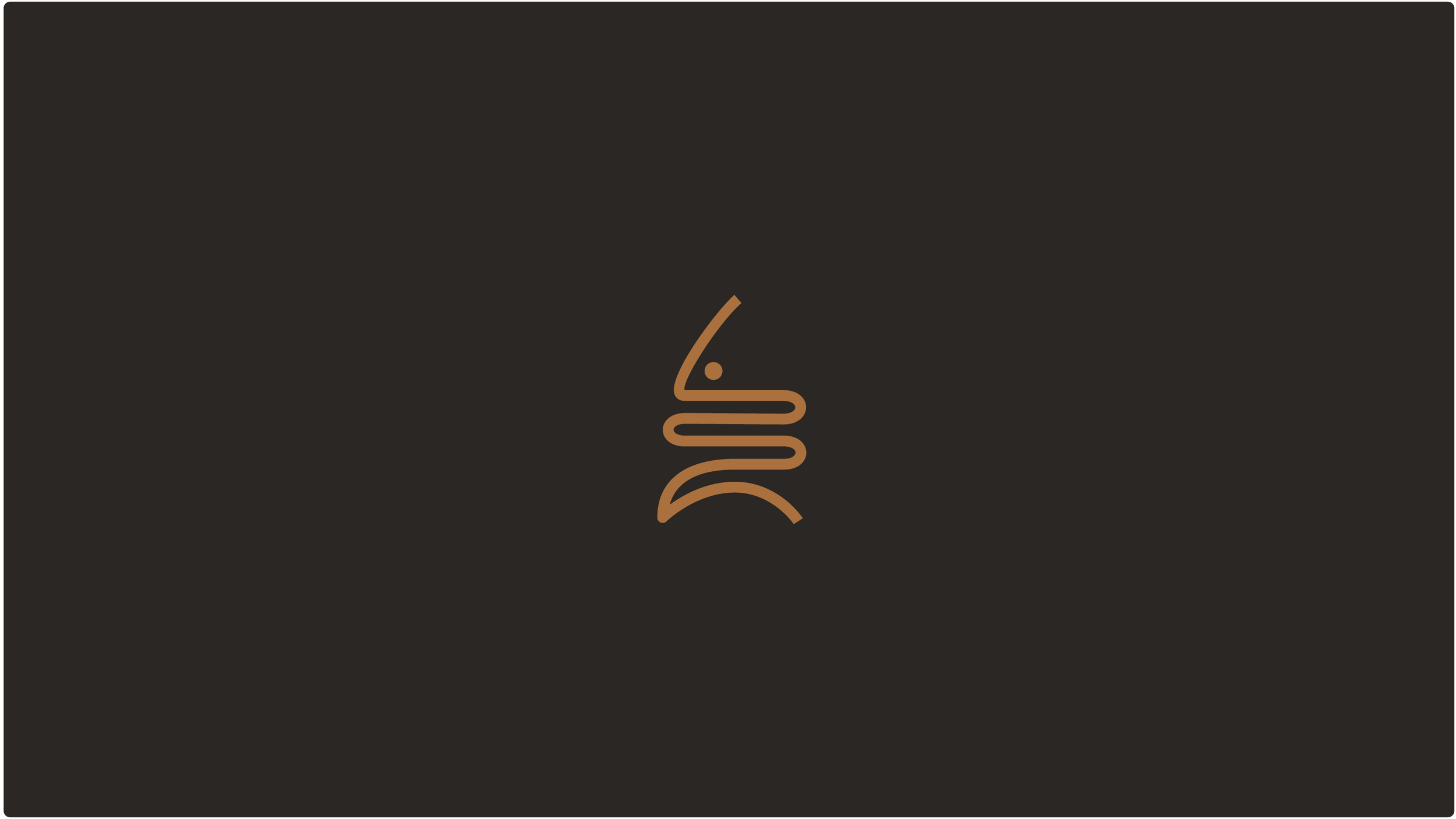
Six lines. Read one way it is a fishbone with an eye. Turn it over and it is the worm of a copper still, the coil where the vapor cools and comes out as spirit. The whole process in one small drawing, and it stitches onto a cap at an inch tall.
The wordmark and the colors.
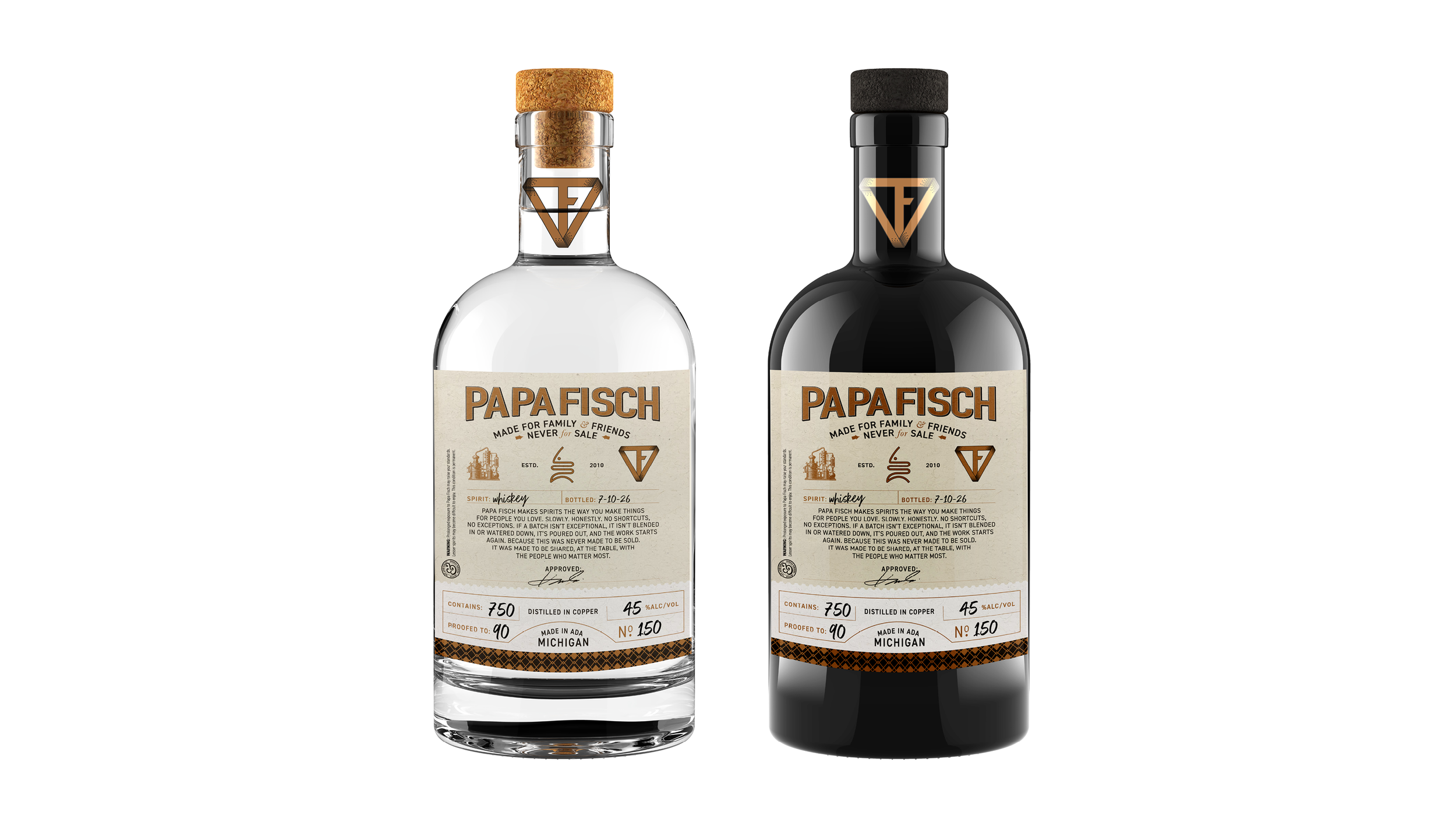
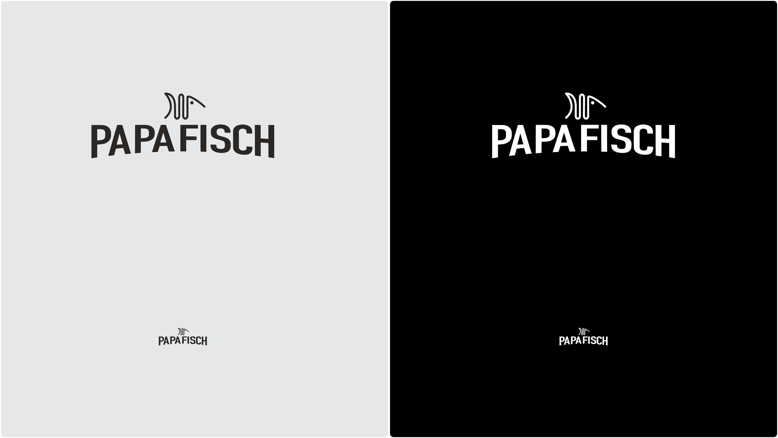
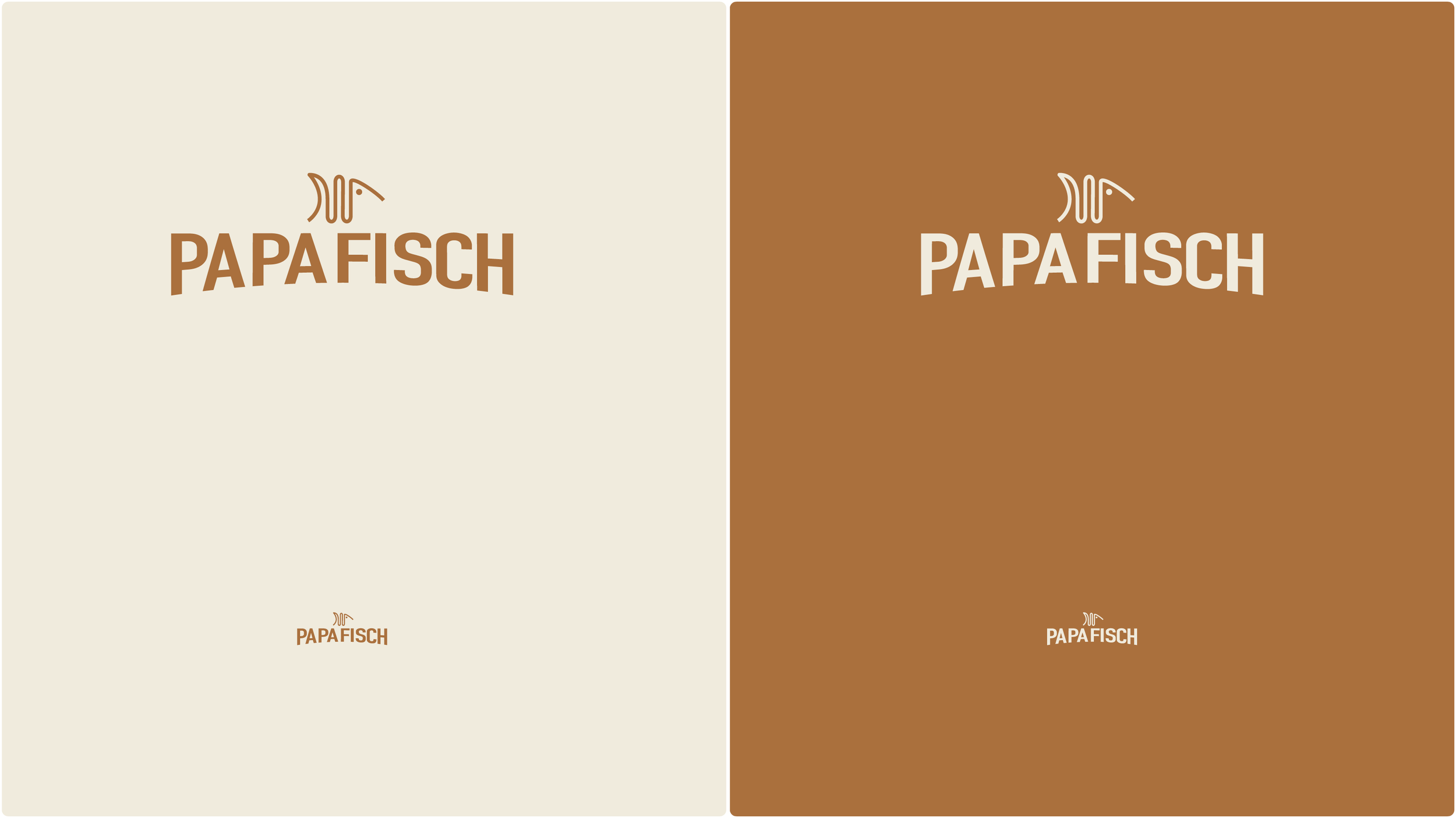
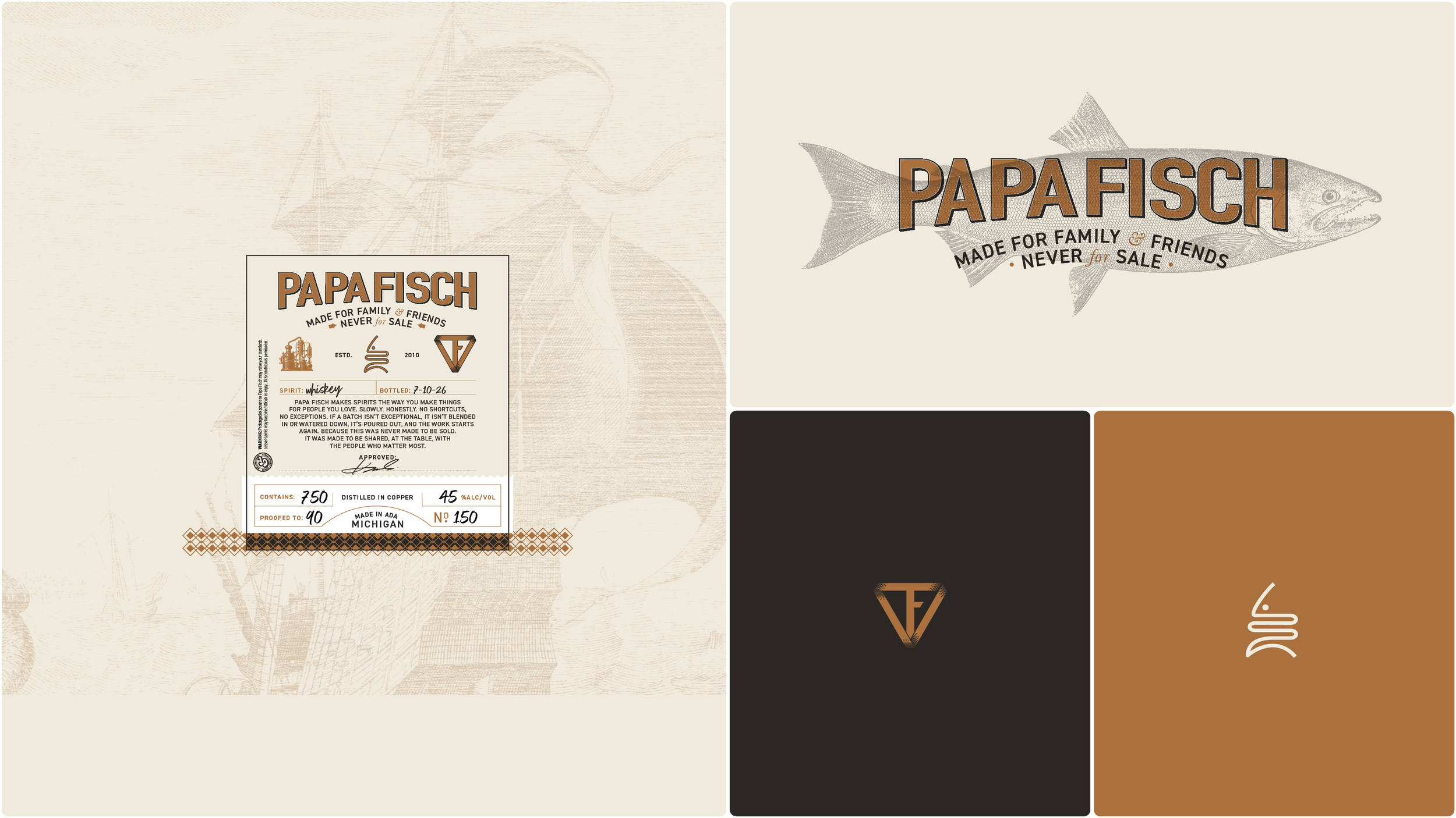
Papa Fisch in tall capitals set on a gentle arch, the way a sign painter would letter a bar. On the label it picks up a highlight and a shadow for depth. Three colors do all the work. Burnished copper, deep charcoal and warm cream. The maker's own triangle, his initials drawn into a TF, kept its place on the neck of the bottle and on the label.
The label.
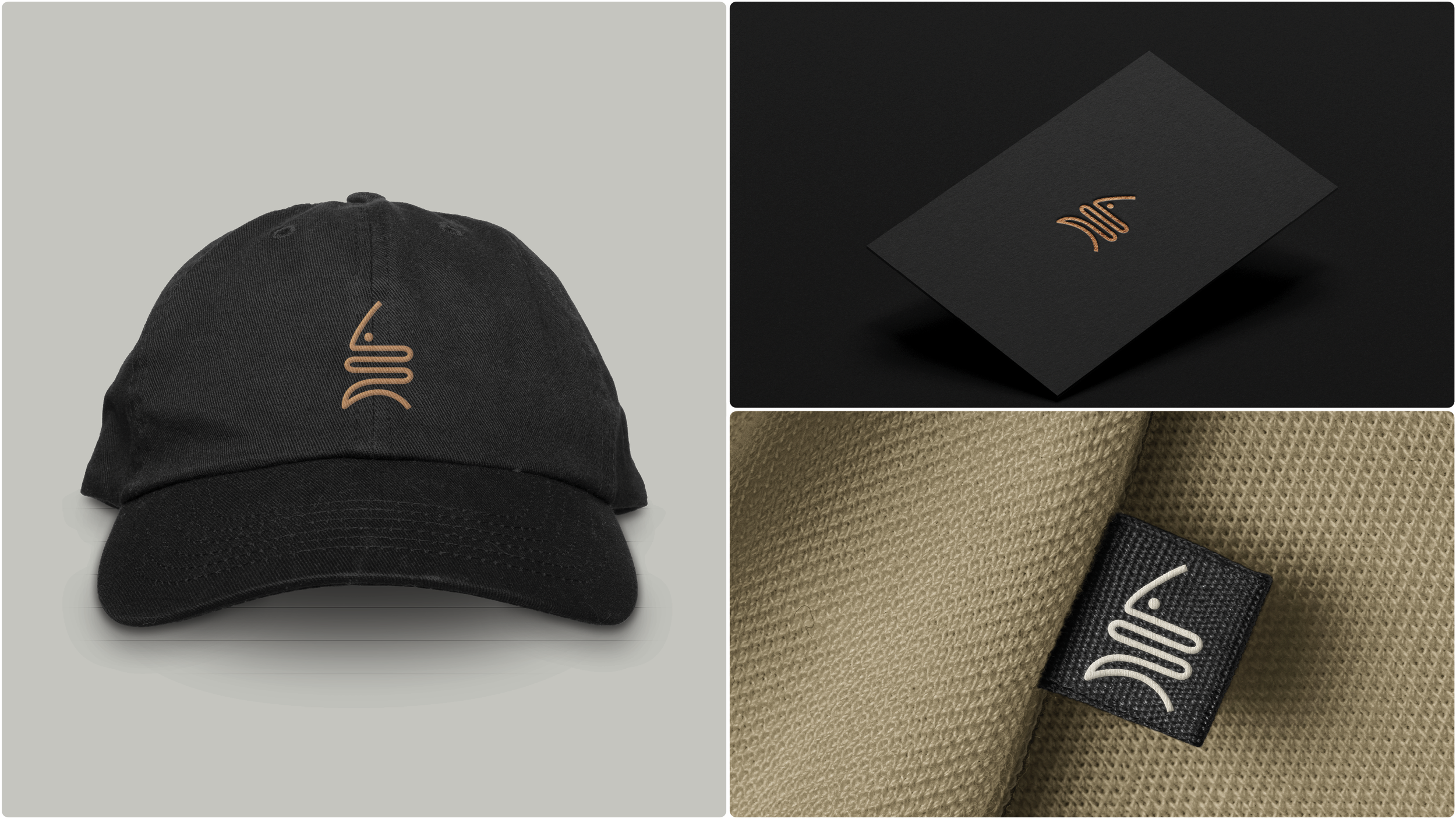
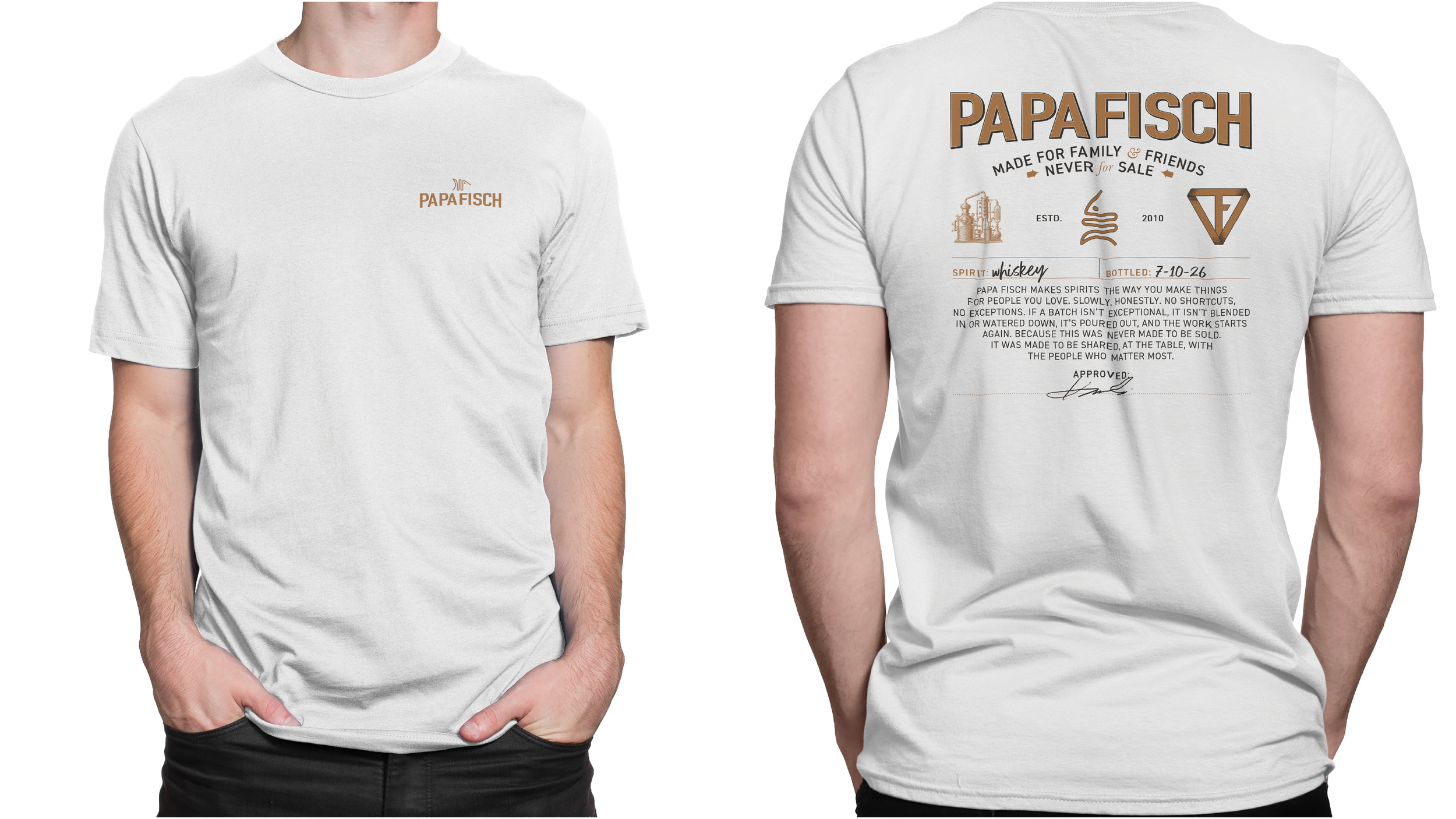
Made to print blank on a desktop printer at four inches by four and a half, then finished with a pen. Spirit, bottled on, contains, proof, alcohol by volume, bottle number, and a line marked Approved for the maker's signature. The story sits in the middle. Made for family and friends, never for resale, sits under the name. A small copper still, the symbol and the TF triangle hold the row below it. And a warning line, that prolonged exposure to Papa Fisch may raise your standards. The same label went on the back of a tee, the symbol went on a cap, a foil card and a woven tag, and a fish-skeleton version of the wordmark is headed for a bar sign.
The results
The maker approved the symbol, the label and the wording in one meeting and asked for one change, a fish skeleton behind the wordmark for the bar sign. The print-ready label went out within days, and the full set of files followed in August. Every version of the logo, in every color, in print and screen formats, the color swatches, and the label as a blank he prints himself. The first bottles of the summer's barrel went out under the new name, with his signature on every one.
FAQ’s
-
Five things, and we hold every logo to them. Simple enough that a child could draw it. Memorable, so it sticks after one look. Timeless, built on no trend. Versatile, so it works on a bottle, a hat and a favicon. Appropriate, so it says something true about the brand. The Papa Fisch symbol is six lines that read as a fishbone and, turned over, as the worm of a still. That is all five.
-
Start with what changes and what stays. For Papa Fisch the spirit, the proof and the batch change every time, so those lines are blank and filled in by hand. The name, the story, the symbol and the maker's triangle stay. The label prints on a desktop printer at about four by four and a half inches, so a new batch never waits on a print run. A signature line makes every bottle his.
-
Less than you think, and more than a logo. Papa Fisch got a symbol, a wordmark, three colors, a label and its story in a few sentences, with the files to put them anywhere. That is enough to make a bottle, a cap and a shirt look like they came from the same place. It did not need a 40-page guideline. One maker runs the brand, and he can keep it consistent himself.
-
Papa Fisch started with a conversation in March and saw the finished identity in July. The label file went out days after the presentation, and the full set of logo files followed in August. Bigger brands take longer, because more people have to agree. For the same kind of work with a bigger story behind it, see Croze Nest, the barrel maker we repositioned.
Services
Brand story · Logo design · Logo system · Wordmark · Color palette · Label design · Merchandise concepts · Logo production files
Have a story that belongs on a bottle? Start with the words.
Start a conversation
Wit & Craft is the brand agency for owner-led manufacturers and trades, in Grand Rapids, Michigan, since 2015.